Table of Contents >> Show >> Hide
- Before You Pair Anything: Pick Your Orange “Personality”
- How This List Works
- Bold Blues: Orange’s Most Famous Frenemy
- Greens That Spark: From Tropical to Electric
- Pinks & Reds: The “Sunset” Family That Always Photographs Well
- Purples: Unexpected, Artsy, and Seriously Chic
- Yellows & Golds: High-Watt Sunshine Pairings
- Make Orange + Bold Colors Look “Designed,” Not Random
- Room-by-Room Ideas
- of “Real-Life” Experiences: How Orange Pairings Actually Play Out
- Conclusion
Orange is the espresso shot of color: energizing, confident, and just a little dramatic in the best way. It can read as
sunny and playful (hello, tangerine), artsy and modern (vivid persimmon), or earthy and elevated (burnt orange and
terracotta). The tricky part isn’t using orangeit’s picking the right color partner so it looks intentional, not like
your room got dressed in the dark.
The good news: orange is wildly social. Designers often lean on the color wheel for foolproof pairingsespecially
blue-and-orange (classic complementary contrast) and combinations that mix warm and cool tones for balance.
When you keep undertones and saturation in mind, orange plays nicely with everything from inky navies to electric
pinks.
Before You Pair Anything: Pick Your Orange “Personality”
Orange isn’t one colorit’s a whole mood board. First, figure out what kind of orange you’re dealing with:
- Yellow-leaning orange (marigold, pumpkin, mango): feels bright, cheerful, and high-energy.
- Red-leaning orange (coral, vermillion, persimmon): feels punchy, modern, and a bit spicy.
- Brown-leaning orange (burnt orange, terracotta, rust): feels grounded, cozy, and designer-y.
Next, match intensity with intensity. If your orange is loud, pair it with colors that can hold their own (jewel tones,
saturated brights) or use the bold color in smaller, high-impact accents (pillows, art, tile, lamp shades).
How This List Works
Below are 30 bright, bold colors that go with orange. Each entry includes a quick “why it works” and
an easy way to use itbecause color theory is fun, but not as fun as a room that actually looks good.
Bold Blues: Orange’s Most Famous Frenemy
Blue sits opposite orange on the color wheel, which is why the pairing feels instantly alive. When orange is warm and
energetic, blue brings cool confidence.
1) Navy
Why it works: Navy is deep, tailored, and calminglike a blazer for your walls. Orange pops against it
with crisp contrast.
Try it: Navy wall + orange art or a burnt-orange sofa with navy drapes.
2) Cobalt Blue
Why it works: Cobalt is saturated and modern; it makes orange look extra bright and intentional.
Try it: Cobalt tile or a statement chair with orange throw pillows.
3) Sapphire Blue
Why it works: Jewel-tone sapphire adds richness and keeps orange from feeling too “sports team.”
Try it: Sapphire rug + orange accents (vases, books, frames).
4) Royal Blue
Why it works: Bold and classic, royal blue gives orange a graphic, high-contrast edge.
Try it: Color-block a wall: royal blue lower half, orange accessories up top.
5) Turquoise
Why it works: Turquoise feels fresh and playful; orange adds warmth so the combo doesn’t turn icy.
Try it: Turquoise backsplash + orange bar stools or pendant cords.
6) Teal
Why it works: Teal has depth and sophisticationorange becomes the fun, bright counterpoint.
Try it: Teal built-ins with orange pottery or artwork.
7) Aqua
Why it works: Aqua reads airy and summery; orange anchors it with warmth.
Try it: Aqua bedding with orange accent pillows and a patterned throw.
8) Robin’s Egg Blue
Why it works: Crisp, clean, and cheerfulthis light-but-bright blue makes orange look playful, not heavy.
Try it: Robin’s egg cabinetry with orange hardware or counter decor.
Greens That Spark: From Tropical to Electric
Orange and green share a “citrus family” vibethink oranges, limes, tangerines. The key is contrast: pair earthy
oranges with lush greens, and vivid oranges with punchy yellow-greens for a modern kick.
9) Emerald Green
Why it works: Emerald is luxe and dramatic; orange feels like glowing candlelight next to it.
Try it: Emerald velvet sofa + orange lumbar pillow and brass accents.
10) Kelly Green
Why it works: Bright kelly green turns orange into a lively, upbeat palette that feels bold but classic.
Try it: Kelly green accent chair + orange side table or art.
11) Forest Green
Why it works: Forest green is grounded and moody; orange reads warmer and more refined, less neon.
Try it: Forest green walls + orange ceramics, pillows, or a statement lamp.
12) Mint Green
Why it works: Mint is fresh and modern; orange keeps it from feeling too sweet or sterile.
Try it: Mint painted door + orange wreath, planter, or doormat.
13) Seafoam Green
Why it works: Seafoam has a breezy softnessorange adds zing and energy.
Try it: Seafoam bathroom tile with orange hand towels and art.
14) Lime Green
Why it works: Lime is fearless. With orange, it’s high-voltage, editorial, and surprisingly modern.
Try it: Keep one color dominantlime accessories in an orange-leaning room (or vice versa).
15) Chartreuse
Why it works: This yellow-green brings playful tension; orange looks more graphic and contemporary beside it.
Try it: Chartreuse artwork or a vase against a burnt-orange wall.
Pinks & Reds: The “Sunset” Family That Always Photographs Well
Pairing orange with pinks and reds can feel like a golden-hour filter in real life. The trick is to separate them
with pattern, texture, or a grounding element (wood, black accents, white trim) so everything doesn’t melt into one
giant fruit punch.
16) Fuchsia
Why it works: Fuchsia is bold and fashion-forward; orange turns it into a playful, modern palette.
Try it: Fuchsia art + orange accessories in a mostly neutral space.
17) Magenta
Why it works: Magenta is deeper than hot pink, so it pairs beautifully with burnt orange and terracotta.
Try it: Magenta pillows on an orange sofa, anchored with a patterned rug.
18) Hot Pink
Why it works: This is a bold-on-bold combo that feels youthful and energeticgreat for maximalist styling.
Try it: Hot pink accent chair + orange throw blanket; repeat one small detail (like a pink book spine).
19) Bubblegum Pink
Why it works: Bubblegum is bright but approachable; orange keeps it lively and less sugary.
Try it: Bubblegum accessories (tray, vase) with orange florals or candles.
20) Raspberry
Why it works: Raspberry has richness and depthorange looks warmer and more sophisticated next to it.
Try it: Raspberry curtains + orange accent pillows in a reading nook.
21) Cherry Red
Why it works: Cherry red and orange feel bold and graphic; the combo thrives with clean lines and minimal clutter.
Try it: Cherry red door or stools with orange wall artkeep the rest simple.
22) Tomato Red
Why it works: Tomato red is warm like orange but distinct enough to create layered warmth rather than sameness.
Try it: Tomato red cookware display in a kitchen with orange accents or tile.
Purples: Unexpected, Artsy, and Seriously Chic
Orange and purple can look theatrical in a good waylike a boutique hotel lobby that serves very expensive sparkling water.
Purples also help orange feel less “seasonal” and more design-forward.
23) Violet
Why it works: Violet is saturated and punchy; orange becomes even brighter by contrast.
Try it: Violet accent wall + orange art in bold frames.
24) Amethyst
Why it works: Amethyst has jewel-tone depth; it pairs beautifully with burnt orange for a luxe feel.
Try it: Amethyst throw pillows + burnt-orange rug in a cozy den.
25) Plum
Why it works: Plum is moody and elegant; orange reads warm and glowy next to it.
Try it: Plum headboard or bedding with orange accent lamps.
26) Orchid
Why it works: Orchid sits between pink and purpleperfect for orange that leans coral or persimmon.
Try it: Orchid accessories (art, ceramics) with orange textiles.
27) Periwinkle
Why it works: Periwinkle is bright with a soft edge; orange looks more playful and less intense beside it.
Try it: Periwinkle wall paint with orange accents in a bedroom or office.
Yellows & Golds: High-Watt Sunshine Pairings
Yellow with orange can be stunning when you create separationdifferent saturations, distinct materials, or a third
“referee” color (like navy, white, or green). The result is warm, happy, and energetic.
28) Sunflower Yellow
Why it works: Sunflower yellow is bold and optimistic; orange becomes a natural extension of that warmth.
Try it: Sunflower bar stools + orange pendant light cords, balanced with white walls.
29) Goldenrod (Deep Mustard)
Why it works: Goldenrod is deeper than bright yellow, so it pairs beautifully with burnt orange and terracotta.
Try it: Goldenrod pillows + orange rug; add black accents for structure.
30) Citron
Why it works: Citron is zesty, modern, and a little offbeatorange looks even more vibrant next to it.
Try it: Citron accent pieces (chairs, art) with orange accessories in a playful dining space.
Make Orange + Bold Colors Look “Designed,” Not Random
Use the 60–30–10 approach
Pick one main color (60%), a supporting color (30%), and a bold accent (10%). If orange is the accent, it can be small
but mightypillows, art, a vase, a lamp base. If orange is the main color, choose one bold partner and repeat it in
multiple places so it feels intentional.
Match undertones
A red-leaning orange loves purples and magentas. A yellow-leaning orange looks incredible with teals, turquoise, and
crisp blues. A brown-leaning orange shines with emerald, forest green, and deep navy.
Let pattern do the mixing
If you’re nervous about bold-on-bold, bring both colors in through a patterned rug, wallpaper, or artwork. Pattern acts
like a translator: it introduces the relationship so the room doesn’t feel like two colors arguing in separate corners.
Repeat, repeat, repeat
The easiest way to make bold color feel “designer” is repetition. If you have a teal chair, repeat teal in a small
vase, a book spine, and a stripe in your rug. Suddenly it’s a palettenot a coincidence.
Room-by-Room Ideas
Living Room
Try navy + orange for a classic, cozy contrast. Or go playful with teal + orange
and add a third grounding tone through wood furniture and warm metals.
Kitchen
Orange loves kitchens because it reads warm and inviting. Pair orange accents with cobalt, turquoise, or
robin’s egg for a fresh, clean pop that still feels energetic.
Bedroom
If you want bold but restful, use orange as a supporting player: orange pillows with forest green
bedding, or a burnt-orange throw with periwinkle walls.
Bathroom
Small rooms can handle big personality. Go for turquoise or teal tile with orange accents for a punchy,
boutique feelthen keep the hardware simple so the colors are the stars.
Exterior & Front Door
An orange door can look stunning with navy or forest green details. If you want a more
modern pop, use orange with cobalt planters or a bold citron wreath (yes, citron wreaths can be a thing).
of “Real-Life” Experiences: How Orange Pairings Actually Play Out
Here’s what tends to happen when people start styling with orange: they begin with big dreams (“I want a bold room!”),
buy one orange item (often a pillow), and then spend three days moving it around like it’s a lost remote. Totally normal.
Orange is powerful, so it can feel “too much” if it’s floating alone. The moment it gets a partner colorespecially a
bold blue or a rich greenit stops looking accidental and starts looking curated.
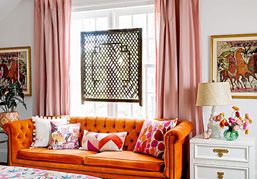
One common scenario: you fall for a burnt-orange sofa because it looks cozy, warm, and vaguely like it belongs in a
magazine. Then it arrives, and suddenly your living room feels like it’s perpetually October. The fix is usually
contrast. Add a navy rug or deep sapphire curtains and the sofa instantly reads sophisticated, not seasonal. Even a
single large piecelike navy artworkcan shift the whole vibe because it gives orange something cool to bounce off.
Another classic: teal and orange. People worry it’ll look loud, but it’s often the oppositeteal has a calming depth,
and orange becomes the cheerful highlight. The “experience” most people report is that the room feels more energetic
in the daytime and cozier at night. That’s because orange picks up warm light beautifully, while teal keeps shadows
from feeling dull. Add texture (woven throws, velvet pillows, glossy ceramics) and the palette looks layered rather
than flat.
If you try orange with pinksfuchsia, bubblegum, hot pinkthe room tends to feel instantly playful. The real-world
trick is to give your eyes a resting place. That could be white trim, light wood, or black accents (thin frames, a
matte-black lamp). Without a visual “pause,” the colors can feel like a party with no snacks: exciting at first, then
exhausting. With a pause, it feels fun and intentionallike a well-planned playlist.
And yes, orange with citrusy greens (lime, chartreuse, citron) is bold. People who love it usually love it because it
feels fresh and modernalmost like a creative studio. The pairing works best when one color is clearly the lead.
For example, keep walls mostly neutral, then use orange art and citron accessories. Or go orange walls with small hits
of chartreuse in a plant pot, a print, and a single accent chair. The “experience” you’re aiming for is confidence,
not chaos.
The final pattern that shows up again and again: repetition beats perfection. You don’t need the “perfect shade” of
turquoise or the “exact right” orange. You need the color to appear more than once so the room reads as a palette.
Repeat your bold partner color in at least three places, echo orange in at least two, and suddenly your space feels
like it was designed on purposebecause it was.
Conclusion
Orange doesn’t need to be “tamed”it needs to be paired. When you choose bold partners that match its intensity (navy,
cobalt, teal, emerald, fuchsia, violet, citron), orange looks confident, modern, and intentionally styled. Start with
your orange undertone, pick one main partner color, repeat it across the room, and let orange do what it does best:
bring warmth, energy, and personalitywithout apologizing for existing.