Table of Contents >> Show >> Hide
- Before You Pick a Color: 7 Quick Checks That Prevent Expensive Regret
- The Main Event: 42 Exterior House Paint Colors for Inviting Curb Appeal
- How to Build an Exterior Color Scheme That Looks “Designer,” Not Random
- Common Curb-Appeal Mistakes (and Easy Fixes)
- Real-World Experiences Homeowners Commonly Have After Painting
- Conclusion
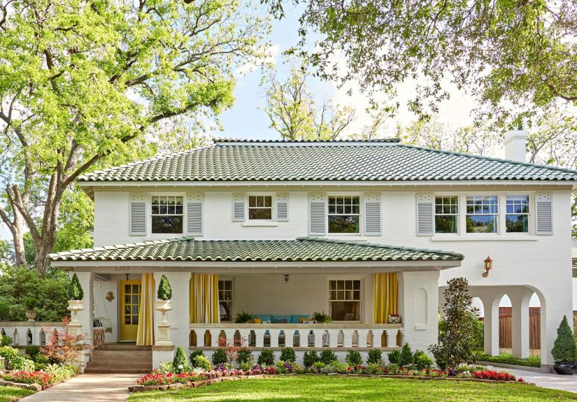
Your home’s exterior is basically its profile photo. And just like your profile photo, the goal is “approachable, put-together,
and not accidentally neon under bad lighting.” The right exterior house paint colors can make a small home feel charming,
a large home feel warm (not fortress-y), and a dated façade look intentionally timeless instead of “we tried our best in 2009.”
This guide gives you 42 specific, real paint-color options (with shade codes where available), plus practical tips for choosing
a curb-appeal-friendly palette you’ll still like after the thrill of fresh paint wears off and the first pollen season arrives.
Before You Pick a Color: 7 Quick Checks That Prevent Expensive Regret
1) Start with what isn’t changing
Roof shingles, stone, brick, hardscape, and even your driveway tint are “fixed colors.” Your paint should coordinate with them,
not fight them. If your roof reads warm (brown/bronze), a cool blue-gray body color can look icy. If your stone has gold flecks,
super-cool whites can look stark.
2) Watch your light like it’s a moody houseplant
Exteriors shift constantly: morning light, afternoon glare, cloudy days, streetlights at night. Colors also tend to look lighter outdoors
than they do on a tiny paint chip. If you love a mid-tone gray indoors, it may read like a pale whisper outsideso consider going one
step deeper than your first instinct.
3) Decide your “three-part” plan
Most great-looking exteriors follow a simple recipe: body (main siding/stucco), trim (windows, fascia,
columns), and accent (front door, shutters, or a secondary bump-out). This keeps the house from looking flat without turning
it into a patchwork quilt.
4) Check your neighborhood and any rules
If you’re in a historic area or a community with guidelines, you may need pre-approval. Even without rules, it helps to consider
nearby homes. You don’t need to match your neighborsbut you also don’t want to be “the lime-green surprise” on a street of warm neutrals.
5) Match color to material (vinyl, brick, wood, stucco)
Dark colors can absorb more heat. On some materialsespecially vinylvery dark shades may increase the risk of warping.
If you have vinyl siding, ask for colors specifically approved for it or keep the main body color in a mid-tone range.
6) Test like a pro (not like a gambler)
Paint a sample area at least 2′ x 2′ (bigger is better), on multiple sides of the house if possible. Look at it in sun, shade, and at dusk.
Tape the trim and accent choices nearby so you see the full schemebecause the trim can make the body color look warmer, cooler, lighter, or darker.
7) Choose the right finish and don’t skip prep
Exterior paint durability is heavily influenced by surface prep. Clean, scrape, sand, patch, prime where needed, and caulk gaps.
For finish, many homeowners like low-luster/satin for siding (for durability without too much shine) and semi-gloss for doors/trim
(because it handles wear and wipes more easily). The best color in the world won’t hide peeling paint or failing caulk.
The Main Event: 42 Exterior House Paint Colors for Inviting Curb Appeal
Tip: Bring the name + code to your paint retailer if you want an exact match. If you’re flexible, many brands can tint very close.
Warm Whites & Soft Off-Whites
- Alabaster (SW 7008) – Creamy, welcoming white that feels cozy, not clinical. Looks great with matte-black hardware and natural wood doors.
- Pure White (SW 7005) – Cleaner white that still avoids harshness. Pair with charcoal shutters for crisp contrast.
- Shoji White (SW 7042) – Warm, slightly beige-leaning white that flatters stone and brick. Lovely with bronze or black accents.
- White Dove (OC-17) – Soft, classic white that plays well with warm roofs and traditional trim. A curb-appeal staple for a reason.
- Simply White (OC-117) – Bright but not icy; works beautifully on modern farmhouses with black windows and a wood porch ceiling.
- Chantilly Lace (OC-65) – A brighter, cleaner white for contemporary exteriors. Consider warmer trim or wood tones so it doesn’t feel stark.
- Swiss Coffee (12) – A creamy off-white that reads friendly in shade. Pair with soft gray trim and a deep green door for an inviting look.
- Dove White – A gentle, versatile white that suits cottage and traditional styles. Add muted blue shutters for a calm, coastal vibe.
Greige, Beige, & Taupe Neutrals
- Revere Pewter (HC-172) – The famous “greige that behaves.” Great with white trim and black or navy accents.
- Edgecomb Gray (HC-173) – Light, warm neutral that feels fresh on siding. Pair with creamy trim and a medium wood door.
- Agreeable Gray (SW 7029) – Balanced gray that rarely feels too cool. Works on everything from ranch homes to modern builds.
- Accessible Beige (SW 7036) – Warm beige with subtle depth; reads classic and grounded. Looks sharp with crisp white trim.
- Perfect Greige (SW 6073) – A deeper neutral that adds structure without going dark. Ideal for brick homes needing a unifying body color.
- Perfect Taupe (PPU18-13) – Rich, earthy taupe that feels sophisticated. Pair with soft-white trim and black lantern lights.
- Even Better Beige (DC-010) – A light earth tone that blends with landscaping. Great for Craftsman-style details and natural stone.
- Natural Linen (SW 9109) – Warm neutral with an easy, breezy feel. Add warm-black shutters and brushed brass for a polished look.
Grays, Charcoals, & Inky Neutrals
- Dovetail (SW 7018) – A cozy deeper gray that anchors an exterior. Pair with bright white trim for a clean, tailored look.
- Mindful Gray (SW 7016) – A calm, mid-tone gray that feels modern and livable. Looks great with a navy door and warm wood accents.
- Gray Owl (OC-52) – Light gray that can read slightly cool; excellent with modern lines and black windows.
- Kendall Charcoal (HC-166) – Bold charcoal with presence. Use as a body color with white trim, or as an accent on shutters/doors.
- Iron Ore (SW 7069) – Soft black/charcoal that feels dramatic without being pitch-dark. Perfect for modern farmhouse exteriors.
- Wrought Iron (2124-10) – Deep, complex charcoal that’s elegant on siding or doors. Pair with warm whites and natural stone.
- Tricorn Black (SW 6258) – A true black for strong contrast. Best when balanced with warm wood, plants, and lighter trim.
- Cracked Pepper (PPU18-01) – A deep, peppery charcoal-black that looks sharp on doors, shutters, or an entire exterior if you want moody curb appeal.
Blues That Feel Classic (Not “Theme Park Coastal”)
- Hale Navy (HC-154) – Iconic navy for timeless curb appeal. Pair with white trim and brass lighting for instant polish.
- Naval (SW 6244) – Deep navy with a grounded vibe. Looks especially good with crisp white trim and warm wood porch posts.
- Seaworthy (SW 7620) – Dark, saturated blue with a stormy feel. Try it on the body with creamy trim for a high-end look.
- Yarmouth Blue (HC-150) – Softer blue that works on shutters and doors. Great for Colonial-style homes and classic porch railings.
- Midnight Blue (N480-7) – Blue-gray that leans dramatic. Use it for a modern exterior with light stone and black accents.
- Compass Blue (MQ5-54) – Inky navy that reads bold but refined. Pair with warm white trim and a cedar-tone door.
Greens & Sages for “Grows-With-the-Landscape” Charm
- Sea Salt (SW 6204) – A soft, muted green that feels relaxed. Lovely on beachy homes or cottages with white trim.
- Evergreen Fog (SW 9130) – A modern green-gray that looks sophisticated in sun and shade. Great with creamy whites and black hardware.
- Clary Sage (SW 6178) – Herbal green with warmth. Works beautifully with tan stone and a natural wood front door.
- Saybrook Sage (HC-114) – Mid-tone sage that feels historic and calm. Pair with off-white trim and warm brass lighting.
- Sprig of Sage (8004-28D) – Cool-leaning sage that’s fresh and contemporary. Looks great with crisp whites and charcoal accents.
- Hidden Gem (N430-6A) – Smoky jade (blue-green) that reads like a “new neutral.” Ideal for doors, shutters, or a full-body statement.
Warm Earth Tones & Happy Accents
- Urbane Bronze (SW 7048) – Brown-gray that feels modern and grounded. Pair with warm white trim and natural wood details.
- Cavern Clay (SW 7701) – Terracotta that feels sunbaked and inviting. Stunning with creamy whites and desert landscaping.
- Redend Point (SW 9081) – Soft clay/blush-beige that adds warmth without screaming “pink house.” Great with off-white trim and black accents.
- Canyon Dusk (S210-4) – Earthy terracotta neutral that feels cozy. Use on stucco or as a front-door color with warm white siding.
- Rumors (MQ1-15) – Rich ruby red for a confident front door or shutters. The “lipstick” moment your entryway didn’t know it needed.
- Hawthorne Yellow (HC-4) – Balanced yellow that adds cheerful curb appeal. Best as an accent door or porch ceiling pop against white/gray body colors.
How to Build an Exterior Color Scheme That Looks “Designer,” Not Random
- Modern farmhouse: Alabaster body + Tricorn Black windows/accents + a natural wood door. Clean, high contrast, always photogenic.
- Classic Colonial: White Dove body + Hale Navy shutters + Rumors or a deep black door. Traditional with a confident twist.
- Craftsman warmth: Even Better Beige body + creamy trim + Urbane Bronze accents. Add a muted sage door for a nature-forward finish.
- Coastal calm: Sea Salt body + bright white trim + Yarmouth Blue door. Soft, breezy, and not “souvenir shop.”
- Desert modern: Cavern Clay body + warm white trim + matte black lighting. Feels organic and architectural at the same time.
Common Curb-Appeal Mistakes (and Easy Fixes)
- Ignoring undertones: If your stone has golden warmth, choose a warm white or greige instead of a blue-gray.
- Too many colors: Three is usually plenty. If you want extra interest, vary sheen (subtle!) rather than adding a fourth paint color.
- Forgetting the front door: A strong door color can make the whole exterior feel intentional, even if the body color is neutral.
- Skipping the “far-away test”: Step across the street. The house is viewed from distance more than from three inches away.
Real-World Experiences Homeowners Commonly Have After Painting
Once the ladders are gone and the compliments roll in, the real test begins: living with your exterior color through every season,
every weather mood swing, and every time your neighbor’s sprinkler hits the sidewalk like it’s practicing for the Olympics.
Here are the “been there” moments that come up again and again.
First: light is the ultimate plot twist. A gray that looked perfect at noon can lean green at 5 p.m., and a creamy white can look
downright peachy at sunset. Homeowners often say the most helpful thing they did was painting large samples on multiple sides of the house.
A north-facing wall might stay cooler and flatter, while a sunny side can make the same color glow brighter. The win is not finding a color that
never changes (good luck); it’s choosing one that changes in ways you still like.
Second: trim is the secret stylist. People tend to focus on the body color, then realize afterward that the trim choice decides whether
the house feels crisp, cozy, or oddly washed out. Bright white trim can make a greige look sharper and more modern. Creamy trim can make a gray feel warmer
and friendlier. And once you see it, you can’t unsee itlike noticing your haircut looks different depending on your hoodie color.
Third: the front door is small but mighty. Many homeowners who play it safe on the body color feel bolder later and repaint the door.
A deep navy, smoky jade, or rich red can instantly upgrade curb appeal without repainting the whole house. The door is also the easiest place to try trends:
if you fall out of love, repainting a door is a weekend project, not a life event.
Fourth: prep work becomes a believer-maker. People who rushed prep often describe the same frustrations: peeling near trim edges,
rough patches that show in angled sunlight, and caulk lines that look messy after the paint dries. Homeowners who took time to clean, scrape, sand, prime,
and caulk usually say the finished look felt “newer” and stayed that way longer. In other words: prep is not a boring step; it’s the difference between
“freshly painted” and “professionally finished.”
Finally: landscaping and paint are best friends. Once the exterior color is updated, shrubs that were “fine” can suddenly feel tired,
and the reverse is also truefresh greenery can make a neutral paint job look expensive. A common experience is doing a small landscaping refresh after painting:
new mulch, a couple of larger planters, and updated house numbers. It’s the curb-appeal version of putting on shoes that match your outfit.
Conclusion
The best exterior house paint colors for curb appeal aren’t just trendythey’re coordinated with your fixed materials, tested in real light,
and balanced across body, trim, and accents. Use the 42 options above as your shortlist, then sample and tweak until your home looks inviting from the street
and feels “you” every time you pull into the driveway.