Table of Contents >> Show >> Hide
- Style vs. Theme: What’s the Difference?
- The “Make-It-Work” Fundamentals (Before You Pick a Style)
- Popular Decorating Styles (and How to Spot Them)
- How to Choose Your Style Without Overthinking It
- Decorating Themes You Can Layer on Almost Any Style
- Room-by-Room: Quick Wins That Make Any Style Feel Intentional
- Real-World Decorating Experiences: What Usually Happens (and How to Win)
- Wrap-Up: Your Home, Your Rules (With a Little Strategy)
If you’ve ever stood in the throw-pillow aisle holding two “perfect” options and somehow felt personally attacked by both,
welcome. Decorating is supposed to be fun, but the internet has turned it into a pop quiz: Is your living room Modern? Contemporary?
Modern Farmhouse? Coastal Grandmother? Is that… a vibe or a diagnosis?
Here’s the good news: you don’t need a single, strict label to make your home look pulled together. What you do need is
a clear directionsomething that guides your choices so the room feels intentional instead of “I bought this because it was 40% off and I panicked.”
This guide breaks down popular decorating styles and flexible themes, plus practical ways to combine them
without creating a design identity crisis.
Style vs. Theme: What’s the Difference?
Think of a decorating style as the “bones” of a room: the general shapes, furniture silhouettes, materials, and overall attitude.
A theme is the “story” you layer on top: a coastal feeling, botanical energy, vintage romance, desert warmth, or moody-library drama.
- Style = the structure (lines, furniture, finishes, architecture-friendly choices).
- Theme = the flavor (color story, motifs, art, accessories, styling choices).
Example: A home can be Transitional (style) with a Botanical theme (leafy art, earthy greens, natural textures).
Or Scandinavian (style) with a Monochrome theme (soft black-and-white with cozy neutrals).
The “Make-It-Work” Fundamentals (Before You Pick a Style)
Styles are helpful, but rooms succeed or fail on basics. If your space feels “off,” it’s usually not because you chose the wrong style
it’s because one of these fundamentals is out of balance.
1) Color: Give the Room a Simple Color Story
A reliable approach is using a dominant color, a supporting color, and a smaller accent color. This keeps the room cohesive and prevents the
“every color from the crayon box” situation (unless you’re intentionally going maximalistmore on that later).
Try this: pick one neutral you can live with long-term (warm white, soft greige, sandy beige), then add one “personality color” (sage, navy,
terracotta), then a smaller pop (brass, blush, black, emerald).
2) Texture: The Fastest Way to Make a Room Feel Expensive
Texture is the secret sauce. Even a neutral room looks rich when you layer materials: a nubby rug, linen curtains, a leather chair, a matte ceramic
lamp, a wood coffee table, and a little something shiny (metal or glass) so the room doesn’t look like it’s wearing beige sweatpants to a wedding.
3) Scale and Proportion: The “Why Does This Look Tiny?” Fix
If your rug is too small, your art is undersized, or your coffee table is shrinking in fear next to the sofa, the whole room will feel awkward.
Big spaces need pieces with presence. Small spaces need smart proportions (and fewer random “filler” items).
4) Layered Lighting: Don’t Make the Ceiling Light Do All the Work
A room feels flat when it relies on one overhead light. Aim for layers: general light (ambient), functional light (task), and mood/feature light (accent).
Translation: a ceiling fixture + a reading lamp + a little glow somewhere (sconce, picture light, LED in a shelf, etc.).
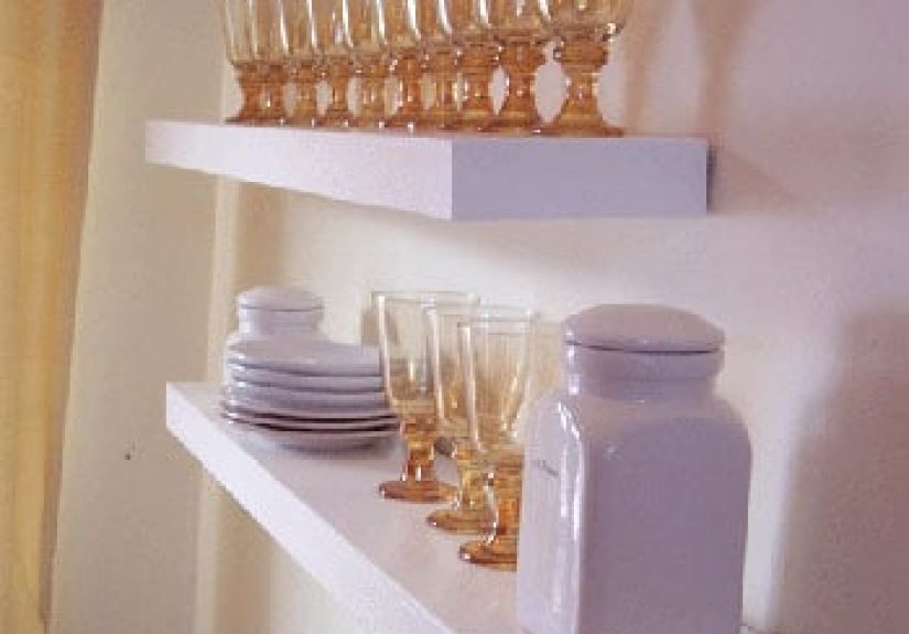
5) Styling Rules (That You’re Allowed to Break)
Designers often group objects in odd numbers (like threes) and vary height/shape to keep surfaces interesting. Use it as a guide, not a law.
If your shelf looks like a cluttered souvenir shop, the fix is often editingremoving a few things so the best pieces can breathe.
Popular Decorating Styles (and How to Spot Them)
Below are widely used styles, each with a quick “signature move” you can try without renovating your life. Pick one as your base, then layer
a theme on top.
Modern
The vibe: clean lines, function-first, warm woods, minimal ornament. Modern is rooted in early-to-mid 20th-century design rather than “what’s new today.”
- Key materials: wood, leather, glass, metalkept streamlined.
- Palette: neutrals with earthy warmth; occasional bold color.
- Signature move: swap fussy decor for one strong sculptural piece (lamp, chair, art).
Contemporary
The vibe: current and flexiblesleek shapes, mixed materials, updated neutrals, and a “now” feeling. It evolves over time and can borrow from other styles.
- Key materials: metal, stone, wood, plush textilesoften in contrast.
- Palette: crisp neutrals, sometimes high-contrast with black accents.
- Signature move: keep surfaces uncluttered and add interest through shape (curved sofa, bold art, sculptural vase).
Minimalist
The vibe: calm, intentional, and edited. Minimalism is less about “empty” and more about “only what earns its keep.”
- Key materials: simple woods, matte finishes, natural textiles.
- Palette: restrained; tonal neutrals.
- Signature move: choose one hero piece per zone (sofa, dining table, bed) and let negative space do its job.
Scandinavian
The vibe: bright, functional, cozy. Think light woods, simple forms, and a lived-in warmth that doesn’t feel fussy.
- Key materials: pale wood, wool, linen, ceramics.
- Palette: whites and soft neutrals; gentle contrasts.
- Signature move: add softnesstextiles, layered rugs, and warm lightingso the room feels welcoming, not clinical.
Japandi
The vibe: a serene blend of Scandinavian comfort and Japanese simplicity. Clean lines, natural materials, and a peaceful, grounded feeling.
- Key materials: wood, linen, stone, clay, rattanoften in calmer, deeper tones.
- Palette: warm neutrals, earthy browns, soft blacks, muted greens.
- Signature move: choose fewer, better objectshandmade-feeling ceramics, simple art, and furniture with quiet craftsmanship.
Mid-Century Modern
The vibe: retro but timelesstapered legs, organic curves, graphic shapes, and warm woods.
- Key materials: walnut-toned woods, leather, brass accents.
- Palette: neutrals plus saturated pops (mustard, teal, olive).
- Signature move: add one iconic silhouette (a splayed-leg chair or a low credenza) and keep the rest simple.
Industrial
The vibe: warehouse-inspiredraw textures, exposed elements, and sturdy utility.
- Key materials: metal, reclaimed wood, concrete, brick.
- Palette: grays, black, rust, deep neutrals.
- Signature move: mix a rugged piece (metal shelf, factory-style pendant) with something soft (curtains, rug) so it feels like a home, not a loading dock.
Traditional
The vibe: classic and refinedricher woods, symmetry, timeless shapes, and layered details.
- Key materials: wood furniture, classic textiles, antique-inspired finishes.
- Palette: warm neutrals, heritage colors, deeper tones.
- Signature move: anchor the room with a classic rug pattern and build from there.
Transitional
The vibe: the “best of both worlds” blend of traditional warmth and modern clean lines. Polished, but not precious.
- Key materials: mixed textureswood + metal + soft upholstery.
- Palette: soft neutrals with gentle contrast; calming and flexible.
- Signature move: pair a classic sofa shape with modern lighting or simplified side tables.
Farmhouse (and Modern Farmhouse)
The vibe: comfortable, practical, and a little nostalgicoften mixed with cleaner, modern lines in the “modern farmhouse” version.
- Key materials: wood, woven textures, simple hardware, vintage-inspired pieces.
- Palette: warm whites, soft blacks, muted blues/greens.
- Signature move: add one “workhorse” piecelike a big dining table or a sturdy consolethen keep decor relaxed and unfussy.
Coastal
The vibe: airy, relaxed, and light. Coastal doesn’t have to mean seashell explosionsit can simply mean breezy materials and a calm palette.
- Key materials: linen, cotton, rattan, light woods.
- Palette: whites, sandy beiges, ocean blues, sea-glass greens.
- Signature move: swap heavy drapes for lighter curtains and add woven texture (baskets, jute rug).
Bohemian (Boho)
The vibe: layered, eclectic, creative, and collected. Boho loves pattern, texture, and global influencewithout needing to match perfectly.
- Key materials: mixed textiles, vintage finds, handmade decor, natural fibers.
- Palette: anything goes, but it’s best with a unifying “color thread.”
- Signature move: start with a neutral base and layer pattern through pillows, rugs, and art so it feels intentional, not chaotic.
Eclectic
The vibe: a confident mix of styles and eras that still feels cohesive.
- Key materials: mixedyour job is to repeat a few elements (color, wood tone, metal finish) so it hangs together.
- Palette: can be neutral or colorful, but should have a plan.
- Signature move: choose one consistent “through-line” (like black accents or warm woods) to unify the room.
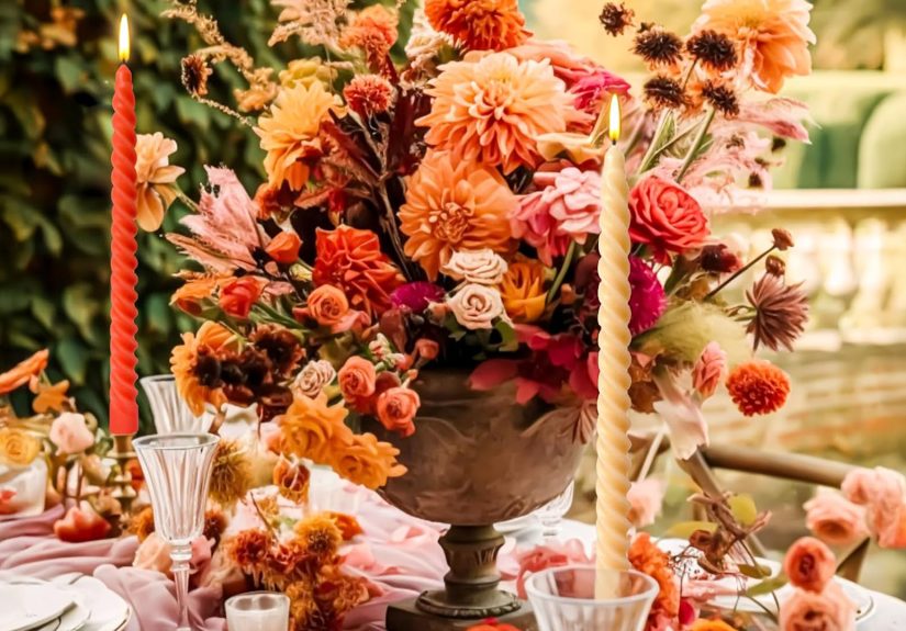
Art Deco / Glam
The vibe: bold geometry, shine, and drama (the good kind). Think luxe finishes, strong shapes, and a little sparkle that says,
“Yes, I do own a lint roller, thanks for asking.”
- Key materials: brass, velvet, lacquer, glass, marble-like stone.
- Palette: jewel tones, black-and-white, metallics.
- Signature move: add a geometric pattern (rug or wallpaper) and one metallic accent (mirror, lamp, hardware).
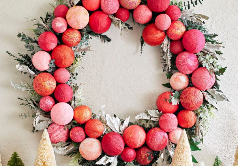
Maximalist
The vibe: expressive, layered, and pattern-happydone with intention, not clutter. Maximalism is “more,” but curated.
- Key materials: mixed patterns, bold art, vintage pieces, texture upon texture.
- Palette: bold color stories (often anchored by a consistent background color).
- Signature move: build a gallery wall with a repeated frame color to keep visual order.
How to Choose Your Style Without Overthinking It
Step 1: Pick Three Words You Want the Home to Feel Like
Examples: calm, warm, and practical (hello, transitional); bright, simple, and cozy (Scandi);
bold, playful, and artistic (maximalist or eclectic).
Step 2: Start With What Won’t Change
Work with your fixed elements: floors, countertop color, fireplace brick, window shape, ceiling height. The best style for your home is the one that
cooperates with your architecture instead of fighting it.
Step 3: Build a “Style Recipe”
Try a simple formula: 70% base style + 30% accent style or theme. This keeps the room cohesive while still personal.
- Transitional base + Botanical theme
- Modern base + Warm Rustic theme
- Scandinavian base + Vintage theme
- Industrial base + Cozy “library” theme
Step 4: Create a Repeatable Pattern of Choices
Cohesion often comes from repeating a few decisions across the room:
- One metal finish (brass OR black OR chrome) repeated 3–5 times.
- One wood tone (light, medium, or dark) repeated across major pieces.
- One accent color repeated in art, textiles, and one small decor item.
Decorating Themes You Can Layer on Almost Any Style
Botanical Theme
Works with: Scandinavian, Transitional, Boho, Coastal, Modern. Use leafy art, greens, natural textures, and one or two real plants you can keep alive
(choose your battles).
Moody Library Theme
Works with: Traditional, Transitional, Modern, Industrial. Deep paint (or deep textiles if you rent), warm lamps, rich wood, and art with contrast.
Add a cozy throw and suddenly you’re one mug of tea away from feeling like the main character.
Vintage Theme
Works with: Eclectic, Farmhouse, Mid-Century, Traditional. Add patina through thrifted pieces, vintage frames, and classic patterns. Keep one consistent
color palette so it feels curated rather than random.
Monochrome Theme
Works with: Minimalist, Contemporary, Modern. Choose one color family and use multiple shades plus texture. Monochrome is not “one-note” when materials
do the heavy lifting.
Travel/Collected Theme
Works with: Boho, Eclectic, Traditional. The key is editing: display fewer, bigger, better items rather than every souvenir at once. Rotate pieces
seasonally like a mini museum.
Room-by-Room: Quick Wins That Make Any Style Feel Intentional
Entryway
- One statement mirror or art piece (sets the tone immediately).
- A tray or bowl for keys (function is style’s best friend).
- A lamp or sconcesoft light makes the whole home feel warmer.
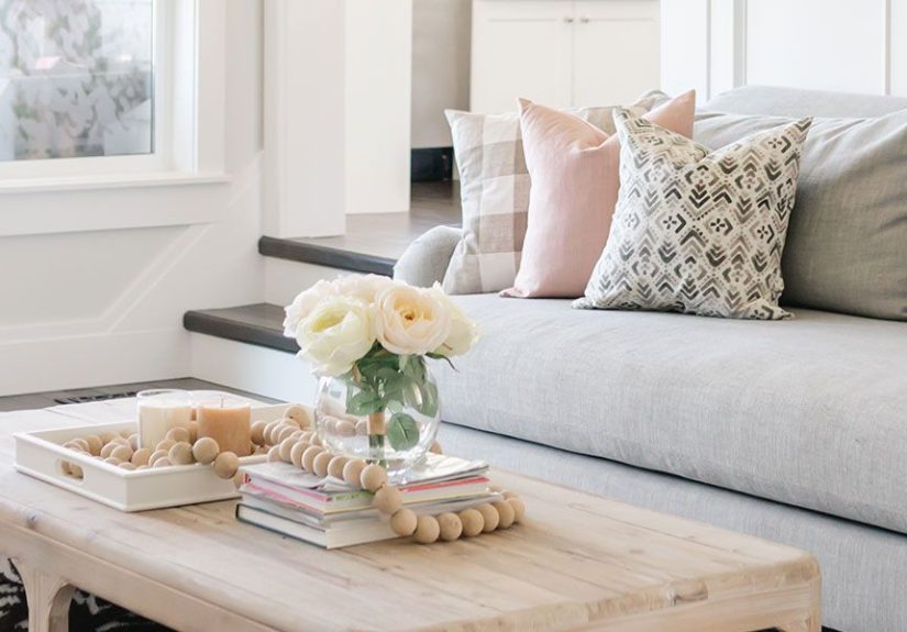
Living Room
- Use a rug big enough that at least the front legs of seating sit on it.
- Layer lighting: floor lamp + table lamp + ambient ceiling fixture.
- Pick one “anchor” texture (leather, bouclé, linen) and repeat it twice.
Bedroom
- Choose calming contrast (soft neutrals + one deeper accent color).
- Use at least two bedside light sources (lamps or sconces).
- Upgrade bedding texture: quilt + duvet + a throw = instant “hotel energy.”
Kitchen and Dining
- Repeat hardware finishes (don’t mix five metals unless you’re very confident or very chaotic).
- Add warmth with wood boards, textiles, or a runner.
- Hang artyes, even in the kitchen. It’s allowed.
Bathroom
- Use one bold element: wallpaper, a mirror, or lighting that feels special.
- Keep counters clear; use trays to corral essentials.
- Swap cheap towels for thicker onesit changes the vibe immediately.
Real-World Decorating Experiences: What Usually Happens (and How to Win)
The internet shows “after” photos. Real life is more like: you paint one wall, realize the light changes everything, then stand in the hallway at
10:47 p.m. whispering, “Why is this color… greener at night?” Below are common decorating experiences people go throughand the fixes that keep
you moving forward without rage-returning every purchase.
Experience 1: The “I Love Everything” Problem
Many people don’t struggle to find a stylethey struggle because they like too many. One day it’s Scandinavian calm; the next day it’s bold
maximalism; by Friday you’re pricing chandeliers like you own a French château. The fix is choosing a base style that matches your
daily life (cleaning tolerance matters!) and letting themes do the experimenting. Keep the big pieces steady (sofa, rug, bed), then swap the “fun layer”
(pillows, art, accessories) when your taste shifts. Your home can evolve without starting over.
Experience 2: The “Open-Concept Echo Chamber”
Open layouts look amazing online, but in real life they can feel like one giant room where nothing knows its job. The most common win is defining
zones: a rug to “claim” the living room, a pendant or chandelier to anchor the dining area, and a consistent color thread across the whole space
so it flows. You don’t need wallsyou need visual boundaries. One repeated metal finish and one repeated wood tone across zones can make the entire
area feel designed instead of accidental.
Experience 3: The “Rental Reality Check”
Renters often feel stuck with beige carpet, dated lighting, or rules that prohibit painting. The workaround is treating your decor like a removable
“skin”: curtains hung high to fake taller windows, large rugs to cover floors, plug-in sconces for layered light, and peel-and-stick wallpaper used
strategically (like behind a bed or on a powder room wall). In rentals, lighting and textiles do most of the heavy lifting. You can
create a strong style identity without touching the landlord’s precious “eggshell off-white.”
Experience 4: The “It Looked Bigger Online” Furniture Mistake
Almost everyone has ordered a table that arrives looking like it belongs in a dollhouseor a sofa that suddenly makes the room feel like a hallway.
The lesson: measure, then measure again, then use painter’s tape on the floor to map the footprint. The “fix” isn’t always returning; sometimes it’s
pairing. A too-small coffee table can be saved by adding a larger rug and two substantial side tables so it doesn’t feel lonely. A too-large sofa can
be balanced by using lighter visual elements nearby (glass table, slim lamp, fewer bulky accessories).
Experience 5: The “Thrift Store Jackpot (and Then Chaos)”
Thrifting is the best and worst: you find a gorgeous vintage chair, then you keep bringing home “just one more thing,” and suddenly your living room is
an antique mall. The key is curating with a plan. Decide your repeating elements (one wood tone, one metal finish, one accent color) before you shop.
When a piece fits the plan, it’s a yes. When it’s “cute but random,” it’s a noor it becomes a gift for someone else. The real magic of a collected
home is editing: fewer objects, higher impact, and enough negative space that your best finds can actually shine.
Wrap-Up: Your Home, Your Rules (With a Little Strategy)
Decorating styles and themes aren’t cagesthey’re tools. Pick a base style that supports your life, layer themes that tell your story, and lean on the
fundamentals (color, texture, scale, and lighting) to keep the space feeling intentional. The goal isn’t perfection. The goal is a home that feels like
you live there on purpose.