Table of Contents >> Show >> Hide
- Styles vs. Themes: What’s the Difference?
- How to Find Your Decorating Style Without Taking a Personality Quiz
- The Big Decorating Styles (With Clear “Spot It in the Wild” Clues)
- Decor Themes: The “Vibe Layer” That Makes a Home Feel Like You
- Mixing Styles Like a Pro (Instead of Like a Panic Purchase)
- Color, Light, and Paint: The Part People Skip (Then Regret)
- Room-by-Room Mini Playbook
- Common Decorating Mistakes (And How to Dodge Them)
- Conclusion: Build the Base, Then Add the Personality
- Real-World Decorating Experiences (What People Learn the Hard Way)
Decorating your home is basically choosing a personality… for your furniture. And while that sounds dramatic, it’s also
wildly helpful: once you can name what you like, you can stop impulse-buying random “cute” stuff that later looks like
it came from five different universes.
This guide breaks down popular decorating styles (the “how it’s built”) and decor themes (the “vibe it gives”),
with specific examples, practical rules for mixing, and a few reality checks so your space ends up cohesivenot a showroom,
not a theme park, and definitely not a museum of trendy mistakes.
Styles vs. Themes: What’s the Difference?
Think of style as the structure: the shapes of furniture, the materials, the architectural details, and the overall design logic.
Theme is the mood: coastal, botanical, moody library, desert retreat, Parisian café… you get the idea.
A style can live without a theme (minimalist can be just minimalist). A theme without a style often becomes clutter (a pile of seashells
does not automatically equal “coastal,” it equals “I shop emotionally”). The sweet spot is when your style choices support your theme.
How to Find Your Decorating Style Without Taking a Personality Quiz
You don’t need an algorithm to tell you you’re “63% Scandinavian with a rising Boho.” You need patternsyour patterns.
Start with three quick steps:
- Notice what you linger on. Screenshots, saved posts, hotel lobbies you didn’t want to leavethose are clues.
- Separate “pretty” from “livable.” A white sofa looks amazing until you remember you own a body that eats food.
- Choose your non-negotiables. Comfort? Easy cleaning? Lots of storage? Natural light? Your priorities narrow the field fast.
The Big Decorating Styles (With Clear “Spot It in the Wild” Clues)
Below are the most common interior design styles and what actually makes them recognizable. Use these as building blocks.
You can commit to one, blend two, or borrow pieces from severalon purpose.
1) Modern
Modern is often confused with “anything that exists now,” but it’s really a design approach rooted in clean lines,
simple forms, and “less, but better.” You’ll see uncluttered surfaces, strong geometry, and a focus on function.
Try it: Choose a streamlined sofa, keep décor intentional (not constant), and use a restrained palette with one confident accent.
2) Contemporary
Contemporary is “of-the-moment.” It borrows from modern, but changes as trends changeso it may lean warmer, softer,
or more sculptural depending on what’s current. It often features clean silhouettes, updated materials, and curated statement pieces.
Try it: Add one sculptural chair, a bold light fixture, or a modern art momentthen keep the rest calm so it can breathe.
3) Traditional
Traditional leans classic: detailed woodwork, refined silhouettes, symmetry, and a sense of “this home has stories.”
Expect richer materials, layered textiles, and furniture that looks like it would happily host a holiday dinner.
Try it: Pair a classic rug with tailored curtains and warm wood tones. Add depth with trim, molding, or framed art.
4) Transitional
Transitional is the peace treaty between traditional and modern: classic comfort + cleaner lines. It’s ideal if you like
timeless spaces but don’t want them to feel formal or fussy.
Try it: Put modern lighting over a more traditional table, keep the palette neutral, and let texture do the heavy lifting
(linen, wool, leather, natural fibers).
5) Scandinavian
Scandinavian style is bright, functional, and cozy in a “quiet competence” way. It typically uses light woods,
simple shapes, neutral colors, and a strong emphasis on comfort and practicality.
Try it: Keep walls light, add pale wood, use a few black accents for contrast, and bring in warmth through textiles.
6) Mid-Century Modern
Mid-century modern is the iconic “1950s–60s cool”: tapered legs, warm wood (often walnut), organic curves, and functional forms.
It’s crisp without being cold, and it plays well with other styles.
Try it: Add one authentic-feeling anchor piece (a sideboard, chair, or lamp), then keep accessories minimal and graphic.
7) Industrial
Industrial takes cues from warehouses and lofts: exposed metal, raw wood, concrete, brick, and utilitarian shapes.
The key is balanceindustrial looks best when it’s warmed up.
Try it: Pair metal finishes with soft textiles, add warm lighting, and use a large rug to keep it from feeling echo-y.
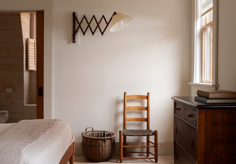
8) Farmhouse (Classic + Modern Farmhouse)
Farmhouse is cozy, practical, and a little nostalgic. Classic versions lean rustic and weathered; modern farmhouse
tends to be cleaner and more editedoften with bright whites, black accents, and simple silhouettes.
Try it: Mix simple forms with natural textures (wood, woven baskets, linen), and keep the space comfortable and unfussy.
9) Coastal
Coastal isn’t “decorate your home like a souvenir shop.” The polished version uses airy fabrics, light woods,
relaxed shapes, and a breezy paletteoften whites, sand tones, and blues.
Try it: Use linen, slipcovers, woven textures, and subtle nautical notes (think stripes, not anchor explosions).
10) Bohemian (Boho)
Bohemian decor is layered, global, relaxed, and personal. Patterns mix. Textures stack. Plants thrive.
It’s creative and collectedlike your home has been living a much cooler life than you have.
Try it: Start with a neutral base, then layer rugs, add handmade textures, and mix patterns using one repeating color to unify.
11) Japandi
Japandi blends Japanese simplicity with Scandinavian warmth. It’s calm, natural, and quietly refined:
clean lines, organic materials, minimal clutter, and a focus on craftsmanship.
Try it: Choose low-profile furniture, use wood and stone, keep décor sparse, and prioritize negative space.
12) Art Deco
Art Deco is glamour with geometry: bold shapes, symmetry, rich color, and luxe materials. Today’s Deco-inspired
interiors often use a few statement pieces rather than full historical recreation.
Try it: Add a curved velvet chair, a geometric mirror, or a brass-and-glass lampthen keep the rest clean.
13) Maximalism
Maximalism is “more,” but not “mess.” It’s bold color, layered pattern, collected art, and expressive objectscurated so it feels intentional.
The best maximalist rooms still have structure: repeated colors, consistent scale, and purposeful groupings.
Try it: Pick a tight palette (3–5 main colors), repeat them across patterns, and group decor so it reads as collections, not clutter.
14) Eclectic
Eclectic style is the art of mixing. The goal is a home that feels collected over timedifferent eras, textures,
and influences unified by scale, color, and proportion.
Try it: Keep one “through-line” (a recurring wood tone, a consistent metal finish, or a repeating shape) across the room.
Decor Themes: The “Vibe Layer” That Makes a Home Feel Like You
A theme is the story your room tells. Unlike a style, it doesn’t require specific furniture silhouettes. Themes are especially useful
when you want a mood across multiple roomseven if each room uses slightly different pieces.
Popular Home Decor Themes (That Don’t Require Props)
- Cozy Cottage: soft colors, vintage touches, florals, warm wood, charming imperfections.
- Modern Organic: clean lines + natural textures (linen, oak, clay, stone), earthy palettes, calm contrast.
- Moody Library: deep paint, warm lighting, layered textiles, leather, shelves, and art that feels lived-in.
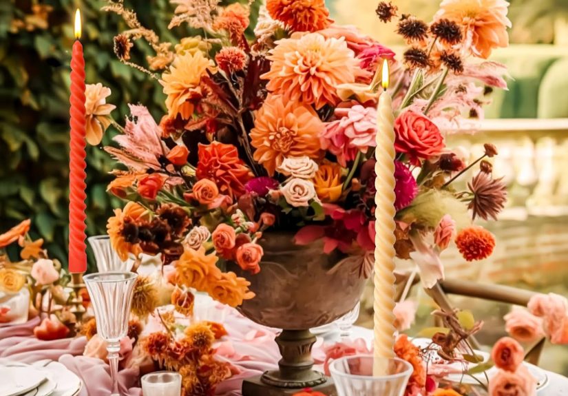
- Desert Retreat: sand tones, terracotta, woven textures, sculptural forms, sun-washed minimalism.
- Botanical / Biophilic: plants, natural materials, nature-inspired colors, and plenty of daylight.
- Old-World Inspired: patina, antiques, stone, arches, warm neutrals, and rich texture.
How to Apply a Theme Without Turning Your Home Into a Set
- Use color and texture first. The vibe should come from materials and palette, not novelty objects.
- Pick one signature motif. One. Not twelve. Repetition is elegant; over-collection is… a garage sale.
- Keep function sacred. A themed room still needs storage, lighting, and comfortable seating.
Mixing Styles Like a Pro (Instead of Like a Panic Purchase)
Most real homes are mixed-style. The trick is making the mix look deliberate. Here are rules that actually work:
Rule 1: Choose a Dominant Style
Pick your “main character” styleabout 70–80% of the room. The remaining 20–30% can be supporting roles: accents, lighting,
textiles, and a few standout pieces.
Rule 2: Unify With a Palette
Even wildly different furniture can look cohesive if the colors relate. Choose a base (warm neutrals or cool neutrals),
then add 1–2 accent colors you repeat across the room.
Rule 3: Repeat Materials and Shapes
Repetition is the secret handshake of good design. Repeat a wood tone, a metal finish, or a curve shape (arched mirror, rounded chair, oval table).
Your brain reads that repetition as “intentional.”
Mixing Combos That Nearly Always Work
- Modern + Traditional = Transitional: classic comfort with cleaner lines.
- Scandinavian + Boho = Scandi-Boho: bright simplicity warmed up with texture, pattern, and plants.
- Industrial + Farmhouse: raw materials softened by cozy textiles and practical, lived-in pieces.
- Contemporary + Art Deco accents: modern base with glam geometry and luxe materials.
- Coastal + Traditional (New England vibe): tailored shapes with airy fabrics and restrained blues.
Color, Light, and Paint: The Part People Skip (Then Regret)
Color is the fastest way to communicate a style or theme, but it’s also the fastest way to get humbled.
Paint changes with lightmorning vs. night, north-facing vs. south-facing, sunny vs. rainy. If you’ve ever said,
“Why does this look… different?” congratulations, you’ve met reality.
Practical Color Strategy
- Start with what won’t change. Floors, countertops, big furniture.
- Check the light. Warm bulbs warm everything; cool daylight shifts colors cleaner.
- Use a “whole-home” flow. Rooms don’t have to match, but they should relate.
- Think in undertones. Two “whites” can fight if one is pinkish and the other is greenish.
Bonus Nerd Detail That Helps: LRV
LRV (Light Reflectance Value) is a measure of how much light a color reflects. Higher LRV = brighter and more reflective;
lower LRV = moodier and more light-absorbing. If you’re working with a dark room, LRV can be a surprisingly useful clue.
Room-by-Room Mini Playbook
Living Room
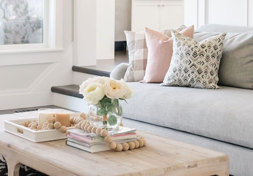
Anchor with a sofa and rug that match your dominant style (modern, traditional, mid-century, etc.).
Then theme it with textiles and art: coastal through linen + blues, boho through layered patterns, modern organic through wood + clay + texture.
Bedroom
Bedrooms love calm styles (Scandinavian, Japandi, modern organic), but any style works if you keep the palette restful and the lighting soft.
Make your bed the hero: quality bedding, layered textures, and a headboard that fits the style story.
Kitchen
Kitchens read “style” through finishes: cabinet profile, hardware, lighting, and materials. Farmhouse leans warm and classic;
modern is sleek and minimal; industrial uses metal and raw texture; transitional balances traditional forms with cleaner lines.
Bathroom
Small rooms are perfect for a theme moment: a moody powder room, a spa-like Japandi bath, or a crisp coastal look.
Keep pattern on one surface (tile or wallpaper), then let the rest stay simple.
Entryway
Your entry is the trailer for the movie that is your home. One strong light fixture, a mirror, a functional landing zone,
and a hint of your palette go a long way.
Common Decorating Mistakes (And How to Dodge Them)
- Buying a matching set: It’s safe, but it can feel flat. Mix finishes and textures for depth.
- Over-theming: A few cues are elegant; too many props are chaotic. Let materials do the talking.
- Ignoring scale: If your rug is too small, your furniture looks like it’s floating awkwardly in space.
- Not planning lighting: Overhead-only lighting is a crime against ambiance. Add lamps, sconces, and warm layers.
- Chasing trends without a base: Trends are dessert. Build the meal first (layout, comfort, cohesion).
Conclusion: Build the Base, Then Add the Personality
The best decorating styles and themes aren’t about copying a photothey’re about building a home that supports your life and still looks
like you meant it. Start with a clear dominant style, use themes to set the mood, and lean on repetition (palette, materials, shapes)
for cohesion. Then have fun: a home can be polished and personal at the same time. That’s not breaking the rulesthat’s finally using them.
Real-World Decorating Experiences (What People Learn the Hard Way)
Here’s what tends to happen outside of perfectly staged photos: you make a plan, you feel confident, and then lighting, scale,
and daily life show up like uninvited guests who refuse to leave. The good news? Those “oops” moments are exactly how people
figure out their real style.
One of the biggest lessons is scale. A sofa that looks “normal” in a giant showroom can feel like a cruise ship
in a modest living room. The opposite happens too: a cute apartment-sized couch can disappear in an open floor plan. People often
learn to measure (or at least tape out furniture on the floor) after they’ve experienced the awkward shuffle of trying to walk around
a coffee table that’s basically blocking international travel routes.
Next comes paint reality. Many homeowners pick a color they loved on a screen, paint a whole room, and then discover it turns
green at night or beige in the morning. That’s not you failingit’s light doing what light does. After a few rounds of “why does this look
different every hour,” people start sampling paint in multiple spots and checking it at different times of day. It’s less glamorous than
“instant makeover,” but it saves sanity.
Another frequent experience: the open-shelving fantasy. Open shelves look airy and stylish… until you realize your mugs are not
a curated collection, they’re a mismatched crowd with at least one novelty cup you got as a joke in 2016. Many people compromise by doing
a mix: closed storage for the real-life stuff, open shelving for the “pretty and consistent” stuff.
People also discover that mixing styles is easier than it sounds when you focus on the “bridge.” Maybe the bridge is a shared
color palette, a repeated wood tone, or one metal finish across the room. Once there’s a through-line, eclectic looks collected instead of chaotic.
Without that through-line, the room reads like five different shopping trips arguing with each other.
Finally, the most underrated experience: function wins. The prettiest theme in the world won’t survive a lack of lighting,
nowhere to set your drink, or no place to drop your keys. People who love their homes long-term usually build the basics firstlayout, comfort,
storageand then layer in style. It’s not less creative; it’s more sustainable. And honestly, nothing feels more “high design” than a room that
looks great and works on a regular Tuesday.