Table of Contents >> Show >> Hide
- Jump to:
- What “Bold” Means (and What It Doesn’t)
- The Foundation: Layout + Ergonomics
- Color, Wallpaper, and Texture That Don’t Scream
- Built-Ins + Storage That Look Like Furniture
- Lighting: The Unsung Hero of Looking Put-Together
- Styling: Personality Without the Clutter Spiral
- Spend vs. Save: Where Your Money Actually Matters
- 3 Copy-Now Bold Home Office Looks
- Common Mistakes (So You Don’t Build a Cute Chaos Cave)
- Conclusion and Real-World Experience
If your current “home office” setup is a laptop on the couch next to a mystery stain and a
charger that only works if you hold it at a 37-degree angle… congratulations. You’ve achieved
Survival Mode Chic. But if you want a workspace that feels like it belongs to a person who
drinks water, answers emails, and occasionally has a good idea, it’s time for a glow-up.
This guide is your no-fluff, design-forward roadmap to a bold study and home office:
rich color, confident pattern, smart storage, and ergonomics that won’t punish your neck for being
ambitious. The goal: a room that looks amazing on Zoom, functions beautifully in real life, and
makes you want to sit down and actually do the thing (whatever “the thing” is).
What “Bold” Means (and What It Doesn’t)
“Bold” isn’t just “paint one wall red and hope for the best.” In a study room or home office, bold
is a controlled, intentional move that adds energy and identity without nuking your focus. Think:
one strong statement supported by calmer supporting actors.
Pick your bold flavor
- Moody & tailored: deep navy, charcoal, or forest green with warm wood and brass.
Feels like a private library where important decisions get made (even if it’s just choosing lunch). - Maximal & joyful: punchy color, playful art, patterned wallpaper, and layered texture.
Great for creative work and people who find beige emotionally suspicious. - Graphic & modern: strong contrast, clean lines, statement lighting, and curated shelves.
Crisp, confident, and low-dramaexcept for the drama you choose.
The secret is balance: bold color + neutral breathing room, pattern + solids, “wow” + “I can still
read spreadsheets without squinting.”
The Foundation: Layout + Ergonomics
A bold home office design doesn’t work if it hurts to use. Before you pick wallpaper that
looks like a Victorian botanical fever dream (no judgment), lock in the basics: desk placement,
comfort, and movement.
Desk placement that actually helps you work
If you have a window, use it like the gift it is. Side light is your best friend: it brightens your work
without turning your monitor into a mirror. Aim to place your desk so the window is to your left or
rightnot directly in front (glare) or behind (your webcam turns you into a silhouette).
Small space? You can still win. A wall-mounted desk, a “cloffice,” or a tucked-in nook can feel
intentional if you give it a defined boundary: a painted zone, a wallpaper panel, or a lighting moment.
Ergonomics, but make it livable
Here’s the deal: you don’t need a NASA command chair to be comfortable, but you do need adjustability.
Start with the chair height so your feet are flat on the floor (or on a footrest), and your thighs are roughly
parallel to the floor. Keep shoulders relaxed, elbows close to your body, and let the chair support your spine.
Then set your monitor so the top portion of the screen sits at or slightly below eye level, and place it about
an arm’s length away. If you’re using a laptop, elevate it and use a separate keyboard and mouse. Your neck will
send you a thank-you note. (It will still complain sometimes, but with better manners.)
Build in movement like it’s part of the job
Even perfect posture gets cranky if you freeze in place for hours. Add micro-movement into the room itself:
a sit-stand option, a clear path to stand and stretch, or a timer-friendly routine (water refill breaks count,
and they’re emotionally supportive).
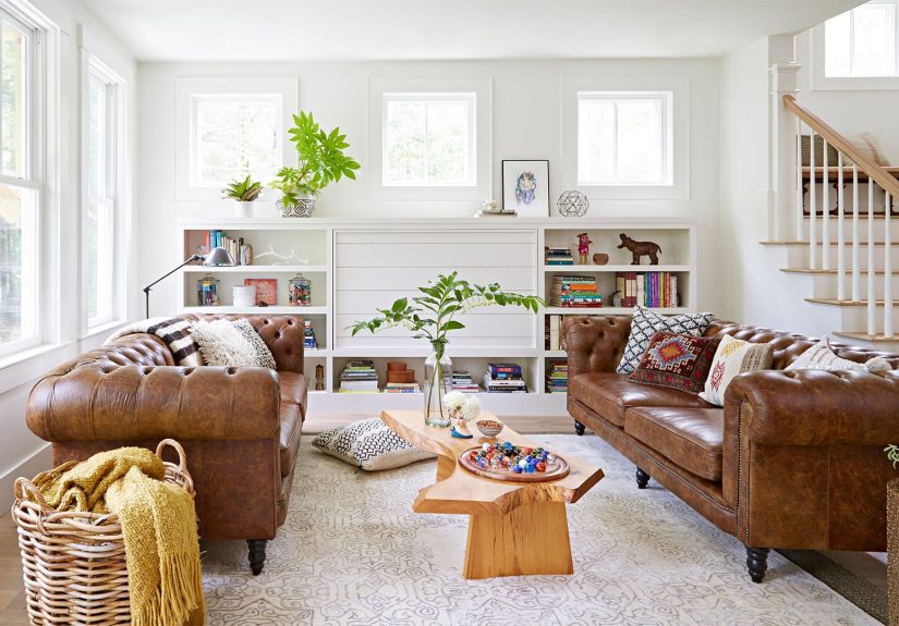
Color, Wallpaper, and Texture That Don’t Scream
Color is the fastest way to get a “designer” look. The trick for a bold study is choosing a hue that feels rich
rather than chaoticand then repeating it in a few spots so it looks intentional, not accidental.
Go deep, not loud
Deep greens, inky blues, and warm charcoals are bold because they create atmosphere. They also play well with wood,
leather, and metal finishes. If you want something warmer, try a muted terracotta or clay tonestill bold, but cozy.
Want a high-impact move without painting the entire room? Try one of these:
- Color-drenched built-ins: paint shelves and cabinetry a saturated shade for instant depth.
- Accent wall behind the desk: the best “Zoom background” you’ll ever own.
- Two-tone split: darker on bottom, lighter on top, with a crisp line for structure.
Wallpaper that behaves (mostly)
Wallpaper is basically confidence in sheet form. Use it where it reads like a statement piece:
behind the desk, inside the back panels of shelves, or on the ceiling if you want that “fifth wall” drama.
The key is to keep the surrounding elements simpler: solid curtains, quieter rugs, and a desk surface that’s not
auditioning for a clutter documentary.
If you love pattern mixing, keep everything in the same color family. It’s the difference between “collected and cool”
and “I lost a bet at a fabric store.”
Texture is the quiet flex
Bold isn’t only colorit’s contrast. Pair a moody wall with a warm wood desk. Add a velvet chair, a woven shade,
a boucle ottoman, or a leather desk pad. Texture adds depth without extra visual noise, which is ideal for a study room
where you need to concentrate.
Built-Ins + Storage That Look Like Furniture
A bold office fails the moment it becomes a junk drawer with a Wi-Fi signal. Storage is not optional; it’s the reason
your beautiful shelves don’t turn into a landfill of cables and expired sticky notes.
Make shelves work harder than your group chat
Built-ins (or even sturdy bookcases styled like built-ins) give you a high-end look fast. Paint them a vivid color for
a designer vibe, then organize with a mix of books, boxes, and baskets. The magic formula is:
closed storage for ugly stuff + open shelves for pretty stuff.
- Use labeled bins for cords, adapters, and tech accessories (aka “the gremlins”).
- Hide paper clutter in file drawers or magazine holders that match your palette.
- Keep daily-use tools within arm’s reach: pens, notebook, charger, headphones.
Paper doesn’t have to ruin your life
If paper multiplies in your home office like it’s getting paid per sheet, set up a simple three-step system:
shred, file, or recycle. The win isn’t perfectionit’s keeping piles from
turning into permanent furniture.
Pro-tip: keep one attractive tray for “active papers” and force everything else into the system once a week.
Your desk should not look like it’s waiting to testify in court.
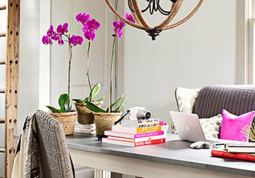
Lighting: The Unsung Hero of Looking Put-Together
Lighting is how you make bold look expensive. It’s also how you avoid headaches, glare, and that haunted fluorescent
vibe from your freshman dorm.
Layer it like a pro
Great home office lighting is a mix of three types:
ambient (overall glow), task (work light), and accent (mood + style).
A ceiling fixture plus a desk lamp is a solid start; adding sconces or a floor lamp makes it feel finished.
Beat glare (because you deserve peace)
Place task lighting so it doesn’t bounce into your eyes or reflect off the monitor. If you can, angle screens away from
direct windows and use shades to soften daylight. Dimmers are underrated for evening work sessionsand for turning your
office into a cozy reading room after hours.
Styling: Personality Without the Clutter Spiral
The difference between “styled” and “messy” is editing. You want the space to feel personal, but not like you live inside
a craft store checkout aisle.
Use a “repeat and restrain” rule
Pick 2–3 main colors and repeat them across the room (art, rug, books, accessories). Then restrain everything else.
This makes bold choices feel cohesive. For example: deep green walls + brass lighting + warm oak desk, repeated in a frame
and a plant pot. Boomintentional.
Build a Zoom-friendly background (without trying too hard)
Put your bold moment behind you: wallpaper panel, art wall, or color-drenched shelves. Add one warm lamp and one plant.
That’s it. Resist the urge to place 47 tiny objects behind your head like a museum gift shop exploded.
Spend vs. Save: Where Your Money Actually Matters
If you’re budgeting, here’s the honest split: invest in what touches your body every day, and save on what touches your
eyeballs occasionally.
Where to spend
- Ergonomic chair: adjustable arms, seat height, and lumbar support matter when you sit for hours.
- Desk setup basics: monitor arm/stand, keyboard and mouse, and a footrest if needed.
- Lighting: a good desk lamp is both functional and instantly “designed.”
Where to save
- Wallpaper: peel-and-stick can look fantastic, especially on a single accent wall.
- Art: thrift frames, print downloadable art, or enlarge a personal photo in a clean mat.
- Storage: matching boxes and baskets can make affordable shelving look custom.
3 Copy-Now Bold Home Office Looks
1) The Moody Library Study
This is the “I read hardcovers and make power moves” look. Go with deep paint (navy, charcoal, or forest green), add a
warm wood desk, and use brass or aged bronze for lighting and hardware. Style shelves with books, a few sculptural objects,
and closed storage on the bottom. A plaid or subtle pattern wallpaper panel behind the desk adds heritage energy without
feeling like a theme park.
2) The Bold Creative Studio
Perfect for designers, writers, and anyone who thinks in color. Choose one joyful hue (coral, magenta, or vivid teal) and
either color-drench a nook or create a single, punchy accent wall. Pair it with lighter furnitureglass, pale wood, or white
so the room still breathes. Add a graphic rug and one oversized art piece. Bonus points for a quirky desk lamp that makes you
smile before coffee.
3) The Compact “Cloffice” That Feels Custom
Small space doesn’t mean small style. Install a wall-mounted desk or a slim console. Use paint or wallpaper to “frame” the
workspace so it reads like a built-in. Add floating shelves above and a plug-in sconce to free up desk space. Keep supplies in
labeled boxes so the whole thing can look tidy in under two minutes when guests appear (and judge you politely).
Common Mistakes (So You Don’t Build a Cute Chaos Cave)
- Too many patterns at once: pick one hero pattern (wallpaper or rug), then simplify everything else.
- Ignoring ergonomics: the prettiest office is still a problem if your chair and monitor are wrong.
- Glare everywhere: position the desk and lighting to avoid reflections and eye strain.
- No closed storage: open shelving without bins is just clutter with better visibility.
- Over-decorating the desk: leave space to work. Your desk is a tool, not a shrine.
Conclusion and Real-World Experience
A bold study and home office isn’t about decorating louderit’s about designing smarter. Start with comfort and layout,
choose one confident statement (color, wallpaper, or built-ins), layer in lighting, and build storage that keeps your space
calm enough to focus. When style and function shake hands, you get a room that feels like it was made for youbecause it was.
of Real-World Experience (What Actually Works)
In real homes, the “bold office” success story almost always comes down to one thing: people stop treating their workspace
like an afterthought. The most common turning point is when someone realizes their home office is where they spend hours of
their lifeso it should feel as intentional as a living room or kitchen. And yes, that includes people who swear they “don’t
care about decor.” (They do. They just care quietly, like a responsible adult.)
One pattern you’ll notice in makeovers: bold choices feel easier when they’re contained. Many people start with a single
“zone” behind the deskeither paint, wallpaper, or a color-blocked arch. It’s a psychological win because the room changes
dramatically without feeling like you committed to painting every wall at midnight with a questionable playlist and no plan.
Once that zone is defined, everything else becomes simpler: the desk becomes the anchor, the chair becomes the workhorse,
and the styling becomes supportive instead of chaotic.
Another real-life lesson: storage is the make-or-break detail nobody wants to talk about because it’s not sexy. But the
fastest way a bold room becomes stressful is when the “beautiful shelves” turn into a random pile of cords, mail, and office
supplies. People who love their office long-term usually have at least two layers of storage: a quick-drop spot for today
(a tray or top drawer) and a closed system for everything else (files, bins, cabinets). The goal is not “perfect minimalism.”
The goal is “my desk is clear enough that I can start working without first excavating it like an archaeologist.”
Lighting is another sneaky factor. In before-and-after stories, the “after” almost always includes a warm lamp or two.
That’s because bold colors and wallpaper look richer with layered light. Plus, people work at weird hours. A room that looks
great at noon but feels harsh at 9 p.m. won’t get used the way you want. A good desk lamp and soft ambient lighting make the
office feel inviting, which is half the battle when motivation is running late.
Finally: the chair. People resist spending money on a chair because it’s not “fun decor.” Then they buy one and suddenly
understand why their lower back has been writing angry reviews for years. If there’s one upgrade that tends to pay off fast
in daily comfort, it’s a chair that adjusts to your bodynot the other way around. And once comfort is handled, bold design
becomes the cherry on top instead of a distraction from discomfort.