Table of Contents >> Show >> Hide
- Step 1: Identify Your Wood’s Undertone (Because “Brown” Is Not a Plan)
- Step 2: Decide Whether You Want Harmony or Contrast
- Step 3: Let Lighting Pick the Finalists (Not Your Phone Screen)
- Step 4: Choose a Core Neutral That Actually Likes Your Wood
- Step 5: Pick Accent Colors That Make Wood Look Expensive
- Room-by-Room Color Strategies (With Specific Examples)
- Cheat Sheet: Best Wall Color Directions by Wood Tone
- Step 6: Mixing Different Wood Finishes Without Chaos
- Step 7: The Sample-and-Commit Method (AKA How to Avoid Regret)
- Conclusion: Make the Wood the Hero, Not the Problem
- of Real-World Experiences (What People Notice After They Choose the Right Colors)
Wood is basically the extrovert of interior design: it shows up, has a warm personality, and somehow makes everything else in the room
look like it didn’t try hard enough. But pairing paint, textiles, and accent colors with wood furniture and wood floors doesn’t have to
feel like a game show where you lose points for picking “the wrong beige.”
The secret is simple: stop thinking “brown” and start thinking undertones, light, and
contrast. Once you do, choosing colors that complement wood furniture and floors becomes less “mystical art”
and more “repeatable strategy” (with fewer tears in the paint aisle).
Step 1: Identify Your Wood’s Undertone (Because “Brown” Is Not a Plan)
Most wood reads as brown overall, but the undertone is what decides whether your walls look effortlessly curated or oddly… jaundiced.
Wood undertones usually fall into a few camps:
- Golden/yellow (many oaks, maples, hickory, pine)
- Orange (honey oak, some red oak stains)
- Red/pink (cherry, some red oak, mahogany tones)
- Cool/ashy (some modern stains, white oak in cooler finishes)
- Deep brown (walnut, espresso stains)
Quick Undertone Test You Can Do in 10 Seconds
Hold a bright white sheet of paper (or a true white paint swatch) right next to the wood. The undertone will “pop” by comparison.
If the wood suddenly looks more orange, pink, or yellow next to that papercongrats, you just found the undertone that’s been
quietly running the show.
Step 2: Decide Whether You Want Harmony or Contrast
There are two reliable ways to make wood look intentional:
-
Harmony: Choose wall colors with similar undertone “temperature” (warm with warm, cool with cool) for a seamless,
cozy, designer-approved flow. -
Contrast: Choose wall colors that lean opposite (warm wood + cooler paint, cool wood + warmer paint) to balance the space
and let the wood stand out without turning the room into a monochrome toast festival.
Neither approach is “more correct.” The best choice depends on the vibe you want: calm and blended, or crisp and defined.
Step 3: Let Lighting Pick the Finalists (Not Your Phone Screen)
Lighting changes color more than people expectsometimes dramatically. North-facing rooms often pull colors cooler; warm afternoon light can
make warm paints look even warmer; LEDs can skew green or blue depending on the bulb. Before committing:
- Test large paint samples on multiple walls (at least poster-size).
- Look at them in morning, afternoon, and night lighting.
- Check them next to your biggest wood surfaces: floor, coffee table, built-ins, or trim.
This is also why “the perfect color online” sometimes becomes “why is my living room faintly mint?” in real life.
Step 4: Choose a Core Neutral That Actually Likes Your Wood
Neutrals are the workhorses of rooms with wood floors and wood furniture. The trick is picking a neutral with the right undertone so it
doesn’t clash with the wood (or make it look dated). Here are the most dependable families:
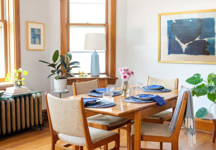
Warm Whites and Creams
Warm whites are excellent with golden, honey, or red-leaning woods because they feel soft, not icy. They brighten a room without turning your
oak floors into the star of a courtroom drama.
Greige (Gray + Beige)
Greige is popular for a reason: it can bridge warm wood and cooler decor. Look for greige that’s balancedtoo gray can fight warm oak; too beige
can make everything feel a little sepia-filtered.
Soft Taupe and Mushroom Tones
Taupes are especially good when you have multiple wood tones in one space (floor + furniture + trim). They’re the diplomats of paint colors:
calm, flexible, and rarely starting conflict.
Gentle Warm Grays
Warm grays (not icy grays) can modernize rooms with traditional wood finishes. The key is making sure the gray has enough warmth to “talk to” the wood,
rather than ghost it.
Step 5: Pick Accent Colors That Make Wood Look Expensive
Once your wall color is sorted, accent colors are where the room gets personality. Wood pairs beautifully with colors found in nature and with
deeper, slightly muted tones. Here are combinations that consistently work:
Greens (Sage, Olive, Forest)
Green is practically wood’s best friend. Sage and olive complement golden floors, while deeper greens look stunning against walnut or espresso stains.
If you want “cozy, layered, and intentional,” green is your shortcut.
Blues (Dusty Blue, Navy, Blue-Gray)
Blue is a classic balancing act for warm woods. Dusty blues and blue-grays soften orange undertones; navy brings drama and contrast without feeling harsh.
Bonus: blue tends to make wood grain look richer.
Warm Earth Tones (Terracotta, Clay, Muted Rust)
Earth tones can harmonize with wood beautifully, especially in rooms leaning rustic, Southwest, or organic modern. The move is to keep them muted
(not neon) so the wood and the color feel like they share a zip code.
Charcoal and Near-Black
Dark accents (like charcoal) can make light-to-medium wood look crisp and modern. Think: black metal frames, charcoal textiles, or a deep accent wall
to anchor the room. Use sparingly so the space stays inviting.
Room-by-Room Color Strategies (With Specific Examples)
Living Room With Medium Oak Floors
- Wall color idea: balanced greige or warm white
- Accent palette: olive + cream + black accents
- Why it works: greige calms oak’s warmth; olive adds a natural complement; black sharpens the edges
Bedroom With Cherry or Red-Toned Wood Furniture
- Wall color idea: soft warm white, pale greige, or a gentle sage
- Accent palette: linen + sage + soft brass
- Why it works: the red undertone gets balanced by green-leaning colors and softened neutrals
Kitchen With Wood Cabinets and Wood Floors
- Wall color idea: creamy white or light greige
- Accent palette: muted blue tiles, matte black hardware, natural textiles
- Why it works: the neutral keeps the space bright; blue adds contrast; black reads modern and intentional
Hallway With Dark Walnut or Espresso Floors
- Wall color idea: warm white, soft taupe, or a light neutral with depth
- Accent palette: warm metals + natural fiber runners
- Why it works: dark floors need lighter walls for balance; warm neutrals prevent the space from feeling stark
Cheat Sheet: Best Wall Color Directions by Wood Tone
Yellow or Golden Wood (Maple, Pine, Some Oak)
- Great choices: warm whites, greige, muted blue-gray, soft sage
- Avoid: super-icy grays (can turn the wood extra yellow), overly yellow beiges (can go “all banana, no peel”)
Orange-Toned Wood (Honey Oak)
- Great choices: blue-grays, balanced greige, muted greens
- Avoid: loud bright colors that amplify the orange
Red/Pink Wood (Cherry, Mahogany)
- Great choices: warm gray, soft greige, sage/olive greens, creamy whites
- Avoid: strong pinks/reds (unless you want your room to look like a berry smoothie)
Dark Brown Wood (Walnut, Espresso)
- Great choices: warm whites, taupes, mushroom neutrals, deep jewel tones for accents
- Avoid: very icy pale colors if they make the room feel cold or overly formal
Step 6: Mixing Different Wood Finishes Without Chaos
If you have wood floors plus wood furniture plus wood trim, don’t panicyou’re not doomed to live in a cabin-themed escape room.
Here are a few rules that make mixed wood tones work:
- Pick a dominant wood tone (usually the floor) and treat everything else as supporting cast.
- Repeat tones at least twice (a medium wood table + medium wood picture frames) so it feels intentional.
- Vary the depth, not the undertone when possible (light oak + medium oak works easier than light oak + red cherry).
- Use a “bridge” material like a rug, woven texture, or neutral upholstery to connect different woods.
Step 7: The Sample-and-Commit Method (AKA How to Avoid Regret)
The fastest path to the right color isn’t scrollingit’s testing. Use these practical steps:
- Choose 6–8 contenders (not 30; you are not running a paint museum).
- Test big swatches on at least two walls.
- View them next to your wood in daylight and lamplight.
- Eliminate anything that looks unexpectedly green/pink/yellow.
- Pick the one that looks good even when you’re not trying to convince yourself.
Conclusion: Make the Wood the Hero, Not the Problem
When you choose colors that complement wood furniture and floors, you’re not “matching brown.” You’re balancing undertones, respecting light,
and deciding how much contrast you want in the room. Start with the wood’s undertone, pick a neutral that plays nicely, then add accent colors
that make the grain and warmth look intentional. Test samples in real lighting, and your space will feel cohesivelike it was designed on purpose,
not assembled during a dramatic weekend of impulsive decisions and strong coffee.
of Real-World Experiences (What People Notice After They Choose the Right Colors)
In real homes, the “best” paint color is rarely the one that looks perfect on a tiny swatch under fluorescent store lights. People often describe the
same pattern: they pick a color they love in theory, paint the wall, and then realize their wood floors have opinions. A common experience with golden oak
is choosing a cool, trendy gray and watching the floor suddenly look more yellow than ever. It’s not that gray is “wrong”it’s that the contrast can push
the wood’s undertone forward like it’s trying to be noticed from space. Once homeowners shift to a balanced greige or a warmer white, they usually say the
room feels calmer, brighter, and less visually “split” between modern walls and traditional floors.
Another frequent experience shows up with cherry or red-toned furniture. People will paint a room a warm beige expecting cozy elegance, and instead the red
undertone in the wood turns louderalmost pinkbecause the wall color quietly echoes it. The fix tends to feel almost magical: introduce a green-leaning neutral
(even a soft sage) or a neutral with a cooler backbone, and the cherry settles down and looks richer instead of shoutier. Many describe it as the moment the wood
starts reading “classic” instead of “why does my dresser look sunburned?”
Dark walnut floors bring their own storyline. Homeowners sometimes pick a bright, icy white hoping for crisp contrast, then find the room feels colder and more formal
than plannedlike the space put on a suit and forgot to invite anyone over. Switching to a warmer white (or adding taupe, linen, and warm metals) usually brings the
comfort back without losing the sophistication. People often report that the wood grain looks deeper and more dimensional once the walls stop feeling stark.
Then there’s the “I mixed woods and now I’m stressed” phase. It’s incredibly common: maybe the floor is medium oak, the dining table is darker, and there’s a random
honey-toned console you love but can’t return. The experience most people share is that once they add a bridging rug and choose a wall color that sits in the middle
(like soft taupe or balanced greige), the mixed woods stop competing. The room starts to feel layered instead of mismatched. Many also notice that repeating one wood
tone in small waysframes, bowls, stoolsmakes the mix look deliberate.
Finally, almost everyone who tests paint properly says the same thing: lighting was the surprise villain. Colors that looked neutral can go green at night, look pink
in morning sun, or turn flat under cool LEDs. The people happiest with their final choice usually did one unglamorous step: big sample patches and a few days of living
with them. It’s not thrilling, but it saves time, money, and that awkward feeling of explaining to guests that “it wasn’t supposed to look like that.”