Table of Contents >> Show >> Hide
- Why Google Slides Works So Well for Real Life
- Before You Start: The 3-Minute Plan That Saves an Hour
- How to Create a Presentation Using Google Slides: 11 Steps
- Step 1: Open Google Slides and Start a New Deck
- Step 2: Name Your File and Put It Where You Can Find It Later
- Step 3: Choose a Theme (or Template) That Matches Your Goal
- Step 4: Set the Slide Size and Basic Structure
- Step 5: Build Your Outline Using Slide Titles (Not Paragraphs)
- Step 6: Use Layouts and the Theme Builder for Consistency
- Step 7: Add Text the Smart Way (Short, Scannable, Human)
- Step 8: Add Visuals (Images, Charts, Diagrams) That Earn Their Space
- Step 9: Collaborate and Control Sharing Like a Responsible Wizard
- Step 10: Add Speaker Notes and Practice With Presenter View
- Step 11: Polish, Animate Lightly, and Export/Publish the Right Way
- Design Tips That Instantly Improve Your Google Slides Presentation
- Common Google Slides Problems (and How to Fix Them Fast)
- Conclusion
- Experience Notes: of “What People Learn the Hard Way”
Google Slides is the “show your work” tool of the internet age: fast, collaborative, and available anywhere you can open a browser.
It’s also the place where perfectly smart people accidentally create 47-slide novels with 9-point font. Let’s not be those people.
In this guide, you’ll learn an efficient, repeatable process for building a clean, convincing deck in Google Slidesfrom “blank page panic”
to “I can present this without sweating through my hoodie.” We’ll keep it practical, a little funny, and very copy-and-paste friendly.
Why Google Slides Works So Well for Real Life
Google Slides shines when you need to move quickly and work with other humans (a bold requirement, I know). Because it’s cloud-based, you can:
collaborate in real time, leave comments instead of chaotic group texts, and present from almost any device without hauling around a flash drive
like it’s 2006.
Before You Start: The 3-Minute Plan That Saves an Hour
The best-looking presentations aren’t “designed” firstthey’re decided first. Do this quick prep before you touch themes, fonts, or
the seductive “WordArt energy” inside you:
- Define the win: What should your audience think, feel, or do when you finish?
- Choose 3–5 key points: Most decks die from “just one more thing.”
- Collect assets: Logos, screenshots, links, stats, quotes, and images you’ll need.
- Write slide headlines: Make each slide title a sentence that states the takeaway (not a vague topic label).
How to Create a Presentation Using Google Slides: 11 Steps
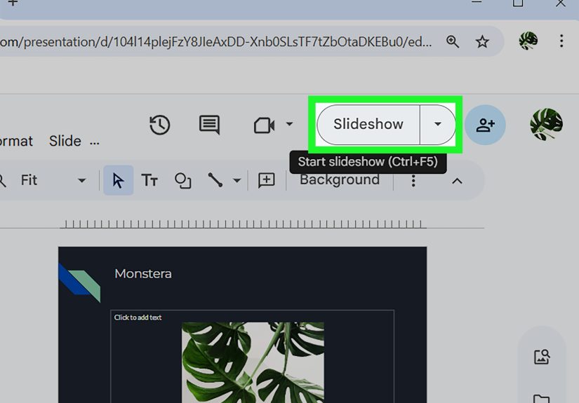
Step 1: Open Google Slides and Start a New Deck
Go to Google Slides (or open it from Google Drive) and create a new presentation. You can start blank, pick a template, or use a
previously built deck as your starting point if you already have a style you like.
Pro tip: If you’re making decks often (school projects, work updates, club pitches), templates are your friend. They’re like
meal prep, but for slides.
Step 2: Name Your File and Put It Where You Can Find It Later
Click the title area at the top and name your presentation immediately. Use a name that makes future-you proud:
“Marketing Plan Q1 2026” beats “Untitled presentation (19)”.
If you’re working with a group, place it in a shared folder. Organization feels boring until it saves your life at 11:58 PM.
Step 3: Choose a Theme (or Template) That Matches Your Goal
Open the Themes panel and pick a theme that fits the mood: professional, playful, academic, minimalist, whatever.
A consistent theme helps your deck look intentionaleven if you built it while eating cereal out of a mug.
Design rule: Don’t fight your theme. If you choose something clean and modern, keep your content clean and modern.
If you choose something bold, use bold visuals and short text.
Step 4: Set the Slide Size and Basic Structure
Most presentations use widescreen (16:9), especially for projectors and modern displays. If you’re printing or embedding in a specific format,
adjust the page setup early so you don’t end up with awkward cropping later.
Then create a simple structure:
Title → Agenda (optional) → Main sections → Summary/Next steps.
This is the “don’t get lost” map for your audience.
Step 5: Build Your Outline Using Slide Titles (Not Paragraphs)
Create your section slides and write slide titles as clear takeaways. For example:
- Weak: “Budget”
- Strong: “The budget works if we cut recurring costs by 12%”
This approach keeps the deck logical. It also makes presenting easier because you’re not reading walls of textyou’re explaining decisions.
Step 6: Use Layouts and the Theme Builder for Consistency
Layouts save time and keep spacing consistent. Instead of dragging text boxes around like you’re playing “align the rectangle,” apply a layout
that matches what you need (title + body, two columns, image + caption, etc.).
If you want a polished, “we-have-brand-guidelines” look, use the theme tools (often called the theme builder) to standardize:
fonts, colors, footer text, slide numbers, and recurring elements like logos.
Do it once, and every slide benefits.
Step 7: Add Text the Smart Way (Short, Scannable, Human)
Slides aren’t documents. Your audience can either read or listen, but rarely both. Keep text simple:
- Use short bullets or short sentences.
- Aim for one idea per slide.
- Use big font sizes (your back row deserves rights).
- Highlight key words instead of adding more words.
Quick reality check: If your slide looks like a textbook page, it’s not a slideit’s a cry for help.
Step 8: Add Visuals (Images, Charts, Diagrams) That Earn Their Space
Visuals are where Slides becomes a “presentation” instead of a “reading assignment.” Add images, icons, screenshots, or charts that make your
point faster than text can.
For data, consider charts linked from Google Sheets so updates don’t require rebuilding visuals. For process explanations, a simple diagram
(boxes and arrows) often beats a paragraph.
Pro tip: Use visuals to clarify, not decorate. If an image doesn’t support your message, it’s just taking up rent-free space.
Step 9: Collaborate and Control Sharing Like a Responsible Wizard
Click Share and set permissions intentionally:
Viewer (can view), Commenter (can comment), Editor (can edit).
For group work, “Editor” is greatuntil someone “fixes” your title slide into a meme.
Use comments to request changes and keep feedback organized. If you’re sharing widely (like a class or a large audience), consider publishing
a view-only version so your deck doesn’t become a collaborative art experiment.
Step 10: Add Speaker Notes and Practice With Presenter View
Speaker notes are your secret weapon: reminders that you can see, but your audience can’t. Add notes for key points, examples, or
transitions so you don’t rely on memory under pressure.
Then rehearse using Presenter view. It’s designed to help you stay on track with tools like a timer, slide navigation, and notes.
Some setups also support audience Q&A features, which can be useful for interactive sessions.
Bonus: If you present in a video meeting, learn how your setup handles speaker notes and screen sharing before it’s showtime.
Test it once. Save yourself the “Can everyone see my notes?” panic.
Step 11: Polish, Animate Lightly, and Export/Publish the Right Way
This is the “make it look like you meant to do that” step:
- Proofread (read it out loudyour brain skips mistakes silently).
- Check alignment (messy spacing screams “rushed”).
- Keep transitions simple (subtle beats chaotic).
- Verify contrast (dark text on light background usually wins).
When you’re ready to share, pick the best format:
- Link sharing for collaboration or easy access.
- PDF for fixed formatting and printing.
- PowerPoint if someone needs a .pptx.
- Publish to the web if you want an embeddable, view-only version for a site.
Design Tips That Instantly Improve Your Google Slides Presentation
Use the “One Slide, One Job” Rule
Every slide should do exactly one job: explain a point, show data, tell a story beat, or set up the next section. If it’s doing three jobs,
split it into three slides. Your audience will thank you with their attention span.
Headlines Beat Labels
Slide titles shouldn’t be labels (“Results”). Make them conclusions (“Results beat the target by 18%”). This makes your deck understandable
even if someone reads it without you present.
Build Visual Hierarchy With Size, Not Chaos
Make the most important thing the biggest thing. Use fewer font sizes, not more. If everything is bold, nothing is bold.
Be Kind to Accessibility
Use readable font sizes, strong contrast, and don’t rely only on color to communicate meaning (helpful for color-blind viewers and everyone
watching on a washed-out projector).
Common Google Slides Problems (and How to Fix Them Fast)
“Why can’t my teammate edit?”
Check sharing permissions. If they’re a Viewer or Commenter, they can’t edit. Also confirm they’re signed into the correct Google account.
“The deck looks different on the projector”
Test on the display you’ll use, and keep layouts simple. If you’re using custom fonts or complex formatting, export a PDF as a backup.
PDFs are the “I refuse to be surprised today” option.
“My animations are… a lot.”
Use animations like hot sauce: a little can be great, too much ruins dinner. Keep transitions consistent and avoid stacking multiple effects
per slide unless you truly need them.
Conclusion
Creating a presentation in Google Slides isn’t about clicking every featureit’s about building a clear story, keeping your design consistent,
and using the right tools (layouts, notes, sharing) so your message lands. Follow the 11 steps above, and you’ll end up with a deck that looks
confident, stays organized, and actually helps your audience understand what you’re sayingan underrated superpower.
Experience Notes: of “What People Learn the Hard Way”
After you’ve built a few Google Slides decks, certain patterns show uplike how everyone thinks they’ll “just remember what to say,”
and then the moment they present, their brain becomes an unplugged Wi-Fi router. That’s why speaker notes feel like cheating (in a good way).
The first time someone presents with notes in Presenter view, they usually say some version of: “Wait… I can see my notes and the audience
can’t? Where has this been all my life?”
Collaboration is another big “aha.” At first, sharing a deck with editors seems perfectuntil you watch a teammate resize every text box,
swap the theme, and introduce a brand-new font called “Why Is This Here Sans.” The experience teaches a valuable lesson: give edit access
to the people who truly need it, use comments for everyone else, and create a quick “style agreement” up front (fonts, colors, layout rules).
It’s not controllingit’s keeping the project from turning into a design reality show.
Another common experience: people underestimate how much slide titles matter. New presenters often write topic titles (“Marketing,” “Budget,”
“Timeline”) and then wonder why the deck feels fuzzy. After a few rounds of feedback, they learn that strong titles act like guide rails.
When titles state the takeaway (“Budget stays flat by shifting spend from X to Y”), the deck becomes easier to skim and easier to present.
Suddenly, the presenter isn’t “reading slides”they’re telling a story the slides support.
Presenting online adds its own set of lessons. Many people discoverlivethat sharing the wrong screen is a thing that can happen to anyone.
The practical habit that forms is simple: test your setup once, confirm what the audience sees, and keep a PDF backup in case the internet
decides to become performance art. People also learn to keep animations minimal online, because lag can turn a smooth transition into a
dramatic suspense moment nobody asked for.
Finally, there’s the “export regret.” Someone spends hours perfecting a deck, then sends it to a person who wants PowerPoint. Most of the time,
the export works finebut the experience teaches you to simplify design, use consistent layouts, and avoid overly delicate formatting when you
know your file might travel across platforms. If the stakes are high, sharing a PDF or publishing a view-only version can preserve your intent.
The best takeaway from all these experiences is that Slides is powerfulbut your process is what makes it reliable.