Table of Contents >> Show >> Hide
- Why manuscript formatting matters (besides saving your sanity)
- The “standard manuscript format” baseline (your safe default)
- How to Format a Manuscript: 10 Steps
- Step 1: Read the submission guidelines like they’re a map and you’re already lost
- Step 2: Set up the document page correctly (size and margins first)
- Step 3: Choose a readable font and stick to it (this is not the time for “quirky”)
- Step 4: Lock in line spacing and paragraph spacing (double means double)
- Step 5: Indent paragraphs the right way (use settings, not the spacebar)
- Step 6: Use a clean header with page numbers (so pages don’t wander off)
- Step 7: Build a proper title page (when appropriate)
- Step 8: Format chapters, section breaks, and scene breaks consistently
- Step 9: Use italics, quotes, and special text like a professional (not a confetti cannon)
- Step 10: Run a pre-submit checklist (and make your file behave)
- Common formatting mistakes that scream “I did this at 2 a.m.”
- Manuscript format vs. “book formatting”: don’t mix them up
- Experience-based add-on: real-world formatting lessons writers run into
- Conclusion
Manuscript formatting is the literary version of showing up to an interview wearing pants. Could you get hired without them?
Maybe. Do you want to gamble your book on “maybe”? Absolutely not.
Whether you’re submitting a novel to agents, sending a nonfiction proposal to a publisher, or handing a draft to an editor,
clean, standard manuscript format helps the reader focus on your wordsnot your creative relationship with margins.
The goal isn’t to make your manuscript look like a printed book. The goal is to make it easy to read, easy to annotate,
and easy to evaluate.
Why manuscript formatting matters (besides saving your sanity)
Editors, agents, reviewers, and professors all read a lot. Like, a lot. Standard formatting reduces friction:
predictable spacing makes line edits easier; consistent headings prevent confusion; and a sensible layout helps your document
behave across different devices and software.
One more truth that never goes out of style: submission guidelines win. If an agent, publisher, contest, journal,
or instructor asks for something specific, do thateven if it breaks “the rules.” Think of standard format as the default setting,
not the constitution.
The “standard manuscript format” baseline (your safe default)
If you’re formatting a book manuscript for submission and you don’t have special instructions, this is the widely accepted baseline:
- Page size: US Letter (8.5″ x 11″) unless requested otherwise
- Margins: 1 inch on all sides
- Font: 12-point, readable serif (Times New Roman is the classic “don’t overthink it” choice)
- Line spacing: Double-spaced
- Alignment: Left-aligned (ragged right edge), not fully justified
- Paragraphs: First-line indent about 0.5 inch; no extra blank lines between paragraphs (unless guidelines say so)
- Page numbers: Included in a header
Now let’s turn that into a reliable process you can follow every time.
How to Format a Manuscript: 10 Steps
Step 1: Read the submission guidelines like they’re a map and you’re already lost
Before you touch a font menu, check the target’s requirements. Agents and publishers may specify:
file type (.docx vs. Google Doc vs. PDF), line spacing, whether to include a title page, how to label chapters,
and whether they want page headers at all.
Pro tip: Create a tiny “Guidelines” note at the top of your working file (not in the submitted file)
that lists the requirements. It prevents the classic mistake: spending an hour perfecting format… for the wrong rules.
Step 2: Set up the document page correctly (size and margins first)
Start with US Letter (8.5″ x 11″) unless the guidelines request A4. Then set margins to 1 inch on all sides.
Why? Because standard margins give room for comments, printing, and sanity.
Example: If your software defaults to 1.25″ margins, change it. That “slightly wider” look can throw off page counts,
and some readers interpret it as not following instructions.
Step 3: Choose a readable font and stick to it (this is not the time for “quirky”)
Use a standard, easy-to-read font at 12-point size. Times New Roman is the most common for book submissions.
The point is consistency and readabilitynot showing your personality through typography.
(Your personality should be in the prose, not in a font that looks like a haunted carnival poster.)
- Good: Times New Roman 12, Garamond 12, similar readable serif fonts
- Avoid: Decorative fonts, tiny font sizes, unusual spacing tricks
Step 4: Lock in line spacing and paragraph spacing (double means double)
Set the manuscript to double spacing throughout. Then check paragraph settings:
you generally want no extra space before or after paragraphs.
Why this matters: Double spacing makes editing and commenting easier.
Extra blank space between paragraphs can make the manuscript look like a blog postfine online, but not standard for submission.
Quick check: Highlight a page and confirm:
Line spacing = Double; Spacing Before = 0; Spacing After = 0 (unless your guidelines say otherwise).
Step 5: Indent paragraphs the right way (use settings, not the spacebar)
Standard manuscript format typically uses a first-line indent of about 0.5 inch.
Set it in your paragraph settings so it applies consistently.
- Best: Automatic first-line indent setting
- Acceptable: Tab key (if consistent)
- Do not do this: Five spaces like it’s 1997 and you’re typing a school report on a keyboard missing three keys
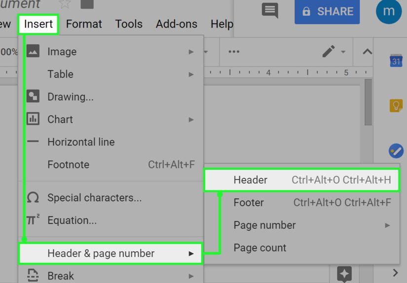
Step 6: Use a clean header with page numbers (so pages don’t wander off)
Most submission formats use a header that includes your last name (or author name), a shortened title, and the page number.
Place it in the header area, typically aligned to the right.
Example header: Garcia / THE GLASS HARBOR / 12
If you’re formatting an academic manuscript (APA/MLA/Chicago), the header rules may differ:
MLA commonly uses last name + page number; APA may use page numbers and (for some formats) a running head.
When in doubt, follow the style guide or your instructor.
Step 7: Build a proper title page (when appropriate)
Many agents and publishers prefer a simple title page for book submissions. Keep it plain:
title, author name, contact info (as requested), and approximate word count.
Example layout (simple and standard):
- Title (centered, upper third of page)
- By Your Name (centered under title)
- Contact info (often in a corner: email, phone; address only if requested)
- Word count (approximate, optional unless requested)
Important: Don’t decorate the title page. No fancy borders. No inspirational quotes. No clip art of a quill.
The formatting is not auditioning for a role in a medieval movie.
Step 8: Format chapters, section breaks, and scene breaks consistently
Standard practice is to start each chapter on a new page. Chapter headings should be consistent in style and placement.
Some writers place the chapter title/number about a third of the way down the first page of the chapter, but spacing can vary.
For scene breaks within a chapter, use a simple, centered marker such as:
# or * * * (choose one and stick with it). Avoid decorative symbols and emoji.
(Yes, even if your scene break feels like it deserves a tiny dragon.)
Consistency rule: Whatever you do for Chapter 1 must be what you do for Chapter 27.
Formatting should feel invisible.
Step 9: Use italics, quotes, and special text like a professional (not a confetti cannon)
Manuscripts should be clean and readable. Use italics for emphasis sparingly.
Avoid excessive bolding, underlining, ALL CAPS, or stylized text unless it’s truly necessary (and genre-appropriate).
- Italics: Common for emphasis, thoughts (depending on style), titles within text
- ALL CAPS: Rare; sometimes used for short-title in headers or intentional shouting in dialogue
- Underlining: Generally avoided in modern manuscripts unless guidelines request it
If you have letters, texts, emails, poetry, or excerpts inside your manuscript, format them clearly and consistently.
For example, you might indent a block quote or use a distinct style for lettersjust don’t turn it into a typographic theme park.
Step 10: Run a pre-submit checklist (and make your file behave)
Manuscript formatting isn’t finished until the document exports cleanly and reads cleanly.
Do a final pass with a checklist that catches the most common submission headaches.
Pre-submit checklist
| Item | What to verify |
|---|---|
| File type | Meets the guideline (often .docx). Avoid PDF unless requested. |
| Consistency | Same font, spacing, chapter style, and scene break markers throughout. |
| Headers & numbers | Page numbers appear correctly on every page that should have them. |
| Track Changes | Turned off; no hidden edits, comments, or reviewer notes unless requested. |
| Widows/orphans | Not usually a dealbreaker for submissions, but scan for awkward single lines at page tops/bottoms. |
| Spellcheck | Run itand still proofread, because spellcheck will happily approve “form” when you meant “from.” |
| File name | Clear and professional (e.g., LastName_Title_Full.docx). |
Specific example file names that don’t make anyone sigh:
Nguyen_ThePaperGarden_QueryChapters.docx
Johnson_StoneRiver_Manuscript.docx
Common formatting mistakes that scream “I did this at 2 a.m.”
- Using extra blank lines between paragraphs instead of first-line indents
- Full justification that creates weird word spacing rivers across the page
- Inconsistent scene breaks (*** on one page, ### on another, and a mysterious “~ ~ ~” later)
- Changing fonts mid-manuscript because you pasted from another file and didn’t normalize styles
- Leaving comments or Track Changes visible in the submitted document
- Over-formatting to look like a printed book (columns, fancy drop caps, “chapter art”)save that for layout
Manuscript format vs. “book formatting”: don’t mix them up
A manuscript is a working document designed for review and editing. A printed book layout (or an ebook layout) is a designed product.
Manuscripts prioritize readability and consistency; book layouts prioritize typography, aesthetics, and final presentation.
If you’re self-publishing, you may eventually create a print-ready interior filebut that comes later, usually after editing and proofreading.
For submissions, keep it simple and standard unless told otherwise.
Experience-based add-on: real-world formatting lessons writers run into
Writers don’t usually “mess up formatting” because they’re careless. They mess it up because modern writing happens in messy ways:
Google Docs at lunch, Word at night, notes on a phone, a chapter pasted from an older draft, beta reader comments everywhere, and a
last-minute change made five minutes before hitting submit. That’s not a character flawit’s the creative process.
Formatting problems show up when that process leaves behind artifacts.
One of the most common real-life scenarios is the copy-and-paste style explosion. You paste a chapter from another file,
and suddenly your indents change, line spacing shifts, and some paragraphs have extra spacing after them. The fix isn’t to manually “tap it back.”
The fix is to select the manuscript (or at least the pasted section) and re-apply the correct paragraph settings and styles.
This is why consistency matters so much: when the document is style-driven, it’s repairable.
Another frequent moment: the scene break identity crisis. Writers try out different separators while drafting:
three asterisks, a centered emoji (bold choice), a blank line, then later a hashtag. By the end, the manuscript looks like it’s hosting a
symbol convention. Readers may not reject you for this, but it does create unnecessary friction. Pick one marker that’s plain and recognizable
(like * * *) and use it everywhere. A clean manuscript feels controlledeven when the plot is gleefully out of control.
Then there’s the header problem, which usually happens because writers format the first page nicely and assume the rest will follow.
But headers live in header space, not in the body text. If you typed “My Name / Title / 1” on page one manually, it won’t update,
it won’t repeat correctly, and it won’t survive a page count change. The professional approach is inserting page numbers and header text using the
document’s header tool so it updates automatically. It’s the difference between a sign taped to a door and the actual address of a house.
A more subtle formatting lesson comes from over-correction. Some writers worry that standard format looks “boring,”
so they add design flourishescustom fonts, decorative line breaks, stylized chapter openers, or full justification to make it “look like a book.”
The intention is good (you care!). But in submissions, those choices can backfire because they interfere with readability and editing.
Editors and agents want to evaluate content efficiently. Standard format quietly says, “I’m easy to work with.”
If you’ve ever used feedback tools, you’ve probably seen the Track Changes trap. A writer revises with comments,
accepts some changes, rejects others, and forgets to finalize the document. The result is a submission that displays editorial notes,
private comments, or visible revision marks. It’s not just messyit can reveal behind-the-scenes information you didn’t intend to share.
Before submitting, do a “final review”: remove comments (unless requested), accept changes into clean text, and export in the requested format.
Finally, a practical truth: guidelines aren’t there to torture you. They exist because organizations need documents to be
consistently readable and sortable. Once you treat manuscript formatting as a checklist instead of a creative obstacle, it becomes fast.
Many writers keep a personal manuscript templatea clean .docx file with margins, spacing, header, and chapter style already set up.
Then every new project starts in a format that’s ready for submission. The less time you spend wrestling the document, the more time you get to
write the part readers actually came for: the story.