Table of Contents >> Show >> Hide
- Start with the Wallpaper, Not the Paint
- Step 1: Study Your Wallpaper Like a Designer
- Step 2: Decide the Mood of the Room
- Step 3: Build a Simple Color Palette
- Step 4: Think About Light, Room Function, and Finishes
- Step 5: Use Real-Life Testing, Not Just Tiny Chips
- Step 6: Special Situations and Tricky Wallpapers
- Real-Life Examples and Experience-Based Tips
- Wrapping It Up
Wallpaper is having a serious main-character moment again. From oversized botanicals to moody murals, it’s bold, it’s fun, and it’s… a little intimidating when you’re standing in the paint aisle staring at 9,000 almost-identical beige chips.
The good news: there is a method to the color madness. Interior designers don’t just “eyeball it” (well, not only). They follow a few repeatable steps: analyze the wallpaper, decide the mood, look at undertones and light, and then test colors in real life before committing. Design editors and paint pros also tend to agree on a core set of tricks for getting that polished, magazine-worthy look when you’re pairing paint with patterned walls.
In this guide, we’ll walk through how to pick paint to match your wallpaper without losing your mind, your weekend, or your security deposit. We’ll talk about reading undertones, choosing between subtle and bold pairings, using accent walls, and avoiding the classic “oops, it looked different in the store” disaster.
Grab your wallpaper sample (or the whole rollno judgment) and let’s turn you into the person friends text when they’re panicking about paint colors.
Start with the Wallpaper, Not the Paint
Rule number one: wallpaper is the diva, paint is the supporting cast. Since wallpaper patterns are harder to change and usually more expensive than a can of paint, designers almost always choose paint after the wallpaper, not the other way around.
Think of the wallpaper as your inspiration board. It already has a built-in color palette: a background shade, one or two primary colors, and secondary or accent tones. Your job is to decide which of those shades your paint will echo, soften, or contrast.
This approach also plays nicely with current wallpaper trends like murals, bold botanicals, and stripes, where designers often coordinate cabinetry, trim, or adjacent walls to one of the wallpaper’s key hues for a cohesive look.
Step 1: Study Your Wallpaper Like a Designer
Before you walk into a paint store, spend a few minutes really looking at your wallpaper. Lay it flat near a window and ask yourself a few questions:
Identify the primary, secondary, and background colors
- Primary color: The hue you notice first (maybe a leaf green, navy blue, or blush pink).
- Background color: The “field” color behind the patternoften cream, white, or a subtle pastel.
- Accent colors: Smaller details like berries, stems, stripes, or shadow tones.
Many designers recommend matching either the primary color or the background color when you’re trying to keep things calm and cohesive. Matching the main wallpaper color in paint helps distribute that shade around the room so the wallpaper doesn’t feel like a random patch of pattern.
Check the undertones: warm vs. cool
Two colors can be “white” but still clash horribly if one has cool blue undertones and the other leans creamy yellow. The same is true for grays, blues, greensyou name it.
- Warm undertones (yellow, red, or brown) feel cozy and inviting.
- Cool undertones (blue, green, or violet) feel crisp and airy.
Paint and wallpaper look more harmonious when their undertones match or intentionally complement each other. A warm cream wallpaper will love a warm greige or beige paint; a cool white wallpaper usually prefers cool soft grays or blue-leaning neutrals.
Notice the scale and busyness of the pattern
Large, bold patterns (oversized florals, mural scenes) already make a big statement, so designers often pair them with quieter paint colors. On the other hand, a subtle textured or tone-on-tone wallpaper can handle richer or darker paint because it doesn’t visually compete as much.
Step 2: Decide the Mood of the Room
Once you know what you’re working with, decide how you want the space to feel. The same wallpaper can look totally different depending on the paint you pair it with.
Do you want calm and seamless?
If you’re decorating a bedroom, nursery, or reading nook, you might want a soft, soothing look. Designers often recommend:
- Matching the background color of the wallpaper for a “wrapped in a cloud” effect.
- Choosing a slightly lighter or darker version of the main wallpaper shade to keep everything gentle but still defined.
- Leaning into warm, creamy neutrals instead of icy whites, especially in low-light rooms, to avoid a cold or sterile feel.
Or bold and high-contrast?
In spaces like powder rooms, dining rooms, or entryways, a little drama can be a good thing. You might:
- Pick one of the accent colors in the wallpaper and use it as your paint color so the pattern really pops.
- Use a lighter neutral paint with a dark, moody wallpaper to create contrast and keep the room from feeling too heavy.
- Try a “color drenched” look by repeating one main hue on walls, trim, and even ceiling, then letting the wallpaper introduce pattern in select areas.
Is the wallpaper an accent or the main event?
If you’re using wallpaper on just one feature wall (say, behind a bed or in a dining room niche), you’ll usually want the surrounding walls to support, not fight, the star wall. Many pros recommend:
- Using a neutral pulled from the wallpaperlike the background cream or soft gray.
- Keeping paint colors one or two steps lighter/darker than the wallpaper’s main hue for a smooth transition.
- Letting the wallpaper simply be the “art” and keeping paint simple.
Step 3: Build a Simple Color Palette
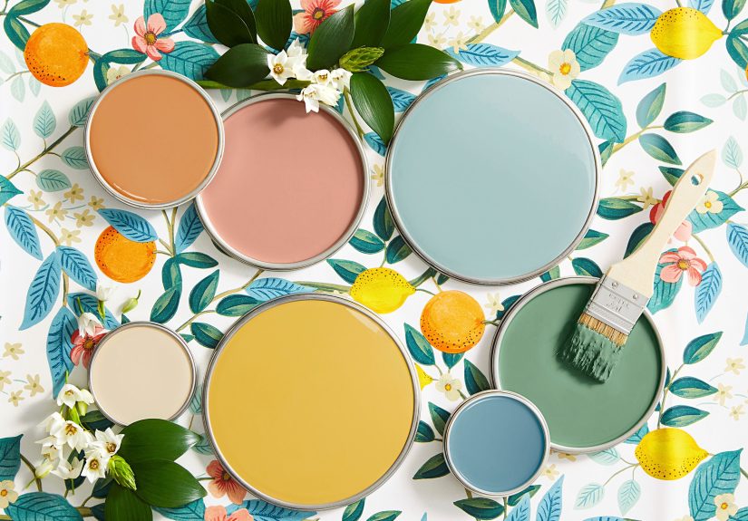
Before you commit to one paint color, it helps to build a tiny palette of three to five options pulled from your wallpaper. Here are the combinations designers come back to again and again.
Option 1: Match the background color
This is the safest, most forgiving choice. If your wallpaper has a cream or soft gray background, matching that tone on the other walls almost always works. The result is subtle, airy, and makes the pattern feel integrated instead of random.
Example: A botanical wallpaper with a warm ivory background and green leaves. Paint the other walls in a similar warm ivory and let the greenery stand out on the patterned wall. The whole room feels calm, but still interesting.
Option 2: Pull an accent color
If you want more personality, grab one of the less dominant colors from the wallpapermaybe the soft blue in the shadows or the muted clay in the flowersand use that as your paint color. This adds depth and makes the pattern feel thoughtfully curated instead of matchy-matchy.
Example: A stripe wallpaper with navy, light blue, and white. Most people think “white walls,” but painting the non-papered walls a muted dusty blue from one of the stripes makes the whole room feel designer-level intentional.
Option 3: Quiet neutrals with bold wallpaper
When your wallpaper is dramatica dark floral, a busy geometric, or a muralneutral paint is your best friend. Designers often recommend warm whites, soft greiges, and taupes that echo the wallpaper’s undertone but give your eyes somewhere to rest.
Example: A moody jungle mural with deep greens and inky blues. Instead of going full emerald on the remaining walls, you might choose a warmer, sandy neutral that picks up the lightest leaf or vine tone in the print.
Step 4: Think About Light, Room Function, and Finishes
Even the perfect paint chip can go rogue once it’s on all four walls. That’s where light and finish come in.
Natural and artificial light
- North-facing rooms tend to read cooler and more shadowy, so warm neutrals often look better than crisp, cool whites.
- South-facing rooms can handle cooler tones because the light is warmer and brighter.
- Evening-only rooms (think dining rooms) will mostly be seen under artificial light, so test your colors under the bulbs you’ll actually use.
Designers often advise avoiding super-cool whites and very bright paints in bedrooms since they can feel harsh and overstimulating; soft, warm tones tend to be more restful and pair beautifully with gentle wallpaper patterns.
Room function
How you use the room also matters:
- Bedrooms and nurseries: Favor softer neutrals and low-contrast pairings.
- Powder rooms: Great for bold wallpaper and bolder paint choices because you don’t spend all day in there.
- Living rooms and kitchens: Aim for balanced, livable palettes that work with your furniture, flooring, and cabinetrynot just the wallpaper.
Paint finishes around wallpaper
Finish doesn’t change the color itself, but it affects how the color reads:
- Matte/flat: Hides imperfections, feels soft and cozygood near delicate or matte wallpapers.
- Eggshell/satin: Slight sheen, easier to cleangreat for high-traffic rooms.
- Semi-gloss: Typically for trim and doors; can highlight architectural details that tie into your wallpaper colors.
Many pros recommend a slightly higher sheen on trim and doors (like semi-gloss) and a lower sheen on walls so the wallpaper and paint don’t compete for attention.
Step 5: Use Real-Life Testing, Not Just Tiny Chips
Here’s where a lot of people go wrong: they pick a color based on a 2-inch chip under fluorescent store lights, then wonder why it looks totally different at home.
Bring a wallpaper sample to the paint store
Take an actual piece of your wallpaperideally a decent-sized sampleto the paint store. Many paint shops have color scanners that can read your wallpaper and either suggest close matches or create a custom color mix for you.
This is especially helpful when your wallpaper background is a very specific shade of cream, blue, or green that doesn’t quite match any standard swatch.
Paint big samples, not small swatches
- Buy sample pots of two to four contenders.
- Paint them on poster board or foam boards, not directly on the wall if you’re risk-averse.
- Hold the boards right next to the wallpaper and move them around the room.
- Look at them in the morning, midday, and evening, and under your actual lamps.
Designers and paint pros consistently emphasize testing colors in different lights before decidingespecially when you’re coordinating with a fixed element like wallpaper.
Step 6: Special Situations and Tricky Wallpapers
When the pattern is very bold or dark
If your wallpaper is dramatica black-and-gold geometric or a lush moody floralyou’ll usually want paint that balances it out:
- Use a lighter neutral pulled from the wallpaper to prevent the room from feeling like a cave.
- Limit wallpaper to one accent wall and use softer paint everywhere else.
- Consider a color-drenched look (walls, trim, and ceiling in one deep shade) only if you’re intentionally going for a cocoon-like vibe.
When you’re working with peel-and-stick wallpaper
Peel-and-stick wallpaper is popular with renters and commitment-phobes, but it still deserves thoughtful paint choices. Designers suggest treating it like “real” wallpaper: consider pattern scale, undertones, and how long you plan to live with the look.
If you know you might change out the wallpaper in a year or two, choose a flexible neutral paint that works with multiple patterns so you don’t have to repaint every time you swap designs.
When you want to break the rules (on purpose)
Color rules are there to guide you, not trap you. If you truly love a bold contrastsay, citron wallpaper with inky blue wallsand you’ve tested it in your space, go for it. Many designers emphasize that confidence and intention matter just as much as strict “rules.”
Real-Life Examples and Experience-Based Tips
Theory is great, but it’s easier to make decisions when you can picture real rooms. Here are a few practical scenarios that echo what designers and homeowners often run into when matching paint to wallpaperplus what tends to work (and what doesn’t).
Example 1: Busy floral wallpaper in a small bedroom
Imagine a small bedroom with a vintage-style floral wallpaper: cream background, pink roses, olive leaves, and tiny blue buds. The first instinct might be to paint the rest of the walls pink to “match” the flowers. In practice, that can make the room feel like a theme party.
A more successful approach:
- Match the warm cream background on the remaining walls.
- Use the olive green for smaller elements like a nightstand or lamp base.
- Bring in the pink and blue through textilespillows, throws, or art.
The result is a cozy, restful bedroom where the wallpaper feels special but not overwhelming. You still see the flowers, but you’re not drowning in them every time you lie down.
Example 2: Graphic stripe wallpaper in a hallway
Hallways are perfect for pattern because you’re just passing through, but they can also feel tunnel-like if you get the color wrong. Let’s say you have a stripe wallpaper with navy, soft gray, and white.
You could:
- Paint the non-papered walls soft gray to match one of the stripes, creating a tailored, unified look.
- Keep trim and doors a clean but slightly warm white (not blue-white) so the space doesn’t feel cold.
- Add a runner or art that repeats the navy to tie everything together.
This combination looks intentional, upscale, and easy to update later if you change decor. It’s a great real-world example of pulling both neutrals and accent colors directly from the wallpaper palette.
Example 3: Mural wallpaper behind a sofa
Mural-style wallpaperlike a mountain scene, abstract wash, or oversized botanicalis trending, especially in living rooms and dining rooms. It can be stunning behind a sofa, but the surrounding paint color makes or breaks the look.
Imagine a misty, blue-gray landscape mural. If you paint the other walls a stark, cool white, the mural can feel stuck on, almost like a giant sticker. Instead:
- Pull a soft gray-blue from the lightest part of the mural and use that on adjacent walls.
- Choose a slightly warmer white for trim to keep the room from feeling icy.
- Layer in textureslinen, wood, natural fibersso the room feels grounded and inviting.
Now the mural feels like part of the architecture, not a separate element.
Lessons from common mistakes
After you’ve seen enough paint-and-wallpaper combos (and a few fails), some patterns emerge:
- Going too bright with paint: Super-saturated paints often bounce light around and compete with patterned wallpaper. Muted, slightly grayed-down versions of your favorite colors are usually more livable.
- Ignoring undertones: If your wallpaper is warm and your paint is cool (or vice versa) and it looks “off,” undertones are probably to blame. Adjusting by even one step toward warm or cool can suddenly make everything click.
- Skipping the sample stage: Many people regret going straight from chip to full gallon. Real-world testing on large swatches almost always saves time, money, and swearing later.
Experience-based shortcuts when you’re stuck
If you’re still frozen in the paint aisle, here are a few quick defaults that often work surprisingly well:
- When in doubt, match the wallpaper’s background color within one or two shades lighter/darker.
- Use a warm off-white or greige instead of a cool white unless your wallpaper is clearly cool-toned and your room gets tons of natural light.
- For very colorful wallpapers, choose the softest, least obvious accent color as paintit often brings sophistication without shouting.
- If the wallpaper already has multiple bold colors, let paint be the calm friend: think subtle, warm neutrals that won’t fight for attention.
Over time, you’ll start to see the same principles repeat: match or complement undertones, balance busy patterns with quieter paint, and always test in your actual light. Once you’ve done this for one room, the next one feels much less scaryand yes, you might even start having fun choosing paint instead of dreading it.
Wrapping It Up
Picking paint to match your wallpaper isn’t about guessing which chip “feels right.” It’s about reading the wallpaper’s color story, deciding how bold or subtle you want the room to feel, matching undertones, and then testing your top choices in real light.
Start with the wallpaper as the star, pull two to four paint options from its background and accent colors, consider room function and lighting, and don’t skip the sample step. With that process, you’ll end up with a room that looks pulled together, intentional, and way more high-end than the amount of panic that went into it.