Table of Contents >> Show >> Hide
- Meet Your Muse: Puffin Features That Matter on Paper
- Reference Without Becoming the Villain in the Bird’s Story
- Color Palette: How to Mix Puffin Colors Without Mud or Panic
- Pick Your Medium: Watercolor, Acrylic, Gouache, or “Yes”
- A Step-by-Step Puffin Painting Process You Can Actually Use
- Step 1: Gesture and big shapes (before the beak steals your attention)
- Step 2: Lock in value structure (the secret sauce)
- Step 3: Paint the face like a mask of shapes
- Step 4: Build the bill in layersstructure, then sparkle
- Step 5: Suggest feathers; don’t count them like you’re doing taxes
- Step 6: Give the puffin a world to live in
- Composition Ideas Beyond “Center Puffin, Staring at Camera”
- Common Puffin Painting Mistakes (and How to Fix Them Fast)
- Painting With Purpose: A Quick Note on Puffin Conservation
- Artist Experiences: What “Puffin Painting” Feels Like in Real Life
- Conclusion
If you’ve ever seen a puffinstanding upright like a tiny tuxedoed bouncer, wearing a bill that looks like it was
designed by a committee of highlightersyou already know why artists love painting them. Puffins are graphic and
goofy at the same time: bold shapes, crisp contrast, and just enough neon on the beak to make your color wheel
blush. The trick is turning “cute bird” into a painting that feels alive, three-dimensional, and unmistakably puffin.
This guide walks you through the art side and the natural-history side, because puffin painting gets easier
the moment you understand what you’re looking at: how the bill changes through the year, why the face can look
cleaner in one season and smokier in another, and how that squat posture affects your sketch. We’ll talk watercolor,
acrylic, and gouache choices; composition ideas beyond the classic “puffin mugshot”; and practical steps you can
adapt to your own stylerealistic, whimsical, or somewhere in the delicious middle.
Meet Your Muse: Puffin Features That Matter on Paper
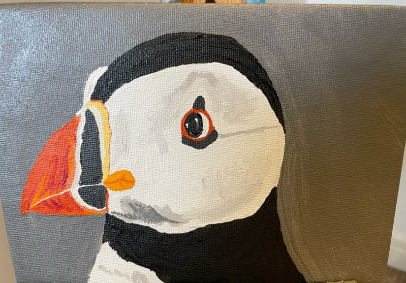
That bill isn’t just colorfulit’s structured
The Atlantic puffin’s bill is the headline act: bold, triangular, and layered with color zones that often include
orange-reds, yellows, and cooler gray-blue notes near the base. For painting, think of it less like a flat “orange
beak” and more like a little sculpted mask. The angles and planes catch light differentlyespecially along the ridge
and near the mouth lineso you’ll get a more convincing result if you map highlights and shadows early.
Also: the puffin’s look changes by season. In the breeding season, adults tend to show the showiest bill colors and
cleaner facial contrast. Outside that period, the face can appear darker and the bill less flamboyant. Translation for
artists: reference photos taken in summer can look like a different “character” than photos taken in winter. Both are
correctso choose your vibe on purpose.
Black-and-white is never just black-and-white
Puffins are black above and white below, but those areas behave very differently in paint. The black plumage often
reflects cool sky light, and the white belly picks up ambient color from ocean, cliffs, and fog. If you paint the bird
with pure tube black and pure paper-white, it can look like a sticker. Instead, treat the “black” as a deep mixture
with subtle temperature shifts, and treat the “white” as a family of light grays with warm/cool variation.
Proportions: the puffin is built like a sturdy little bowling pin
Puffins are compact: thick-set neck, short wings, and a body that reads as an oval that’s been to the gym. They also
stand upright on land, which can tempt you into making the head too small or the body too tall. A helpful mental model:
start with an egg-shaped body, then place a head that feels slightly larger than you’d expectbecause that bill visually
expands the entire head area. The legs are short and set back, which creates that signature “I’m balancing on tiny
stilts” stance.
Reference Without Becoming the Villain in the Bird’s Story
Puffins nest in colonies on coastal islands and cliffs, and they’re charismatic enough that humans can get a little
overexcited. If you’re collecting references in the field, prioritize distance and respect: use a long lens, keep noise
low, and follow local guidance. Many people see puffins from wildlife cruises or designated viewing areas. If you’re
painting from photos, consider using your own shots from responsible viewing, public-domain wildlife imagery, or licensed
references.
Artist tip: choose references with clear lighting. A slightly overcast day can be perfectsoft shadows, readable forms,
and fewer blown highlights on the bill. If your reference is harsh midday sun, simplify: reduce the number of tiny
highlight specks and focus on the big planes (bill ridge, cheek patch, crown, and belly).
Color Palette: How to Mix Puffin Colors Without Mud or Panic
For the plumage: build a “near-black” that breathes
A reliable approach is mixing a deep neutral from complementary colors (for example, a dark blue plus a warm brown or
dark red). You want a black that can lean cool in the shadow side and slightly warmer where reflected light hits. In
watercolor, you can layer transparent darks to keep them luminous. In acrylic, you can glaze thin dark layers after your
underpainting sets.
For the belly: paint the “white” as value first, color second
Decide your light direction, then block in the belly as a set of light values: a bright area facing the light, a gentle
turning shadow, and a darker underbelly where the bird overlaps the ground or rock. Once the structure works, tint those
lights with a whisper of environmentcooler near ocean reflections, warmer near sunlit rock.
For the bill and feet: separate hue zones like a stained-glass window
The fastest way to lose the puffin look is to blend the bill into a single orange gradient. Instead, identify the major
color blocks (orange-red tip, yellow accents, gray-blue base, and any darker seams). Paint them as connected shapes with
crisp edges, then soften only where the form turns. The feet usually read as warm orange, but they still need value
structureshadow between toes, darker under the body, and a highlight on the upper surfaces.
Pick Your Medium: Watercolor, Acrylic, Gouache, or “Yes”
Watercolor: perfect for puffin vibes and ocean air
Watercolor excels at soft atmospheric backgroundsmist, sea, sky gradientswhile still allowing sharp edges for the bill.
If you love luminous darks, layer them instead of trying to nail the perfect “black” in one pass. Keep the bill shapes
clean by letting layers dry fully before adding crisp boundaries.
Acrylic: great for graphic contrast and fast corrections
Acrylic makes it easy to push contrast: deep near-blacks, solid whites, and saturated bill colors. You can underpaint the
puffin as simple values (dark/medium/light), then glaze color on top. Bonus: if your bill goes a little clown-crazy, you
can fix it without sacrificing the whole bird.
Gouache: the underrated puffin superstar
Gouache gives you watercolor-like handling with the ability to paint opaque highlightsideal for bill shine, eye sparkle,
and feather edge accents. If you want a slightly stylized puffin with clean shapes and painterly edges, gouache is a very
friendly choice.
A Step-by-Step Puffin Painting Process You Can Actually Use
Step 1: Gesture and big shapes (before the beak steals your attention)
Start with a light gesture line indicating postureupright, leaning, or looking down. Then place two simple forms: an oval
for the body and a circle/oval for the head. Add the bill as a wedge shape. At this stage, you’re not drawing a puffin;
you’re placing a puffin-shaped problem on the page so you can solve it calmly.
- Check the angle of the head (it changes the entire personality).
- Check bill-to-head proportion (too small = generic bird; too huge = cartoon parrot).
- Place the eye early so the face doesn’t drift.
Step 2: Lock in value structure (the secret sauce)
Before adding full color, establish the three big values:
dark (crown/back), light (belly/cheek patch), and midtones (shadows on the belly, bill base areas, and any background
rocks). If the values read well in grayscale, the puffin will work even if your orange is “slightly too nacho.”
Step 3: Paint the face like a mask of shapes
Puffins have strong facial geometry: cheek patches, a distinct boundary where dark head meets lighter face areas, and a
bold bill base. Paint these as interlocking shapes. Keep edges crisp where anatomy demands it (bill edge, mouth line),
and softer where feathers transition (neck into body).
Step 4: Build the bill in layersstructure, then sparkle
Treat the bill like a mini landscape:
- Base layer: block in the main color zones cleanly.
- Form layer: add shadows under ridges and at the bill’s base where it meets the face.
- Detail layer: define the mouth line and any subtle ridges or plates without over-outlining.
- Highlight layer: add the shine lastsmall, intentional, and placed on the planes facing your light.
Step 5: Suggest feathers; don’t count them like you’re doing taxes
Puffin plumage reads as sleek and dense. You can hint at feather direction with a few strokes along the crown and
shoulder, but avoid making the bird fuzzy unless your reference truly shows fluff (for example, a young puffling). For
adults, you’ll usually get a better result with smooth transitions and selective texture.
Step 6: Give the puffin a world to live in
Background choices change the mood:
- Sea + sky gradient: clean, minimal, modern.
- Rocky cliff textures: natural and story-rich (watch your contrast so rocks don’t fight the bird).
- Soft fog: instant atmosphere; great for watercolor.
- Colony hints: tiny silhouettes in the distance can add context without clutter.
Composition Ideas Beyond “Center Puffin, Staring at Camera”
The profile portrait
A side view lets you show off bill shape and facial patterning cleanly. Use negative space: the triangular bill against
open sky can be striking.
The “fish delivery” moment
Puffins are famous for carrying multiple small fish crosswise in the bill. If you want narrative, this is it: movement,
purpose, and a built-in focal point. Keep the fish simplifiedshape and sparkleso they support the puffin rather than
becoming a second main character.
Low-angle puffin on rock
Paint the puffin as a little hero against the horizon. A low viewpoint exaggerates posture and gives you room for a big
skyperfect for dramatic lighting.
Common Puffin Painting Mistakes (and How to Fix Them Fast)
- Problem: The bird looks flat.
Fix: Increase value contrast on the bill planes and add a soft cast shadow under the body. - Problem: The bill looks like a single orange blob.
Fix: Re-establish distinct color zones and sharpen the mouth line. - Problem: The belly is pure white and feels cut out.
Fix: Add a gentle turning shadow and tint whites with environmental color. - Problem: The puffin looks like “generic seabird.”
Fix: Adjust proportions: slightly larger head mass, stronger bill wedge, and more upright stance.
Painting With Purpose: A Quick Note on Puffin Conservation
Puffins aren’t just adorablethey’re also sensitive indicators of ocean conditions. Along the U.S. Northeast, puffin
colonies have a conservation story that’s both hopeful and complicated: restoration projects helped bring puffins back to
nesting islands in Maine after they disappeared from many sites historically, but changing ocean conditions can affect the
availability of the small fish they rely on to feed chicks. For artists, this matters because it reminds us that “puffin
painting” isn’t only about a cute subject; it’s also about a real animal tied to real places and ecosystems.
If you want to add meaning without turning your painting into a lecture, use subtle storytelling: a hint of nesting
habitat, a suggestion of sea fog, or a composition that emphasizes distance and wildness. Your art can celebrate the
puffin while quietly respecting the fact that it’s not a propit’s a neighbor with a demanding ocean commute.
Artist Experiences: What “Puffin Painting” Feels Like in Real Life
Painting puffins has a funny way of turning you into a detective, a minimalist, and a weather reporterall before lunch.
The detective part happens first: you sit down with a reference photo or a field sketch and realize your brain has been
lying to you. You thought the puffin was “black and white with an orange beak.” Then you zoom in and find cool
blues in the shadows, warm browns in the dark plumage, pale grays in the cheek patch, and a bill that’s basically a color
theory seminar wearing a helmet. That discovery is one of the best parts. Puffins reward attention without demanding you
paint every microscopic feather.
The minimalist part comes next, usually when you try to paint the bill too carefully. Puffin bills are detailed, but
not in a fussy waythey’re defined by bold boundaries and clean planes. Many artists describe a “less is more” moment:
the puffin starts looking better when you stop drawing every line and instead commit to big shapes. It’s like carving a
little sculpture with paint. A clean wedge, a crisp mouth line, a carefully placed highlightand suddenly the bird
pops, even if you never painted a single “feather.”
If you ever paint puffins near the coast (or even just channel that coastal feeling in the studio), you discover why
so many puffin paintings have atmosphere. Coastal light is rarely neutral. Even on bright days, ocean reflections cool
your shadows. On foggy days, everything softens, and your edges become a creative decision rather than a fact. Artists
often find themselves simplifying the world so the puffin can be the star: a gentle sky wash, a few rock textures, and
the suggestion of wind. If you’ve never painted “wind” before, puffins will teach you. A slightly angled stance, a
tighter value range in the background, and a few directional strokes can imply weather without drawing a single gust.
Another surprisingly relatable experience: the emotional whiplash of the puffin’s expression. One minute it looks like a
dignified seabird; the next it looks like it’s judging your life choices (respectfully, but firmly). This is mostly an
eye-placement issue. Move the eye a millimeter and you can shift the mood from “hero portrait” to “cartoon sidekick.”
Many painters learn to pause at this stage, step back, and ask: “Is this the puffin I meant to paint?” If not, you fix
it earlybecause once you’ve lovingly rendered the bill, you will not want to admit the eye is wrong. (Ask literally any
painter. We have all been there. We all have the receipts.)
Puffin painting also becomes a surprisingly good practice in restraint with saturated color. That bill is bright, but if
you crank saturation everywhere, it stops feeling special. Experienced bird painters often treat the bill like jewelry:
it gets the cleanest edges, the most intentional highlights, and the boldest color. Everything else supports it with
quieter neutrals. This contrast makes the bill feel even more vivid, without you having to squeeze neon orange directly
from the tube and hope for the best.
Finally, puffin painting tends to leave you with a gentle sense of place. Even if your background is simple, you start
thinking about rocky islands, cold water, and the idea that this little bird can fly out over the ocean to find food and
return to a burrow. That context can change how you paint. You may choose cooler shadows, a salt-air palette, or a
composition that gives the puffin spaceliterally more sky, more sea, more breathing room. The result feels less like a
“bird illustration” and more like a moment. And that’s usually what people mean when they say a puffin painting has
charm: it captures not just the look of the bird, but the feeling of meeting it.
Conclusion
Puffin painting is the perfect mix of structure and play: bold shapes you can design confidently, plus color accents that
make viewers smile before they even know why. Start with strong proportions and values, treat the bill as a set of
purposeful color zones, and let the environment tint your whites and darks. Whether you’re painting a realistic Atlantic
puffin perched on granite or a whimsical puffin with watercolor splashes for feathers, the same rule applies: give the
bird solid form, then let personality take the microphone.