Table of Contents >> Show >> Hide
- What Exactly Is the Pinterest Paletteand Why People Pay Attention
- The 2025 Pinterest Palette at a Glance
- Meet the Colors Shaping a Very Colorful 2025
- Why This Palette Feels So “2025”
- How to Use the Pinterest Palette Without Turning Your Home Into a Bag of Skittles
- Room-by-Room Ideas You Can Actually Pull Off
- For Creators and Brands: Turning the Palette Into Scroll-Stopping Content
- Quick Color-Combo Cheat Sheet
- Experiences: A 7-Day Pinterest Palette Test Drive (Add This to Your Life, Not Your Stress)
- Conclusion
If you’ve ever opened Pinterest for a “quick idea” and resurfaced 47 minutes later with plans to repaint your entryway, learn sourdough, and start a cherry-themed capsule wardrobe… congratulations. You are exactly the kind of beautiful chaos that makes trend forecasting possible.
For 2025, Pinterest’s color predictions don’t whisper. They wink, they sing, and they occasionally show up holding a pickle margarita. The Pinterest Palette is pointing to a year that’s bold but livablehigh-energy hues paired with a creamy neutral that keeps everything from feeling like a children’s museum.
What Exactly Is the Pinterest Paletteand Why People Pay Attention
Pinterest isn’t just a mood-board machine; it’s a planning engine. People save ideas months before they act on them, which gives the platform a uniquely early window into what’s about to pop off in homes, closets, beauty routines, and even menus.
The 2025 Pinterest Palette is built from Pinterest’s own insights: the company looks at color-related searches and clusters, then maps them against first-party Pin color data and engagement signals like savesbasically, the internet’s biggest “keep this for later” button doing what it does best. The result is five trend-driven shades designed to travel across categories, from paint and fashion to manicures and mocktails.
The 2025 Pinterest Palette at a Glance
The five predicted colors are:
Cherry Red, Butter Yellow, Aura Indigo, Dill Green, and Alpine Oat.
Together, they read like a stylish charcuterie board: rich, bright, earthy, herbal, and creamy.
Here’s the fun part: this palette doesn’t demand you commit to a full-room makeover. You can use it like seasoningadd a pinch, taste, adjust, and avoid accidentally “color-drenching” your entire life in one weekend. (Unless you want to. I’m not your paint therapist.)
Meet the Colors Shaping a Very Colorful 2025
Cherry Red: The Main-Character Hue
Cherry Red is bold, rich, and unapologeticlike a great lipstick or a perfectly timed comeback in a group chat. Pinterest ties this shade to “Cherry Coded” energy: statement-making, a little nostalgic, and extremely camera-friendly.
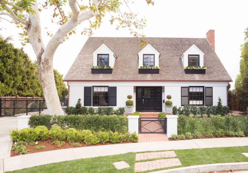
- Where it shines: front doors, powder rooms, statement chairs, holiday tables that aren’t actually for a holiday.
- Easy entry: a cherry-red throw, art print, vase, bar-cart moment, or a single painted interior door.
- Big commitment move: a cherry-red island, built-in, or accent wall that turns “neutral living room” into “editorial spread.”
- Pair it with: Alpine Oat for softness, Dill Green for a high-contrast “garden party,” or Aura Indigo for dramatic, moody polish.
If you’re nervous, use Cherry Red the way designers talk about the “unexpected red” pop: small, intentional, and placed where your eye naturally lands (entryway, mantel, kitchen shelf styling). It’s the color equivalent of adding hot saucestart with a dash.
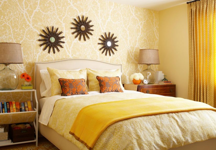
Butter Yellow: Cozy Sunshine Without the Cartoon Vibes
Butter Yellow is the warm, soft glow of a lamp at golden hour. It’s playful, but not loudmore “French bakery” than “highlighter marker.” Pinterest links this shade to whimsical, styled aesthetics that feel vintage and fresh at the same time.
- Where it shines: kitchens, breakfast nooks, kids’ rooms that don’t look like a toy explosion, and anywhere you want a mood lift.
- Easy entry: a butter-yellow rug, backsplash tile, lampshade, bedding, or a painted thrifted side table.
- Big commitment move: butter-yellow cabinetry or a color-drenched office for cheerful focus.
- Pair it with: Aura Indigo for a modern “sun + twilight” contrast, or Alpine Oat for a creamy monochrome that still feels warm.
Butter Yellow also photographs beautifully. If you create content, it’s a background color that looks bright without blowing out your exposure (translation: fewer “why does my kitchen look neon?” regrets).
Aura Indigo: Lilac With an Edge
Aura Indigo is that in-between shade that makes people argue (affectionately) about whether it’s purple or blue. It’s moody, slightly cosmic, and feels like it belongs in a velvet jewelry boxor a modern bedroom with crisp white bedding and excellent lighting.
- Where it shines: bedrooms, creative studios, glam bathrooms, and “I want a little drama” corners.
- Easy entry: candles, textiles, art, a painted nightstand, or even a statement tile in a small niche.
- Big commitment move: a saturated wall behind the bed, or built-ins painted Aura Indigo with warm metal hardware.
- Pair it with: Butter Yellow for pop, Alpine Oat for softness, or Cherry Red for a luxe jewel-tone story.
If you’re trying to make a space feel “designed” without adding a million objects, Aura Indigo is your cheat code. One confident surface can do the work of 20 extra accessories.
Dill Green: The New “Interesting Neutral”
Dill Green is earthy, tangy, and surprisingly sophisticated. It’s the kind of green that feels like a nod to nature, but also like you know what you’re doing. Pinterest literally describes it as “pickled perfection,” and honestly? Accurate.
- Where it shines: kitchens (hello, cabinets), pantries, mudrooms, and anywhere you want grounded energy.
- Easy entry: dishware, linens, planters, a painted stool, or a simple olive-to-dill floral arrangement.
- Big commitment move: lower cabinets in Dill Green, paired with Alpine Oat walls and warm wood.
- Pair it with: Alpine Oat for calm, Cherry Red for bold contrast, or Aura Indigo for a deep, botanical mood.
Pro tip: Dill Green loves texture. Think rattan, linen, matte ceramics, unlacquered brass, and wood with visible grain. It’s basically the color version of “touch grass,” but inside.
Alpine Oat: The Creamy Neutral That Makes Everything Else Look Expensive
Alpine Oat is your new baseline. It’s a milky, cozy beige that reads modern when done rightless “builder beige,” more “well-steamed oat milk latte.”
- Where it shines: everywhere. Walls, trim, upholstery, bedding, and as the glue that holds the palette together.
- Easy entry: swap stark white for Alpine Oat in pillows, curtains, or a warm neutral paint.
- Big commitment move: whole-room neutral layering (walls + textiles + rugs) to create a calm backdrop for bolder accents.
- Pair it with: literally the entire paletteespecially Cherry Red and Dill Green.
Alpine Oat also plays nicely with both warm and cool metals. If your hardware is brass, it works. If it’s black, it works. If it’s “I bought this in 2017 and refuse to change it,” it still probably works.
Why This Palette Feels So “2025”
Here’s the bigger story: 2025 color trends aren’t just about brightness. They’re about specificity. Pinterest and design media have been pointing out how these hues feel like they have a point of viewdistinct shades tied to aesthetics, moods, and even foods (cherries, butter, dill, oats). It’s self-expression with a practical streak: you can go bold, but you can also come home and relax.
That theme matches what many major “color of the year” announcements have been saying too: cozy, grounded tones (browns, purples, earthy reds) are still huge, but people are also hungry for curated pops that feel personal rather than random. So Pinterest’s palette becomes a bridge: it gives you the expressive colors and the creamy neutral to keep them wearable.
How to Use the Pinterest Palette Without Turning Your Home Into a Bag of Skittles
1) Pick one “hero” color and one “supporting actor”
Choose a single star (Cherry Red, Butter Yellow, Aura Indigo, or Dill Green), then let Alpine Oat act as your calm backdrop. If you want a second bold color, keep it to accents.
2) Use the 60–30–10 rule (because math can be fashionable)
Think 60% dominant (usually Alpine Oat or another neutral), 30% secondary (a softer color like Butter Yellow or Dill Green), 10% accent (Cherry Red or Aura Indigo). This keeps things energetic but intentional.
3) Test colors in your real lighting
A color that looks like “soft butter” in daylight can look like “sad mustard” at night under cool LEDs. Swatch, live with it for a day, and trust your eyeballs more than your screen.
4) Let texture do some of the work
If you want the palette to feel grown-up, bring in texture: linen, boucle, ribbed glass, matte ceramics, natural wood, and woven fibers. Texture turns bold color into “designed,” not “decorated.”
Room-by-Room Ideas You Can Actually Pull Off
Kitchen
- Dill Green lower cabinets + Alpine Oat walls + warm wood shelves.
- Butter Yellow backsplash tile to brighten a neutral kitchen.
- Cherry Red bar stools or a small appliance moment (yes, your toaster can be cute).
Living Room
- Alpine Oat walls + Aura Indigo art + Cherry Red pillow or throw.
- Dill Green curtains for a grounded, nature-inspired frame.
- Butter Yellow accents in books, ceramics, or a single statement chair.
Bedroom
- Aura Indigo accent wall behind the headboard, balanced by Alpine Oat bedding.
- Butter Yellow bedside lampshades for warm glow.
- Cherry Red in a small, intentional detail: a bench cushion, artwork, or bedside book stack.
Bathroom
- Cherry Red vanity (or even just the vanity door) with warm metal hardware.
- Dill Green tile or painted wainscoting for spa-but-interesting energy.
- Alpine Oat towels + Butter Yellow candle = instant cozy.
For Creators and Brands: Turning the Palette Into Scroll-Stopping Content
Pinterest’s palette isn’t only for redecorating. It’s also a creative planning tool. If you make ads, shoot products, design packaging, or build seasonal campaigns, color can be the fastest way to look “current” without changing your entire brand voice.
- Content themes: “Cherry-coded” outfits, butter-yellow spring refreshes, cosmic Aura Indigo beauty looks, Dill Green kitchen edits, Alpine Oat cozy layering.
- Seasonal mapping: Butter Yellow in spring, Cherry Red for late summer and holiday, Dill Green for kitchens year-round, Aura Indigo for fall/winter mood, Alpine Oat always.
- Product styling: Use Alpine Oat as the hero background, then add one bold prop color for instant visual identity.
Bonus: Pinterest provides palette values (like hex/RGB/CMYK) so designers can keep color consistent across print, web, and videoaka fewer “why is this purple suddenly blue?” arguments in your team chat.
Quick Color-Combo Cheat Sheet
- Soft & sunny: Alpine Oat + Butter Yellow + warm wood + brass.
- Modern botanical: Alpine Oat + Dill Green + black accents + linen.
- Bold but elegant: Alpine Oat + Cherry Red + deep walnut + gold.
- Cosmic cozy: Alpine Oat + Aura Indigo + soft white + velvet textures.
- High-contrast, high-style: Dill Green + Cherry Red + Alpine Oat (add a stripe or checker pattern for extra punch).
- Playful editorial: Butter Yellow + Aura Indigo + Cherry Red (keep it mostly accents so it feels curated, not chaotic).
Experiences: A 7-Day Pinterest Palette Test Drive (Add This to Your Life, Not Your Stress)
Trend reports are fun, but the real magic is how color feels in your actual Tuesday. So here’s a week-long “test drive” that doesn’t require a full renovation, a design degree, or selling your soul to a paint store.
Day 1: Alpine Oat Reset. Start by softening your base. Swap one harsh-white item (a pillow cover, a bath towel, a lampshade) for something creamy. Notice how the room immediately looks calmerlike it drank water and went to bed on time.
Day 2: Butter Yellow Morning Boost. Add Butter Yellow where you start your day: a kitchen towel, a mug, a small vase, or a throw on the breakfast chair. The experience is weirdly practicalyellow makes the space feel warmer even if it’s freezing outside, like emotional central heating.
Day 3: Dill Green “Touch Grass” Moment. Bring Dill Green into a functional zone: a pantry bin, a cutting board display, a plant pot, or a set of napkins. The vibe is grounded and fresh, and it plays nicely with wood, stone, and anything that looks like it came from nature instead of a factory.
Day 4: Aura Indigo After-Hours Glow. Try Aura Indigo at night: a candle, a throw blanket, or a single piece of art. This color has “mood lighting” energy even when it’s not actually lit. It makes a room feel curated, like you have a playlist for every emotion (even if you really just hit shuffle).
Day 5: Cherry Red Confidence Sprinkle. Put Cherry Red where it can do its job: near the entry, on the dining table, or in your outfit. The experience is immediatered reads intentional. Even a small pop feels like you made a decision, which is a rare and powerful feeling in modern life.
Day 6: Mix Two Colors on Purpose. Choose a duo: Butter Yellow + Aura Indigo (playful contrast) or Dill Green + Cherry Red (bold, earthy drama). Keep the mix to small objectsthink a bowl + napkins, or a pillow + art. Your goal is harmony, not a color cage match.
Day 7: Photograph and Edit Nothing. Take a quick photo in daylight and one at night. If the colors still look good without heavy filters, you’ve found a combination that works in real life, not just on a perfectly lit mood board. That’s the whole point: Pinterest can inspire the “what,” but your space decides the “how.”
The best part of this experiment is that it teaches you your comfort level. Maybe you’re a full Cherry Red person. Maybe you’re an Alpine Oat minimalist who enjoys Dill Green in small, responsible doses. Either way, you’ll end the week with a palette that feels personaland that’s the trend that never goes out of style.
Conclusion
The Pinterest Palette for 2025 is a reminder that “vibrant” doesn’t have to mean “loud.” These colors are expressive, but they’re also flexible: Cherry Red brings confidence, Butter Yellow adds warmth, Aura Indigo delivers mood, Dill Green grounds everything, and Alpine Oat makes it all feel elevated instead of chaotic.
If you take one idea into 2025, let it be this: pick a color with a point of view, give it a neutral best friend, and use texture to make it feel intentional. Your home, your outfits, and yeseven your mocktailswill thank you.