Table of Contents >> Show >> Hide
- Why A Cloth Napkin Is A Sneaky-Good Color Coach
- The Napkin-to-Home Playbook: How To Pull A Color Scheme From Fabric
- Read Your Napkin Like A Designer: Hue, Value, And Saturation
- Undertones: The Reason “Perfect Beige” Turns Peachy At Night
- Make It Work In Your Actual House: Lighting, Sampling, And Reality Checks
- Pattern Without Panic: How To Keep It From Looking Too Busy
- Use Tech Without Letting Tech Boss You Around
- Four Specific Napkin-to-Room Examples You Can Copy
- Room-to-Room Flow: Let One Napkin Set The Whole House Up For Success
- Common Mistakes (And The Fast Fixes)
- Try This Shopping Checklist (So You Don’t Buy 37 Things)
- Experience Notes: What It’s Actually Like To Design From A Cloth Napkin (About )
- Conclusion
- SEO Tags
If you’ve ever stood in the paint aisle holding six “perfect” swatches and feeling your confidence evaporate
like a puddle in July… you’re not alone. Color decisions get weirdly emotional. One minute you’re “just picking
a warm white,” and the next you’re debating whether Eggshell Whisper is secretly green (it is).
Here’s a surprisingly sane shortcut: use a cloth napkin as your color scheme inspiration. Yesan actual napkin.
Not a “mood board” that requires three apps, four Pinterest boards, and a minor identity crisis. A cloth napkin
gives you a ready-made palette with built-in balance: a background, supporting shades, and accent popsall
already proven to look good together because they’re literally printed and woven to do exactly that.
Whether you’re decorating a dining room, refreshing a kitchen, planning a party tablescape, or trying to make
your living room feel less like “I moved in yesterday,” a napkin can act like a tiny fabric compass pointing you
toward a cohesive color story.
Why A Cloth Napkin Is A Sneaky-Good Color Coach
1) It’s a real-life palette (not a screen fantasy)
Digital inspiration is fununtil your “soft terracotta” turns into “traffic cone” on the wall. Cloth napkins live
in the real world, under real light, next to real surfaces. They help you see how colors behave outside the
perfect lighting of a staged photo.
2) It includes texture, not just color
A woven linen napkin reads differently than a smooth cotton one. Texture changes how color feels: a slubby weave
can soften bright hues; a crisp twill can make the same hue look sharper. That’s important when you’re translating
“napkin blue” into paint, upholstery, tile, or wallpaper.
3) It often has built-in “rules” designers use
Many napkin patterns naturally follow what designers do on purpose: a dominant color, one or two supporting colors,
and a smaller accent. In other words, the napkin is already doing the math so you don’t have to.
The Napkin-to-Home Playbook: How To Pull A Color Scheme From Fabric
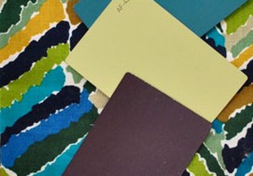
Step 1: Pick the “vibe napkin,” not the “random napkin”
Start with a cloth napkin you genuinely likenot one you tolerate because it was on sale in a four-pack.
Look for a napkin that matches the mood you want:
- Calm and airy: soft blues, oatmeal, sage, warm whites
- Cozy and grounded: rust, caramel, olive, deep navy, chocolate
- Playful and energetic: citrus tones, turquoise, coral, punchy pink
- Classic and polished: crisp neutrals with one rich accent (black, emerald, burgundy)
Pro tip: patterns make palette-building easier because they include multiple shades. Solids can work too, but you’ll
need to choose supporting and accent colors more intentionally.
Step 2: Identify the “big three” colors
Spread the napkin out and squint (yes, squinting counts as design strategy). Ask:
- Dominant color: What color takes up the most space? (Often the background.)
- Secondary color: What supports the dominant shade without competing?
- Accent color: What shows up in smaller pops that make the pattern feel finished?
If your napkin has five or six colors, don’t panic. You don’t have to use them all. Pick three to build the core
scheme, then treat the rest like “optional guest stars.”
Step 3: Assign each color a job using the 60-30-10 guideline
A simple way to prevent “everything is bold and now my room looks like a candy wrapper” is the 60-30-10 guideline:
- 60%: the dominant color (walls, big rug, large furniture)
- 30%: the secondary color (curtains, upholstery, major accents)
- 10%: the accent color (pillows, art, vases, napkins themselves)
The point isn’t to measure your sofa with a tape measure; it’s to keep balance. If you love your accent color, you
can bump it upbut do it on purpose, not by accident.
Step 4: Translate napkin colors into materials
Fabric-to-paint matching is not one-to-one. Instead, aim for “same family, similar mood.” A napkin’s teal might
become a softer dusty teal on the wall, while the napkin stays bright as the accent.
- Walls: choose a quieter version of the dominant or secondary color
- Big furniture: use neutrals or the secondary color to ground the room
- Accessories: let the accent color show up in smaller, repeatable moments
- Metals/woods: match the napkin’s undertone (warm napkin → warmer woods/brass; cool napkin → cooler woods/nickel)
Read Your Napkin Like A Designer: Hue, Value, And Saturation
Hue: the “what color is it” part
This is the obvious part: blue, green, red, etc. But hue alone doesn’t guarantee harmony.
Value: how light or dark it is
Value is why a room can feel soothing or dramatic even if it’s “all blue.” A napkin that mixes a pale blue
background with a deep navy stripe gives you a ready-made light-to-dark range. That range is gold when you’re
creating contrast without adding extra colors.
Saturation: how intense it is
Highly saturated colors feel lively (and sometimes loud). A napkin often balances saturation by pairing a bright
accent with softer supporting shades. Copy that strategy. If your napkin has a neon-ish coral, use it in small
hitsdon’t paint your entire hallway “Coral Confidence” unless you truly want to feel like you live inside a
grapefruit.
Undertones: The Reason “Perfect Beige” Turns Peachy At Night
Undertones are the subtle warm/cool lean hiding under a color. Two paints can look identical on a tiny chip and
completely different on a wall because one has a pink undertone and the other has a green undertone.
A cloth napkin helps you spot undertones faster. Hold your napkin next to something truly white (printer paper
works) and something truly gray. Does the napkin read warmer (yellow/red/brown) or cooler (blue/green/gray)?
That’s your undertone directionand it should guide everything from paint to flooring to metals.
Make It Work In Your Actual House: Lighting, Sampling, And Reality Checks
Take the napkin on a lighting tour
Walk your napkin around the room in the morning, midday, and evening. Natural light and bulbs change color
perceptionsometimes dramatically. If your napkin’s creamy background looks gray at night, that’s a hint your
room’s lighting skews cool, and you may need warmer supporting colors to balance it.
Sample paint the smart way
Don’t pick paint at the store and hope for the best. Instead, bring the napkin home first, then choose a few
paint candidates that match its dominant or secondary color family. Test large swatches (or sample boards) and
view them next to the napkin under your room’s lighting.
Also: pick your “fixed” items before final paint when possiblethings like countertops, flooring, or a sofa
you’re keeping. Your napkin should harmonize with what’s staying, not just what you wish was staying.
Pattern Without Panic: How To Keep It From Looking Too Busy
Use the napkin pattern as your “hero,” then rotate in solids
If your napkin is patterned, you already have movement. Balance it with solids in similar tonesthink solid
curtains, a simple rug, or a calm wall color. If everything is patterned, your eyes won’t know where to rest.
Mix scale like a grown-up
Big pattern + medium pattern + small pattern works better than “six mediums fighting for dominance.”
If your napkin has small stripes, pair it with a larger-scale pattern elsewhere (like a bigger plaid or a bold
abstract) and a solid to break it up.
Use Tech Without Letting Tech Boss You Around
If you want extra help pulling exact shades, snap a photo of your napkin in natural light and use an online
palette extractor or color wheel tool to identify the main colors. This is especially useful for:
- Finding a paint “neighbor” that feels like the napkin color, not a harsh copy
- Creating a set of 3–5 coordinating colors from one fabric
- Testing complementary vs. analogous combinations before you buy anything
Still, trust your eyes in your space. Screens are helpful, but your living room is not a screen (unless you’re
decorating inside a giant tablet, in which case… respect).
Four Specific Napkin-to-Room Examples You Can Copy
Example 1: Cream + Navy + Mustard (the “smart casual” palette)
Imagine a cream linen napkin with navy stripes and a tiny mustard stitch. Use cream as the wall color or main
upholstery (60%), navy for larger anchors like a rug border or dining chairs (30%), and mustard as the accent in
art, a vase, or two killer throw pillows (10%). This combo feels classic but not boring.
Example 2: Sage + Warm White + Terracotta (the “organic calm” palette)
A soft sage napkin with warm-white background and terracotta accents practically decorates a kitchen or breakfast
nook by itself. Keep walls warm white, bring in sage through cabinetry, open shelving, or textiles, and sprinkle
terracotta via pottery, planters, or a patterned runner.
Example 3: Dusty Blue + Sand + Coral (the “beach, but adult” palette)
A dusty blue napkin with sandy beige and coral detailing works beautifully in a living room. Let beige ground the
room (so it doesn’t feel chilly), use dusty blue in a larger element like an area rug or drapery, and keep coral
as a “surprise and delight” color in small decor. The result: breezy, not theme-park.
Example 4: Cranberry + Forest Green + Gold (the “holiday that doesn’t scream” palette)
If your napkin includes cranberry, forest green, and a hint of gold, borrow the colors for a seasonal refresh
without turning your home into a decoration warehouse. Keep neutrals dominant, use green in foliage and a few
textiles, and let cranberry appear in candles, ribbons, or napkin rings. Gold can show up as metal accents.
Room-to-Room Flow: Let One Napkin Set The Whole House Up For Success
If you like a cohesive home, treat your napkin palette as a “house palette,” not just a single-room idea.
You can repeat one color (like the dominant neutral) throughout, then swap accent colors by room.
That way the house feels connected, but each space still has its own personality.
Common Mistakes (And The Fast Fixes)
Mistake: Matching everything perfectly
If your napkin’s exact teal appears on the walls, sofa, curtains, and the dog’s sweater, it can feel flat.
Fix it by layering shades: choose lighter/darker versions of the same hue and mix textures (matte paint + velvet
pillow + ceramic vase).
Mistake: Using every color in the napkin
Five colors can be fabulous in fabricand chaotic in a room. Fix it by choosing three core colors, then use the
others only if needed in tiny amounts (like art or a small accessory).
Mistake: Ignoring undertones
Warm napkin + cool wall paint = “Why does everything look slightly sick?” Fix it by aligning undertones: warm with
warm, cool with cool, or intentionally contrast while keeping one neutral consistent.
Mistake: Forgetting lighting
A color that looks perfect at noon can look muddy at 8 p.m. Fix it by sampling in your room and adjusting the
color’s brightness (lighter/darker) rather than switching the hue completely.
Try This Shopping Checklist (So You Don’t Buy 37 Things)
- Bring the napkin (or a clear photo) when shopping.
- Pick 3 core colors: dominant, secondary, accent.
- Choose 1–2 neutrals to act as “breathing room.”
- Test paint candidates at home, next to the napkin.
- Repeat the accent color at least 2–3 times for a cohesive look.
- Mix textures so the palette feels layered, not flat.
Experience Notes: What It’s Actually Like To Design From A Cloth Napkin (About )
The first “experience” most people have with this method is relieffollowed immediately by suspicion.
A napkin? Really? But once you try it, you notice something important: the napkin doesn’t just hand you colors,
it hands you confidence. That’s because your brain can stop inventing combinations from scratch and start
editing a combination that already works.
Here’s what it tends to look like in real life. You lay the napkin on the table like it’s evidence in a cozy
mystery novel. Then you start pulling nearby objects into the “investigation”: a wood sample, a tile, a paint fan
deck, maybe a throw pillow you swear you’re not emotionally attached to (you are). Suddenly you can see harmony
and conflict quickly. That warm creamy stripe in the napkin? It makes your “cool white” paint chip look a little
icy. The tiny olive detail? It makes your brass hardware feel intentional instead of random. It’s like the napkin
is quietly whispering, “Yes, this works,” or “No, ma’am, that’s a different undertone.”
Another common experience: you realize you don’t need as many new items as you thought. When you have a clear
palette, you stop buying “pretty things” and start buying “pretty things that belong here.” That one accent color
becomes your filter. If the object doesn’t play nicely with your napkin palette, it doesn’t come home with you.
(This is also known as “saving money,” a thrilling hobby.)
You’ll also notice how quickly the 60-30-10 balance shows itself. If your cart is full of accent-color items,
your future room is about to feel shouty. If everything is neutral, the room might feel safe but sleepy. Designing
from a napkin makes it easier to correct course earlybefore you’re standing in a room full of beige wondering why
it feels like a waiting area.
The most surprising part, though, is how personal it becomes. People often pick napkins for emotional reasons:
a color that reminds them of a favorite trip, a pattern that feels like their grandmother’s table, a tone that
makes everyday dinner feel a little more special. When you build a room palette from that napkin, you’re building
from a story, not just a trend. The space ends up feeling more “you,” even if you can’t explain whyexcept that
you can, because the napkin is right there. Tiny. Fabric. Proof.
And yes, you may eventually become the person who says things like, “I’m choosing curtains based on my napkins.”
Don’t worry. It sounds odd until your room looks pulled togetherand then it sounds like genius.
Conclusion
Using a cloth napkin for color scheme inspiration is equal parts practical and fun: it gives you a real-world
palette with built-in balance, helps you spot undertones, and makes it easier to translate color into paint,
textiles, and decor without guessing. Start with a napkin you love, pull three core colors, assign them jobs, test
in your lighting, and let texture do some of the heavy lifting. The best part? When you’re done, you can still use
the napkin for dinnerbecause good design should be useful, not precious.