Table of Contents >> Show >> Hide
- Step 1: Figure Out Your Gray’s “Personality” (Undertone + Light)
- Best Color Families to Pair With Gray Walls
- 1) Crisp white + soft black: the “always works” combo
- 2) Navy and deep blues: instant sophistication
- 3) Sage, olive, and earthy greens: calm, lived-in, and modern
- 4) Blush, dusty rose, and soft mauves: surprisingly chic with gray
- 5) Mustard and warm yellows: bright energy without neon chaos
- 6) Terracotta, rust, and burnt orange: warm, cozy, and very forgiving
- 7) Teal and blue-green: bold, but still calming
- 8) Burgundy, plum, and jewel tones: moody elegance
- 9) Beige, cream, and warm neutrals: the anti-cold-gray solution
- Easy Color-Palette Recipes for Gray-Wall Living Rooms
- How to Use Accent Colors Without Overdoing It
- Matching Metals and Wood Tones With Gray Walls
- Common “Gray Wall” Mistakes (and Easy Fixes)
- Choosing the Right Accent Color Based on Your Lifestyle
- Extra: Real-World “Gray Wall” Experiences (Common Scenarios People Run Into)
Gray walls are the sweatpants of paint colors: comfy, reliable, and somehow appropriate for both a fancy dinner party
and a Saturday binge-watch. But here’s the twistgray is not “just gray.” Some grays lean blue and icy, some lean
warm and cozy (hello, greige), and some are moody enough to make your houseplants feel judged.
The good news? Once you figure out what kind of gray you’ve got, choosing decorating colors gets a lot easierand
way more fun. Below are color pairings that work beautifully with gray walls in a living room, plus practical tips
(and a few “learn-from-other-people’s-mistakes” moments) to help you pull it all together without repainting your
life.
Step 1: Figure Out Your Gray’s “Personality” (Undertone + Light)
Before you buy 12 throw pillows and accidentally start a pillow-based economy, take a minute to identify your gray’s
undertone. This is the hidden color vibe that makes a gray feel cool, warm, or slightly… confusing.
Quick clues your gray is cool-toned
- It looks crisp, steely, or slightly bluish in daylight.
- It plays nicely with chrome, polished nickel, and glass.
- It can feel a bit “modern gallery” if the room lacks warm textures.
Quick clues your gray is warm-toned
- It has a soft “mushroom,” taupe, or beige-adjacent look (often called greige).
- It warms up around wood tones, leather, and brass.
- It tends to feel invitingeven on cloudy days.
Lighting changes everything (yes, even your opinions)
Gray shifts dramatically depending on natural light direction, bulb temperature, and even what’s outside your window.
A gray that looks calm at noon can look blue at dusk and greenish at 8 p.m. under warm LEDs. Test paint chips or large
swatches on multiple walls and check them morning, afternoon, and night before committing your décor budget.
Best Color Families to Pair With Gray Walls
Think of gray as a neutral stage backdrop. Your accent colors are the cast. The goal is balance: enough contrast for
interest, enough harmony for calm, and enough texture so the space doesn’t feel like a waiting room that’s proud of
its clipboard collection.
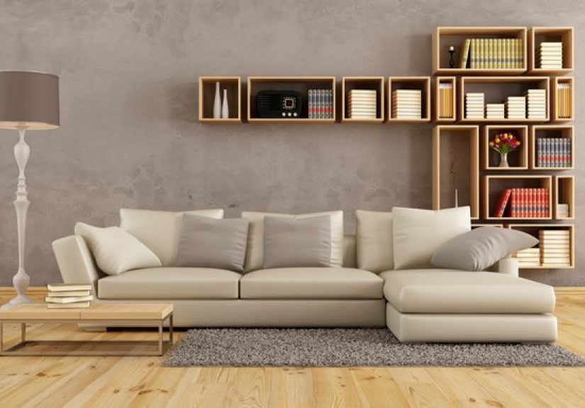
1) Crisp white + soft black: the “always works” combo
Pairing gray walls with white trim, white upholstery, and black accents is clean, timeless, and easy to update later.
It’s especially great for cool grays because it reinforces that fresh, airy feel.
- Try it: White sofa or curtains + black picture frames + gray walls + a textured rug.
- Keep it cozy: Add warmth with wood (oak, walnut) and a few woven textures.
2) Navy and deep blues: instant sophistication
Blue and gray are natural best friendsespecially navy. Navy anchors the room, makes gray look intentional, and adds
“grown-up” energy without going full dramatic-blackout-curtains.
- Try it: Navy accent chair, navy throw pillows, or a navy area rug pattern.
- Finish it: Brass or warm wood to keep the palette from feeling chilly.
3) Sage, olive, and earthy greens: calm, lived-in, and modern
If you want a living room that feels like a deep breath, green is your move. Soft sage pairs beautifully with cool
grays, while olive and mossy greens look incredible with warm grays and greige.
- Try it: Sage curtains + creamy pillows + jute rug + plants (your plants will feel seen).
- Pro tip: Repeat green in at least two places (pillow + art, or plant + throw) for cohesion.
4) Blush, dusty rose, and soft mauves: surprisingly chic with gray
Gray and blush is a modern classic: the gray keeps it grounded, and the blush adds warmth and softness. This pairing
works especially well for mid-tone grays that risk feeling flat.
- Try it: Blush pillows + white/cream sofa + warm wood coffee table.
- Upgrade it: Add a touch of black for structure (frames, lighting, or hardware).
5) Mustard and warm yellows: bright energy without neon chaos
Yellow brings instant sunlight to gray walls. Mustard and butter-toned yellows are especially good because they feel
warm and intentionalnot “highlighter accidentally exploded.”
- Try it: Mustard throw blanket + patterned pillow + warm brass lamp.
- Balance it: Use yellow as an accent (10–15%), not the whole story.
6) Terracotta, rust, and burnt orange: warm, cozy, and very forgiving
Want gray walls to feel less “cool modern” and more “inviting cozy”? Add terracotta and rust tones. These earthy
shades play beautifully with warm grays and make a space feel collected, not sterile.
- Try it: Rust velvet pillow + tan leather chair + woven basket textures.
- Works best with: Greige, mushroom grays, and taupe-leaning grays.
7) Teal and blue-green: bold, but still calming
Teal is the fun cousin of navymore playful, still sophisticated. Teal and gray can read coastal, mid-century, or
contemporary depending on your furniture and metals.
- Try it: Teal artwork + gray walls + white sofa + walnut tones.
- Keep it classy: Stick to deeper teals rather than bright aqua for living rooms.
8) Burgundy, plum, and jewel tones: moody elegance
If your gray walls are medium to dark, jewel tones can look incredible. Burgundy and plum add depth, while emerald
gives a lush contrast. This is the palette for people who want “cozy drama,” not “haunted hallway.”
- Try it: Charcoal-gray walls + burgundy accents + brass + creamy textiles.
- Best tip: Use rich colors in soft materials (velvet, wool, boucle) to avoid harsh contrast.
9) Beige, cream, and warm neutrals: the anti-cold-gray solution
Sometimes the best “color” is just warmth. Creamy whites, sand, oatmeal, and camel tones soften gray walls and make
the space feel welcoming. If you’re nervous about bold accents, start here.
- Try it: Cream sofa + oatmeal rug + tan leather + gray walls.
- Texture matters: Layer linen, wool, boucle, and natural fibers to prevent blandness.
Easy Color-Palette Recipes for Gray-Wall Living Rooms
If you want plug-and-play options (no interior design degree required), here are palettes that consistently work. Each
includes a “role” for the color so you don’t accidentally make every item fight for attention.
Palette A: Modern Calm
- Base: Gray walls + warm white
- Accent: Sage green
- Pop: Black (frames, lighting)
- Materials: Light oak, linen, woven textures
Palette B: Cozy Warmth
- Base: Warm gray/greige + cream
- Accent: Terracotta/rust
- Support: Camel/tan leather
- Metals: Brass/antique gold
Palette C: Crisp Classic
- Base: Cool gray + bright white
- Accent: Navy
- Support: Medium wood
- Metals: Chrome or polished nickel
Palette D: Soft and Stylish
- Base: Mid-gray + warm white
- Accent: Blush/dusty rose
- Support: Charcoal details
- Materials: Velvet, boucle, natural wood
Palette E: Moody Luxe
- Base: Deep gray/charcoal + cream
- Accent: Burgundy or emerald
- Support: Black accents
- Metals: Brass (adds glow)
How to Use Accent Colors Without Overdoing It
Use the 60–30–10 guideline (without turning it into math homework)
- 60%: Main color (gray walls + big pieces like sofa/rug base)
- 30%: Secondary color (curtains, chairs, major textiles)
- 10%: Accent color (pillows, art, accessories)
Repeat your accent color at least twice
One random teal vase can look like it got lost on its way to another home. Repeating teal in art, a pillow, or a throw
makes it feel intentional and “designed.”
Let texture do some of the decorating
Gray walls love texture. If you keep colors mostly neutral, layer texture through rugs, baskets, chunky knits, wood
grain, stone, and mixed fabrics. Texture prevents gray from feeling flat even with a minimal palette.
Matching Metals and Wood Tones With Gray Walls
Metals
- Brass/antique gold: Warms up gray and adds a soft glow (great for warm grays and greige).
- Chrome/polished nickel: Crisp, modern, and cool (great for cool grays).
- Matte black: Works with almost any gray and adds contrast without clutter.
Wood
- Light oak/maple: Brightens gray rooms and keeps them airy.
- Walnut/medium wood: Adds richness and balances gray’s coolness.
- Very dark wood: Looks dramatic with light grayjust add warm textiles to avoid “formal” vibes.
Common “Gray Wall” Mistakes (and Easy Fixes)
Mistake: The room feels cold
Fix: Add warm neutrals (cream, camel), swap to warmer bulbs, introduce wood, and use warm accents like
terracotta or mustard.
Mistake: Everything is gray and nothing stands out
Fix: Add contrast with black details, a deep accent color (navy, emerald), or a patterned rug with
multiple tones.
Mistake: The gray looks “off” next to your furniture
Fix: It’s usually undertones. Pull in accent colors that match the undertone (cool gray + blues/greens;
warm gray + creams/rusts). Artwork can also bridge awkward undertone gaps.
Choosing the Right Accent Color Based on Your Lifestyle
If you have kids or pets
Choose forgiving, deeper accents (navy, olive, rust) and patterned textiles that hide everyday life. Gray already does
a lot of the heavy lifting herelean into it.
If you’re a minimalist
Go tonal: gray + white + black, then use texture and one subtle accent (sage, dusty blue). Minimal doesn’t have to
mean “empty,” it just means “calm with confidence.”
If you love changing things seasonally
Keep your big items neutral and rotate accents:
- Spring: sage, blush, light blue
- Summer: teal, crisp white, natural fibers
- Fall: rust, mustard, burgundy
- Winter: navy, evergreen, cream, metallic sparkle
Extra: Real-World “Gray Wall” Experiences (Common Scenarios People Run Into)
Here’s the part nobody tells you when you pick gray paint: you’re not just choosing a coloryou’re choosing a
relationship. And like any relationship, it gets weird under certain lighting.
One of the most common experiences people share is the “my gray turned blue” moment. They paint the living room, step
back, and suddenly the walls feel like they’re auditioning for an iceberg documentary. This tends to happen with cool
grays in north-facing rooms or spaces with lots of cool daylight. The fix is usually not repainting (deep breaths): it’s
warming up the room with cream textiles, warm wood, and brass lighting. Even swapping pillow covers from bright white
to off-white can make the gray read less icy.
Another classic: the “gray ate my furniture” problem. A medium gray wall plus a medium gray sofa plus a medium gray
rug can create a room where everything politely blends… and nothing looks intentional. People often solve this by adding
contrast in two places: a darker anchor (like a charcoal rug border, black frames, or a navy chair) and a lighter lift
(cream curtains, a lighter rug field, or brighter artwork). Once you give the eye a few clear “stops,” the whole room
looks more designedwithout buying a single new piece of furniture.
Then there’s the “why does it look green?” surprise. Some grays have a green undertone that shows up next to certain
woods, plants, or warm lighting. Homeowners often notice it most at night, when warm bulbs bounce around the room and
pull hidden undertones forward. The trick many people use is to introduce colors that harmonize with that undertone
instead of fighting itolive accents, natural linen, and warm neutrals can make a green-leaning gray feel earthy rather
than accidental.
A more fun experience: the “I added one mustard pillow and now my room has a personality” effect. Gray is a calm
backdrop, so even a small accent can feel powerful. People who are nervous about color often start with one warm accent
(mustard, rust, blush), realize it looks great, and then repeat it in a second spot (artwork, a throw, a vase). That’s
usually the turning point where a gray room stops feeling safe and starts feeling styled.
Finally, there’s a practical lesson most gray-wall living rooms learn sooner or later: if you don’t bring in texture,
the room can feel flat. Gray is sophisticated, but it’s also a master of showing you exactly how smooth and shiny your
surfaces are. People often report that the room “clicked” after adding just a few textural upgrades: a woven basket,
a chunky knit throw, a nubby rug, or linen curtains. Texture makes gray feel layered and invitingeven when the color
palette stays simple.
The takeaway from all these real-life scenarios is pretty comforting: gray walls rarely need to be “fixed.” They just
need the right supporting castwarmth if they feel cold, contrast if they feel bland, and texture if they feel flat.
Once you make those three adjustments, gray becomes what it was always meant to be: the easy, flexible backdrop that
lets your style (and your life) do the talking.