Table of Contents >> Show >> Hide
- Table of Contents
- Rule 1: Choose a goal before you choose a color
- Rule 2: Limit your palette on purpose
- Rule 3: Use the 60–30–10 balance (when you need instant harmony)
- Rule 4: Pick value first (light vs. dark), then hue
- Rule 5: Treat undertones like the “fine print”
- Rule 6: Don’t mix warm and cool randomlybalance them
- Rule 7: Test color in the lighting where it will live
- Rule 8: Watch out for metamerism (the “betrayal” effect)
- Rule 9: Control saturationsave the loud colors for the punchline
- Rule 10: Use color harmony toolsthen break them gently
- Rule 11: Design for contrast and readability (not vibes)
- Rule 12: Respect the medium: RGB isn’t CMYK (and paint isn’t pixels)
- Rule 13: If everything pops, nothing popschoose hierarchy
- Extra: Real-World Color Experiences (About )
- Wrap-Up
Color is the fastest way to make something feel “designed” (or, tragically, “I picked this under fluorescent lighting at 9 p.m.”).
The problem isn’t that you don’t have taste. The problem is that color is sneaky: it changes with lighting, materials, screens, print,
and even the mood you’re in when you decide that neon chartreuse is “basically a neutral.”
This guide gives you 13 practical color rules you can use for interiors, outfits, branding, slides, websitesanything.
Each rule comes with what to do, what to skip, and at least one real-world example so you can stop guessing and start choosing.
Rule 1: Choose a goal before you choose a color
Follow this
Decide what the color is supposed to do. Calm? Energize? Feel premium? Make a tiny room feel bigger? Direct attention to a “Buy Now” button?
Your goal narrows the field faster than any color wheel ever will.
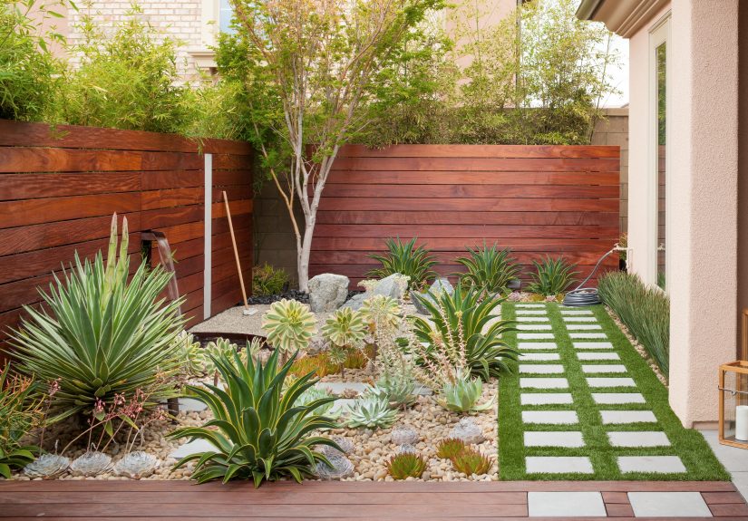
- Interiors: Cozy and grounded usually leans warm and muted; airy and fresh often leans lighter and cooler.
- Branding: High-trust industries often rely on restrained palettes; youth/lifestyle brands can push saturation and contrast.
- Wardrobe: If you want “put-together,” pick a base neutral and one intentional accent. If you want “creative,” add a second accentbut make it related.
What to skip
Don’t start with “I saw this on Pinterest” as your only strategy. Inspiration is great, but it’s not a plan. Your space, lighting, and materials are not the same as a staged photo.
Rule 2: Limit your palette on purpose
Follow this
Pick a small cast of characters:
1 dominant color, 1–2 supporting colors, and 1 accent. In most situations, that’s enough to look intentional.
You can always expand later, but starting small prevents “accidental rainbow.”
Quick example: Navy (dominant) + warm white (support) + tan leather (support) + brass (accent).
What to skip
Avoid building a palette by collecting random “pretty colors” one by one. Pretty doesn’t automatically equal compatible.
A good palette is a system, not a jar of jellybeans.
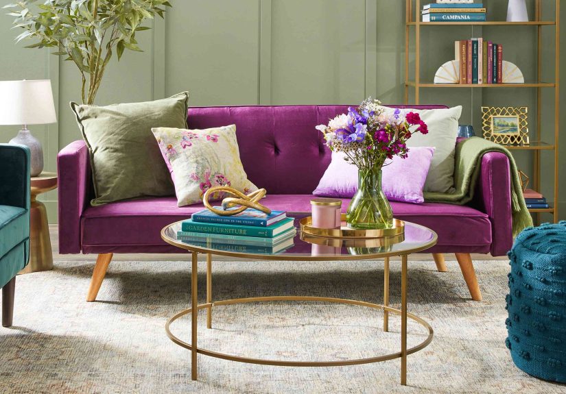
Rule 3: Use the 60–30–10 balance (when you need instant harmony)
Follow this
When you want a fast, dependable structure, distribute color roughly like this:
60% dominant, 30% secondary, 10% accent. It works in rooms, outfits, slide decks, even website UI.
- Living room: 60% warm white walls + 30% medium-toned sofa/rug + 10% bold pillows/art.
- Presentation: 60% neutral background + 30% brand color blocks + 10% high-contrast highlight color for key numbers.
What to skip
Don’t split everything evenly (33/33/33) unless you want “three people talking at once” energy.
Equal-weight colors tend to compete instead of cooperate.
Rule 4: Pick value first (light vs. dark), then hue
Follow this
Value is how light or dark a color is. If your values are too similar, your design can look flateven if the hues are different.
If your values are well spaced, the design reads clearlyeven in grayscale.
Try a quick test: take a screenshot (or photo), convert it to black-and-white, and check if you still see structure and hierarchy.
If it collapses into a gray blur, you need stronger value contrast.
What to skip
Don’t rely on hue differences alone (like red vs. green at the same darkness).
It can look muddy, and it can become unreadable for people with color-vision differences.
Rule 5: Treat undertones like the “fine print”
Follow this
Undertones are the subtle color biases hiding inside “neutral” colorslike the green in a gray, the pink in an off-white, or the yellow in a beige.
The trick: compare your color to a clean reference (like a bright true white or a known neutral) to reveal the undertone.
Example: Two “white” paints can look identical until one sits next to a true whitethen suddenly one reads creamy and the other reads icy.
What to skip
Don’t judge a color in isolation. A color’s personality shows up in comparison and context.
Also: stop calling every problem “lighting” when the undertone is the real culprit. (Lighting is guilty too, but undertones have receipts.)
Rule 6: Don’t mix warm and cool randomlybalance them
Follow this
Warm colors lean red/orange/yellow; cool colors lean blue/green/violet. Mixing warm and cool can look amazingif you do it with intent.
- Rule of thumb: pick a temperature “leader” (mostly warm or mostly cool), then add the opposite temperature as an accent.
- Example: A cool gray room becomes livable with warm wood, brass, and creamy textiles.
What to skip
Avoid mixing multiple temperatures at the same intensity without a plan (cool white, warm beige, icy gray, orange oak, neon art).
That’s not “eclectic”that’s “my house is arguing with itself.”
Rule 7: Test color in the lighting where it will live
Follow this
Color is basically a performance, and lighting is the stage director. Natural daylight, warm lamps, bright white LEDseach one changes how colors read.
Always test samples in the actual environment:
- View it morning, midday, and at night.
- Move it around the room (near windows, in corners, under lamps).
- Check it next to fixed items you can’t change easily (floors, countertops, cabinets).
What to skip
Don’t pick paint from a tiny chip and call it a day. Paint is a giant surface; the color will intensify and reflect onto everything else.
Also skip the “store lighting illusion”those aisles can make anything look like a good idea.
Rule 8: Watch out for metamerism (the “betrayal” effect)
Follow this
Metamerism is when two colors match under one light source but don’t match under another. It’s why your sofa and your rug look perfect at noon,
then at night one becomes mysteriously greener like it joined a villain arc.
- Compare materials side-by-side under multiple lighting conditions.
- If an exact match matters (fabric to paint, cabinetry to flooring), check under the lighting you use most.
- When possible, choose a deliberate contrast instead of chasing a “perfect” match.
What to skip
Don’t assume “it matches in the store” means “it matches forever.” Different surfaces and finishes reflect light differently, too.
Matte paint and glossy tile can turn the same color into two different personalities.
Rule 9: Control saturationsave the loud colors for the punchline
Follow this
Saturation is intensity. Highly saturated colors (bright red, electric blue, neon anything) demand attention.
Use them like hot sauce: a little makes everything better; too much makes you question your life choices.
Try this structure:
muted base + medium supporting tones + one saturated accent.
What to skip
Avoid using multiple high-saturation colors at full strength on large surfaces.
That’s how you accidentally recreate a children’s TV set (unless that is your actual goalthen congratulations, you nailed it).
Rule 10: Use color harmony toolsthen break them gently
Follow this
Color harmony isn’t magic; it’s a shortcut. Popular structures include:
complementary (opposites), analogous (neighbors),
triadic (three evenly spaced), and split-complementary (a softer version of complementary).
Here’s how to make them feel modern (and not like a school color wheel project):
- Lower saturation (make brights a bit dustier).
- Adjust value (one light, one medium, one dark).
- Use neutrals to “buffer” the relationships.
What to skip
Don’t treat the color wheel like a law book. Two colors can be “harmonious” and still look terrible if they’re both too loud or too similar in value.
Harmony is the starting point; context is the finish line.
Rule 11: Design for contrast and readability (not vibes)
Follow this
If people can’t read it, it doesn’t matter how “aesthetic” it is. For digital content, aim for strong text/background contrast.
A widely used guideline is a contrast ratio of at least 4.5:1 for normal text (and higher for extra clarity).
- Example: Light gray text on a white background looks chic until it becomes invisible.
- Fix: Darken the text, lighten the background, increase font weight/size, or all three.
What to skip
Don’t rely on color alone to convey meaning (“click the green button,” “errors are in red,” “sales are blue”).
Pair color with labels, icons, patterns, underlines, or shape cuesso it still works in grayscale and for color-blind users.
Rule 12: Respect the medium: RGB isn’t CMYK (and paint isn’t pixels)
Follow this
Screens use light (RGB). Print uses ink (CMYK). Paint is pigment on textured walls under changing light.
Translation: color shifts happen. Plan for them.
- For print: design in RGB if you must, but proof your work and convert intentionally near the end. Expect some bright screen colors to dull in CMYK.
- For branding: define color values across formats (HEX/RGB for digital, CMYK for print) and test samples.
- For interiors: choose paint based on real samples, not online photos (which are affected by cameras, screens, and editing).
What to skip
Skip the expectation of “perfect matching everywhere.” Aim for consistent relationships (dominant/support/accent, value contrast, temperature balance).
That’s what reads as “on brand” or “well designed,” even when the exact shade shifts.
Rule 13: If everything pops, nothing popschoose hierarchy
Follow this
Color is one of your strongest hierarchy tools. Decide what deserves attention and give it the most contrast (in value, saturation, or both).
Keep the rest calmer so your “important thing” doesn’t have to fight for its life.
- Web UI: One primary button color. Secondary buttons get a quieter treatment. Links are clearly differentiated.
- Room design: One statement element (art, rug, sofa) gets the bold color. Everything else supports.
- Wardrobe: One standout piece (jacket/shoes/bag). The rest builds a clean stage for it.
What to skip
Don’t add more colors when something feels “off.” Often the fix is fewer colors, clearer hierarchy, or better value spacing.
More color is not therapy. (It is sometimes retail therapy, but that’s a separate budget line.)
Extra: Real-World Color Experiences (About )
Below are five real-life-style scenarioscommon situations designers and homeowners run intoshowing how these rules save time, money,
and emotional stability (which is priceless, but also technically priceless because no one sells it at Home Depot).
1) The “Perfect White” That Turned Green Overnight
A classic: someone chooses a white paint from a swatch, paints the whole room, and wakes up to walls that look faintly minty.
What happened? Undertones plus context. That “white” had a green-gray undertone, and the room’s surrounding elementscool daylight from a north-facing window,
plus a greenish reflection from trees outsideamplified it. The fix is almost always comparison and control: test your “white” next to a true white reference,
and test it in the room at multiple times of day. If you want a warmer, creamier read, choose a white with warmer undertones and confirm under your evening lighting.
2) The Rug That Matched the Sofa… Until the Lamps Turned On
In daylight, the rug and sofa were best friends. Under warm lamps, the rug pulled orange and the sofa pulled gray. That’s metamerism and finish differences:
fibers and textures reflect light in different ways, and two “matches” can break apart under a new light source. The pro move is to compare them side-by-side
under the lighting you actually use, then decide whether you truly need a match. Often, the smarter choice is intentional contrast: choose a rug that clearly
supports the sofa (same temperature, different value) instead of trying to clone it.
3) The Brand Palette That Looked Premium OnlineThen Cheap in Print
Bright, saturated colors can look luxurious on a backlit screen, then flatten when converted to CMYK for print.
That’s because CMYK has a smaller range of reproducible colors than RGB. The easiest prevention is planning: build a palette with print in mind,
proof it, and keep at least one dependable, ink-friendly anchor color. Also, define hierarchy: maybe the neon “pop” becomes a digital-only accent,
while print materials lean on a deeper, richer version of the same hue plus strong neutrals.
4) The Website That Was Gorgeous… and Nobody Could Read It
“Minimal” doesn’t mean “invisible.” Low-contrast typography is one of the fastest ways to make a site feel inaccessible and unfinished.
The fix is boringand that’s good news, because boring fixes are reliable: increase contrast, increase size/weight, and stop using color alone to communicate.
If a form field error is only shown in red, add an icon and clear text. If links are only slightly bluer than body text, add an underline or other non-color cue.
Good design is not a scavenger hunt.
5) The Outfit That Felt Loud for No Reason
Sometimes an outfit “should” workeach piece is niceyet together it feels chaotic. Often the culprit is too many competing saturations and temperatures.
A neon sneaker, a warm camel coat, a cool gray top, and a bright cobalt bag can all be great individually, but together they have no leader.
The fix is hierarchy and limitation: pick one hero piece, keep the rest supportive, and match temperatures where possible.
If you want to keep multiple colors, reduce saturation on the supporting ones (dusty blue instead of electric blue) so the look reads intentional.
Wrap-Up
Color confidence isn’t about memorizing rulesit’s about knowing which rule solves which problem. Use structure (like 60–30–10), protect value contrast,
respect undertones and lighting, and keep hierarchy clean. Then break the rules only when you can explain what you’re doing on purpose.
That’s the difference between “designer energy” and “I own a lot of paint samples.”