Table of Contents >> Show >> Hide
- Why This Topic Matters
- What You Need Before You Start
- How to Build the Composite in GIMP
- How to Build the Composite in Photoshop
- Best Practices for Realistic Results
- Common Mistakes Beginners Make
- A Simple Example Workflow
- GIMP vs. Photoshop: Which Is Better?
- Ethical Tips for Publishing the Image
- Conclusion
- Experiences, Lessons, and Creative Takeaways
Let’s get one thing out of the way: making a photo that tricks people into thinking you really met a celebrity is a terrible idea. It is misleading, messy, and the internet has a long memory. What is fair game, though, is learning how to create a clearly labeled fan composite, parody image, or stylized “what if” edit using real photo-editing skills in GIMP and Photoshop.
That means your finished image should be presented as fan art, satire, parody, or a creative compositenot as a real photograph. Done the right way, this kind of project is a fantastic way to practice masking, color correction, lighting, perspective matching, blend modes, retouching, and realistic shadow work. Done the wrong way, it becomes digital catfishing with extra layers.
In this guide, you’ll learn how to build a celebrity-inspired composite responsibly using GIMP or Photoshop. We’ll cover planning, picking the right source images, matching light and scale, refining skin tones, adding believable shadows, and labeling the image so no one mistakes it for real life. Think of it as photo compositing with a conscienceand better technique.
Why This Topic Matters
Photo manipulation tools are more powerful than ever. GIMP gives budget-minded creators a serious editing toolkit, while Photoshop remains the heavyweight champ for advanced compositing. Both can create polished, cinematic results. But the more realistic your image looks, the more responsibility you have in how you use it.
That is why experienced designers, photographers, and digital artists usually follow three common rules:
- Use images you have permission to edit.
- Do not present manipulated images as documentary truth.
- Label fan art, parody, or composites clearly when shared publicly.
Those rules are not boring legal wallpaper. They protect your reputation, respect other people’s likenesses, and make your work easier to publish without drama. Also, they prevent the awkward moment when your cousin comments, “Wow, you met that actor?” and you have to choose between honesty and disappearing forever.
What You Need Before You Start
1. Two Compatible Images
The best composites start with source photos that already have something in common. Look for:
- Similar camera angle
- Similar lighting direction
- Matching image quality and sharpness
- Comparable perspective
- A pose that makes physical sense
If one person is lit from the left and the other is lit from above with harsh noon sun, you are volunteering for extra work. It is possible to fixbut it is not fun.
2. Licensed or Allowed Assets
Use public-domain, licensed, press-approved, or otherwise permitted photos whenever possible. If you are making fan art for a blog post, tutorial, or portfolio piece, make sure you are not violating usage restrictions. The safer path is always using photos you have rights to use.
3. Editing Software
Both tools can handle this project:
- GIMP: Great for masking, layer work, cloning, color correction, and manual compositing.
- Photoshop: Excellent for non-destructive workflows, layer masks, adjustment layers, smart objects, and advanced blending.
4. A Clear Label
Before you even begin, decide how the final image will be described. Add a caption such as fan composite, digital artwork, parody edit, or celebrity-inspired concept image. This is not an afterthought. It is part of the project.
How to Build the Composite in GIMP
Step 1: Open Both Images as Layers
In GIMP, import your background image first, then place the second image on a new layer. Keeping both elements separate makes it easier to resize, transform, and mask non-destructively. Name your layers clearly. “Layer 47 copy final FINAL2” is not a workflow. It is a cry for help.
Step 2: Isolate the Subject
Use selection tools such as Paths, Foreground Select, or Select by Color to cut out the person you want to place into the scene. Zoom in and spend time around hair, shoulders, jawline, and clothing edges. A composite can look nearly perfect, but a jagged ear will ruin the illusion instantly.
Step 3: Add a Layer Mask
Instead of erasing pixels directly, use a layer mask. This allows you to refine the cutout gradually with soft brushes. Lower brush opacity for natural transitions. Hair, semi-transparent fabrics, and soft edges benefit the most from mask-based editing.
Step 4: Match Scale and Perspective
Use the Scale and Perspective tools to make the subject fit the background naturally. Compare eye level, shoulder height, and body proportions against nearby objects in the scene. If the subject looks like a giant standing in a coffee shop, the problem is probably scale, not destiny.
Step 5: Fix Lighting
Use Brightness-Contrast, Curves, Levels, and Shadows-Highlights to bring the two images into the same lighting world. Ask yourself:
- Is the subject too bright?
- Are the shadows too deep compared to the scene?
- Does the skin tone feel too warm or too cool?
Subtle adjustments usually work better than dramatic ones. Realism often comes from restraint.
Step 6: Add Contact Shadows
A person pasted into a background often looks like they are floating because the image lacks contact shadows. Create a new layer under the subject, paint a soft shadow with a low-opacity brush, then blur it slightly. Keep the shadow direction consistent with the scene’s light source.
Step 7: Blend Color and Texture
If the images still feel disconnected, try adding a gentle overall color grade. A mild warming filter, slight desaturation, or unified contrast curve can make the whole scene feel like it came from one camera. In GIMP, this can be done with Curves, Color Balance, or a soft overlay layer.
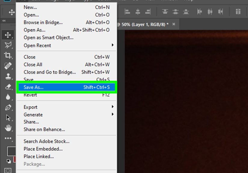
How to Build the Composite in Photoshop
Step 1: Place Images and Convert Smart Objects
Open both images in Photoshop and place the subject into the background document. Convert the subject layer to a Smart Object before transforming it. That way, you can resize and tweak it without grinding away image quality.
Step 2: Make a Precise Selection
Use Select Subject as a starting point, then refine with Select and Mask. Pay extra attention to hair edges and fine detail. Photoshop’s edge refinement tools can save time, but they still need human judgment. Software is smart; your eyeballs are smarter.
Step 3: Use Layer Masks, Not Destructive Erasing
Apply a layer mask and paint with black or white to hide or reveal areas. Soft masks are your best friend for blending sleeves, hair, and edge transitions into the environment.
Step 4: Match Exposure and White Balance
Use adjustment layers such as Curves, Levels, Color Balance, Hue/Saturation, and Selective Color clipped to the subject layer. This is where Photoshop shines. You can isolate changes to one subject without affecting the background.
Step 5: Match Blur and Noise
One of the most overlooked realism tricks is image texture. If the background photo is slightly grainy and the inserted subject is ultra-clean, the mismatch will be obvious. Add a little noise or reduce sharpness to bring both elements closer together.
Step 6: Add Realistic Shadows and Reflections
Create shadows on separate layers using soft brushes, transformed duplicates, or blurred shapes. If the scene has reflective surfaces such as polished floors, windows, or glossy tables, add a subtle reflection with reduced opacity and slight blur. Tiny details make a big difference.
Step 7: Finish with Global Color Grading
Once the subject is integrated, add a final overall grade on top of all layers. A photo filter, gradient map with low opacity, or Camera Raw adjustments can bring everything together. This final pass often turns “obviously edited” into “convincingly stylized.”
Best Practices for Realistic Results
Choose the Right Pose
Do not force impossible body language. If one figure is looking left and the other is reacting to something on the right, your image will feel emotionally disconnected. Pick poses that look like they belong in the same moment.
Respect the Light Source
The fastest way to spot a composite is mismatched light. Check highlight direction on the nose, chin, shoulders, and hair. If necessary, dodge and burn selectively to reshape light and shadow.
Do Not Over-Smooth Skin
Over-retouching screams “edited.” Leave a little skin texture. Real people have pores, not candle wax faces.
Mind the Edges
Hard edges can work in graphic design, but natural photos usually need subtle softness. Feathered masks, slight blur, and zoomed-in cleanup are essential.
Keep It Honest in Presentation
If you share the image publicly, label it. Use terms like fan edit, digital composite, or parody artwork. The technical goal may be realism, but the social goal should be clarity.
Common Mistakes Beginners Make
- Wrong scale: The inserted person is too tall, too small, or physically impossible in the frame.
- Bad edge cleanup: Halos, leftover background, and sharp cut lines make the composite look cheap.
- Color mismatch: One image is warm, the other cool, and the result looks stitched together.
- Ignoring grain: Texture mismatch can be as distracting as bad lighting.
- No shadow: Without grounding shadows, the subject floats like a haunted sticker.
- Misleading caption: Even a well-made edit becomes a problem if it is presented as real.
A Simple Example Workflow
Imagine you want to create a fun blog header showing yourself “at a movie premiere” next to a famous actor. The safe, smart version would look like this:
- Use a licensed red-carpet background.
- Use a permitted press image or authorized promotional photo.
- Cut yourself out from a photo with similar lighting.
- Place both subjects in the same frame at realistic scale.
- Match exposure and color temperature.
- Add shadows under shoes and along the ground plane.
- Apply one final color grade across the whole image.
- Publish it with a caption like “Fan composite created in Photoshop and GIMP for tutorial purposes.”
That gives you a visually strong result without pretending the event really happened. You get the creative thrill, your readers get transparency, and everyone sleeps better.
GIMP vs. Photoshop: Which Is Better?
Choose GIMP if:
- You want a free tool
- You are comfortable with a more manual workflow
- You mainly need masking, color correction, cloning, and compositing basics
Choose Photoshop if:
- You want faster advanced selections
- You rely on non-destructive adjustment layers
- You need smart objects, Camera Raw, and polished finishing tools
Both can produce strong results. Photoshop is more streamlined for professional compositing, but GIMP absolutely holds its own if you are patient and careful.
Ethical Tips for Publishing the Image
Before posting your composite online, run through this checklist:
- Is the image clearly labeled as edited, parody, or fan art?
- Do you have the right to use the source images?
- Could the image confuse viewers into believing something false?
- Would the caption still make sense if someone screenshotted the image out of context?
If the answer to that third question is yes, revise it. Add labeling directly on the image if necessary. A clean watermark such as “fan composite” can prevent misunderstanding when your post gets separated from its original caption.
Conclusion
Creating a celebrity-inspired composite in GIMP or Photoshop is less about “faking reality” and more about mastering digital storytelling. The real craft lies in selecting compatible images, making precise masks, matching light, balancing color, adding grounded shadows, and finishing with a unified grade. GIMP offers a capable free route, while Photoshop provides a more flexible professional workflow.
The biggest difference between clever digital art and a misleading fake is not the software. It is the intent and presentation. If your image is clearly labeled as fan art, parody, or composited artwork, you can showcase your editing skills without crossing a line. In other words, use your powers for portfolio glorynot internet chaos.
Experiences, Lessons, and Creative Takeaways
One of the most useful lessons people learn from this type of project is that realism is built from many tiny decisions, not one magical button. Beginners often think the hard part is cutting out the subject. In reality, the cutout is only the start. The real challenge is making the subject belong to the environment. That means asking dozens of visual questions: Is the face too bright? Is the chin shadow in the wrong direction? Does the floor need a softer contact shadow? Is the camera height believable? When editors begin noticing these details, their overall image-making improves across everything they do.
Another common experience is discovering how much easier the project becomes when the source photos are chosen well. People often waste an hour trying to force two incompatible images together, then switch to better source material and finish the job in fifteen minutes. That is not cheating. That is learning. Good compositing starts long before the mask tool appears. It starts with planning, taste, and restraint.
Many creators also find that fan composites are a useful training ground because they teach patience. Hair masking alone can humble even confident editors. The same is true for color matching. A face might look perfect on its own, then suddenly appear orange, gray, or oddly plastic once placed into the background. That moment is frustrating, but it is also valuable. It teaches the eye to compare tones, contrast, and texture more critically.
There is also a creative confidence boost that comes from finishing a polished composite responsibly. When the image is clearly framed as parody or fan art, creators can focus on storytelling instead of deception. The final piece becomes a design exercise, a portfolio sample, or a blog visual rather than an awkward attempt to fool people. That shift in mindset usually produces stronger work because the goal becomes craft, not trickery.
Editors who spend time with both GIMP and Photoshop often report a similar conclusion: the software matters, but workflow matters more. Photoshop may feel faster and more refined for advanced compositing, while GIMP can require more manual problem-solving. Yet both reward careful observation. In both programs, the best results come from accurate masking, subtle adjustments, and repeated zooming in and out to check the image as a whole.
Perhaps the biggest takeaway is that responsible editing does not make the process less fun. It actually makes it better. When you stop trying to “prove” something fake and start trying to build something convincing as art, you gain more freedom. You can exaggerate mood, add cinematic color, stylize the scene, and still be honest with your audience. That is a much better long-term habit for anyone creating content for the web, a portfolio, or social media.