Table of Contents >> Show >> Hide
- Why a Tiny Card Still Punches Above Its Weight
- What “Advertising-Grade” Business Cards Have in Common
- 12 Creative Business Card Concepts That Actually Work
- 1) The “Die-Cut Silhouette” Card
- 2) The “Color-Core Edge” Card
- 3) The Soft-Touch “Velvet Handshake” Card
- 4) Letterpress or Deboss: The “Quiet Luxury” Card
- 5) Foil Stamping: The “Spotlight” Card
- 6) The Transparent Card (Plastic or Clear Accent)
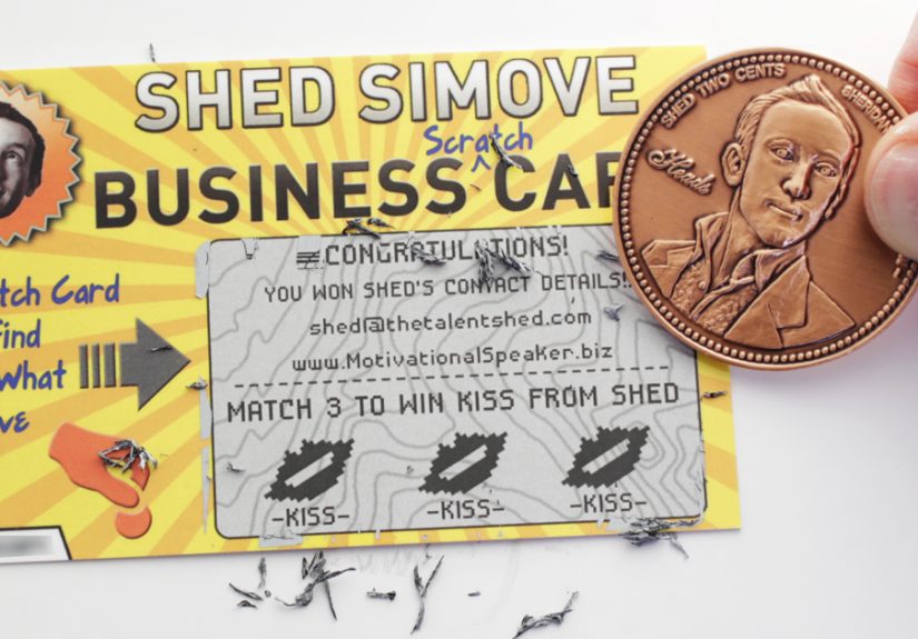
- 7) The “Tool” Card: A Card That Does Something
- 8) The “Mini Portfolio” Card (Two-Sided Storytelling)
- 9) The QR Code Card (Done Like a Pro, Not Like a Random Sticker)
- 10) The NFC + Paper Hybrid (Tap-to-Share, Still Tangible)
- 11) The Sustainable “Good Story” Card
- 12) The Folded Micro-Brochure (When You Truly Need More Space)
- The Design Rules That Keep “Creative” From Becoming “Chaotic”
- Print & Production Cheat Sheet (So You Don’t Accidentally Print Sad Cards)
- How to Measure Whether Your Card Is Winning the Advertising Game
- Mistakes That Make Even Beautiful Cards Lose
- Conclusion: The Card Is Small, But the Brand Signal Is Huge
- Experiences Related to Creative Business Cards ( of Real-World Lessons)
A business card is a tiny rectangle with an oversized ego. It shows up for 10 seconds, tries to make a first impression,
and then hopes it doesn’t end up living out its days in the shadowy “miscellaneous drawer” where pens go to retire.
And yet… when a business card is done right, it doesn’t just share your info. It advertises youquietly, constantly,
and sometimes loudly enough to make someone say, “Okay, I’m keeping this.”
The best creative business cards don’t rely on gimmicks. They use smart design, irresistible materials, and a pinch of psychology
to do what great advertising always does: stop the scroll (or in this case, stop the pocket shuffle), spark curiosity,
and make you memorable.
Why a Tiny Card Still Punches Above Its Weight
Even in a world where you can “connect” with a stranger in three taps and two awkward seconds of phone fumbling,
paper still has an unfair advantage: it’s physical. Touch is sticky in the brain. Texture signals quality.
Weight suggests credibility. And when someone holds your card, you own a small moment of their attention.
A great card also solves a real networking problem: memory. People meet a lot of people. Most names leave their heads
faster than a free donut leaves the break room. A card that looks and feels distinctive gives your new contact a
mental hooksomething to remember you by, not just your email address.
What “Advertising-Grade” Business Cards Have in Common
1) They’re instantly clear (because confusion is not a brand trait)
Creative doesn’t mean cluttered. A winning card makes the essentials obvious: who you are, what you do,
and how to reach you. If someone needs a magnifying glass, the card is advertising your chiropractornot your business.
2) They create a sensory moment
A premium stock, a soft-touch finish, a crisp deboss, a flash of foilthese aren’t “extra.” They’re tactile persuasion.
They turn your card into a mini brand experience.
3) They give people a reason to keep them
The best cards aren’t “here’s my contact info.” They’re “here’s a tiny useful object,” “here’s a mini story,” or
“here’s something delightful.” A card that earns a spot in a wallet is basically a tiny billboard that travels.
4) They match the brand like a tailored suit (not a Halloween costume)
The card should feel like your businessindustry-appropriate, audience-appropriate, and personality-appropriate.
A neon, die-cut explosion can be perfect for a creative studio and absolutely tragic for a grief counselor.
(Unless the grief counselor is also a clown. In which case: please seek a different counselor.)
12 Creative Business Card Concepts That Actually Work
Below are creative business card ideas that win the advertising game because they’re built on strategynot novelty.
Each one can be adapted to fit your brand voice, budget, and the reality that wallets have feelings too.
1) The “Die-Cut Silhouette” Card
A custom shape can communicate what you do before anyone reads a word. Think: a house outline for a realtor,
a camera profile for a photographer, a coffee cup for a café consultant. The trick is to keep it clean and iconic.
If it looks like a complicated jigsaw piece, people won’t keep itthey’ll fear it.
Pro tip: Use die-cuts to reinforce a simple concept, not to show off every feature your printer owns.
Also: remember storage. A card that can’t fit in a wallet gets “kept” on the nearest table… until it becomes confetti.
2) The “Color-Core Edge” Card
A colored core (a bright stripe through the middle of a thick card) is subtle from the front, dramatic from the side.
It’s one of the most elegant ways to signal premium quality without shouting.
Best for: brands that want to feel modern, confident, and design-forwardwithout going full circus.
3) The Soft-Touch “Velvet Handshake” Card
A soft-touch finish feels like a handshake from someone who moisturizes. It’s tactile, memorable, and pairs beautifully
with minimal design. Add a spot gloss detail (like a logo pop) for contrast and you’ve got a card people pet like a cat.
Best for: premium services, beauty/wellness, creative professionals, boutique brands.
4) Letterpress or Deboss: The “Quiet Luxury” Card
Letterpress and debossing create depth you can feel. That tactile imprint says craftsmanship, and craftsmanship says,
“We care about details.” It’s not flashy. It’s confident.
Design note: Let the texture do the talking. Too many elements and you lose the point (and your printer may lose patience).
5) Foil Stamping: The “Spotlight” Card
Foil is best used like jewelry: one strong accent, not a full suit of armor. A gold or silver foil logo, a single line,
or even a tiny symbol can elevate a simple layout into something people remember.
6) The Transparent Card (Plastic or Clear Accent)
A fully transparent card can be striking, but it’s also easy to overdo. The smarter move is often a clear window,
translucent overlay, or a minimal design that uses negative space like it pays rent.
Best for: photographers, architects, modern retail brands, tech companies with strong visual identity.
7) The “Tool” Card: A Card That Does Something
Utility is retention. A card that doubles as a mini ruler, a bookmark, a cable organizer, or a quick reference guide
is far more likely to stick around. The key is relevance: the tool should connect to your industry or your audience’s daily life.
- Trainer: “5-minute mobility warmup” mini cheat sheet on the back.
- Financial advisor: “Quick budget rule” reference (simple, not overwhelming).
- Event planner: “Checklist” micro-guide that people actually use.
8) The “Mini Portfolio” Card (Two-Sided Storytelling)
The front is clean and classic. The back is your “show, don’t tell.” Instead of listing everything you do,
you show one compelling example: a photo, a before/after, a micro case-study metric, or a signature style.
This works especially well when your work is visualdesign, photography, interiors, branding, illustration, architecture.
9) The QR Code Card (Done Like a Pro, Not Like a Random Sticker)
QR codes work when they feel intentional. They should go to a fast, mobile-friendly destination:
a digital contact card, portfolio, booking page, or a dedicated landing page that matches your brand.
Add a tiny label like “Scan for portfolio” so people know what they’re getting.
Bonus: Use a unique URL or UTM tracking behind the QR code so you can measure results.
10) The NFC + Paper Hybrid (Tap-to-Share, Still Tangible)
NFC business cards are essentially tap-to-share profiles. They can be great for events, sales teams, and anyone who meets
lots of people quickly. The best approach is hybrid: keep the paper design strong and offer a tap/scan option.
That way you’re not betting your first impression on “Waitdo you have NFC turned on?”
11) The Sustainable “Good Story” Card
Recycled stocks, responsibly sourced paper, and minimalist inks can support a sustainability message without looking bland.
Some brands lean into natural textures and earthy palettes; others keep it modern and let a short line do the work:
“Printed on recycled stock” or “responsibly sourced paper.”
If sustainability is part of your brand promise, your card is a perfect place to prove you mean itwithout writing a novel.
12) The Folded Micro-Brochure (When You Truly Need More Space)
A folded card can be a smart choice for service menus, appointment info, or quick packagesif it stays readable.
The goal isn’t to cram your whole website onto cardstock. It’s to give a clean overview and a clear next step:
book, call, scan, visit.
The Design Rules That Keep “Creative” From Becoming “Chaotic”
Creativity wins attention. Structure wins trust. Here’s how to get both.
Use hierarchy on purpose
Decide what the eye should see first, second, third. Usually: name + brand, then role/value, then primary contact.
Hierarchy is your silent salespersonmake it do the heavy lifting.
Respect bleed, trim, and safe zones
Print is not “what you see is what you get.” Designs get trimmed, and tiny shifts happen.
Extend backgrounds to the bleed so you don’t get accidental white edges, and keep important text inside the safe area.
A common rule of thumb for bleed/safety is about 0.125 inches (an eighth of an inch).
Keep type readable (your card is not a legal contract)
Small type, low contrast, and thin fonts are the fastest ways to make a premium card feel amateur.
Use clean fonts, enough white space, and a layout that breathes. “Minimal” isn’t emptyit’s intentional.
Print-ready assets only
If you’re using images or logos, make sure they’re high-resolution (think 300 DPI for print-quality clarity).
Crisp printing is part of your brand impressionblurry graphics silently say, “We cut corners.”
Print & Production Cheat Sheet (So You Don’t Accidentally Print Sad Cards)
The difference between “nice” and “whoa” is often production. Here are practical choices that boost perceived value.
Paper thickness: the instant quality signal
- Standard everyday: common stocks like 14pt are a solid baseline.
- Premium feel: 16pt is sturdier and more “serious” in the hand.
- Ultra-thick statement: very thick options (like 38pt) can feel luxurioususe with a minimalist design so it doesn’t become a brick.
Finishes that deliver “wow” without screaming
- Matte: clean, modern, easy to read.
- Soft-touch: velvety, premium, memorable.
- Spot gloss: selective shine for contrast (logos look great).
- Foil: metallic accent that reads “premium” fast.
- Rounded corners: subtle, modern, and slightly less likely to look beat up after one day in a pocket.
Same-day vs. premium: choose based on the moment
If you need cards today, same-day printing options can save you. If you’re preparing for a major conference,
a big sales push, or a premium brand launch, consider upgrading to finishes and thicker stocks that support your positioning.
Your card should match the stakes.
How to Measure Whether Your Card Is Winning the Advertising Game
Great design is fun. Great design that you can measure is a marketing superpower. Try these:
- Trackable QR code: send people to a dedicated landing page and measure visits, clicks, and conversions.
- Unique offer: a small perk (“Free consult,” “10% off first service”) with a simple code.
- Lead capture: link to a short form or booking page instead of a generic homepage.
- Follow-up speed: if your card makes it easier to contact you, you’ll feel it in faster replies.
Mistakes That Make Even Beautiful Cards Lose
- Too much information: your card is not your résumé.
- No clear next step: tell people what to do (scan, book, call, visit).
- Unreadable typography: “stylish” is useless if it’s illegible.
- Shape over function: odd shapes can be memorablebut if they’re annoying to store, they’ll be discarded.
- Outdated details: nothing says “we’re on top of things” like a dead phone number.
Conclusion: The Card Is Small, But the Brand Signal Is Huge
Creative business cards win the advertising game when they combine clarity (so people understand you),
craft (so people remember you), and strategy (so people actually contact you).
Treat your business card like a tiny campaign: one message, one feeling, one next step.
Do that, and your card won’t just sit in someone’s wallet. It’ll work for youquietly selling, long after the handshake ends.
Experiences Related to Creative Business Cards ( of Real-World Lessons)
Let’s talk about what happens after you design the coolest business card on Earthbecause the real world is where
creative cards either become legendary… or become expensive confetti.
One common scenario: the networking event “card exchange” sprint. People are juggling a drink, a name tag that’s peeling off,
and the pressure to look normal while saying, “So what do you do?” for the 57th time. In that moment, the best cards are
the ones that are easy to understand at a glance. A minimalist card with a bold logo and one clear call-to-action (like
“Scan for portfolio”) performs better than a card that tries to explain your entire life story in 6-point font.
The lesson: speed matters. Your card should communicate fastbecause people are busy being socially brave.
Another real-life moment: the “later review.” This is when someone gets home, empties their pockets, and looks through the
stack of cards. Here, the tactile details do their magic. A soft-touch card with a single foil accent or a crisp deboss
becomes memorable because it feels intentional. People may not remember your company name perfectly, but they’ll remember
“the velvety one” or “the thick one with the colored edge.” That memory hook is advertising in action.
Then there’s the practical printer reality check. Creative ideas can be amazinguntil you realize your design ignores bleed,
puts text too close to the edge, or relies on tiny details that won’t reproduce well. This is where experienced teams do
something unglamorous but powerful: they print a small test batch, view it in different lighting (indoor, daylight),
and hand it to a few people for feedback. If someone squints or flips it around twice trying to find your email,
you just saved yourself from printing 1,000 “almost great” cards.
A favorite “smart compromise” strategy is the hybrid card: premium paper plus a QR code that links to a digital contact card
or booking page. It works because it respects how people actually follow up. Some folks still want paper in hand.
Others prefer to scan and save instantly. Hybrid covers both behaviors without forcing anyone into a tech guessing game.
Finally, the best experience-based insight is this: creative business cards work when they match your business promise.
If you’re a high-end consultant, a thick, minimalist card signals confidence. If you’re a playful brand, a clever die-cut
can create delight. If sustainability is central to your story, a textured recycled stock can be the proof. The card isn’t
just a contact toolit’s a tiny product demo of your brand standards. And when your card feels like your brand, people trust
that your work will, too.