Table of Contents >> Show >> Hide
- Why Bad Accessibility Design Feels So Insulting
- 30 Accessibility Designs That Are Straight Up Offensive
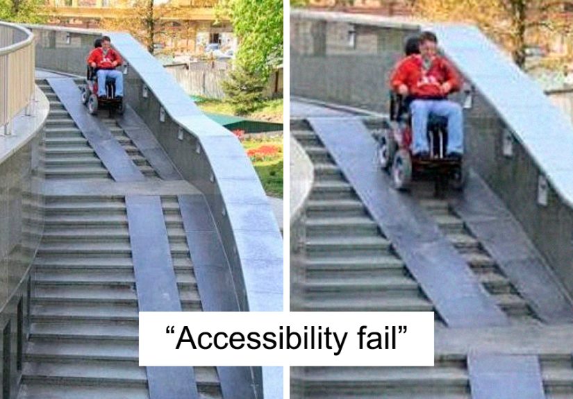
- 1. The Ramp That Ends in Stairs
- 2. The Ramp So Steep It Needs a Seatbelt
- 3. The “Accessible Entrance” Around the Back by the Dumpster
- 4. The Automatic Door Button Hidden Behind a Plant
- 5. The Elevator That Is Always “Temporarily” Out of Service
- 6. The Accessible Parking Space Used as Snow Storage
- 7. The Van-Accessible Space With No Room for a Van
- 8. The Curb Cut That Points Into Traffic
- 9. Tactile Paving That Leads Into a Wall
- 10. The Restroom Stall With Grab Bars and No Turning Space
- 11. The Trash Can in the Accessible Stall
- 12. The Mirror Installed for Giants Only
- 13. The Sink With Pipes Ready to Attack Your Knees
- 14. The Door That Opens Into the Wheelchair Space
- 15. The “Accessible” Table With a Giant Pedestal Base
- 16. The Braille Sign Mounted in a Mystery Location
- 17. Decorative Fonts That Nobody Can Read
- 18. Websites With Pale Gray Text on White Backgrounds
- 19. Buttons That Cannot Be Used With a Keyboard
- 20. Videos With Auto-Generated Captions That Say Nonsense
- 21. Customer Service That Says, “Just Bring Someone to Help You”
- 22. Touchscreens With No Audio, Tactile, or Physical Alternative
- 23. Accessible Seating With the Worst View in the Venue
- 24. Aisles Blocked by Merchandise Displays
- 25. Hotel Rooms Labeled Accessible but Designed by Imagination
- 26. Public Transit Stops With No Safe Boarding Area
- 27. Service Counters Too High for Seated Customers
- 28. Emergency Exits That Ignore Disabled People
- 29. “Accessible” Apps That Break With Screen Readers
- 30. Designs Made Without Asking Disabled People
- What Makes an Accessibility Design Offensive?
- Better Accessibility Design Is Not ComplicatedIt Is Considerate
- Experiences Related to Offensive Accessibility Designs
- Conclusion
Note: This article focuses criticism on careless design decisions, not on disabled people. The examples are based on real accessibility principles used in U.S. public spaces, digital design, transportation, parking, restrooms, signage, and customer service.
Accessibility design should be one of the most practical, human-centered parts of modern life. A ramp should help someone enter a building. A caption should help someone understand a video. A restroom labeled “accessible” should not require a tactical military operation, a tape measure, and emotional support snacks. Yet somehow, bad accessibility designs keep appearing in public places, apartments, stores, schools, restaurants, websites, offices, and transit systems like someone clicked “include disability access” and then immediately left for lunch.
The worst part is that many of these designs look like they were created to check a box, not to help a person. They technically say “accessible,” but practically scream, “Good luck, buddy.” And when accessibility is done badly, it is not just inconvenient. It can be humiliating, unsafe, expensive, exhausting, and exclusionary.
Good accessibility is not a decorative feature. It is a civil right, a design discipline, and a basic sign that someone thought beyond the average able-bodied customer. The Americans with Disabilities Act, accessible design standards, inclusive design principles, and digital accessibility guidelines all point toward one simple idea: people should be able to enter, move, communicate, shop, work, learn, and participate without being treated like an afterthought.
So let’s look at 30 accessibility designs that are straight up offensivenot because they are funny to the people forced to use them, but because they reveal how absurdly bad design can become when inclusion is treated as paperwork instead of real life.
Why Bad Accessibility Design Feels So Insulting
A badly placed ramp is not just a bad ramp. It is a message. It tells wheelchair users, parents with strollers, older adults, injured people, delivery workers, and anyone with mobility needs that their access was considered last. When a door opener is blocked by a trash can or a “wheelchair-accessible entrance” leads through a storage room, the building is not simply inconvenient. It is announcing that dignity was not included in the construction budget.
Accessibility fails also create emotional labor. People have to call ahead, ask for help, explain their bodies to strangers, wait for a manager, search for a working elevator, or decide whether an outing is worth the risk. That is not inclusion. That is an obstacle course wearing a name tag.
30 Accessibility Designs That Are Straight Up Offensive
1. The Ramp That Ends in Stairs
This is the classic villain of accessibility design. A ramp gently guides someone upward, only to end at a set of stairs like a prank from an architect with a dark sense of humor. A ramp that does not connect to an accessible route is not a ramp. It is a scenic disappointment.
2. The Ramp So Steep It Needs a Seatbelt
A ramp should not feel like a ski jump. When the slope is too steep, it becomes dangerous for wheelchair users, people with walkers, and anyone with balance issues. If someone needs mountain-climbing confidence to enter a bakery, the design has failed.
3. The “Accessible Entrance” Around the Back by the Dumpster
Nothing says “welcome” like sending disabled customers through the service alley next to broken pallets and yesterday’s onions. Separate entrances may sometimes be unavoidable in old buildings, but when the only accessible route feels hidden, dirty, or unsafe, it turns access into a side quest.
4. The Automatic Door Button Hidden Behind a Plant
Plants are lovely. Plants blocking an accessibility button are not. Door operators need to be visible, reachable, and usable. If someone has to part the decorative ficus like Indiana Jones discovering a temple switch, the design is not working.
5. The Elevator That Is Always “Temporarily” Out of Service
An elevator that breaks once is a maintenance issue. An elevator that is always broken is a policy issue. For many people, a nonworking elevator does not mean “take the stairs.” It means “you cannot enter.” Temporary problems become permanent exclusion when nobody treats repairs as urgent.
6. The Accessible Parking Space Used as Snow Storage
Accessible parking spaces are not winter storage units. Piling snow into access aisles makes it impossible for wheelchair users to unload safely. The sign may still be standing, but the space has functionally vanished under a frozen mountain of “we forgot people exist.”
7. The Van-Accessible Space With No Room for a Van
Van-accessible parking needs enough width, vertical clearance, and a usable access aisle. When the aisle is too narrow or blocked, the space becomes a decorative rectangle. A wheelchair lift cannot politely fold itself into a compact-car fantasy.
8. The Curb Cut That Points Into Traffic
A curb ramp should connect pedestrians to a safe crossing path. When it shoots someone directly into the street, a pole, a storm drain, or a parked car, it creates danger while pretending to offer access. That is not universal design. That is civil engineering with a shrug.
9. Tactile Paving That Leads Into a Wall
Tactile ground indicators help blind and low-vision pedestrians navigate. When they lead into a wall, planter, or random obstacle, they become misinformation underfoot. Bad tactile paving is like a GPS saying, “Turn left into the aquarium.”
10. The Restroom Stall With Grab Bars and No Turning Space
An accessible restroom is not created by slapping grab bars onto a tiny stall and calling it a day. People need space to turn, transfer, close the door, and maneuver safely. When the stall is too small, the grab bars become decoration with plumbing nearby.
11. The Trash Can in the Accessible Stall
This one is painfully common. A restroom may technically have enough spaceuntil someone parks a trash can, mop bucket, baby changing station, or decorative basket directly in the turning area. Accessibility cannot survive clutter. The floor space is not bonus storage.
12. The Mirror Installed for Giants Only
Mirrors, sinks, soap dispensers, hand dryers, and paper towel holders should be usable from seated and standing positions. When everything is mounted too high, the message is clear: “You may enter, but you may not participate in basic hygiene.” Stylish? Maybe. Inclusive? Absolutely not.
13. The Sink With Pipes Ready to Attack Your Knees
Accessible sinks need knee clearance and protected pipes. Exposed hot pipes can burn someone’s legs, especially if they have limited sensation. A sink should not come with a hidden injury feature.
14. The Door That Opens Into the Wheelchair Space
Some rooms technically have accessible spaceuntil the door swings into it and blocks the person using it. Good design considers how objects move, not just how they look on a floor plan. A wheelchair user should not have to solve a geometry problem to enter a room.
15. The “Accessible” Table With a Giant Pedestal Base
A table may look open until a huge center pedestal blocks knees, footrests, or mobility devices. Restaurants often miss this detail. If a person cannot roll under the table comfortably, the table is not accessible. It is just furniture with confidence.
16. The Braille Sign Mounted in a Mystery Location
Braille signage should be placed predictably so people can find it. When signs are mounted too high, too low, behind furniture, or on the wrong side of the door, they become a scavenger hunt. Accessibility should reduce guesswork, not turn hallways into escape rooms.
17. Decorative Fonts That Nobody Can Read
Curly, ultra-thin, low-contrast typography may look fancy on a boutique menu, but it can be a nightmare for people with low vision, dyslexia, cognitive disabilities, or tired eyes. Readability is not the enemy of beauty. It is the whole reason letters exist.
18. Websites With Pale Gray Text on White Backgrounds
Low-contrast text is one of the most common digital accessibility failures. Designers sometimes choose whisper-light gray because it feels “minimal.” Unfortunately, users cannot buy, read, book, or learn from content they cannot see. Minimalism should not mean disappearing ink.
19. Buttons That Cannot Be Used With a Keyboard
Many people navigate websites without a mouse. They may use a keyboard, switch device, screen reader, voice control, or other assistive technology. If a website traps users or hides focus indicators, it fails a basic rule of digital access: every interactive element should be operable.
20. Videos With Auto-Generated Captions That Say Nonsense
Captions are not optional decoration. They provide access for Deaf and hard-of-hearing users, people in noisy environments, language learners, and anyone who forgot headphones. Bad captions can turn serious information into comedy soup. If a medical video captions “blood pressure” as “mud treasure,” we have a problem.
21. Customer Service That Says, “Just Bring Someone to Help You”
This is not a design object, but it is absolutely an accessibility design failure. Systems should support independence. Telling disabled customers to bring a helper shifts the burden onto them and treats access as a personal favor instead of a service responsibility.
22. Touchscreens With No Audio, Tactile, or Physical Alternative
Kiosks are everywhere: parking garages, airports, fast-food counters, pharmacies, hotels, and hospitals. When they rely only on a flat touchscreen, they can exclude blind users, people with tremors, wheelchair users who cannot reach the screen, and anyone who needs more time. A shiny screen is not innovation if it locks people out.
23. Accessible Seating With the Worst View in the Venue
Accessible seating should offer comparable choices, not a lonely corner behind a pillar where the performer looks like a rumor. Disabled guests should not be forced into the least desirable location simply because planners treated wheelchair spaces like leftover pixels.
24. Aisles Blocked by Merchandise Displays
Retail stores love a promotional tower. Customers using wheelchairs, walkers, canes, scooters, or service animals do not love squeezing through a maze of scented candles and clearance socks. Clear paths matter. A sale display is not more important than basic movement.
25. Hotel Rooms Labeled Accessible but Designed by Imagination
Some hotel rooms claim accessibility but have beds too high to transfer onto, showers without proper seats, slippery floors, unreachable thermostats, or furniture blocking the route. A reservation checkbox is not enough. Guests need accurate descriptions and rooms that actually work.
26. Public Transit Stops With No Safe Boarding Area
A bus may have a ramp, but if the stop is surrounded by mud, snow, uneven pavement, or no curb connection, riders still cannot board safely. Accessibility is a chain. If one link breaks, the whole trip can fail.
27. Service Counters Too High for Seated Customers
Reception desks, ticket windows, checkout counters, and pharmacy counters should include accessible portions. When everything is built at standing height, seated customers are forced to look up, pass cards awkwardly, or discuss private information loudly. That is not just inconvenient; it can be undignified.
28. Emergency Exits That Ignore Disabled People
Emergency planning must include disabled occupants. If evacuation routes, alarms, refuge areas, communication systems, or staff training exclude people with disabilities, the building is only safe for some people. “We’ll figure it out during the emergency” is not a plan. It is a lawsuit with flashing lights.
29. “Accessible” Apps That Break With Screen Readers
Apps may look sleek while being nearly unusable with assistive technology. Unlabeled buttons, images without alt text, confusing heading structures, and forms that do not announce errors can make essential services inaccessible. A beautiful app that cannot be navigated is a locked door with animations.
30. Designs Made Without Asking Disabled People
This is the root problem behind many offensive accessibility failures. Designers guess, committees approve, contractors install, and only afterward does someone ask actual users whether it works. Inclusive design should involve disabled people early, often, and meaningfully. Nothing about us without us is not a slogan for a poster. It is a design requirement with a heartbeat.
What Makes an Accessibility Design Offensive?
Offensive accessibility design usually has one or more of three problems: it is unsafe, it is performative, or it takes away dignity. A steep ramp is unsafe. A Braille sign hidden behind a potted plant is performative. A separate entrance through a loading dock takes away dignity. The design may exist, but it does not provide equal access.
The most insulting designs are often the ones that clearly had enough budget to look polished but not enough attention to work. A luxury lobby with marble floors and a broken lift tells a very specific story. So does a website with cinematic animations but no keyboard navigation. Beauty without usability is not design excellence. It is expensive wallpaper over a locked door.
Better Accessibility Design Is Not ComplicatedIt Is Considerate
Good accessibility starts with asking practical questions. Can people enter through the same main route? Can they move independently? Can they read the sign, hear the message, understand the form, reach the button, use the restroom, board the vehicle, and leave safely in an emergency? If the answer is no, the design is not finished.
Designers, landlords, business owners, city planners, developers, and event organizers do not need to be perfect on day one. But they do need to stop treating accessibility like a decorative compliance sticker. The goal is not to barely pass inspection. The goal is to create places and products that people can actually use.
Experiences Related to Offensive Accessibility Designs
Ask people who deal with poor accessibility every week, and the stories come quickly. Someone arrives at a restaurant after checking online for wheelchair access, only to discover that the “accessible entrance” is locked and the staff cannot find the key. Another person books an accessible hotel room months in advance, then arrives to find a bathtub instead of a roll-in shower. A Deaf customer attends a public event where captions were promised, but the screen freezes after the first five minutes. A blind shopper tries to use a payment kiosk, but none of the buttons are labeled for a screen reader. These are not rare technical glitches. They are everyday reminders that access often depends on whether someone in charge cared enough to test the experience.
One of the most frustrating parts is how often disabled people are expected to be grateful for designs that barely function. A business may point proudly to a ramp, even when that ramp is too steep, blocked by delivery boxes, or positioned far from the entrance. A venue may advertise accessible seating, then place wheelchair users away from friends and family. A website may install an accessibility widget while leaving the actual checkout process impossible to complete with a keyboard. The message becomes: “We did something, so please stop complaining.” But access is not a participation trophy.
There is also a social cost. When access fails, disabled people often have to become their own advocates in public. They must ask strangers to move chairs, explain why a blocked aisle matters, request a manager, prove that a service animal is allowed, or describe personal mobility needs at a front desk. That can be exhausting. It turns ordinary errands into negotiations. For people who already plan their day around transportation, energy, pain, medication, sensory needs, or assistance schedules, one bad design can ruin the entire outing.
The embarrassment should not belong to the person asking for access. It should belong to the system that made access difficult. No customer should have to announce, “I cannot reach that,” in the middle of a checkout line. No student should miss class because the elevator has been broken for weeks. No employee should have to enter through the freight door while everyone else walks through the front lobby. These moments may seem small to people who never face them, but they accumulate. They shape where people shop, work, study, worship, travel, and socialize.
Better experiences happen when organizations design with real users instead of assumptions. That means testing entrances with wheelchair users, checking captions with Deaf users, reviewing forms with screen reader users, asking neurodivergent people about sensory overload, and listening when people say something does not work. It also means maintaining accessible features after opening day. A working ramp, clear path, readable sign, usable website, and respectful staff training are not special extras. They are the difference between being welcomed and being quietly excluded.
The encouraging truth is that many accessibility fixes benefit everyone. Curb cuts help wheelchair users, but also parents with strollers and travelers with luggage. Captions help Deaf viewers, but also people watching videos in noisy airports. Clear signs help people with cognitive disabilities, but also tired customers trying to find the restroom before disaster strikes. Accessible design is not a niche expense. It is smart design that makes life less ridiculous for more people.
Conclusion
Accessibility designs become offensive when they pretend to solve a problem while creating another one. A ramp that leads nowhere, a caption system that mangles meaning, a restroom that cannot be used, or a website that traps keyboard users all send the same message: disabled people were considered too late, too little, or not at all.
The solution is not mystery. It is planning, testing, maintenance, and respect. Real accessibility means usable routes, clear communication, safe spaces, reliable digital experiences, and designs shaped by the people who depend on them. The best accessibility design is not loud or flashy. It simply works. And when it works, people do not have to fight the building, the website, the parking lot, the restroom, or the customer service desk just to live their lives.
In other words, accessibility should never feel like a joke. Unless the joke is on the people who thought a ramp into a staircase was a good idea. In that case, yes, we are all staring.