Table of Contents >> Show >> Hide
- Why Downtown LA Was Ready for a Restaurant With Main Character Energy
- The Setting: A Former Movie Palace With Serious Storytelling Power
- Commune Design and the Art of Controlled Maximalism
- The Food: Brooklyn Roots, Los Angeles Attitude
- What Made It “Splashy” Without Feeling Silly
- Downtown LA Dining and the Power of Adaptive Reuse
- Design Lessons Restaurants Can Still Learn From LA Chapter
- The Restaurant as a Symbol of Downtown LA’s Ambition
- What a Visit Felt Like: The Experience Behind the Design
- Conclusion: Why This Downtown LA Restaurant Still Matters
Downtown Los Angeles has never been shy about drama. This is a neighborhood where old movie palaces sit beside fashion showrooms, coffee bars hum under century-old facades, and a single doorway can lead from street grit to cinematic grandeur. So when a restaurant arrives with stained glass, patterned tile, brass details, moody banquettes, and the swagger of a European café that somehow got lost on Broadway, it deserves a proper spotlight.
That restaurant was LA Chapter, the opening-era dining room inside the former Ace Hotel Downtown Los Angeles. At the time of its debut, it felt like exactly the kind of place DTLA had been waiting for: stylish without being stiff, historic without smelling like a museum, and bold enough to make checkerboard floors and stained glass feel fresh again. Today, because the Ace Hotel DTLA closed in 2024 and the building has moved into a new chapter, this article looks at the restaurant as both a real dining destination of its moment and a design case study in how a restaurant can help define a neighborhood’s identity.
In other words, this is not just a story about where people ate. It is a story about how a restaurant looked, felt, and performed the role of “the place everyone suddenly wants to talk about.” And Downtown LA, being Downtown LA, gave it quite a stage.
Why Downtown LA Was Ready for a Restaurant With Main Character Energy
For decades, Broadway in Downtown Los Angeles carried the bones of a glamorous past. The avenue was lined with historic theaters, ornate facades, old retail buildings, and the kind of architecture that makes you stop mid-sidewalk and wonder why more cities do not dress this nicely. Yet for a long stretch, the area felt underused, overlooked, or treated as a place people passed through rather than lingered in.
Then came a wave of revival. Hotels, restaurants, coffee shops, galleries, apartments, and creative offices began filling old buildings with new life. The former United Artists Theatre building, a Spanish Gothic landmark tied to Hollywood history, became one of the clearest symbols of that shift. When the Ace Hotel opened there, it did not simply add rooms to the neighborhood. It added a new social engine.
LA Chapter sat at the street level, doing what great hotel restaurants are supposed to do: welcoming guests, pulling in locals, feeding the curious, and making the lobby feel less like a check-in zone and more like a small urban stage. It helped give the building a heartbeat at sidewalk level. A hotel may bring travelers upstairs, but a restaurant brings everyone together at the front door.
The Setting: A Former Movie Palace With Serious Storytelling Power
The building’s history did a lot of the heavy lifting before anyone unfolded a napkin. Built in the 1920s, the United Artists Theatre building was connected to the golden age of Hollywood and the independent spirit of the United Artists founders, including Mary Pickford, Douglas Fairbanks, Charlie Chaplin, and D. W. Griffith. That legacy gave the restaurant a backdrop most dining rooms can only dream about.
But historic buildings are tricky. Lean too heavily into nostalgia and a restaurant becomes a costume party. Ignore the past and the design feels rootless. The smartest move at LA Chapter was balance. The space did not try to recreate a 1920s dining room down to the last spoon. Instead, it took fragments of the building’s old personality and translated them into a modern, social, highly photogenic restaurant.
The result was part grand café, part neighborhood dining room, part hotel hangout, and part design showroom. That sounds like a lot, because it was. But in Downtown LA, where old and new constantly elbow each other for attention, the mix made sense.
Commune Design and the Art of Controlled Maximalism
LA Chapter’s visual identity was tied closely to Commune Design, the Los Angeles-based studio known for layering references with a confident, handmade feel. The broader Ace Hotel project drew from 1920s Hollywood, California modernism, Spanish Gothic architecture, and the scrappier creative edge of Los Angeles culture. Inside the restaurant, those ideas became tangible through texture, pattern, color, and craft.
Stained Glass Without the Church Whisper
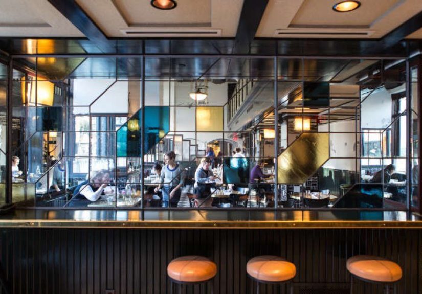
One of the restaurant’s most memorable features was its use of stained glass. In the wrong hands, stained glass can feel heavy, formal, or overly precious. Here, it became graphic and contemporary. The panels nodded to the building’s past while avoiding the trap of looking like a prop from a historical drama. They filtered light, broke up sightlines, and gave the room a distinctive glow.
That was the genius of the detail. It was decorative, but not merely decorative. It connected the restaurant to the building’s previous life, added color without shouting, and gave diners something to notice between bites. In the age of restaurant interiors designed for quick phone photos, the stained glass had a slower charm. It rewarded looking.
Pattern as Personality
Checkerboard floors, patterned tile, dark wood, brass accents, and graphic surfaces gave LA Chapter its splash. The restaurant was not minimalist in the blank-white-wall sense. It had rhythm. It had movement. It had the visual confidence of a place that knew people would walk in and immediately scan the room.
Pattern can be risky in restaurants because it competes with people, plates, and lighting. LA Chapter made it work by using pattern as structure rather than noise. The checkerboard effect created energy underfoot. The tiles added a crafted note. The darker tones grounded the room. Instead of feeling busy, the restaurant felt layered.
A Café Mood With Hotel Polish
The space borrowed from the romance of grand European cafés and New York dining rooms, but it still felt Angeleno. Banquettes overlooked the street. Café seating invited sunny-day lingering. The room felt polished enough for a special dinner yet relaxed enough for an afternoon coffee or casual meeting. That flexibility was one of its greatest strengths.
Downtown LA restaurants often have to serve multiple audiences at once: office workers, design tourists, hotel guests, theatergoers, locals, brunch groups, and people who say they are “just grabbing a quick bite” and then order three courses. LA Chapter understood that range. It was dressed up, but not uptight.
The Food: Brooklyn Roots, Los Angeles Attitude
LA Chapter was created by Jud Mongell and chef Ken Addington, the team associated with Five Leaves in Greenpoint, Brooklyn. That origin story mattered because Five Leaves had already developed a reputation for casual, stylish all-day dining: the kind of restaurant where breakfast, lunch, dinner, coffee, and people-watching all feel equally at home.
Rather than simply copy the Brooklyn formula and paste it into Los Angeles, LA Chapter adapted the idea for Downtown LA. The menu leaned into familiar American dining while giving dishes their own local identity. This was not fussy tasting-menu territory. It was more about comfort, smart details, good ingredients, and enough personality to keep the room from feeling generic.
That approach matched the design. The restaurant was accessible, but not plain. It wanted to be useful throughout the day, but it also wanted you to remember where you were. In the best hotel-restaurant tradition, it could serve as a breakfast stop, a lunch meeting spot, a date-night room, or the place where someone inevitably says, “I found the coolest spot downtown.”
What Made It “Splashy” Without Feeling Silly
The word “splashy” can be dangerous. It can suggest a restaurant that arrives with more hype than substance, all glitter and no grip. LA Chapter’s splash came from something more durable: setting, story, and sensory detail.
It Had a Real Sense of Arrival
Great restaurants do not begin at the table. They begin at the entrance. LA Chapter had the advantage of a dramatic building and a lively Broadway address, but it also knew how to use the threshold. Exterior café seating softened the street edge. The interior pulled you into a world of patterned surfaces, warm light, and visual detail. You did not simply enter; you transitioned.
It Made Historic Design Feel Social
Some historic spaces are beautiful but intimidating. LA Chapter avoided that stiffness. Its design was rich, but the room still felt like a place for conversation, coffee, dinner, and human messiness. That matters. A restaurant can be architecturally impressive, but if everyone feels like they need to whisper, the food has already lost half the battle.
It Understood the Theater of Dining
Restaurants are not just about cuisine. They are about pacing, lighting, acoustics, seating, and the little thrill of looking around and deciding you are exactly where you want to be. LA Chapter worked because it embraced that theater. The building had literal theatrical history, but the dining room created its own performance: servers moving between tables, light shifting through glass, guests framed in banquettes, plates landing like small scenes.
Downtown LA Dining and the Power of Adaptive Reuse
LA Chapter also showed why adaptive reuse is so powerful in restaurant design. A new restaurant in a new box can be excellent, but it has to build its soul from scratch. A restaurant in a historic building inherits texture, memory, and a sense of consequence. The challenge is to respect the past without becoming trapped by it.
In Downtown LA, this approach has become part of the neighborhood’s appeal. Old banks become bars. Former industrial spaces become dining rooms. Movie palaces become performance venues. Hotel lobbies become social hubs. The city’s history is not locked behind velvet ropes; it gets reused, reinterpreted, and sometimes served with fries.
LA Chapter fit that ecosystem beautifully. It did not erase the old United Artists story. It added another layer. For a neighborhood defined by reinvention, that felt exactly right.
Design Lessons Restaurants Can Still Learn From LA Chapter
Even though LA Chapter belongs to a specific moment in Downtown LA’s hospitality history, its lessons still feel current. Restaurant trends change quickly, but some ideas have staying power.
First, Design Should Tell a Local Story
A restaurant does not need to look like a history textbook, but it should feel connected to its address. LA Chapter worked because its design responded to the building and the neighborhood. The stained glass, Gothic references, café seating, and layered materials all made sense on Broadway. They would not have had the same impact in a suburban shopping center or a glassy office park.
Second, “Instagrammable” Is Not Enough
Yes, LA Chapter was photogenic. But its appeal went beyond a single money shot. The room had details that held up after the first glance. That is the difference between a restaurant designed for posting and a restaurant designed for living. A good interior should look great in photos. A great interior should still feel interesting after the phone goes back in your pocket.
Third, Flexible Dining Wins
The all-day model remains powerful because city life is messy. People want breakfast meetings, late lunches, solo coffee, casual dinners, pre-show meals, and somewhere to sit while pretending to answer emails. A restaurant that can shift moods throughout the day has a better chance of becoming part of people’s routines.
The Restaurant as a Symbol of Downtown LA’s Ambition
LA Chapter’s importance was never only about its menu or its tile choices. It represented a belief that Downtown LA could support stylish, design-forward hospitality on a scale that felt urban, not isolated. It suggested that Broadway could once again be a place of arrival, not just a corridor of old signs and locked doors.
Of course, Downtown LA’s story has never been simple. The neighborhood has faced cycles of excitement, investment, difficulty, recovery, and reinvention. The closure of the Ace Hotel DTLA in 2024 was a reminder that even beloved places are vulnerable to economic shifts and changing travel patterns. But the design legacy of LA Chapter still matters because it captured a moment when Downtown LA felt full of possibility.
That is what memorable restaurants do. They mark time. They give a neighborhood a room where its aspirations become visible. LA Chapter was not just a place to eat; it was a mood board for a changing Downtown Los Angeles.
What a Visit Felt Like: The Experience Behind the Design
Imagine approaching the restaurant from Broadway on a bright Los Angeles afternoon. The street is doing what Downtown LA streets do best: mixing delivery trucks, theater facades, commuters, tourists, old storefronts, and someone walking with great urgency while holding an iced coffee like a steering wheel. Then the building rises in front of you, ornate and slightly mysterious, as if it has been waiting since the silent-film era for someone to ask it to dinner.
The first impression is scale. This is not a tiny hidden restaurant pretending secrecy is a personality. It has presence. The facade gives you a little ceremony before you even sit down. Outside seating softens the mood, making the place feel approachable rather than grandiose. You can picture someone stopping for coffee, another person lingering over lunch, and a group gathering before a show, all without the room needing to change costumes.
Inside, the eye starts moving immediately. The checkerboard pattern gives the floor a pulse. The banquettes create cozy pockets within the larger room. Stained glass adds color and depth without turning the restaurant into a kaleidoscope accident. The lighting flatters the materials, which is restaurant design’s version of good manners. Everything seems to say: stay a little longer.
The experience works because the room offers both spectacle and comfort. Some restaurants are impressive for five minutes, then exhausting for the rest of the meal. LA Chapter’s better trick was making visual richness feel hospitable. You could admire the details, but you could also relax into the space. The design did not demand constant applause. It simply kept giving you new things to notice.
At breakfast, the restaurant would have felt like a polished neighborhood café: bright enough to start the day, stylish enough to make a regular Tuesday seem slightly more cinematic. At lunch, it could shift into a meeting spot where the room’s energy helped carry the conversation. By dinner, the darker tones, glass, brass, and pattern would take on a more dramatic quality, perfect for the kind of evening where nobody wants to admit they chose the restaurant partly because it photographs well.
The food experience matched that flexibility. The all-day format made the restaurant feel useful, not precious. You could come for something casual and still feel surrounded by occasion. That is a difficult balance. Too casual, and the design feels overdressed. Too formal, and the room stops being fun. LA Chapter found a middle ground: elevated but easygoing, stylish but not allergic to appetite.
For design lovers, the best seat would be one with a view across the room. That way, dinner becomes a slow visual tour: chairs, tile, sconces, glass, street-facing windows, and the steady choreography of a busy dining room. For people who care less about interiors, the room still works because it has warmth and movement. You do not need to know the name of a design studio to understand when a space feels good.
That may be the most valuable experience lesson from Downtown LA’s splashiest restaurant: memorable hospitality is not built from one dramatic feature. It comes from a stack of decisions that add up. The entrance matters. The seat matters. The light matters. The menu language matters. The way the room changes from morning to night matters. Even the view out the window matters, especially in Downtown LA, where the street scene is half the entertainment.
LA Chapter’s experience was ultimately about contrast. Old Hollywood history met modern hospitality. Gothic references met casual dining. Pattern met comfort. Brooklyn restaurant DNA met Los Angeles sunlight. A former theater district found a new kind of performance. The result was a restaurant that felt splashy not because it was loud, but because it understood the pleasure of making an entrance.
Conclusion: Why This Downtown LA Restaurant Still Matters
Downtown LA’s splashiest new restaurant was never just about a fresh menu or a fashionable hotel address. LA Chapter stood out because it turned a historic building into a living social space, using stained glass, pattern, craft, and all-day hospitality to create a room with real personality. It captured a moment when Broadway was being reimagined and when restaurants were becoming key players in the city’s urban revival.
Even though the original Ace Hotel DTLA era has ended, the story remains useful for anyone interested in Downtown LA restaurants, restaurant design, adaptive reuse, or the way hospitality can shape a neighborhood’s identity. LA Chapter proved that a restaurant can be both beautiful and usable, nostalgic and modern, dramatic and welcoming. That is a rare recipe. No wonder people noticed.