Table of Contents >> Show >> Hide
- Why Create a Timeline in Excel?
- Method 1: Create a Timeline with SmartArt
- Method 2: Create a Timeline with a Scatter Chart
- Method 3: Create a Gantt-Style Timeline with a Stacked Bar Chart
- Method 4: Create an Interactive Timeline with a PivotTable Timeline Filter
- How to Choose the Right Excel Timeline Method
- Common Mistakes to Avoid
- Final Thoughts
- Extra Practical Experience: What Actually Helps When Building Timelines in Excel
- SEO Tags
Excel is many things: a calculator, a tracker, a mild source of workplace drama, and, surprisingly, a pretty solid tool for building timelines. If you need to map out a project schedule, show milestones, present a product launch plan, or make sense of a chaotic list of dates, Excel can absolutely help. You do not need fancy project management software just to show that Task A happens before Task B and that somebody really should have started two weeks ago.
In this guide, you will learn how to create a timeline in Excel using four practical methods. Some are fast and visual. Others are more customizable. One is perfect when you want a classic project-style timeline. Another works best when you need an interactive date filter for PivotTables. The right method depends on whether you want something pretty, something functional, or something that politely screams, “Please look at my deadlines.”
Before you start, gather the basics in your worksheet: event names, task names, start dates, end dates, milestone dates, and any categories you want to show by color. Clean dates matter here. If Excel thinks your date is text, your timeline may behave like it is on vacation.
Why Create a Timeline in Excel?
A timeline gives structure to information that might otherwise look like a random pile of dates. It can help you visualize project phases, campaign rollouts, hiring plans, editorial calendars, construction schedules, academic milestones, and more. Instead of reading a table row by row, people can instantly see what happens first, what overlaps, and where the bottlenecks live.
Excel is especially useful because most teams already use it. That means you can build a timeline without learning a new platform, and you can update the underlying data later without starting from scratch. In other words, your timeline can grow up and become a responsible adult.
Method 1: Create a Timeline with SmartArt
If you need a quick, presentation-friendly timeline for a few milestones, SmartArt is the easiest route. It is best for high-level visuals, not detailed project tracking. Think keynote slide, not mission control.
When to use this method
Use SmartArt when you want to show a simple sequence of events such as a company history, product roadmap, launch phases, or major deadlines. It works well when the timeline is short and the design matters more than precise spacing between dates.
Step-by-step instructions
- Open a blank area in your worksheet. Go to the Insert tab and select SmartArt.
- Choose a timeline-style graphic. In the SmartArt gallery, select Process. Pick a layout such as Basic Timeline or Circle Accent Timeline.
- Enter your milestone text. Click the text pane and type your events. You can include both the date and a short description, such as “January 2026 Product Research” or “March 2026 Beta Launch.”
- Add or remove milestones. Use the SmartArt Design tools to add shapes if you need more entries, or delete extras if your timeline should stay clean and simple.
- Customize the look. Change colors, fonts, and SmartArt styles so the graphic matches your branding or presentation theme.
Pros and cons
Pros: Very fast, beginner-friendly, visually polished, great for presentations.
Cons: Limited precision, not ideal for detailed task durations, harder to manage with many events.
Example
Imagine you are creating a startup funding timeline. You could show milestones like “Idea Validation,” “Prototype,” “Seed Round,” and “Public Launch” in one clean visual without building a full chart. SmartArt handles that nicely. It will not calculate durations or dependencies, but it looks good while pretending to be effortless.
Method 2: Create a Timeline with a Scatter Chart
If you want a more custom timeline that plots events along an actual date axis, a scatter chart is one of the best Excel methods. This approach is excellent for milestone timelines because it places events according to real dates rather than equally spaced boxes.
When to use this method
Choose a scatter-chart timeline when date accuracy matters. It is ideal for project milestones, historical events, campaign calendars, product releases, and any situation where spacing should reflect real time.
Set up your data
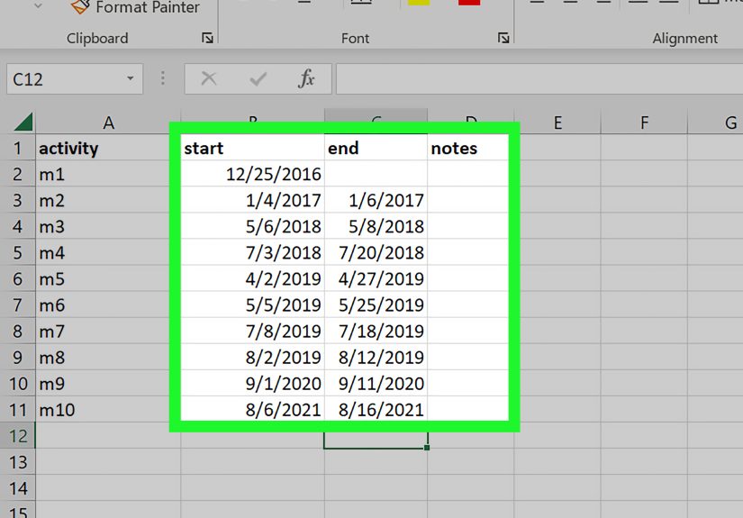
Create a table with columns like these:
- Date
- Event
- Position (use 1 and -1 values to stagger labels above and below the line)
Your rows might look like this:
01/15/2026 Kickoff 1
02/10/2026 Design Approved -1
03/20/2026 Development Complete 1
04/15/2026 Launch -1
Step-by-step instructions
- Select a blank cell so Excel does not accidentally chart the wrong thing. Go to Insert and choose a Scatter chart with markers only.
- Add your data series. Right-click the chart and choose Select Data. Edit the series so the X values are your dates and the Y values are your position numbers.
- Format the vertical axis. Since the Y values are only there to place labels, you can hide the vertical axis. Your real star is the horizontal date axis.
- Turn dates into labels. Add data labels to the points, then format the labels to use values from cells if you want your event names to appear instead of plain numbers.
- Style the axis like a timeline. Format the horizontal axis as dates. Adjust minimum and maximum bounds if needed so your chart does not add too much empty space before or after the timeline.
- Improve readability. Stagger labels above and below the line, enlarge markers for important milestones, and use consistent date formatting.
Why this method works so well
A scatter chart uses a true value axis, which means your January and June events will not be spaced the same as June and July unless the actual dates say so. That makes the chart more honest, which is refreshing in both spreadsheets and life.
Best use case
This is a strong choice for executive summaries and roadmap visuals where you want the timeline to feel custom without turning Excel into an art project gone rogue.
Method 3: Create a Gantt-Style Timeline with a Stacked Bar Chart
If you want to show task durations across time, this is the classic method. Excel does not have a built-in Gantt chart button, but you can simulate one by customizing a stacked bar chart. This is the closest thing to a traditional project timeline in Excel.
When to use this method
Use this method when you need to show tasks, phases, overlaps, and progress over time. It is perfect for marketing plans, website redesigns, construction schedules, onboarding plans, editorial calendars, and product launches.
Set up your data
Create columns for:
- Task Name
- Start Date
- Duration (in days)
For example:
Planning 01/05/2026 10
Design 01/16/2026 14
Development 02/01/2026 25
Testing 02/28/2026 10
Step-by-step instructions
- Select the data. Highlight the task names, start dates, and durations.
- Insert a stacked bar chart. Go to Insert, choose Bar Chart, and select Stacked Bar.
- Switch rows and columns if needed. If Excel guesses wrong, use Chart Design and click Switch Row/Column.
- Hide the start-date series. Click the bars representing start dates and format them with No Fill. This makes the duration bars appear to “float” at the correct start point on the timeline.
- Reverse task order. Format the vertical axis and select Categories in reverse order so the first task appears at the top, like a normal human expects.
- Format the horizontal axis as dates. Adjust minimum bounds, major units, and date formatting to fit your schedule.
- Add polish. Change bar colors by phase, reduce gap width, add data labels if useful, and include milestones or progress notes if needed.
What makes this method powerful
A Gantt-style timeline shows duration, overlap, and sequence all at once. If two tasks run at the same time, the chart shows it immediately. If a task starts late, the chart makes that painfully obvious, which is exactly what a timeline should do.
Pro tip
If you want to calculate duration automatically, use a simple formula such as =End Date – Start Date. That way, when dates change, your timeline updates with less drama and fewer manual edits.
Method 4: Create an Interactive Timeline with a PivotTable Timeline Filter
This method is a little different. Instead of building a visual project roadmap, you create an interactive timeline control that filters data by date. It works with PivotTables and PivotCharts, making it a great option for dashboards and reports.
When to use this method
Use a PivotTable timeline when you want to analyze data by month, quarter, or year. It is especially useful for sales dashboards, finance reports, traffic reports, campaign performance, and any dataset with a date field.
Step-by-step instructions
- Prepare your data. Make sure your dataset includes a real date column, not text pretending to be a date.
- Create a PivotTable. Select your data range, go to Insert, and choose PivotTable.
- Build your PivotTable or PivotChart. Add the fields you want to summarize, such as revenue by region or sessions by channel.
- Insert the timeline control. Click inside the PivotTable, go to the PivotTable tools area, choose Insert Timeline, and select the date field.
- Filter by period. Use the timeline to jump between years, quarters, months, or days. Drag the slider to focus on a specific range.
- Connect it to multiple reports. If your dashboard uses several PivotTables from the same source, you can link the timeline so one filter controls all of them.
Why this method matters
It is not a traditional milestone chart, but it is still a timeline in Excel. And for reporting, it can be more useful than a static graphic because users can interact with it. That means fewer “Can you send me the Q2-only version?” emails, which is always a win.
How to Choose the Right Excel Timeline Method
- Choose SmartArt if you need a quick, clean visual for a handful of milestones.
- Choose a scatter chart if you want a custom milestone timeline with accurate spacing by date.
- Choose a stacked bar chart if you need a project timeline that shows task duration and overlap.
- Choose a PivotTable timeline if your goal is interactive reporting and dashboard filtering.
Common Mistakes to Avoid
The first big mistake is bad date formatting. If Excel does not recognize your dates, your chart may not plot correctly. The second is using too much text. A timeline is supposed to simplify, not become a tiny novel with gridlines. The third is picking the wrong method. A SmartArt timeline is lovely for milestones, but it is not going to replace a Gantt-style schedule when you have 25 tasks and three overlapping phases.
Also, do not ignore spacing, labels, and readability. If your audience has to squint like they are decoding ancient ruins, the timeline needs a redesign.
Final Thoughts
Learning how to create a timeline in Excel is one of those surprisingly useful skills that pays off again and again. Whether you need a simple milestone graphic, a more precise scatter-chart timeline, a Gantt-style project schedule, or an interactive PivotTable filter, Excel gives you enough flexibility to build something useful without leaving your spreadsheet.
The real trick is choosing the method that matches your goal. If you want something fast, use SmartArt. If you want date accuracy, go with a scatter chart. If you need project scheduling, build a stacked bar timeline. If you want analysis and filtering, use a PivotTable timeline. Excel may not be a dedicated timeline app, but with the right setup, it can absolutely get the job done and still have enough energy left to calculate your budget.
Extra Practical Experience: What Actually Helps When Building Timelines in Excel
After working with Excel timelines in real-world situations, one thing becomes clear very quickly: the chart itself is rarely the hard part. The hard part is cleaning the data first. If your dates are inconsistent, your task names are vague, or your durations are missing, Excel will still make a chart, but it may look like it was assembled during a power outage. The best results usually come from spending a few extra minutes organizing the worksheet before touching the Insert tab.
A simple habit that helps a lot is creating a clear source table with columns for task name, owner, start date, end date, duration, and status. Even if you do not use every column in the chart, having them ready makes the timeline easier to update later. It also makes you look wonderfully organized, even if your desktop currently has fourteen screenshots named final-final-v3.
Another useful lesson is that not every timeline needs every detail. People often try to cram task descriptions, dependencies, notes, percentages, risks, and emotional backstory into one visual. That usually makes the timeline harder to read. In practice, the best Excel timelines are selective. A leadership team may only need milestone dates. A project team may need start dates and durations. A dashboard viewer may only need a date filter. Once you define the audience, the correct method usually becomes obvious.
Formatting also matters more than most people expect. Small changes make a timeline feel dramatically more professional. Reducing gap width on a stacked bar chart makes tasks easier to compare. Using one accent color for milestones and another for phases creates visual hierarchy. Aligning date labels properly can turn a messy chart into something presentation-ready. Excel is not always glamorous, but it responds very well when you stop yelling at it and start formatting with purpose.
It is also smart to think about maintenance. A timeline that looks great today but breaks the moment someone adds a new task is not a good timeline. That is why formulas, Excel tables, and consistent data ranges are so helpful. If you expect the schedule to change, and it will, build the timeline so updates are easy. Future you will be tired, under-caffeinated, and extremely grateful.
Finally, remember that timelines are communication tools, not decoration. Their job is to help people understand timing, sequence, and progress. If your chart answers those questions clearly, you have succeeded. If it also looks polished enough to impress a manager, a client, or your own suspicious inner critic, that is a nice bonus.
Note: This HTML is ready for web publishing and excludes unnecessary source-artifact text.