Table of Contents >> Show >> Hide
- What Is Valspar’s 2026 Color of the Year?
- Why Warm Eucalyptus Feels So Right for 2026
- How Warm Eucalyptus Fits Into 2026 Paint Trends
- Best Rooms for Valspar Warm Eucalyptus
- How to Pair Warm Eucalyptus With Other Colors
- Color Drenching With Warm Eucalyptus
- Using Warm Eucalyptus Outside the Home
- Small DIY Projects That Make a Big Difference
- Who Should Use Warm Eucalyptus?
- When to Be Careful With Warm Eucalyptus
- Why This Color Has Staying Power
- Real-Life Experience: Living With a Color Like Warm Eucalyptus
- Conclusion
Move over, plain white walls. Valspar has officially introduced its 2026 Color of the Year, and it is not here to whisper politely from the corner. The shade is Warm Eucalyptus 8004-28F, a restorative, nature-inspired green with warm undertones, vintage charm, and just enough moodiness to make a room feel designed instead of merely painted.
At first glance, Warm Eucalyptus feels like the paint version of taking a deep breath after closing 37 browser tabs. It is calm, but not sleepy. Stylish, but not fussy. Green, but not “accidentally turned the dining room into a salad bar” green. Valspar describes it as a serene and naturally restorative hue, and that description fits: this is a grounded green that brings softness, balance, and a hint of nostalgia into modern homes.
The timing makes sense. After years of bright whites, cool grays, and minimal interiors that sometimes looked like they were afraid of personality, homeowners are craving warmer, more comforting spaces. Warm Eucalyptus lands right in that sweet spot. It feels connected to nature, but polished enough for kitchens, bedrooms, bathrooms, entryways, exteriors, and even small DIY projects like cabinets or furniture makeovers.
What Is Valspar’s 2026 Color of the Year?
Valspar’s 2026 Color of the Year is Warm Eucalyptus 8004-28F. It is a soft, grounded green with warm undertones and a slightly vintage character. Rather than being a bright botanical green or a cool mint, Warm Eucalyptus sits closer to a moody sage with gray-green depth. That makes it flexible, livable, and surprisingly easy to use throughout the home.
Valspar’s selection reflects a broader design shift toward colors that feel restorative. People want homes that support calm, comfort, and a stronger connection to nature. Warm Eucalyptus answers that need without feeling boring. It works like a modern neutral, but it has more personality than beige and more warmth than traditional gray.
Why Warm Eucalyptus Feels So Right for 2026
Every Color of the Year says something about the mood of the moment. Warm Eucalyptus suggests that 2026 design is less about showing off and more about settling in. The color speaks to comfort, resilience, and homes that feel personal rather than overly staged.
Green has been rising for several years because it carries an easy association with nature. It reminds people of gardens, trees, herbs, shaded patios, and quiet outdoor spaces. But Warm Eucalyptus is not a loud leafy green. Its warmth and softness make it feel familiar, almost like a color pulled from an old painted cabinet, a vintage botanical print, or a sun-faded garden gate.
A Vintage-Inspired Green With Modern Flexibility
One of the reasons Warm Eucalyptus stands out is its vintage influence. It has the kind of lived-in charm that pairs beautifully with old wood, linen curtains, brass hardware, stone countertops, woven baskets, and handmade ceramics. Yet it also looks clean in a contemporary space with simple lines and matte black accents.
That balance is important. A trendy paint color can look exciting in a press photo but exhausting in real life. Warm Eucalyptus avoids that trap. It has enough depth to make a statement, but enough softness to remain comfortable day after day.
How Warm Eucalyptus Fits Into 2026 Paint Trends
Valspar is not alone in leaning into deeper, earthier, more emotional colors for 2026. Across the design world, paint brands and interior experts are moving away from sterile minimalism and toward colors with warmth, memory, and mood. Greens, smoky blues, rich browns, soft charcoals, creamy whites, and earthy reds are all part of the conversation.
Warm Eucalyptus fits this movement perfectly. It belongs to the family of “new neutrals,” colors that behave like backdrops but still bring atmosphere. Instead of relying on plain white or basic gray, homeowners can use a color like Warm Eucalyptus to create a room that feels calm, grounded, and finished.
The Rise of Nature-Inspired Neutrals
The phrase “nature-inspired” gets used so often in design that it can start to sound like wallpaper paste for the brain. But in this case, it is accurate. Warm Eucalyptus is rooted in the kind of green people actually want to live with: earthy, soft, and slightly muted. It looks good beside natural materials because it feels like it belongs with them.
Pair it with oak flooring, walnut furniture, rattan lighting, stone tile, clay pottery, cotton bedding, or linen upholstery, and the color becomes even more convincing. It does not compete with texture; it enhances it.
Best Rooms for Valspar Warm Eucalyptus
The beauty of Warm Eucalyptus is that it can work in almost any room, depending on how boldly you use it. It can be a full-wall color, a cabinet color, an accent shade, or a subtle exterior update.
Bedrooms: Calm Without Looking Flat
In a bedroom, Warm Eucalyptus creates a restful backdrop without feeling cold. It is especially effective when paired with creamy white bedding, wood nightstands, woven lampshades, and soft bronze or brass accents. The result feels peaceful but not plain, like a boutique inn where someone actually remembered to include storage.
Bathrooms: Spa Mood, Minus the Spa Bill
Bathrooms are one of the easiest places to use Warm Eucalyptus. The color naturally suggests freshness and calm, which works beautifully with white tile, marble-look surfaces, brushed nickel, aged brass, or warm wood vanities. For a small powder room, using it on all walls can create a jewel-box effect without making the space feel too dark.
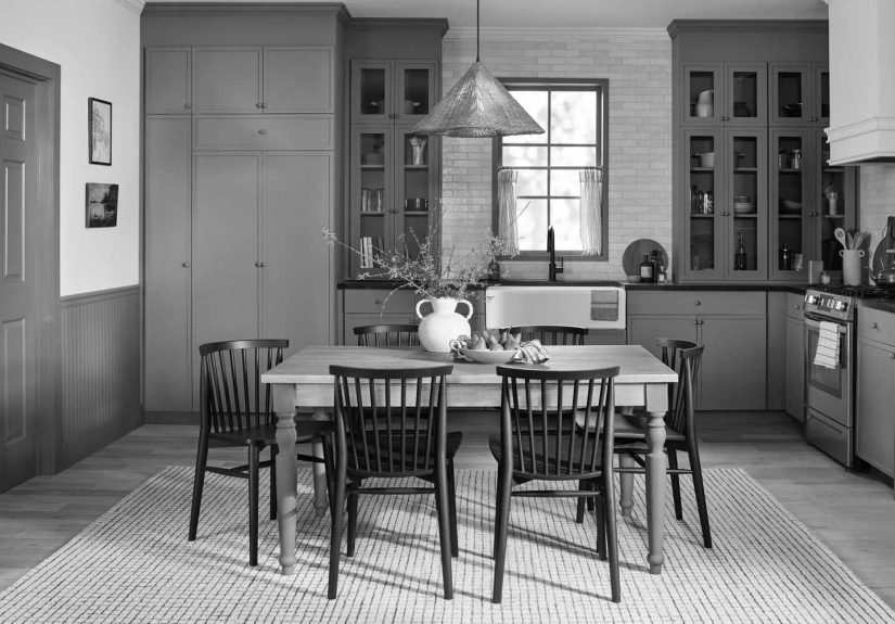
Kitchens: A Softer Alternative to White Cabinets
Green kitchen cabinets have become a major design favorite, and Warm Eucalyptus offers a softer take on the trend. It looks especially good on lower cabinets, islands, pantry doors, or built-ins. Pair it with light countertops for a fresh feel, or use darker stone and brass hardware for something moodier and more classic.
Living Rooms: A Modern Neutral With Personality
In a living room, Warm Eucalyptus can act as a sophisticated wall color that supports layered furniture and decor. It works with camel leather, ivory sofas, dark wood tables, black frames, patterned rugs, and botanical artwork. Basically, it is the friend who gets along with everyone at the dinner party.
Entryways and Mudrooms: Small Space, Big Charm
Entryways, mudrooms, and hallways are perfect testing grounds for a color like Warm Eucalyptus. These spaces often need character but do not always need a full design overhaul. A coat of green paint on beadboard, trim, doors, or storage cabinets can make the area feel intentional in a weekend.
How to Pair Warm Eucalyptus With Other Colors
Warm Eucalyptus is versatile because it has enough gray and warmth to coordinate with many palettes. The trick is to decide whether you want the room to feel soft, earthy, dramatic, or fresh.
For a Soft, Airy Palette
Pair Warm Eucalyptus with warm white, soft cream, pale beige, or light greige. This combination keeps the room bright while giving it more personality than an all-white scheme. It is a strong option for bedrooms, bathrooms, kitchens, and open-plan living spaces.
For a Nature-Driven Palette
Use Warm Eucalyptus with clay, terracotta, mushroom brown, natural oak, muted blue, and sandy beige. These combinations bring out the earthy side of the color and make a space feel grounded and collected.
For a More Dramatic Look
Pair Warm Eucalyptus with charcoal, black, deep brown, aged brass, or smoky blue. This approach works beautifully in dining rooms, studies, powder rooms, and moody bedrooms. The result is rich but not theatrical, which is helpful if your home is not secretly a Victorian mystery novel.
Color Drenching With Warm Eucalyptus
Color drenching means using one color across walls, trim, doors, and sometimes ceilings. Warm Eucalyptus is a strong candidate for this technique because it is calm enough to surround a room without feeling aggressive. In bedrooms or bathrooms, color drenching can create a cocoon-like effect that feels restful and elevated.
If full color drenching feels too bold, try a half-drenched approach. Paint the lower portion of the wall in Warm Eucalyptus and keep the upper wall a lighter complementary shade. This gives structure and interest while keeping the room visually open.
Using Warm Eucalyptus Outside the Home
Warm Eucalyptus is not limited to interiors. It can also work outdoors, especially on front doors, shutters, porch ceilings, exterior accents, patio walls, or garden structures. Because it is rooted in nature, it tends to harmonize with landscaping instead of fighting it.
On a front door, it offers a softer alternative to black or navy. On shutters, it can make a white or cream exterior feel more layered. On patio furniture or planters, it creates a quiet connection between the house and the garden.
Small DIY Projects That Make a Big Difference
You do not need to repaint your entire house to enjoy Valspar’s 2026 Color of the Year. In fact, Warm Eucalyptus may be at its most charming in smaller doses.
Try it on a bathroom vanity, a thrifted side table, a bookcase, a fireplace mantel, a closet door, or a set of dining chairs. It can also refresh old cabinets, create a statement behind open shelving, or turn a forgotten hallway into a design moment. This is the type of color that rewards experimentation because it looks intentional even on modest projects.
Who Should Use Warm Eucalyptus?
Warm Eucalyptus is a great choice for homeowners who want color but do not want chaos. It is ideal for people who are tired of gray but not ready for bright yellow, deep plum, or red dining rooms that announce themselves before guests reach the driveway.
It is also a smart option for anyone trying to make a home feel more peaceful. If your space has lots of natural materials, vintage furniture, traditional details, cottage elements, modern farmhouse touches, or organic modern styling, Warm Eucalyptus will likely feel right at home.
When to Be Careful With Warm Eucalyptus
Like any paint color, Warm Eucalyptus can shift depending on lighting. In rooms with limited natural light, it may appear deeper and moodier. In bright rooms, its softness and warmth may become more visible. Always test a sample on multiple walls and check it in morning, afternoon, and evening light before committing.
Also consider your fixed finishes. If your home has very cool gray floors, icy white tile, or blue-toned countertops, Warm Eucalyptus may need a bridge color, such as warm white, natural wood, woven texture, or brass hardware, to feel connected.
Why This Color Has Staying Power
Some Color of the Year picks are fun for a headline and terrifying for a living room. Warm Eucalyptus is different. It has trend appeal, but it is not dependent on novelty. Soft green has a long design history, from historic homes to garden rooms to classic cabinetry. The 2026 version simply updates that tradition with warmer undertones and a more relaxed mood.
That is what gives Warm Eucalyptus staying power. It can support multiple styles, adapt to different rooms, and pair with both old and new pieces. It is not just a color for the year. It is a color for people who want their homes to feel calmer, warmer, and more connected to the natural world.
Real-Life Experience: Living With a Color Like Warm Eucalyptus
There is something interesting about green paint: it can look quiet on a swatch and completely transform a room once it is on the wall. Warm Eucalyptus belongs to that category. It is not the loudest color in the paint aisle, but it has presence. The first experience many homeowners may have with it is surprise. A small chip might seem subtle, but when painted across a wall, cabinet, or door, the color begins to create atmosphere.
Imagine repainting a tired guest bedroom that has been wearing builder-grade beige since approximately the invention of Wi-Fi. The room has decent light, a simple bed, an oak dresser, and white curtains. On paper, nothing dramatic is happening. But once Warm Eucalyptus goes on the walls, the space suddenly feels calmer and more complete. The oak looks warmer. The white curtains look softer. Even the random chair in the corner, previously known as “laundry mountain base camp,” starts to look like a design choice.
In a bathroom, the experience can be even more noticeable. Bathrooms often feel cold because they contain so many hard surfaces: tile, mirrors, glass, porcelain, metal. A warm green helps soften those edges. Paint the vanity in Warm Eucalyptus, add a cream hand towel, a woven basket, and a small framed print, and the room feels less like a utility zone and more like a place where you might actually remember to moisturize.
Warm Eucalyptus also works well for people who are nervous about color. It does not demand that you redesign your entire personality. You can start with a small project, such as a bookcase or interior door, and still get the satisfaction of change. That is one of its strengths: it gives a visible refresh without forcing every other object in the room into retirement.
The color is especially enjoyable in homes with natural materials. Around wood, linen, rattan, stone, and aged metal, it feels relaxed and layered. It can make newer homes feel less sterile and older homes feel more polished. It also photographs well, which matters in the age of “just one quick picture” becoming a 45-minute furniture-moving event.
The most practical lesson is to test it first. Paint colors are moody little creatures. Warm Eucalyptus may look softer in a bright south-facing room and deeper in a shaded hallway. A sample board or test patch can save you from surprises. But for many spaces, this color offers exactly what 2026 design seems to be asking for: comfort, character, and a little nature-inspired calm that does not require owning 19 houseplants.
Conclusion
Valspar’s 2026 Color of the Year, Warm Eucalyptus 8004-28F, captures the direction of modern home design: warmer, softer, more personal, and more connected to nature. It is a green that feels restful without disappearing, stylish without trying too hard, and versatile enough for walls, cabinets, furniture, doors, and exterior accents.
For homeowners ready to move beyond blank neutrals, Warm Eucalyptus offers a practical and beautiful next step. It brings calm into busy homes, character into simple spaces, and a vintage-inspired warmth that feels right for the moment. In other words, it is the rare trend color that might still look good long after the trend reports have moved on to whatever comes next. Neon mushroom beige? Let us hope not.