Table of Contents >> Show >> Hide
- What Is Earthy Vibrancy?
- Why Earthy Vibrancy Is Taking Over in 2026
- The Key Colors in the Earthy Vibrancy Palette
- How to Use Earthy Vibrancy in Every Room
- Best Color Combinations for Earthy Vibrancy
- Materials That Make the Palette Work
- Common Mistakes to Avoid
- Easy Ways to Try Earthy Vibrancy Without Renovating
- Why This Palette Has Staying Power
- Personal Experience: Living With Earthy Vibrancy in Real Spaces
- Conclusion
Move over, flat gray. Step aside, sad beige. In 2026, the home decor world is reaching for a palette that feels like a desert sunset, a mossy trail after rain, a clay pot warming on a patio, and a plum jam stain on your favorite linen napkin. The name designers are using for it is earthy vibrancy, and yes, it sounds like something a very stylish garden gnome would put on a vision board.
But behind the catchy phrase is a smart and surprisingly livable interior design shift. Earthy vibrancy is all about nature-inspired colors with more confidence: deep terracotta, olive green, rust, ochre, chocolate brown, smoky blue, muted teal, clay pink, burnt orange, burgundy, and plum. These shades are grounded enough to feel timeless, but rich enough to wake up a room that has been surviving on white walls and one decorative basket since 2019.
The trend speaks to what many homeowners want now: rooms that feel warm, personal, layered, and real. Not showroom-perfect. Not cold. Not minimalist in a way that makes you afraid to own a coffee mug. Earthy vibrancy brings comfort and energy together, which is why it is quickly becoming one of the most important 2026 color trends for interiors.
What Is Earthy Vibrancy?
Earthy vibrancy is a color palette built from tones found in nature, but with the saturation turned up just enough to feel fresh. Traditional earth tones are often soft, muted, and neutral: beige, taupe, sand, stone, and sage. Earthy vibrancy keeps that natural foundation but adds more depth, warmth, and personality.
Think of the difference between plain oatmeal and oatmeal topped with cinnamon, toasted nuts, honey, and a spoonful of berry compote. Same comforting base. Much better personality.
In interior design, this means pairing grounded hues with bolder natural colors. A living room might combine muddy blue walls with olive velvet chairs and warm wood furniture. A kitchen might feature terracotta tile, creamy plaster walls, and moss green cabinetry. A bedroom might layer tobacco brown, soft clay pink, ochre, and linen white for a look that feels calm but not sleepy.
Why Earthy Vibrancy Is Taking Over in 2026
The popularity of earthy vibrancy did not appear out of nowhere. It is part of a larger movement away from sterile interiors and toward homes that feel emotionally connected, tactile, and lived-in. After years of cool gray floors, white kitchens, and minimalist spaces, homeowners are craving color that feels human.
Major paint and design forecasts for 2026 also point in this direction. Deep browns, warm khakis, smoky greens, muted blues, terracotta shades, and nature-based neutrals are showing up across paint brands and designer predictions. These colors are not loud in the neon sense. They are expressive in a mature, layered, “I own good olive oil” kind of way.
1. People Want Warmth Again
Cool neutrals had a long run, but many interiors started to feel flat. Earthy vibrancy brings back warmth without making a room look dated. Browns, clay tones, ochres, rusts, and olive greens create an instant sense of comfort. They make a space feel like it has history, even if the sofa arrived yesterday in a box and required one minor emotional breakdown to assemble.
2. Nature-Inspired Design Still Matters
Biophilic design has been growing for years, and earthy vibrancy fits naturally into that conversation. Instead of relying only on houseplants, this palette uses color itself to bring the outdoors in. Moss green, bark brown, oceanic blue, sunbaked clay, and lichen gray all help connect interiors to natural landscapes.
3. Homeowners Are Getting Braver With Color
The 2026 design mood is more personal and less rule-bound. People are mixing old and new furniture, using patterned textiles, painting trim in unexpected shades, and choosing colors that feel meaningful rather than universally “safe.” Earthy vibrancy works because it allows risk without chaos. You can use a deep plum wall or a rusty orange chair and still have the room feel grounded.
The Key Colors in the Earthy Vibrancy Palette
Earthy vibrancy is flexible, but several color families define the look. The best rooms usually combine three or four of these tones rather than relying on one shade alone.
Terracotta and Sunbaked Clay
Terracotta is the unofficial mascot of earthy vibrancy. It feels warm, Mediterranean, rustic, and modern all at once. Use it on tile, painted accent walls, pottery, lamps, throw pillows, or upholstery. A terracotta wall behind a cream sofa can make a living room feel instantly warmer without screaming for attention.
Moss, Olive, and Eucalyptus Green
Green remains one of the strongest interior colors of 2026, but the trend is moving away from pale sage alone. Moss, olive, eucalyptus, and blackened greens feel more sophisticated and grounded. They pair beautifully with walnut, brass, natural stone, cream, and deep brown.
Ochre, Mustard, and Honeyed Yellow
Ochre adds glow. It is less sugary than bright yellow and more complex than beige. In small amounts, it can brighten a moody room. In larger applications, such as curtains or a painted ceiling, ochre creates warmth that feels artistic rather than cartoonish.
Muddy Blue and Smoky Teal
Blue is getting earthier in 2026. Instead of crisp navy or icy blue, designers are leaning toward smoky, mineral, green-blue, and muddy tones. These blues feel connected to water, stone, and sky. They are especially effective in bathrooms, bedrooms, and reading rooms where calm is the goal.
Chocolate Brown and Burnt Umber
Brown is back, and it has hired a publicist. Once dismissed as heavy or old-fashioned, chocolate brown now feels elegant, cozy, and deeply versatile. It works as a wall color, sofa fabric, cabinet finish, or grounding accent. Pair it with clay pink, muted blue, olive green, or creamy white for a look that feels expensive even when the budget says “please be reasonable.”
Plum, Burgundy, and Dusty Berry
Deep plum and burgundy bring drama to earthy vibrancy. These colors work best when treated as sophisticated, moody accents. A burgundy powder room, plum velvet chair, or berry-toned rug can add richness without overwhelming the whole house.
How to Use Earthy Vibrancy in Every Room
Living Room
The living room is the easiest place to experiment because it usually has multiple layers: walls, sofa, chairs, rugs, art, pillows, lighting, and accessories. Start with a grounded base such as warm white, mushroom, clay, or soft taupe. Then add richer colors through furniture and textiles.
A beautiful 2026 living room combination might include muddy blue walls, a camel leather sofa, olive green pillows, a rust patterned rug, and dark wood tables. Another option is cream walls, chocolate brown chairs, ochre curtains, and terracotta ceramics. The key is to let the colors talk to one another rather than compete for the microphone.
Kitchen
All-white kitchens are not disappearing, but they are no longer the only star of the show. Earthy vibrancy gives kitchens a warmer, more collected feeling. Consider olive cabinets, terracotta backsplash tile, warm stone countertops, walnut shelving, or a smoky blue island.
If painting all the cabinets feels like too much commitment, try color on the island, pantry door, range hood, or breakfast nook. Even earthy dishware, woven pendants, and clay-toned runners can shift the mood.
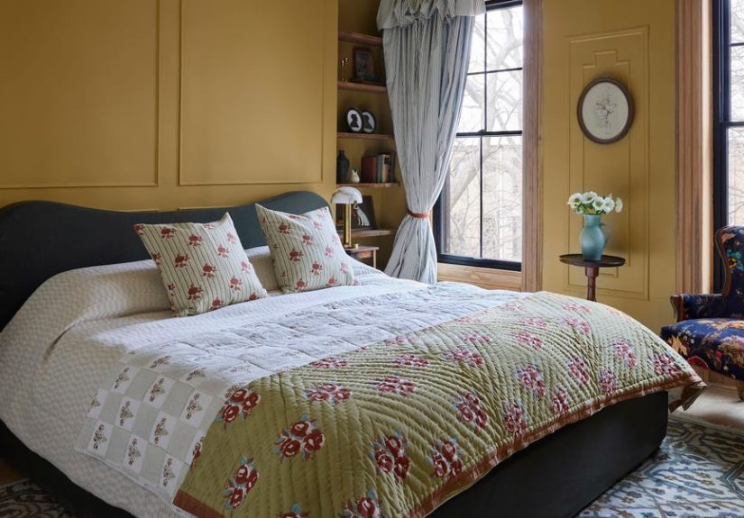
Bedroom
In bedrooms, earthy vibrancy should feel restful, not theatrical. Use softer versions of the palette: clay pink, olive, tobacco brown, muted teal, warm cream, and dusty plum. Linen bedding, wood nightstands, woven shades, and ceramic lamps help the colors feel relaxed.
One easy formula is to keep the walls warm and quiet, then add deeper color in bedding or upholstery. A creamy room with a moss green headboard, rust throw blanket, and plum artwork feels layered without becoming visually noisy.
Bathroom
Bathrooms are perfect for bold color because they are smaller and more contained. A powder room in deep olive, smoky teal, or burgundy can feel jewel-box dramatic. For a softer look, try clay tile, warm white walls, aged brass fixtures, and walnut accents.
Earthy vibrancy works especially well with natural materials such as marble, limestone, zellige tile, plaster, and wood vanities. The result feels spa-like, but not in the generic hotel way where everything looks like it was chosen by a committee named “Neutral.”
Dining Room
Dining rooms can handle richness. In fact, they often need it. Since these spaces are used for gathering, conversation, and the occasional debate about whether cranberry sauce belongs on the plate, deeper color can create intimacy.
Try chocolate brown walls with cream trim, olive grasscloth wallpaper, burgundy curtains, or an ochre ceiling. Pair these tones with candlelight, wood furniture, patterned dishes, and a large piece of art for a room that feels memorable.
Best Color Combinations for Earthy Vibrancy
Earthy vibrancy looks best when colors are layered thoughtfully. Here are several combinations that feel especially current for 2026:
- Terracotta + olive green + cream: Warm, classic, and easy to live with.
- Muddy blue + walnut brown + ochre: Calm but visually rich.
- Chocolate brown + clay pink + brass: Romantic, modern, and elegant.
- Moss green + burnt orange + linen white: Nature-inspired with a lively twist.
- Plum + warm beige + dark wood: Moody without feeling gloomy.
- Smoky teal + terracotta + stone gray: Earth and water in one balanced palette.
Materials That Make the Palette Work
Color is only half the story. Earthy vibrancy needs texture to feel complete. Without texture, deep earth tones can look flat. With the right materials, they become rich and dimensional.
Natural wood is the easiest partner. Walnut, oak, pine, and reclaimed wood all bring warmth. Stone adds permanence. Linen, wool, velvet, leather, rattan, jute, and clay introduce tactile contrast. Metals also matter: aged brass, bronze, blackened steel, and copper work better than overly shiny chrome in most earthy vibrant rooms.
The goal is to create a room that feels collected over time. A little imperfection helps. Handmade ceramics, vintage frames, woven baskets, patinated hardware, and slightly irregular tile all support the palette’s soulful quality.
Common Mistakes to Avoid
Using Too Many Saturated Colors at Once
Earthy vibrancy is not a permission slip to paint every wall a different dramatic shade. Choose one dominant color, one or two supporting colors, and a few accents. Let neutrals and natural materials give the eye a place to rest.
Forgetting About Light
Earth tones change dramatically depending on light. A terracotta that looks warm and glowing in a sunny room may look heavy in a dark hallway. Always test paint samples on multiple walls and check them in the morning, afternoon, and evening.
Choosing Colors That Are Too Flat
The best earthy vibrant colors have undertones. Look for browns with red or charcoal notes, greens with warmth, blues with gray or green depth, and pinks with clay or beige undertones. Flat colors can feel cheap; complex colors feel designed.
Ignoring the Rest of the House
A single earthy vibrant room should still connect to nearby spaces. Repeat small color cues throughout the home: a green vase in the entry, rust pillows in the living room, ochre art in the hallway, or brown trim in the dining room. This creates flow without making every room identical.
Easy Ways to Try Earthy Vibrancy Without Renovating
You do not need to remodel your entire home to enjoy this trend. Start small and build confidence.
- Add rust, olive, or ochre pillows to a neutral sofa.
- Swap a plain lampshade for a terracotta or moss green one.
- Hang art that includes muddy blue, plum, or burnt orange.
- Use clay planters instead of basic white pots.
- Try a deep green or brown tablecloth in the dining room.
- Paint the inside of a bookcase in smoky teal or warm brown.
- Replace cool gray curtains with linen, tobacco, or olive drapes.
These smaller changes are low-risk but high-impact. They let you test how the colors feel in your home before committing to walls, cabinets, or large furniture pieces.
Why This Palette Has Staying Power
Some trends burn bright and then vanish faster than a decorative pumpkin in December. Earthy vibrancy is different because it is rooted in natural color. Clay, wood, moss, stone, bark, fruit, sky, soil, and leaves do not really go out of style. They simply return in new combinations.
The 2026 version feels fresh because it combines familiar earth tones with richer saturation and more expressive pairings. It is not just beige with better branding. It is a fuller, braver, more emotional way to decorate.
Personal Experience: Living With Earthy Vibrancy in Real Spaces
The first time you bring earthy vibrancy into a room, the effect can be surprisingly immediate. A plain space suddenly feels warmer, as if someone turned on a lamp you did not realize was missing. I have seen neutral rooms change completely with one rust-colored rug, one olive chair, or one wall painted in a smoky clay tone. The room does not just look different; it behaves differently. People linger longer. The sofa looks more inviting. Even a cup of coffee seems more photogenic, which is ridiculous but true.
One of the best ways to experience this palette is through textiles. Paint can feel intimidating, especially if you have ever chosen a color from a tiny swatch and ended up with a wall that looked like nacho cheese under artificial light. Textiles are more forgiving. A moss green throw, ochre pillow, plum quilt, or terracotta curtain panel lets you see how the color interacts with your existing floors, furniture, and daylight.
In a living room, earthy vibrancy often works best when it is layered slowly. Start with one anchor piece, such as a warm brown sofa or a patterned rug with olive, rust, and cream. Then repeat one of those colors in two or three smaller accents. This repetition makes the room feel intentional. Without it, the color can look like it wandered in from another house and forgot why it came.
Kitchens are another great testing ground. A full cabinet repaint is a serious project, but smaller changes can still create a strong effect. Terracotta bowls on open shelving, a green runner, amber glass pendants, or warm wood cutting boards can soften a kitchen that feels too white or too cold. If the room has stainless steel appliances, earthy colors help balance the shine and make the space feel less clinical.
Bedrooms benefit from the calmer side of the palette. I would avoid using too many high-energy colors in a sleeping space. Instead, try clay pink sheets, tobacco brown linen, olive curtains, or a muted blue-gray wall. These shades create a cocooning feeling without making the room dark. The best bedroom palettes feel like a deep breath, not a marching band.
The most important lesson from working with earthy vibrancy is that texture matters as much as color. A flat brown wall with flat furniture can feel heavy. But brown with linen, wood grain, brass, wool, and ceramics feels layered and elegant. Terracotta next to glossy plastic may look awkward; terracotta next to aged wood and woven fiber looks natural. This is why the trend pairs so well with vintage pieces, handmade decor, and natural finishes.
Another practical tip: do not chase the trend too literally. Your version of earthy vibrancy should fit your home, your light, and your taste. If you love green, lean into moss, olive, eucalyptus, and teal. If you prefer warmth, use clay, rust, ochre, and brown. If you like drama, add plum or burgundy. The palette is broad enough to personalize, which is exactly why it feels so relevant in 2026.
Ultimately, earthy vibrancy works because it gives rooms a pulse. It makes a home feel grounded but not dull, expressive but not exhausting. It is a color story for people who want comfort with character. And after years of interiors whispering in gray, a little nature-inspired confidence feels wonderfully overdue.
Conclusion
Earthy vibrancy is the new hottest color palette of 2026 because it solves a very modern decorating problem: people want homes that feel calm, but they do not want them to feel lifeless. This palette blends the comfort of earth tones with the energy of richer, more expressive color. Terracotta, olive green, ochre, smoky blue, chocolate brown, plum, rust, and clay pink all work together to create rooms that feel warm, personal, and current.
The beauty of the trend is its flexibility. You can go bold with color-drenched walls and deep cabinetry, or you can start gently with pillows, art, ceramics, and textiles. Either way, earthy vibrancy brings depth, warmth, and soul into the home. It is not about following a trend blindly. It is about decorating with colors that feel connected to nature, memory, comfort, and personality. In other words, it is 2026’s most stylish reminder that your home does not need to look perfect. It needs to feel alive.