
Table of Contents >> Show >> Hide
- Step 1: Start with clean image markup
- Step 2: Understand why images do not always center the way you expect
- Step 3: Use text-align: center; when the image stays inline
- Step 4: Convert the image to a block and use margin: 0 auto;
- Step 5: Wrap the image in a container when you need better control
- Step 6: Use Flexbox for modern horizontal and vertical centering
- Step 7: Use CSS Grid when you want the cleanest full-centering shortcut
- Step 8: Make the image responsive so centering does not break on smaller screens
- Step 9: Use semantic wrappers like <figure> when the image needs a caption
- Step 10: Test common centering mistakes before blaming the browser
- The simplest methods, side by side
- Which method should you choose?
- Real-World Experience: What Centering Images Actually Feels Like on Live Websites
- Conclusion
- SEO Tags
Centering an image in HTML sounds like one of those jobs that should take 14 seconds and half a cup of coffee. Then reality shows up. The image stays glued to the left, your CSS starts looking suspicious, and suddenly you are bargaining with the browser like it is a tiny, stubborn landlord.
The good news is that centering an image is not hard once you know which kind of centering you actually need. Do you want the image centered horizontally inside a page? Centered inside a card? Centered both horizontally and vertically inside a hero section? Or centered without breaking the layout on mobile? Those are slightly different jobs, and HTML plus CSS gives you several clean ways to solve them.
In this guide, you will learn the 10 practical steps that make image centering easy, repeatable, and a lot less dramatic. Along the way, you will see working examples, common mistakes, and simple fixes you can use on real websites.
Step 1: Start with clean image markup
Before you center anything, begin with a solid HTML image element. That means using a valid <img> tag, a real image path, and descriptive alt text. If the image carries meaning, the alt text should explain it. If the image is purely decorative, an empty alt="" is usually the better choice.
This seems basic, but starting with accessible, clean HTML saves headaches later. A centered image that is missing context is still a bad image. It is just a bad image in the middle.
Step 2: Understand why images do not always center the way you expect
Here is the part that trips people up: an <img> behaves like an inline element by default. That means it does not act like a full-width block sitting on its own row unless you tell it to. Because of that, some centering methods work on the image itself, while others work on the image’s parent container.
Think of it this way. Sometimes you center the item. Sometimes you center the space around the item. Knowing the difference is what separates a quick fix from a mysterious pile of CSS that future-you will resent.
Step 3: Use text-align: center; when the image stays inline
If your image is still behaving like an inline element, one of the easiest ways to center it is to center the content inside its parent. That means applying text-align: center; to a block-level wrapper such as a <div>, <section>, or <figure>.
This is great for quick layouts, blog post images, simple banners, or logos inside a header. It is also easy to read, which is always nice when you revisit the code three weeks later and cannot remember what midnight-you was trying to achieve.
When this method works best
Use text-align: center; when you want to center an inline image horizontally and you do not need vertical centering. It is simple, lightweight, and surprisingly effective for common page content.
Step 4: Convert the image to a block and use margin: 0 auto;
If you want to center the image itself rather than the inline content inside a parent, convert the image into a block element and then use automatic side margins.
This is one of the most common and dependable techniques for horizontally centering an image. It works especially well for standalone images in articles, landing pages, and content sections.
If the image is huge, you may also want to control its size so it does not stretch the layout like it owns the place.
Step 5: Wrap the image in a container when you need better control
Real websites rarely have lonely images floating in the void. Usually, an image lives inside a card, a product box, a hero panel, a gallery item, or a content module. In those cases, centering the parent container often gives you cleaner control.
Here, the container is centered on the page with margin: 0 auto;, and the image is centered inside the container with text-align: center;. This combo is useful when you want to control layout width, spacing, and alignment all at once.
In other words, you are not just centering an image anymore. You are centering the image’s whole little apartment.
Step 6: Use Flexbox for modern horizontal and vertical centering
When you want something stronger than the classic tricks, Flexbox is your friend. It makes centering an image inside a parent container much easier, especially when you need both horizontal and vertical alignment.
Here is what is happening:
display: flex;turns the parent into a flex container.justify-content: center;centers the image horizontally.align-items: center;centers the image vertically.- A set height gives the container room to show vertical centering.
Flexbox is excellent for hero sections, profile cards, banners, modals, and dashboard panels. If you have ever tried to center something vertically using ancient CSS tricks, Flexbox feels like a peace treaty.
Step 7: Use CSS Grid when you want the cleanest full-centering shortcut
CSS Grid is another modern option, and for simple centering it can feel almost suspiciously easy. One line does the heavy lifting:
The place-items: center; shorthand centers content horizontally and vertically at the same time. That makes Grid especially nice when you want clean, readable code for a centered image inside a box, modal, feature block, or gallery tile.
Grid is not automatically “better” than Flexbox. It is just wonderfully direct for this specific task. If Flexbox is the multitool, Grid is the very satisfying button that says, “Center it and let me get back to lunch.”
Step 8: Make the image responsive so centering does not break on smaller screens
An image can be perfectly centered on desktop and still cause trouble on mobile if it overflows its container. That is why responsive sizing matters just as much as centering.
This small addition does a lot of work:
max-width: 100%;prevents the image from overflowing its container.height: auto;keeps the image proportions intact.
If you are building a responsive website, this is not optional flair. It is the difference between “nice layout” and “why is the page side-scrolling like it is trying to escape?”
Step 9: Use semantic wrappers like <figure> when the image needs a caption
Sometimes an image is not just decoration. It is part of the content and needs a caption. In that case, a <figure> element is a smart, semantic choice.
This keeps your markup meaningful and tidy. It also helps when you are writing content-heavy pages, tutorials, case studies, or blog posts where the caption adds context.
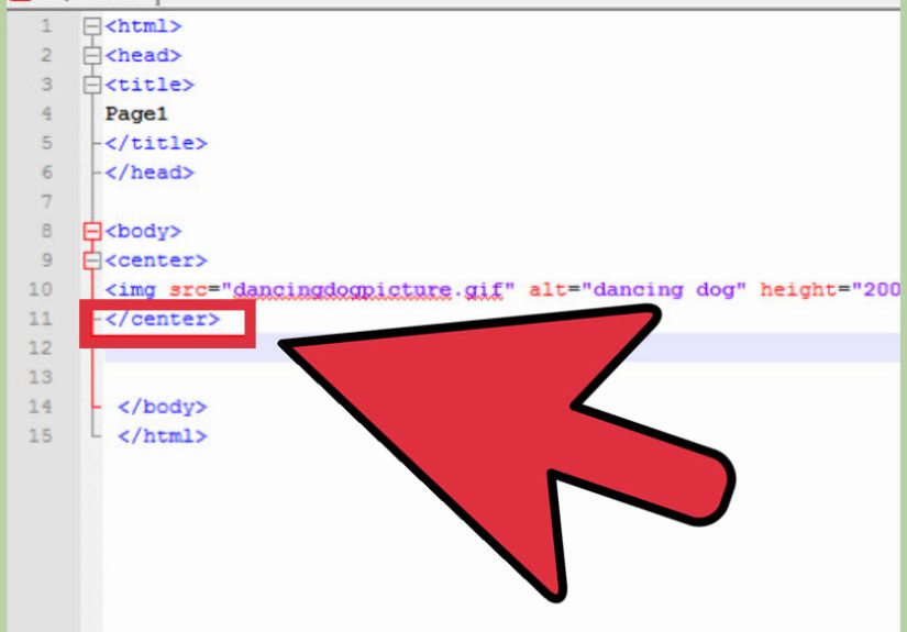
And yes, avoid the old <center> tag. It belongs in the museum gift shop with dial-up sounds and glitter text.
Step 10: Test common centering mistakes before blaming the browser
When image centering fails, the browser is not usually being evil. It is usually being very literal. Check these common issues first:
1. The wrong element has the centering rule
If you use text-align: center;, it should go on the parent, not the image.
2. The image is still inline when you expected block behavior
If you use margin: 0 auto;, make sure the image is display: block;.
3. The parent has no height for vertical centering
Flexbox and Grid need visible space to center content vertically. If the container height collapses to the image height, you will not see any dramatic change.
4. The image is too large
Add max-width: 100%; and height: auto; so the layout can breathe.
5. You are centering the image element when you actually need to center the image content inside a cropped box
That is a different job. In those cases, properties like object-fit and object-position may help manage how the image sits inside its own frame.
The simplest methods, side by side
If you just want the cheat sheet version, here it is:
Method 1: Quick horizontal centering with a parent
Method 2: Horizontal centering on the image itself
Method 3: Full centering with Flexbox
Method 4: Full centering with Grid
Method 5: Bootstrap shortcut
If your project uses Bootstrap, that utility class pair is a handy shortcut for centered block images.
Which method should you choose?
Use text-align: center; when the image is inline and you want a fast horizontal fix. Use display: block; margin: 0 auto; when you want a classic, clean solution on the image itself. Use Flexbox or Grid when you need more layout control, especially vertical centering. Add responsive sizing whenever the image could appear on multiple screen sizes.
The best method is not the fanciest one. It is the one that matches the layout you are building and stays readable for the next person who opens the file. That next person may be you, slightly older, slightly wiser, and wondering why past-you was so confident at 1:12 a.m.
Real-World Experience: What Centering Images Actually Feels Like on Live Websites
Anyone who has worked with HTML for more than an afternoon has had this experience: the image looks like it should be centered, the CSS looks correct, and yet the result is somehow still wrong. On small personal projects, the fix is usually quick. On real websites, though, centering an image becomes part of a larger chain reaction. A theme may add default styles. A framework may apply utility classes. A CMS may wrap the image in extra markup you did not ask for. Suddenly, you are not centering one image. You are negotiating with a whole ecosystem.
One of the most common real-world lessons is that the wrapper matters just as much as the image. Many developers spend too long changing rules on the <img> itself when the actual problem lives in the parent container. A card component may be set to flex. A content block may have inherited text alignment. A gallery item may have overflow rules that change the visual result. Once you get used to checking the parent first, image centering gets much easier.
Another common experience is discovering that “centered” is not always enough. Clients and editors often want the image to be centered and responsive, centered and cropped nicely, or centered and lined up with surrounding text. That is where developers learn the difference between basic alignment and polished layout work. The image might technically sit in the middle, but if it feels oversized, awkward, or disconnected from the rest of the design, the job is not really done.
There is also the mobile lesson. A layout that looks elegant on a wide desktop screen can fall apart on a phone if the image is not constrained properly. This is why so many experienced developers automatically pair centering with max-width: 100% and height: auto. They have seen what happens when they do not. Usually it involves horizontal scrolling, a broken content column, and a level of annoyance that should probably qualify as cardio.
Over time, most people settle into a practical rhythm. For simple article images, they use display: block; margin: 0 auto;. For interface layouts, they use Flexbox or Grid. For content with captions, they reach for <figure>. For framework-heavy builds, they lean on utilities when it makes sense. The biggest shift is mental: instead of treating centering as a random trick, they start treating it as a layout decision. Once that happens, the code gets cleaner, debugging gets faster, and image alignment stops feeling like browser mythology.
Conclusion
Centering an image in HTML is easy once you match the method to the layout. For a quick horizontal fix, center the parent with text-align: center;. For a classic standalone image, use display: block; margin: 0 auto;. For modern layouts, Flexbox and Grid handle horizontal and vertical centering beautifully. Add responsive sizing, meaningful alt text, and semantic structure, and your images will not just sit in the middle. They will actually belong there.
In short, image centering is not about memorizing one magic snippet. It is about knowing which tool fits the job. Once you learn that, the browser stops feeling mysterious and starts feeling cooperative. Mostly. On a good day.


 Close
Close