Table of Contents >> Show >> Hide
Beige had a good run. A long run. A marathon, really. But lately, designers have been opening the windows, dusting off the color wheel, and inviting a more playful cast of shades back into the room. Not chaotic color for the sake of chaos, either. The new wave of retro color combinations feels edited, warm, layered, and surprisingly sophisticated. Think less “grandma’s avocado fridge took over the house” and more “a very stylish person found the best parts of the past and gave them excellent lighting.”
That is exactly why retro palettes are landing so well right now. They deliver nostalgia without looking stuck in a time capsule. They feel familiar, but not sleepy. And after years of cool grays, safe whites, and minimalist everything, homeowners are clearly ready for rooms with more personality, more warmth, and frankly, more pulse.
From powder blue paired with chocolate brown to mustard living happily next to burgundy, vintage-inspired combinations are showing up in kitchens, bedrooms, bathrooms, and dining rooms with a fresh kind of confidence. The trick is that designers are not recreating old rooms exactly as they were. They are remixing the mood. The colors may be throwbacks, but the finish, balance, and styling are very much now.
Why Retro Color Combos Feel Right Again
Retro color palettes are making a comeback because they solve a problem modern homes often have: they can look polished but emotionally flat. A room can be technically beautiful and still feel like it forgot to develop a personality. Vintage-inspired combinations fix that fast. They add mood, memory, comfort, and charm, all without requiring a full renovation or a trust fund.
There is also a broader shift happening in interiors. Design has been moving away from sterile, one-note minimalism and toward layered spaces that feel lived in. That makes retro colors especially appealing because they naturally carry depth. Browns feel grounded. Burgundy feels intimate. Dusty blues feel familiar. Plum and forest green feel like they have stories to tell and excellent taste in records.
Paint brands and design editors have reinforced the same direction: warm browns, heathered plums, oxblood reds, earthy greens, golden yellows, and nature-inspired blues all keep showing up in trend forecasts. In other words, the palette of the moment is not icy or overly precious. It is richer, softer, more tactile, and a lot more willing to flirt with history.
What Makes a Retro Palette Feel Modern Instead of Dated
The secret is restraint and contrast. Designers usually let one color lead while the second color plays support. They also rely on undertones that feel muddier, warmer, or more muted than the original retro versions. That is why today’s earthy green works better than a loud, shiny avocado, and why today’s mustard reads chic instead of cafeteria-adjacent.
Texture matters too. Pairing vintage-inspired colors with wood grain, matte finishes, brushed metal, linen, boucle, plaster, or stone instantly makes them feel current. So does giving them room to breathe. A little negative space, a creamy neutral, or a warm wood floor can keep even the boldest palette from tipping into costume.
And perhaps most important: modern retro rooms are not too matchy. Designers are not painting every single surface one identical shade and calling it a day. They are layering tones, mixing periods, and letting unexpected accents wake the room up. That is where the magic lives.
7 Retro Color Combos Designers Keep Bringing Back
1. Pale Blue and Cherry Red
This combination is one of the clearest examples of retro done right. Pale blue has a softness that keeps a room relaxed, while cherry red adds a crisp, energetic pop. Together, they create tension in the best way: cool and warm, sweet and sharp, playful and polished.
What makes this pairing so appealing is that it can lean in several directions. In a bedroom or dressing room, it reads preppy and tailored. In a kitchen, it can feel slightly European and delightfully unfussy. In a living room, it works beautifully when the red is used with a light touch, like on a side chair, trim, art, or lamp base.
If you want this palette to feel designer-level instead of diner-themed, keep the blue dusty rather than babyish, and use the red as punctuation rather than a shouting match.
2. Mustard and Burgundy
Mustard and burgundy are pure retro chemistry. They have the warmth of a 1970s lounge, the richness of an old hotel in Italy, and the confidence of someone who owns at least one very good wool coat. Mustard brings glow. Burgundy brings weight. Together, they create a palette that feels cozy, cultured, and just dramatic enough.
This duo is especially strong in spaces that need warmth: dining rooms, libraries, dens, and bedrooms. Try mustard in drapery, patterned upholstery, or a vintage-style rug, then thread burgundy through art, ceramics, or a painted piece of furniture. For a bolder take, color drench the room in a soft golden-ochre and bring in wine-red velvet or leather accents.
The reason designers love this combo is simple: it feels nostalgic without being juvenile. It has soul. It also looks fantastic with dark wood, antique brass, and low lighting, which never hurts.
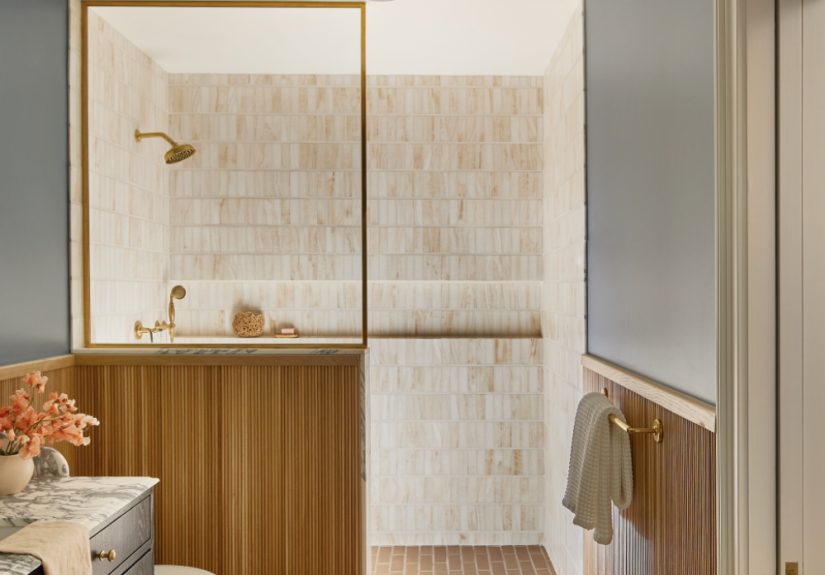
3. Powder Blue and Chocolate Brown
This is the quiet overachiever of the retro revival. Powder blue and chocolate brown may sound like an odd couple on paper, but in real rooms they feel balanced, elegant, and unexpectedly calming. The blue lightens the brown. The brown grounds the blue. No one overacts. Everyone does their job.
Designers often use this pairing when they want something softer than black and white but more distinctive than beige and cream. It is particularly strong in kitchens, bathrooms, and bedrooms where the contrast feels fresh but not harsh. Powder blue tile with walnut cabinetry? Lovely. A brown headboard against muted blue walls? Also lovely. A bathroom with pale blue paint, warm wood, and brown accents? Suspiciously good-looking.
For a modern finish, keep both tones slightly muted. Think dusty blue, cocoa, walnut, espresso, or milk chocolate rather than cartoon blue and dark brown straight from a crayon box.
4. Tangerine and Navy
Tangerine and navy create one of the most exciting retro-inspired pairings in interiors right now. Navy gives structure and depth. Tangerine brings optimism, movement, and a little bit of swagger. It is the design equivalent of a person who can be serious at work but still knows every word to an excellent karaoke song.
This combination works because it has push and pull. The blue is moody and dependable. The orange is bright and expressive. Together, they create a room that feels alive but not chaotic. It is especially effective in offices, entryways, dining rooms, or social spaces that benefit from a little energy.
Use navy as the anchor color on walls, cabinetry, or a large upholstered piece, then add tangerine through art, pillows, lampshades, or a statement chair. If you want the palette to skew more grown-up, introduce natural wood and cream to soften the contrast.
5. Plum and Forest Green
If retro color combos had a glamorous cousin who reads design books for fun and owns at least one velvet jacket, it would be plum and forest green. This pairing feels lush, cocooning, and deeply atmospheric. It has a vintage soul, but it also fits beautifully into today’s appetite for moody, immersive interiors.
Designers are drawn to this combination because it offers richness without relying on black. Plum brings depth with a hint of romance. Forest green contributes calm, grounding energy. Together, they feel dramatic, but not cold.
This combo shines in rooms where mood matters: a dining room with green walls and plum drapery, a bedroom with plum bedding and green millwork, or a study with dark green shelving and aubergine accents. Add marble, walnut, or antiqued brass, and the whole room starts looking like it has opinions about architecture.
6. Oxblood and Camel
Oxblood is having a real moment, and for good reason. It sits between burgundy, brown, and purple, which makes it feel complex and versatile. Pair it with camel, warm beige, or bone, and suddenly the room feels tailored, grounded, and very expensive-looking without actually needing to be expensive.
This is one of the easiest retro-adjacent combinations to use if you are nervous about bold color. Why? Because camel acts like a safety net. It softens the drama and turns a potentially intense shade into something approachable. Oxblood on a chair, bench, tile, or accent wall feels bold. Paired with sandy upholstery, warm white walls, and natural wood, it feels smart.
This duo works especially well in living rooms, offices, or kitchens where you want warmth and character without tipping all the way into maximalism.
7. Earthy Green and Citrine Yellow
Earthy green and citrine yellow are the sunniest members of the retro comeback club. Green offers a nature-based foundation. Citrine or golden yellow adds brightness and a subtle 1970s wink. The result is cheerful but not sugary, especially when both tones are slightly muted.
Use this palette in kitchens, breakfast nooks, mudrooms, or creative spaces. Green cabinetry or painted paneling can be paired with yellow upholstery, art, ceramic lamps, or curtains. The combo also plays beautifully with terracotta, wood, woven textures, and white walls.
If you like the idea of color but do not want your home to look like a vintage postcard exploded, keep the green grayish and the yellow golden rather than neon. The mood should be warm and collected, not highlighter-adjacent.
How to Try Retro Color Combos Without Regret
The easiest starting point is textiles. Pillows, throws, rugs, bedding, and drapery let you test a color relationship before committing to paint or tile. If you fall in love, then you can scale up to walls, cabinetry, or upholstered furniture.
Another smart move is to let one retro shade do the heavy lifting while the other acts as an accent. For example, a powder blue room with brown wood furniture feels easier to live with than equal parts blue and brown on every surface. The same goes for mustard and burgundy, or tangerine and navy.
Pay attention to undertones. Warm colors usually play best with other warm colors, and cool tones tend to like similarly cool company. That does not mean you cannot mix them. It just means the balance has to be intentional. When in doubt, add a unifying neutral like cream, camel, walnut, or soft white.
Finally, do not forget lighting. Retro-inspired palettes often look their best in warm, flattering light. A shade that seems thrilling at noon can feel aggressive under cold LED bulbs at night. Always test paint in the actual room before making lifelong promises.
The Experience of Living With Retro Color Combos
One of the most interesting things about retro color combinations is not just how they look, but how they make a room feel over time. A well-done retro palette changes the emotional temperature of a home. It can make a plain room feel memorable, a large room feel more intimate, and a basic corner feel like it suddenly has a point of view.
Take a kitchen with earthy green cabinets and golden accents. In the morning, the room feels calm and grounded, especially when sunlight hits the warmer tones. It does not scream for attention, but it quietly makes coffee feel more romantic than it has any right to be. Add brass hardware, old wood stools, and a striped runner, and the space starts to feel collected rather than decorated. That is a big difference. Decorated can be nice. Collected feels human.
Now think about a powder blue and brown bathroom. On paper, that might sound unusual. In practice, it can feel like a boutique hotel mixed with a favorite old sweater. The blue brings cleanliness and light. The brown adds steadiness. Together, they create a room that feels cooler in temperature but warmer in spirit. That balance is exactly why so many designers are gravitating toward these combinations. They do more than photograph well. They live well.
Even bolder pairings, like mustard and burgundy or plum and forest green, tend to have a surprisingly comforting effect when used thoughtfully. They create rooms you want to linger in. A reading nook becomes a place where you actually read. A dining room becomes a place where people keep talking long after dessert. A guest room starts feeling less like a spare box with a bed in it and more like somewhere with actual hospitality. Color can do that. It can nudge behavior. It can make people exhale a little.
There is also something deeply personal about choosing a retro palette. These combinations often trigger memory, even when you cannot immediately explain why. Maybe a brown-and-blue room reminds you of an old family den. Maybe oxblood and camel feels like a historic hotel lobby. Maybe tangerine and navy brings back the energy of vintage sportswear, summer camp posters, or your coolest aunt’s apartment. Nostalgia is powerful, but in a home, it works best when it is subtle. You do not want a room that feels frozen in the past. You want one that nods to it, smiles, and keeps moving.
That is why the best retro-inspired homes feel layered instead of themed. They mix old references with new habits. A chartreuse accent chair can live next to a modern lamp. A burgundy throw can land on a streamlined sofa. A cherry-red detail can wake up a mostly neutral room without turning it into a movie set. The joy comes from tension: vintage mood, current execution.
And honestly, that may be the real reason designers are so obsessed. Retro color combos remind us that homes are supposed to feel something. Not just look tidy. Not just look expensive. Not just look acceptable to the internet. Feel something. Warmth. Fun. Comfort. Surprise. A little swagger. Maybe even delight. What a concept.
Final Thoughts
Retro color combinations are back because they bring emotion, individuality, and warmth into a design world that has spent years playing it safe. The newest versions are softer, smarter, and more flexible than their earlier lives, which makes them easier to use in real homes. Whether you lean toward pale blue and cherry red, mustard and burgundy, plum and forest green, or powder blue with chocolate brown, the message is the same: color is back, and it no longer wants to apologize for existing.
If your home has been feeling a little too careful lately, a retro-inspired pairing might be exactly the shake-up it needs. Not a full identity crisis. Just a stylish little rebellion.