Table of Contents >> Show >> Hide
- Who Was William Wurster, and Why Does This House Matter?
- The Original Design: A Courtyard Bungalow With Quiet Confidence
- The Renovation Strategy: Complete the Courtyard, Do Not Compete With It
- A Better Kitchen: Light, Flow, and Daily Use
- Respecting Wurster’s Material Language
- Why This Addition Works So Well
- Historic Renovation Lessons From the Wurster House
- Design Takeaways for Homeowners Planning a Similar Renovation
- The Beauty of Quiet Modernism
- Experiences and Practical Insights From a Wurster-Inspired Renovation
- Conclusion: A Renovation That Lets the Original House Breathe
The best home renovations do not walk into the room shouting, “Look at me, I am new!” They enter politely, shake hands with the original architecture, and somehow make the whole house feel as if it has finally remembered what it wanted to be. That is the charm of the Wurster House Addition and Renovation, a thoughtful update to a 1951 courtyard bungalow designed by William Wurster and later modernized by Jennifer Weiss Architecture in San Francisco.
This project is not simply about adding square footage. Anyone can add space; plenty of houses have additions that look like a box accidentally backed into the living room. The real achievement here is subtler: the renovation improves daily function, opens the kitchen to light and landscape, strengthens the relationship with the courtyard, and preserves the quiet intelligence that made Wurster’s residential work so enduring.
For homeowners, architects, and mid-century modern fans, the Wurster House Addition and Renovation offers a valuable lesson: respectful design does not mean freezing a home in amber. A historic or architecturally significant house can evolve, but the new work must understand the original rhythm, materials, scale, and spirit. In plain English, the renovation has to know when to sing and when to hum backup.
Who Was William Wurster, and Why Does This House Matter?
William Wilson Wurster was one of the most influential American residential architects of the twentieth century, especially in California and the San Francisco Bay Area. His houses are often described as examples of “everyday modernism,” a phrase that fits beautifully because Wurster’s work was not obsessed with drama for drama’s sake. He favored livability, site sensitivity, simple materials, flexible planning, and a deep connection between indoor and outdoor life.
Unlike some modernists who seemed determined to prove that humans should live inside geometry homework, Wurster designed houses that felt relaxed, useful, and deeply connected to place. His residential work often used wood, generous openings, courtyards, garden relationships, and modest forms that made modern living feel warm rather than cold. He helped shape a distinctly Bay Area version of modernismone that cared about landscape, climate, privacy, and the everyday rituals of home.
The Wurster House Addition and Renovation fits squarely into that legacy. The original 1951 bungalow was offset from the street, creating a sheltered courtyard in the middle of the city. That move alone says a lot about Wurster’s priorities. Instead of treating the lot as a stage for the front façade, the house turned inward, using the courtyard as a private outdoor room. It is a very San Francisco idea: make room for peace, light, and greenery even when the city is politely breathing down your neck.
The Original Design: A Courtyard Bungalow With Quiet Confidence
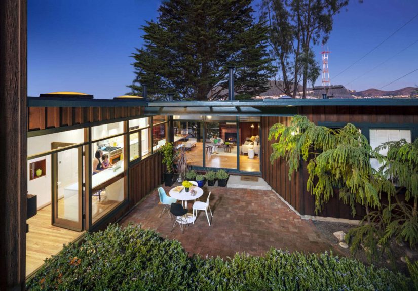
The existing house had a strong architectural idea: a courtyard organized the experience of arrival, light, and daily living. One side of the courtyard already worked beautifully, with a window wall that connected the living room to the garden. The living room had the good manners to look outward, invite sunlight in, and make the courtyard feel essential rather than decorative.
The kitchen side, however, did not carry the same architectural weight. It included an open-air utility area, a single window, and a composition that felt less considered than the living room façade. In many older homes, this is exactly where time exposes a design imbalance. Public spaces may retain their elegance, while kitchensonce treated as back-of-house work zonesstruggle to meet modern expectations for gathering, cooking, homework, coffee, conversation, and the sacred American ritual of standing in front of the fridge wondering what changed since five minutes ago.
By the time of the renovation, the house needed modernization, but the challenge was not to overpower the bungalow. The goal was to complete the courtyard, improve the kitchen, and make the home feel more connected without erasing the character that made it valuable in the first place.
The Renovation Strategy: Complete the Courtyard, Do Not Compete With It
Jennifer Weiss Architecture approached the project with a careful understanding of Wurster’s language. Rather than treating the addition as a separate design statement, the renovation extended the logic already present in the house. The kitchen was gutted and expanded into former outdoor closet space, allowing it to become a larger, brighter, and more useful room.
The most important move was architectural, not cosmetic: the new kitchen façade received its own graceful window wall, giving it the same level of attention and connection that the living room side already enjoyed. Suddenly, the courtyard no longer felt like it had one “good” side and one awkward side wearing sweatpants to dinner. The updated kitchen helped complete the outdoor room, making the garden courtyard feel intentional from every angle.
This is the kind of design decision that separates a sensitive renovation from a merely expensive one. The project did not rely on flashy finishes to create impact. Instead, it improved the relationship between spaces. The house became more coherent, and the courtyard became more than scenery. It became the heart of the home.
A Better Kitchen: Light, Flow, and Daily Use
In mid-century homes, kitchens can be tricky. Many were built when kitchens were more enclosed and task-oriented. Today, homeowners often want kitchens to function as social hubs, family workstations, informal dining zones, and command centers for snacks, schedules, and mildly chaotic mornings.
The Wurster House kitchen renovation solved this by opening the room to the dining area and connecting it more strongly to views through the back of the house. The result was not just a bigger kitchen, but a more meaningful one. Light entered more generously. Sightlines improved. Movement through the house became easier. The kitchen gained the spatial confidence to participate in family life rather than hide behind a wall like it forgot its lines.
The renovation also added a new family entrance with a mudroom and workspace. This may sound practical rather than poetic, but practical improvements are often where good residential architecture earns its keep. A mudroom can change the way a household works. Bags, shoes, coats, keys, mail, and daily clutter finally have somewhere to go besides “any horizontal surface currently available.” In a house with architectural pedigree, these everyday functions matter because they allow the elegant spaces to remain elegant.
Respecting Wurster’s Material Language
One of the smartest parts of the Wurster House Addition and Renovation is the way new details refer back to the original house. Redwood accents in the addition connect to the interior redwood paneling, while circular skylights take inspiration from a circular motif found in the existing eaves. These choices create continuity without slipping into imitation.
That distinction is important. A successful addition to a significant house should not pretend to be original in a dishonest way. At the same time, it should not scream for attention with materials, proportions, or forms that feel unrelated. The best approach is a careful middle path: compatible, respectful, and quietly legible.
In this project, the redwood details do not feel like decorative nostalgia. They act as connective tissue. The circular skylights do not appear as random design confetti. They grow out of an existing motif and bring natural light into the renovated space. The result feels fresh, but not foreign.
Why This Addition Works So Well
1. It Strengthens the Existing Idea
The original house was organized around a courtyard. The renovation did not fight that idea. It made the courtyard stronger by upgrading the kitchen side and improving visual relationships. That is renovation wisdom in one sentence: find the best idea in the house, then help it do its job better.
2. It Updates Function Without Flattening Character
The project modernized the kitchen and circulation while preserving the architectural calm of the bungalow. Many remodels accidentally remove the very features that made a house special. Here, the renovation improves comfort and usability while protecting the home’s mid-century identity.
3. It Uses Details as Bridges
Redwood accents, skylight forms, window-wall proportions, and courtyard relationships all help connect old and new. These are not random pretty things. They are design decisions that build trust between the original structure and the addition.
4. It Understands That Views Are Emotional
The renovation increased visual connections through the house, toward city and bay views, and into the garden courtyard. Views are not only about scenery. They affect mood, orientation, and how large or intimate a home feels. A small house with smart sightlines can feel expansive; a large house with poor connections can feel like a furniture warehouse with plumbing.
Historic Renovation Lessons From the Wurster House
The Wurster House Addition and Renovation also aligns with broader best practices in historic and architecturally sensitive rehabilitation. Preservation guidance in the United States often emphasizes that new additions should protect significant materials and features, remain compatible in massing and scale, and still be distinguishable as new work. That principle is especially useful for mid-century modern homes, where subtle proportions and material choices can be more important than obvious ornament.
For a Wurster house, compatibility means more than matching paint colors. It means understanding how the plan works, how rooms meet landscape, how wood creates warmth, and how modest forms can produce rich spatial experiences. A careless addition might copy the surface but miss the soul. A thoughtful addition studies the house until it can speak the same language with a slightly modern accent.
This is why the project feels so convincing. It does not turn the bungalow into a museum piece. It lets the house continue living. The kitchen becomes useful for contemporary routines. The family entrance handles real household mess. The workspace supports modern life. The courtyard becomes more complete. Nothing about that feels frozen, and nothing feels careless.
Design Takeaways for Homeowners Planning a Similar Renovation
Start With the House’s Strongest Feature
Before choosing tile, appliances, hardware, or the kind of faucet that looks like it belongs in a boutique hotel for very elegant birds, study the house. What is the main architectural idea? Is it a courtyard, a view, a roofline, a material palette, a strong axis, or a relationship to the garden? Once that idea is clear, make every major decision support it.
Do Not Treat the Kitchen as an Isolated Object
A kitchen renovation should improve the whole house, not just the room with the refrigerator. In the Wurster House, the kitchen update improved the courtyard, dining connection, circulation, and family entry. That is a much more powerful result than a kitchen that merely looks good in photos.
Use Materials With Memory
If the original home includes redwood, Douglas fir, brick, concrete, steel windows, or special paneling, new materials should respond thoughtfully. They do not have to match perfectly, but they should belong. Material continuity helps an addition feel rooted rather than pasted on.
Let Natural Light Do Some Heavy Lifting
Skylights, window walls, clerestories, and carefully placed openings can transform a renovation. In mid-century modern homes, light is often a primary design material. The Wurster House renovation uses openings not just for brightness, but for spatial connection.
Respect Scale
A modest house can lose its charm if an addition swells beyond proportion. The goal is not to make the original home look small and apologetic. The goal is to expand carefully, keeping rooflines, massing, and room relationships in balance.
The Beauty of Quiet Modernism
One reason the Wurster House Addition and Renovation feels so relevant today is that it offers an antidote to overdesigned living. Modern homes can sometimes become obsessed with spectacle: giant glass walls, statement stairs, kitchens the size of airport lounges, and lighting schemes that make dinner feel like a product launch. Wurster’s influence points in a different direction.
His houses remind us that good residential design can be modest, practical, warm, and deeply satisfying. A courtyard can be more powerful than a grand façade. A well-placed window can matter more than a dramatic gesture. A kitchen can be modern without looking like it was assembled by a spaceship committee.
The renovation succeeds because it respects that attitude. It does not try to make the house louder. It makes the house clearer. The project improves what daily life asks of the building while preserving the calm intelligence of the original design.
Experiences and Practical Insights From a Wurster-Inspired Renovation
Anyone planning a renovation like the Wurster House Addition and Renovation should expect the process to feel less like a shopping trip and more like a careful conversation with the building. Older architect-designed homes have opinions. They may not speak out loud, thankfully, because that would make permitting meetings even weirder, but their proportions, materials, and circulation patterns will tell you what works and what does not.
The first experience many homeowners encounter is the temptation to “fix” everything at once. A mid-century kitchen may feel too small. Storage may be limited. The entry may not support modern family routines. Bathrooms may need updating. Mechanical systems may be tired. The easy response is to open every wall and chase a completely new layout. But in a Wurster-style home, restraint is often the smarter move. The better question is not, “How do we make this house look new?” The better question is, “How do we make this house work beautifully again?”
A second practical lesson is that exterior relationships matter as much as interior finishes. In a courtyard bungalow, the garden is not an accessory. It is part of the architecture. During planning, homeowners should stand in the courtyard, look back at every façade, and ask whether each side contributes to the outdoor room. A window may need to become larger. A blank wall may need rhythm. A service area may need to be absorbed or redesigned. These moves can improve the emotional quality of the home more than any single countertop selection.
Another experience is the importance of storage that does not ruin the architecture. Mid-century homes often feel airy because they avoid visual clutter, but real families own shoes, backpacks, pet supplies, sports gear, chargers, cleaning tools, and at least one drawer full of mysterious cables no one is brave enough to throw away. The Wurster renovation’s addition of a mudroom and workspace is a reminder that practical zones protect beautiful zones. When daily mess has a destination, the living spaces can remain calm.
Budget conversations also become more focused when the design goal is clear. Instead of spending equally everywhere, invest in the moves that strengthen the original concept: better openings, compatible woodwork, durable flooring, thoughtful lighting, and high-quality transitions between old and new. A renovation can survive a modest appliance package. It has a much harder time surviving bad proportions.
Finally, living in a renovated Wurster-inspired home should feel natural, not precious. The goal is not to tiptoe around architecture as if the house were a museum guard with a roof. The goal is to create rooms that support cooking, reading, gathering, working, resting, and looking outside. When a renovation is successful, the design almost disappears into daily pleasure. You notice the morning light. You enjoy the courtyard. You move easily from kitchen to dining room. You drop your keys in the mudroom instead of losing them in a parallel universe. That is the real luxury: a house that makes ordinary life feel quietly well designed.
Conclusion: A Renovation That Lets the Original House Breathe
The Wurster House Addition and Renovation is a model of how to update a significant mid-century modern home without draining away its character. By expanding and transforming the kitchen, improving courtyard connections, adding practical family spaces, and echoing original details through redwood accents and circular skylights, Jennifer Weiss Architecture created a renovation that feels both fresh and inevitable.
Its biggest lesson is simple: the best additions do not just add. They clarify. They repair weak spots, strengthen original ideas, and make the house more livable without turning it into something unrecognizable. In this case, the renovation completes the courtyard experience, supports modern family life, and honors William Wurster’s enduring belief in architecture shaped around people, place, light, and everyday pleasure.
For anyone considering a mid-century modern renovation, this project offers a useful blueprint. Begin with respect. Study the house. Let the site guide the design. Choose materials that belong. Make practical improvements feel architectural. And when in doubt, remember that quiet confidence usually ages better than loud design gymnastics.
Note: This article is written in original language for web publication and synthesizes verified project information, William Wurster design context, mid-century modern renovation principles, and historic rehabilitation best practices without inserting raw source links into the article body.