Table of Contents >> Show >> Hide
- What Is a Cashmere Kitchen, Exactly?
- Why Cashmere Kitchens Are Taking Over in 2026
- The Signature Elements of a Cashmere Kitchen
- How to Get the Look Without a Full Remodel
- Best Color Pairings for Cashmere Kitchens
- What to Avoid If You Want the Look to Feel Authentic
- Are Cashmere Kitchens Just Another Passing Trend?
- Living With a Cashmere Kitchen: The Experience Behind the Trend
- Conclusion
- SEO Tags
If the all-white kitchen had a good run, the 2026 kitchen trend report has entered the chat with a soft cough and a much better sweater. The new favorite look is the cashmere kitchen: warm, layered, calm, expensive-looking, and somehow still welcoming enough that you can leave a loaf of sourdough on the counter without ruining the vibe. In other words, it is luxury without the attitude.
Unlike flashy kitchen trends that scream for attention like a reality TV contestant in sequins, cashmere kitchens win by whispering. They rely on warm neutral cabinets, creamy paint colors, tactile materials, subtle stone movement, light-to-medium wood tones, and hardware that looks better with age. The effect is polished, but not stiff. Refined, but not museum-like. Think: a kitchen that says, “Yes, I have excellent taste,” without also saying, “Please do not touch anything.”
That balance is exactly why the trend is taking off. Designers and homeowners alike are moving away from the colder whites and grays that dominated kitchens for years. In their place comes a softer palettemushroom, taupe, putty, sand, clay, greige, and warm ivorypaired with natural materials that make a space feel grounded and deeply livable. It is part quiet luxury kitchen, part practical design strategy, and part collective desire to make the busiest room in the house feel less like a showroom and more like home.
What Is a Cashmere Kitchen, Exactly?
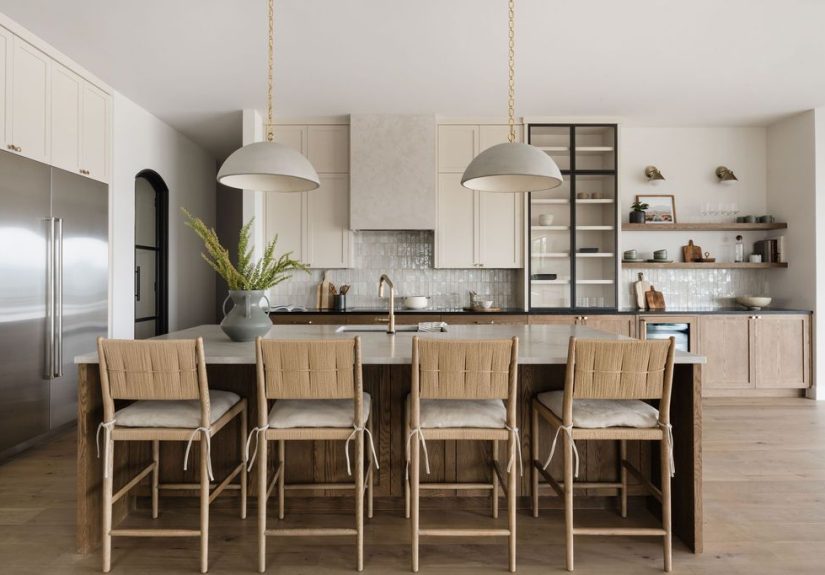
A cashmere kitchen is not about decorating your backsplash with sweaters. It is a design approach inspired by the qualities people associate with cashmere itself: softness, warmth, quiet elegance, and a timeless feel that never looks like it is trying too hard. In practical terms, that usually means a kitchen built around tonal neutrals, soft contrasts, warm metals, wood grain, and richly layered textures.
The palette is the first giveaway. Instead of bright white, icy gray, or sharp black-and-white contrast, cashmere kitchens lean into gentler shades such as creamy off-white, warm beige, mushroom gray, pale taupe, stone, sand, and light clay. These colors create a cocooning effect, especially when repeated across cabinetry, walls, backsplash materials, and countertops in slightly different tones.
Then come the materials. A cashmere kitchen almost always looks better when it includes something real and tactile: white oak, walnut, limestone, quartzite, honed marble-look surfaces, zellige tile, plaster-like finishes, or brushed and unlacquered brass. The goal is depth, not drama. Texture, not clutter. Luxury, not a gold faucet having an identity crisis.
Why Cashmere Kitchens Are Taking Over in 2026
1. They warm up the kitchen without making it feel dark
For years, homeowners chased brightness at all costs. The result was often a kitchen that looked clean on paper but felt a little too clinical in real life. Cashmere kitchens solve that problem beautifully. Warm neutrals still reflect light and keep a space open, but they add softness that stark whites often lack. A putty cabinet color or creamy wall tone can make the room feel instantly more welcoming without sacrificing brightness.
2. They fit the “quiet luxury” mood perfectly
Quiet luxury in interiors is all about restraint, quality, and longevity. That philosophy translates naturally into the kitchen, where permanent finishes matter more than trend-chasing. Cashmere kitchens feel elevated because they focus on enduring elements: good proportions, flattering neutrals, handsome wood, subtle veining, and hardware with character. They look costly, but not because they are covered in shiny things. They look costly because the choices feel confident and edited.
3. They work with the broader shift toward calmer homes
Modern kitchens are no longer sealed-off work zones. They are part of open-plan living, constantly visible from dining rooms, family rooms, and the rest of the house. That has pushed kitchen design toward a more architectural, integrated look. Cashmere kitchens slide neatly into that movement because they are visually calm. They can blend into surrounding rooms, support hidden storage, and help the kitchen feel more like elegant millwork than a command center for toaster chaos.
4. They make natural materials shine
Wood, stone, and warm metals have all been gaining ground, and cashmere kitchens give them the perfect supporting cast. A creamy cabinet color makes white oak look richer. A mushroom-toned island sets off a veined quartzite countertop. A soft beige backdrop lets antique brass develop that beautiful lived-in patina designers love. It is a trend that is less about one hero color and more about making every material in the room look better together.
5. They feel current without being risky
That may be the secret sauce. A homeowner can embrace a warm neutral kitchen without worrying it will look outdated in two years. Cashmere kitchens feel fresh because they replace the coldness of yesterday’s palettes, but they remain classic because they stay rooted in traditional principles: harmony, proportion, texture, and natural beauty. Translation: your future self is less likely to mutter, “What was I thinking?” while repainting cabinets on a holiday weekend.
The Signature Elements of a Cashmere Kitchen
Warm, layered cabinet colors
Cabinet color is usually the heart of the look. The best choices are nuanced rather than flat: mushroom, putty, soft taupe, creamy beige, warm greige, sandy white, light clay, and gentle stone shades. These hues work because they contain warmth without tipping into yellow or looking muddy. They also play nicely with wood and stone, which is the whole point.
Wood tones that add movement
White oak is especially popular, but medium brown woods and walnut also work beautifully. Some cashmere kitchens use painted perimeter cabinets with a stained wood island. Others flip the formula with wood lowers and lighter uppers. Either way, the grain adds movement and warmth that flat paint alone cannot provide.
Stone that looks soft, not stark
Countertops and backsplashes matter here because cashmere kitchens rely on subtle visual interest. Look for quartz, quartzite, or natural stone with creamy bases and soft taupe, beige, sand, brown, or gold veining. Taj Mahal-style quartzite has become especially desirable because it delivers warmth and elegant movement without the high-contrast drama of colder stones.
Brass, bronze, or other warm metals
Cold chrome and harsh black accents can feel too sharp for this trend. Warm metals, especially unlacquered brass, aged brass, and soft bronze, bring in glow and depth. The beauty of these finishes is that they age gracefully. A little wear does not ruin the look; it improves it.
Texture everywherejust not chaos
Texture is what keeps a neutral kitchen from looking flat. Think lightly ribbed glass, linen window treatments, hand-finished tile, fluted millwork, natural wood grain, plaster-like paint, woven stools, or a matte cabinet finish next to polished stone. None of these details need to be loud. They just need to create a room that feels interesting when the color palette stays restrained.
Soft lighting
Cashmere kitchens are rarely lit like operating rooms. Softer lighting, warmer bulbs, and fixtures with more shape or texture help the room feel intimate. Pendants with fabric shades, lantern-inspired silhouettes, or softly diffused glass can make a major difference. The palette may be neutral, but the mood should still be rich.
How to Get the Look Without a Full Remodel
One reason this trend is so appealing is that you do not need to gut your kitchen to participate. A few thoughtful upgrades can move the room in a more cashmere-inspired direction.
Repaint the cabinets in a soft, warm neutral
If your cabinets are bright white or cool gray, a warmer shade can completely change the room. Look for colors described as creamy, mushroom, putty, sandstone, taupe, or greige. The key is a color with a soft undertone that flatters the rest of your finishes instead of fighting them.
Swap cold hardware for warm metal
Changing cabinet pulls and knobs is the design equivalent of changing your shoes before dinner: small move, wildly different impression. Aged brass, brushed brass, or warm bronze can instantly soften the room and add that “effortlessly luxe” quality the trend is known for.
Introduce wood where the kitchen feels flat
Add wood stools, floating shelves, a butcher block accent, a wooden vent hood surround, or even a freestanding vintage table if your layout allows. Wood gives the eye a place to rest and makes a neutral kitchen feel layered rather than one-note.
Upgrade the backsplash thoughtfully
A glossy white subway tile may still be functional, but it often reads a little too crisp for this look. Consider zellige in a creamy tone, a slab backsplash, or tile in a stone-inspired shade with handmade variation. A little irregularity is good. Perfection is overrated, and frankly, a little suspicious.
Declutter the visual field
Cashmere kitchens tend to look serene because they are edited. Appliance garages, integrated storage, organized shelves, and cleaner countertops all support the vibe. This is not about pretending nobody cooks here. It is about letting the kitchen breathe.
Best Color Pairings for Cashmere Kitchens
If you want a foolproof starting point, try one of these combinations:
Mushroom + white oak + unlacquered brass
Possibly the most textbook cashmere combination. It feels grounded, elegant, and easy to live with.
Creamy putty + quartzite + warm bronze
Ideal for homeowners who want the room to feel soft and luxurious without going too beige.
Warm ivory + walnut + honed stone
This pairing adds a little more contrast while keeping the overall mood refined and calm.
Soft taupe + clay accents + textured tile
Great for a kitchen that wants a little earthiness and personality while staying neutral at its core.
What to Avoid If You Want the Look to Feel Authentic
Not every neutral kitchen qualifies as cashmere. If you want the trend to feel intentional, avoid a few common mistakes.
Too much contrast: stark black pendants, icy white counters, and cool gray paint can break the softness of the palette.
No texture: a room full of smooth, flat, same-tone surfaces can look unfinished instead of luxurious.
Cheap gold finishes: warm metal works best when it feels mellow and natural, not bright and flashy.
Overdecorating: cashmere kitchens succeed because they are layered, not crowded. Leave some breathing room.
Are Cashmere Kitchens Just Another Passing Trend?
Yes and no. The name is definitely trendy. The design logic is not. Warm neutrals, natural materials, and thoughtful layering have long been the ingredients of timeless interiors. What changed is the collective appetite for them. After years of cool palettes, sharp contrast, and highly stylized kitchens, homeowners want rooms that feel gentler and more human. Cashmere kitchens answer that desire in a way that feels current, but not disposable.
That is why this trend has real staying power. Even if the phrase “cashmere kitchen” eventually fades, the ideas behind itcomfort, material richness, visual softness, and everyday luxuryare likely to stick around. And honestly, that sounds like a much better investment than repainting everything bright white again in five years.
Living With a Cashmere Kitchen: The Experience Behind the Trend
Design trends usually get judged in photos first, but the real test happens on a random Tuesday morning when someone is making coffee, someone else is looking for a clean mug, and a loaf of bread is somehow already on the island. That is where cashmere kitchens really earn their popularity. They are not just photogenic; they are easy to live with.
The first thing many people notice is how different the room feels emotionally. A kitchen wrapped in warm neutrals tends to feel calmer from the moment you walk in. Bright white spaces can look crisp and beautiful, but they often bounce light around in a way that makes the room feel sharper and more energetic. Cashmere kitchens soften that effect. Early sunlight looks golden instead of glaring. Evening light feels cozy rather than clinical. Even the sound in the room can seem gentler once you bring in more wood, textiles, and matte finishes.
There is also something deeply forgiving about the palette. Small smudges, crumbs, and the little evidence of real life do not scream at you the way they sometimes do in high-contrast kitchens. That does not mean a cashmere kitchen is messy. It just means it does not behave like a judgmental aunt. It has grace. A slightly rumpled linen shade, a wooden cutting board left out after dinner, a stone counter with soft movement, a brass pull that is beginning to patinathese things add charm instead of looking like mistakes.
Another big part of the experience is flexibility. Because the base palette is so versatile, homeowners can change the personality of the room seasonally or over time without ripping out expensive finishes. In fall, the space can lean richer with walnut boards, amber glass, and deep green branches. In spring, it can feel airy with a simple ceramic vase and lighter linens. The room adapts, which is exactly what a hardworking kitchen should do.
Entertaining feels easier in this kind of space, too. Guests naturally gravitate toward kitchens that feel warm, and cashmere kitchens are built for that. They read as polished without seeming precious, which is ideal when people are hovering near the island asking whether they can help and absolutely not helping. The room looks dressed up, but it still invites people to settle in, pour a drink, and stay a while.
Perhaps the best thing about the trend is that it encourages homeowners to think beyond the single “wow” moment. A cashmere kitchen is not trying to go viral because of one dramatic element. Its beauty comes from the whole composition working together: the cabinet tone, the wood grain, the soft backsplash variation, the metal finish, the lighting, the way the room connects to the rest of the home. Living in a space like that feels less like owning a trend and more like finally getting the atmosphere right.
And that, ultimately, is why cashmere kitchens in 2026 feel bigger than a fad. They are not asking homeowners to be louder, bolder, or more dramatic. They are asking them to build kitchens that feel warm, tactile, elegant, and genuinely comfortable. In a world full of things begging for attention, that kind of effortless luxury feels refreshingly smart.
Conclusion
Cashmere kitchens are taking over 2026 because they offer what many homeowners have been missing: warmth without heaviness, elegance without showiness, and timeless style without boredom. By combining soft neutral cabinetry, natural wood, gentle stone movement, warm metals, and thoughtful texture, this look creates a kitchen that feels both expensive and deeply livable. It is a design trend with excellent mannersand that may be exactly why everyone wants it.