Table of Contents >> Show >> Hide
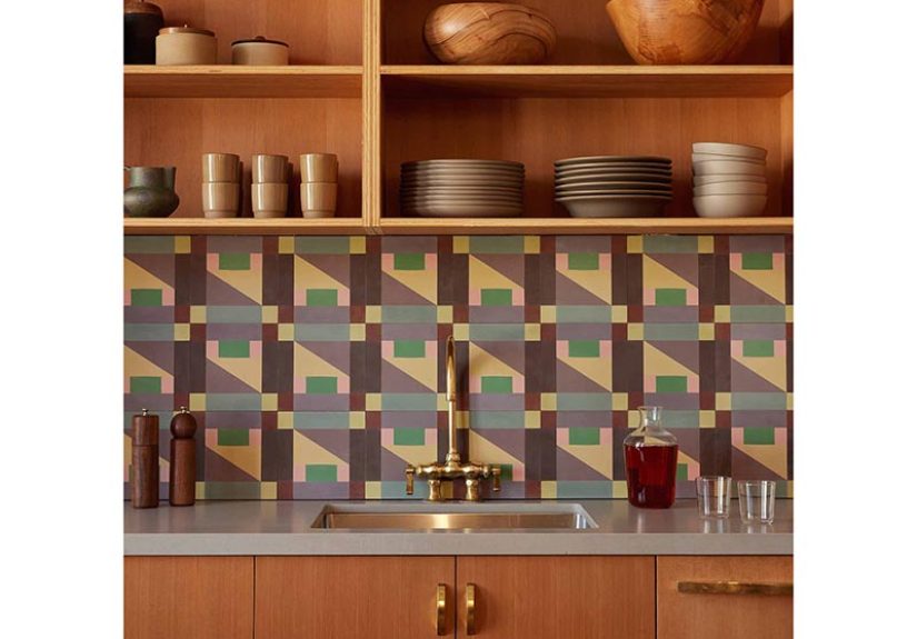
Some tiles are background actors. They do their job, stay on script, and politely disappear behind the faucet. Commune Abstrakt Tile 2 is not that tile. This is the kind of surface that walks into a room, steals the lighting, and somehow still looks cultured about it. It has the visual energy of a painting, the discipline of geometric design, and the practical heft of cement tile. In other words, it is decorative, but not flimsy; bold, but not chaotic; memorable, but not trying too hard like that one chair every design influencer swears is “surprisingly comfortable.”
At first glance, Commune Abstrakt Tile 2 reads like modern art flattened into architecture. Its composition feels painterly, but the pattern still obeys enough geometry to work in real interiors. That is exactly what makes it interesting. It does not look like a mass-market attempt at “artsy tile.” It looks intentional. It looks designed by people who understand both surface pattern and the rooms surfaces actually live in.
For homeowners, designers, and renovation dreamers who want more than a safe neutral square, Commune Abstrakt Tile 2 offers a smart middle path. It gives a space personality without pushing it into theme-park territory. It can elevate a kitchen backsplash, add drama to a powder room floor, or bring rhythm to a bar nook, entry, shower wall, or fireplace surround. If your taste lives somewhere between gallery, boutique hotel, and “I would like my house to have a pulse,” this tile makes a compelling case for itself.
What Makes Commune Abstrakt Tile 2 Different?
The first thing that separates Commune Abstrakt Tile 2 from ordinary decorative tile is the idea behind it. This is not a random pattern printed onto a surface because someone in a meeting said, “People like shapes.” The design comes from an artistic collaboration and carries a real visual lineage. That matters, because the best patterned tile never feels arbitrary. It has internal logic. Even when it is playful, it still feels composed.
Commune Abstrakt Tile 2 belongs to the Abstrakt collection, a series developed through a collaboration with Commune Design. The collection draws from original artwork by Steven Johanknecht, and that artistic origin shows. The pattern has movement, asymmetry, contrast, and balance all at once. It feels painterly in spirit, but architectural in execution. That is a hard trick to pull off. Plenty of patterned tiles are loud. Far fewer are visually lively and still sophisticated.
The design language also gives the tile unusual flexibility. Because the pattern contains both bold and quieter moments, it can work as a feature or as a field. In one room, it becomes the conversation starter. In another, it becomes the glue that ties together cabinetry, plaster, wood, and metal. Good tile does not merely decorate a space; it organizes it. Commune Abstrakt Tile 2 has that rare organizing power.
A decorative tile with an art-school brain
There is a reason this tile feels more refined than many trendy patterned surfaces. Its visual roots connect to abstraction, color study, and geometric composition rather than novelty. The result is a tile that feels expressive without feeling messy. It has enough irregularity to stay alive, but enough structure to avoid visual exhaustion. You do not look at it and think, “That will date in six months.” You look at it and think, “That room probably belongs to someone with very good books.”
That balance is what makes the tile especially attractive in today’s design landscape. Current interiors are increasingly embracing geometry, strong focal points, and surfaces that add character without clutter. Commune Abstrakt Tile 2 fits that shift beautifully. It does not rely on fake distressing, nostalgic clichés, or overly precious hand-painted motifs. It feels graphic, modern, and rooted in design history all at once.
How the Pattern Works in Real Interiors
Patterned tile can go wrong fast. Too much repetition, and the room feels rigid. Too little structure, and the room feels visually caffeinated. Commune Abstrakt Tile 2 succeeds because it sits in the sweet spot between order and spontaneity. The segmented shapes create rhythm, while the varied blocks keep the eye moving. That makes it an excellent option for spaces that need energy without noise.
In a kitchen backsplash, this tile can become the main decorative element in an otherwise restrained palette. Pair it with white oak cabinets, creamy plaster walls, unlacquered brass, and simple counters, and the tile gets room to perform. In a powder room, it can do even more. Powder rooms are one of the few places where you can be a little dramatic without frightening the rest of the house. A full wall or floor in Commune Abstrakt Tile 2 turns a small room into an experience.
Bathrooms are another strong candidate, especially if you want pattern without resorting to cliché spa minimalism. This tile can bring personality to a vanity wall, shower accent, or floor while still working with classic fixtures. It also plays well with quieter supporting materials: matte paint, light stone, terrazzo, walnut, blackened steel, and warm white ceramic. Translation: it has star power, but it is not impossible to cast.
Best places to use Commune Abstrakt Tile 2
- Kitchen backsplash: ideal when the rest of the kitchen is calm and needs one strong visual move.
- Powder room floor or wall: a smart place to let the pattern take center stage.
- Bar area or coffee station: great for giving small built-in zones a custom, collected look.
- Shower niche or feature wall: useful when you want detail without covering every surface in pattern.
- Entry or mudroom: strong enough to make the first impression feel intentional rather than accidental.
- Fireplace surround: especially compelling in eclectic, midcentury, or art-forward interiors.
That said, scale and restraint still matter. Not every room needs to become a geometry thesis. If your cabinetry already has dramatic grain, your wallpaper is busy, and your lighting resembles sculpture in a mild state of emergency, take a breath. Commune Abstrakt Tile 2 shines most when it has visual space around it. Let it be the pattern hero, not part of a design traffic jam.
Material Matters: Why Cement Changes the Experience
Part of the appeal of Commune Abstrakt Tile 2 is not just the pattern, but the material. Cement tile behaves differently from glossy ceramic or ultra-uniform porcelain. It tends to feel softer visually, more grounded, and more tactile. You do not get the same slick, factory-perfect look. Instead, you get variation, depth, and a surface that feels made rather than merely manufactured.
That material reality is important when choosing where and how to use the tile. Cement gives richness, but it also asks for respect. This is not the sort of surface you install and then forget while flinging marinara and red wine around like a cooking show contestant. Handmade cement tile often develops patina over time, and small shifts in tone or shading are part of the charm. For many design lovers, that is a feature, not a flaw. If you want a surface that stays sterile and unchanged forever, you may be happier elsewhere. If you like materials that age with character, cement tile is deeply appealing.
The handmade nature of the tile also contributes to its warmth. Tiny irregularities keep the pattern from feeling mechanical. That matters more than people think. Interiors with too many machine-perfect elements can feel flat, even when expensive. A handmade tile introduces texture and life, the same way natural wood grain or hand-finished plaster does. It reminds the room that humans exist.
Installation and maintenance notes worth knowing
- Use an installer who understands cement tile, not just tile in general.
- Confirm sealing requirements before grouting and after installation.
- Choose grout color carefully; it can change the whole reading of the pattern.
- Avoid harsh or acidic cleaners that can damage delicate or porous surfaces.
- Expect maintenance to be part of the ownership experience, especially in wet areas or heavy-traffic zones.
- Embrace variation rather than fighting it; that is part of what makes handmade cement tile beautiful.
In practical terms, Commune Abstrakt Tile 2 is best for buyers who love design enough to care for it. Not obsessively. Not in a “no one touch the backsplash” way. Just enough to understand that a distinctive material deserves informed installation and sensible upkeep. Think of it as the leather jacket of tile: strong, stylish, better with time, but not thrilled about being neglected.
How to Style Commune Abstrakt Tile 2 Without Overdoing It
The easiest mistake with a statement tile is trying to “match its energy.” Resist that urge. Commune Abstrakt Tile 2 does not need competition; it needs support. The smartest styling approach is to let the tile bring the pattern while the rest of the room handles shape, tone, and texture with a lighter hand.
Cabinetry in oak, walnut, painted cream, olive, or charcoal can all work beautifully depending on the palette in the tile. Hardware should stay simple. Counters should read as calm rather than hyperactive. Lighting can be sculptural, but not in a way that turns the room into a design shouting match. If you want the tile to feel elevated, repeat one or two of its colors elsewhere in small doses: a stool cushion, art frame, dishware, or runner. That creates echo without imitation.
This tile also pairs especially well with materials that have visual honesty: limewash, plaster, brushed metal, soapstone, honed marble, unfinished brass, linen, cane, and matte-painted wood. Those materials keep the room tactile and collected. They also stop the space from feeling too glossy or over-produced. Commune Abstrakt Tile 2 is at its best in rooms that feel layered, not showroom stiff.
Who Should Choose This Tile?
Commune Abstrakt Tile 2 is right for someone who wants a surface with identity. It suits homeowners who are tired of default white subway tile, designers who want an art-driven focal point, and renovators who understand that one memorable material can do more for a room than ten forgettable upgrades. It is especially persuasive in homes that lean eclectic, California modern, collected contemporary, Scandinavian-inspired, or midcentury-adjacent.
It may be less ideal for someone seeking absolute uniformity, ultra-low maintenance, or a highly traditional look. That is not a criticism. It is just good matchmaking. The wrong tile in the wrong home is like wearing sequins to a tax seminar: technically possible, emotionally confusing.
But in the right setting, Commune Abstrakt Tile 2 can anchor an entire design story. It offers color, pattern, craftsmanship, and conversation in one move. Few surfaces manage that without becoming exhausting. This one comes surprisingly close.
Experiences Related to Commune Abstrakt Tile 2
What is it actually like to live with a tile like this, beyond mood boards and beautifully lit product photography? The experience is less about “owning a tile” and more about how the room feels once the tile is in place. Commune Abstrakt Tile 2 changes atmosphere. That is the real difference. A plain surface can finish a room. This one animates it.
In a kitchen, for example, the experience is immediate every morning. Light hits the surface differently throughout the day, and the pattern never reads exactly the same way twice. Early light may pick up the softer tones. Evening light can make the geometry look sharper and more dramatic. That shifting quality is one reason art-inspired tile feels richer than flat decorative repeats. It does not just sit there. It participates.
There is also a strong emotional component to a patterned cement tile. A room with Commune Abstrakt Tile 2 tends to feel more collected and more intentional, even when the rest of the furnishings are simple. Open shelving looks better against it. A coffee setup feels less improvised. A powder room becomes less of a forgotten closet with plumbing and more of a small design destination. Guests notice it, usually in the way you want people to notice something in your home: not because it is screaming for attention, but because it makes the room feel distinct.
Another interesting part of the experience is that the tile encourages restraint elsewhere. Once a surface this strong is installed, people often edit the rest of the room more carefully. Countertops stay cleaner. Decorative objects become fewer and better. Paint choices become more considered. In that sense, the tile can actually improve the design discipline of a space. It asks the room to grow up a little.
Daily life with a tile like this is also tactile. Cement does not feel cold in the same way highly polished surfaces can. Visually, it has softness and depth, and that translates into a room that feels grounded. Even when the pattern is graphic, the finish keeps the effect from becoming harsh. The room ends up feeling artistic, but still livable. That balance is harder to achieve than it sounds.
There is, of course, a practical side to the experience. You become more aware of maintenance, installation quality, and the fact that handmade materials are allowed to have personality. If you are the sort of person who wants every tile to be a carbon copy of the next, that may test your patience. But if you appreciate patina, tonal variation, and surfaces that gain character with time, the experience is rewarding. You stop looking for sterile perfection and start noticing richness instead.
Perhaps the best way to describe living with Commune Abstrakt Tile 2 is this: it makes ordinary routines feel slightly more designed. Washing dishes, walking into a powder room, pouring a drink at the bar, catching a glimpse of the backsplash from the living roomthose moments become a little more visually satisfying. And that is not a trivial thing. The best home materials quietly improve daily life. Not with gimmicks, but with presence.
So no, Commune Abstrakt Tile 2 will not solve all your design problems. It will not fold laundry. It will not explain why every renovation needs three more weeks. But it can give a room soul, rhythm, and a memorable point of view. In the grand hierarchy of household miracles, that is not bad for one square of cement.
Final Thoughts
Commune Abstrakt Tile 2 is more than a pretty patterned tile. It is a design object with artistic roots, material depth, and serious decorative range. It speaks to the current appetite for geometry, handmade character, and bold surfaces that still feel thoughtful. Used well, it can transform a kitchen, bathroom, entry, or accent wall from competent to compelling.
If your goal is a room that feels layered, artful, and unmistakably intentional, this tile deserves a close look. It brings pattern without kitsch, color without chaos, and craftsmanship without stiffness. That is a rare trio. And in a market full of safe surfaces trying very hard not to offend anyone, Commune Abstrakt Tile 2 has the confidence to be interesting. Frankly, more rooms could use that.