Table of Contents >> Show >> Hide
- What Is Design Respite?
- Why Design Respite Is Trending Now
- The Color Palette: Calm Does Not Mean Colorless
- Texture Is the New Luxury
- Lighting: The Unsung Therapist of the Room
- Emotional Zoning: Give Every Mood a Place to Land
- The Respite Kitchen: Calm, Functional, and Not Afraid of Storage
- The Bathroom as a Daily Reset
- The Bedroom: Build the Cocoon
- Furniture Shapes: Rounded, Generous, and Human
- Personal Objects Make Calm Feel Alive
- Sustainability and Longevity: Buy Less, Choose Better
- How to Create Design Respite Without Renovating
- Common Mistakes to Avoid
- Experience Notes: Living With Design Respite
- Conclusion: The New Luxury Is Relief
Some homes shout. Others whisper, “Take your shoes off, exhale, and please stop doom-scrolling on the sofa.” That whisper is the heart of Design Respite, the current obsession reshaping interiors into softer, smarter, more emotionally generous spaces. It is not about turning your house into a silent retreat where every beige vase must be spiritually aligned. It is about designing rooms that help you recover from the noise of everyday life while still looking polished, personal, and very much alive.
In 2026, the strongest interior design ideas are less about showing off and more about feeling restored. Homeowners are asking for warmth, longevity, wellness, flexibility, quiet texture, natural materials, layered lighting, cocoon-like bedrooms, spa-minded bathrooms, and kitchens that function like calm command centers instead of cluttered snack war zones. The mood is intentional but not stiff, luxurious but not precious, edited but not empty.
Think warm minimalism with character. Think color that soothes without vanishing. Think a reading nook that says, “Yes, you may ignore your notifications here.” Design respite is the antidote to visual fatigue, decision overload, and rooms that look great online but feel like waiting rooms in real life.
What Is Design Respite?
Design respite is the practice of creating interiors that give the body and mind a break. It blends calm home design, sensory comfort, wellness-focused features, and timeless decorating choices into spaces that feel grounded. Unlike cold minimalism, it does not require you to hide every book, blanket, mug, and trace of human existence. Unlike maximalism, it does not ask your wallpaper, rug, lampshade, and ottoman to compete in an Olympic shouting match.
The best design respite spaces are layered, tactile, and quietly expressive. They use soft color transitions, natural textures, acoustic comfort, low-glare lighting, flexible layouts, and meaningful objects. The result is a home that works hard in the background so you can feel more relaxed in the foreground.
The Core Ingredients
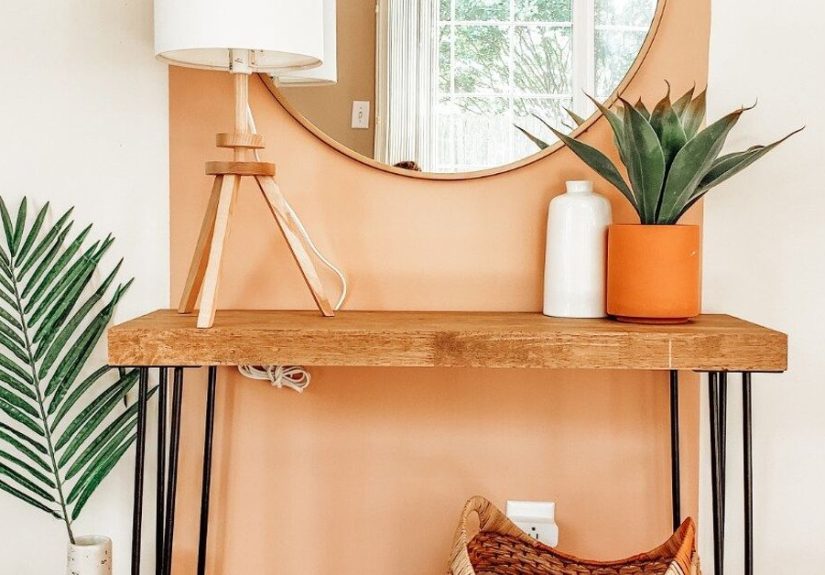
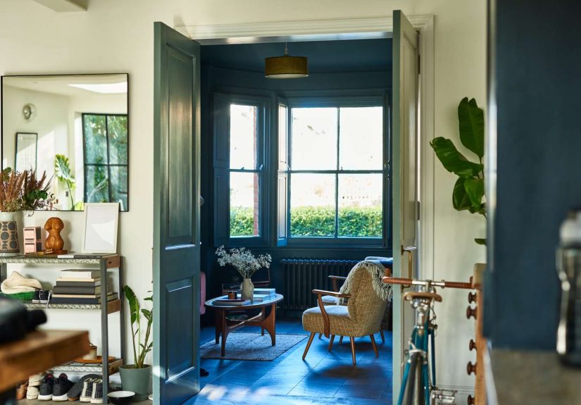
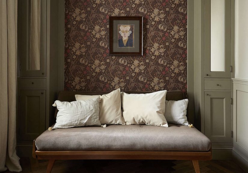
A true respite room usually includes a few reliable elements: comfortable seating, warm lighting, natural materials, breathable negative space, controlled clutter, personal details, and one or two moments of beauty that make you pause. That could be a linen-covered chair near a window, a walnut console with a handmade ceramic bowl, a mossy green bathroom, or a bedroom wrapped in clay, cream, and deep brown tones.
The goal is not perfection. In fact, perfection is often the enemy of calm. A room can be beautiful and still have a dog bed, a stack of novels, or a very suspicious drawer full of charger cables. Design respite simply gives the chaos better boundaries.
Why Design Respite Is Trending Now
Homes have become offices, gyms, classrooms, entertainment zones, recovery spaces, and occasional laundry museums. With so many roles packed under one roof, people want rooms that help them shift modes. A kitchen needs to support cooking, conversation, storage, and health-conscious routines. A bathroom needs to feel more like a daily reset than a tiled pit stop. A bedroom needs to encourage real rest, not just serve as a place where decorative pillows gather in intimidating numbers.
That is why wellness design, sensory interiors, and emotional zoning are gaining attention. Instead of treating beauty as surface decoration, homeowners are thinking about how spaces affect mood, energy, attention, sleep, and family routines. This is design with emotional intelligence. It knows when to be interesting and when to be quiet.
The Color Palette: Calm Does Not Mean Colorless
For years, “calm interior” was often translated as white, gray, beige, repeat until everyone loses the will to discuss paint. Design respite takes a richer approach. Warm neutrals still matter, but they are joined by espresso browns, smoky greens, muted blues, clay, ochre, cream, khaki, mushroom, terracotta, and soft white. These colors feel grounded because they borrow from nature rather than from a printer cartridge running out of ink.
Benjamin Moore’s 2026 color direction highlights deeper, more refined tones like Silhouette AF-655, a brown-black hue with warmth and elegance. Pantone’s Cloud Dancer points toward soft white and spacious clarity. Sherwin-Williams and related color forecasts continue the movement toward earthy, adaptable neutrals. Together, these palettes suggest a larger design mood: people want rooms that feel steady, not sterile.
How to Use Respite Colors at Home
Start with a base that supports the room’s function. In a bedroom, try warm white, mushroom, muted clay, soft olive, or deep brown for a cocooning effect. In a living room, pair cream walls with walnut, boucle, linen, wool, or aged brass. In a bathroom, explore mineral greens, smoky blues, or pale stone tones. In a kitchen, consider warm cabinetry, soft stone surfaces, and color in the backsplash or island instead of splashing neon drama everywhere like a smoothie accident.
If you love bold color, design respite still has room for you. The trick is restraint. A burgundy chair, a chartreuse vase, a tomato-red lamp, or a deep teal powder room can energize a home without turning every room into a festival poster. Calm does not mean shy. It means balanced.
Texture Is the New Luxury
In design respite, texture does the heavy lifting. Smooth white boxes are out; touchable rooms are in. Linen curtains, plaster walls, rattan baskets, raw timber, honed stone, wool rugs, mohair pillows, leather pulls, ceramic lamps, woven shades, and limewash finishes bring depth without visual chaos.
Texture also helps a home feel human. A hand-thrown bowl has tiny irregularities. Wood grain changes from plank to plank. Washed linen wrinkles in a way that says, “I have accepted reality.” These imperfections create comfort because they do not demand constant maintenance or flawless styling.
Layering Without Clutter
The secret is to layer materials, not random objects. A room can feel rich with only a few components if each one has presence. Imagine a cream sofa, a nubby wool rug, a dark wood table, a ceramic lamp, a linen shade, and one oversized branch arrangement. That is enough. You do not need seventeen trays, nine tiny sculptures, and a decorative knot that no one understands.
Lighting: The Unsung Therapist of the Room
Bad lighting can ruin even the most expensive design. Overhead glare makes a room feel like a dentist’s office with throw pillows. Design respite depends on layered lighting: ambient light for general glow, task light for reading or cooking, accent light for art and texture, and low evening light for winding down.
Use dimmers wherever possible. Choose warm bulbs for living spaces and bedrooms. Add table lamps, floor lamps, sconces, under-cabinet lighting, and small shaded lamps in unexpected places. A tiny lamp on a kitchen counter can make leftovers feel like cuisine. That is power.
Emotional Zoning: Give Every Mood a Place to Land
Open-concept living is not disappearing, but many homeowners are craving more defined areas. Emotional zoning means shaping spaces around how you want to feel and what you need to do. A work zone should support focus. A dining zone should invite connection. A lounge zone should make your shoulders drop. A bedroom should not look like your laptop moved in and signed a lease.
You can create zones without building walls. Use rugs, lighting, furniture placement, screens, curtains, bookcases, or even paint changes. A corner chair, small side table, soft lamp, and basket of blankets can become a decompression zone. Add a plant and suddenly it has a personality.
The Respite Kitchen: Calm, Functional, and Not Afraid of Storage
The kitchen is becoming more intelligent, health-conscious, and integrated with the rest of the home. For design respite, the kitchen should feel easy to use and easy to reset. That means better storage, fewer fussy details, durable surfaces, smart appliances where useful, and materials that age gracefully.
Warm minimalism works beautifully here. Think slab or slim-profile cabinet doors, large drawers instead of awkward lower cabinets, hidden charging zones, quiet appliances, soft-close hardware, integrated lighting, and natural stone or stone-look surfaces. A kitchen can be sleek without being cold, especially when paired with warm wood, veined quartzite, creamy neutrals, or green-gray cabinetry.
Small Kitchen Respite Ideas
If a full renovation is not happening, focus on sensory upgrades. Replace harsh bulbs with warmer ones. Add a washable runner. Clear the countertops except for daily-use items and one beautiful object. Use drawer dividers so utensils stop forming a tiny metal rebellion. Add a wooden cutting board, a ceramic crock, or a small lamp. Suddenly, your kitchen feels less like a task factory and more like a place where soup could happen.
The Bathroom as a Daily Reset
The bathroom is one of the clearest places to apply design respite. Spa-inspired design does not have to mean a marble palace with a bathtub the size of a kayak. It can mean warm lighting, better ventilation, soft towels, a curbless shower, accessible storage, quiet colors, natural textures, and surfaces that are easy to clean.
Technology is also entering the bath in practical ways: smart mirrors, improved shower systems, heated floors, water-saving fixtures, and lighting that supports different routines. But the best respite bathrooms do not feel gadget-heavy. They feel calm, efficient, and personal. The technology should disappear into the experience, like a polite butler who never asks you to update firmware.
The Bedroom: Build the Cocoon
A design respite bedroom should be soft, quiet, and slightly protective. Upholstered headboards, layered bedding, blackout curtains, tactile rugs, warm paint, and low bedside lighting all contribute to a sense of retreat. Instead of bright white and sharp contrast, consider warm neutrals, brown-forward palettes, muted mauve, dusty blue, olive, mushroom, or clay.
Acoustic softness matters too. Fabric panels, rugs, lined curtains, upholstered furniture, and bookshelves can reduce echo and make the bedroom feel more intimate. The goal is not to create a cave. It is to create a room that tells your nervous system, “Nothing urgent is happening here.”
Furniture Shapes: Rounded, Generous, and Human
Sharp angles can be elegant, but respite design favors pieces with a little softness. Rounded sofas, curved chairs, oval tables, scalloped edges, cylindrical ottomans, and softened corners make a room easier to move through and easier to relax in. The look is not childish or overly cute. It is simply more forgiving.
Comfort-first furniture is especially important because design respite is meant to be used. A chair that looks sculptural but punishes your spine after seven minutes is not respite. It is an art installation with lumbar consequences.
Personal Objects Make Calm Feel Alive
One risk of calm interiors is sameness. A room can become so tasteful that it forgets who lives there. The cure is personal detail: framed family photos, travel finds, inherited furniture, handmade pottery, favorite books, local art, vintage lighting, or a slightly odd object that makes guests ask, “What is the story here?”
Design respite is not about erasing personality. It is about editing personality so the room feels meaningful rather than crowded. Keep what carries memory, beauty, usefulness, or humor. Release what only carries dust.
Sustainability and Longevity: Buy Less, Choose Better
A restorative home is also one that resists the churn of disposable trends. Choose materials and furniture with longevity in mind: solid wood, repairable pieces, vintage finds, natural fibers, quality hardware, and timeless color foundations. This does not mean every purchase must be heirloom-level. It means asking better questions before buying: Will I still like this in three years? Can it be repaired? Does it work with what I already own? Is it comfortable? Does it make my home feel better, or just newer?
Vintage and antique pieces are especially useful in respite design because they add depth and reduce the showroom effect. A weathered table, old mirror, or vintage lamp can make a room feel collected rather than assembled in one panicked weekend.
How to Create Design Respite Without Renovating
You do not need a contractor, a giant budget, or a dramatic “before and after” montage. Start with one room and one feeling. Do you want the living room to feel calmer? Remove visual noise, improve lighting, add texture, and create a clear resting zone. Do you want the bedroom to feel more restful? Change the bulbs, simplify the nightstands, add better curtains, and choose bedding that feels good against the skin.
Quick Respite Upgrades
- Replace harsh overhead lighting with lamps and dimmable warm bulbs.
- Add one natural texture: linen, wool, wood, stone, clay, rattan, or leather.
- Create a no-device corner with a chair, lamp, and side table.
- Use trays, baskets, and drawers to control everyday clutter.
- Bring in a grounding color such as olive, khaki, mushroom, clay, or deep brown.
- Swap thin curtains for lined fabric panels to soften sound and light.
- Keep fewer decorative objects, but choose better ones.
Common Mistakes to Avoid
The first mistake is confusing respite with blandness. A calm room still needs contrast, texture, and rhythm. Without those, it becomes oatmeal with furniture. The second mistake is buying everything new. Respite design benefits from age, story, and patina. The third mistake is ignoring function. A gorgeous room that lacks storage will eventually become a clutter display with throw pillows.
Another common issue is relying on one overhead light. Please do not make your living room feel like a grocery aisle. Layer the lighting. Your sofa deserves better, and frankly, so do your cheekbones.
Experience Notes: Living With Design Respite
The first time you intentionally create a design respite space, the change can feel surprisingly physical. You may not notice it as “design” at first. You notice that you stop dropping your bag in the middle of the room because there is finally a proper landing spot. You notice that evenings feel softer because the lighting is no longer blasting from the ceiling like a police interview. You notice that your bedroom starts to feel like a bedroom again, not a satellite office with pillows.
One of the most effective experiences related to design respite is the creation of a small transition zone near the entry. It does not need to be grand. A narrow console, a bowl for keys, a hook for a bag, a closed basket for shoes, and a warm lamp can change the mood of coming home. Instead of walking into clutter, you walk into order. Not rigid order, just enough order to prevent your day from following you into the living room wearing muddy boots.
Another powerful shift happens in the bedroom. Removing extra furniture, clearing the nightstand, switching to warmer bulbs, and adding heavier curtains can make sleep feel more intentional. The room becomes less stimulating. Even the simple act of choosing bedding in natural fibers can make the space feel more breathable. It is not magic, but it is close enough that you may become annoyingly enthusiastic about linen.
In the kitchen, design respite often comes from reducing friction. A drawer that opens smoothly, a counter that has breathing room, a pantry shelf that does not require excavation, and lighting that helps you cook without squinting can make daily life feel easier. The kitchen becomes less of a battleground and more of a rhythm. You chop, stir, wipe, reset. Beautiful design is wonderful, but a kitchen that resets quickly is a form of domestic poetry.
The living room experience is about permission. A respite living room gives permission to sit down without performing. It has a real place for books, blankets, drinks, remotes, and feet. It includes beauty, but not the kind that makes guests afraid to touch anything. The best version might have a deep sofa, a textured rug, a dim lamp, a favorite chair, a side table within reach, and one piece of art that changes the whole mood. It feels complete without feeling staged.
Perhaps the biggest lesson is that design respite is personal. One person relaxes in a pale, quiet room with white oak and linen. Another needs deep green walls, stacks of books, velvet cushions, and a lamp that looks like it has secrets. Both can be right. The real measure is not whether the room matches a trend forecast. The measure is whether your body softens when you enter it.
Conclusion: The New Luxury Is Relief
Current Obsessions: Design Respite captures a larger shift in home design. People still want beauty, but they also want support. They want rooms that calm the nervous system, simplify routines, invite connection, and hold personal meaning. The most desirable homes now feel warm, tactile, flexible, and emotionally intelligent.
Design respite is not a single style. It can be modern, traditional, vintage, coastal, earthy, artistic, minimalist, or richly layered. What matters is the feeling: a home that gives more than it takes. In a world full of noise, that kind of room is not boring. It is quietly radical. Also, it pairs very well with tea, slippers, and canceling plans politely.
Note: This article is written as original, publish-ready content based on current interior design, color, wellness, kitchen, bath, and home trend research. No raw source links or content reference tags are included in the HTML.