Table of Contents >> Show >> Hide
- What a Reference Photo Is, and What It Is Not
- Why Artists Use Reference Photos
- How to Choose a Good Reference Photo
- How to Turn a Reference Photo Into Original Artwork
- Common Mistakes When Using Reference Photos
- The Legal and Ethical Side of Reference Photos
- A Simple Workflow for Using a Reference Photo Better
- What Artists Learn From Experience Using Reference Photos
- Final Thoughts
- SEO Tags
A reference photo can be one of the best tools in an artist’s kit. Right up there with a sketchbook, a favorite brush, and that one pencil you refuse to throw away even though it’s now the size of a french fry. Used well, a reference photo helps you study lighting, anatomy, perspective, texture, and color without forcing your subject to stand perfectly still for three hours while you mutter, “Don’t move, I’m almost done with the ear.”
But here’s the catch: a reference photo is supposed to help your art, not hijack it. The goal is not to become a human photocopier with feelings. The goal is to use visual information intelligently, then transform it into something that feels alive, personal, and unmistakably yours. Whether you paint, draw, illustrate digitally, or work across mixed media, knowing how to use a reference photo well can improve accuracy without flattening creativity.
In this guide, we’ll cover how to choose a strong reference, how to avoid the stiff “copied from a phone screen” look, how to combine multiple references, and how to think about the legal and ethical side of using photos in art. We’ll also get into real-world experience, because theory is lovely, but eventually every artist has to stare at a reference photo and ask, “Why does this hand look like a haunted croissant?”
What a Reference Photo Is, and What It Is Not
A reference photo is visual source material. It gives you information about the subject: pose, structure, value shifts, proportions, environment, color relationships, and surface details. It can capture fleeting moments that are hard to study from life, like dramatic weather, a moving person, an animal that refuses to pose like a paid professional, or a specific lighting setup you want to revisit in the studio.
What it is not is a commandment etched in stone. A good artist does not bow to the photo and paint every eyelash, leaf, wrinkle, or lamppost exactly as seen. A good artist edits. You decide what matters, what supports the focal point, what needs to be simplified, and what should disappear entirely.
Think of the reference photo as raw material. It is closer to a pile of ingredients than a finished meal. Nobody claps because you served a bag of flour. The magic happens when you turn the ingredients into something with flavor, structure, and your own point of view.
Why Artists Use Reference Photos
There is a strange myth in art that “real” artists should work only from life and never use photos. That sounds noble until you try painting a sunrise that lasts nine minutes, a toddler who treats stillness as a personal insult, or a city street that changes every ten seconds. Reference photos are practical. More than that, they are often necessary.
Artists use reference photos to:
- Capture fleeting light and weather conditions
- Study anatomy, gesture, and proportion later in the studio
- Preserve details that would be easy to forget
- Build more complex compositions from multiple sources
- Work on subjects that are inaccessible, expensive, or constantly moving
- Create a visual library that can support personal style over time
That said, drawing from life is still valuable because it builds observation skills in a way photographs cannot fully replace. A photo compresses the world into a flat image. Life forces you to interpret form, depth, and spatial relationships in real time. The strongest artists often use both: life for training the eye, photos for convenience, memory support, and complex studio work.
How to Choose a Good Reference Photo
Not every photo deserves the honor of becoming art. Some photos are useful. Others are just visual chaos in JPEG form. Choosing the right reference can save you hours of frustration.
Look for Clear Lighting
Lighting is everything. It reveals form, creates mood, and tells you where the structure of the subject begins and ends. If the lighting is muddy, overexposed, heavily filtered, or weirdly artificial, your artwork may feel confused from the start.
The best reference photos usually have:
- A readable light source
- Clear shadow shapes
- Visible form changes
- Good separation between subject and background
If you are shooting your own photos, try different angles and lighting setups. Side lighting often gives you more useful information than flat front lighting. One strong light source can make form much easier to understand than soft, evenly lit mush.
Choose Strong Composition, Not Just a Pretty Subject
A beautiful subject does not automatically make a strong reference photo. A reference needs structure. Look for a clear focal point, a strong value pattern, interesting negative space, and a composition that leads the viewer’s eye.
This is where many artists get tricked. They see a cute cat, dramatic mountain, or stylish portrait and assume they have found gold. Then they start painting and realize the image has no clear hierarchy, five competing focal points, and a background that looks like three separate arguments happening at once.
Before you commit, squint at the photo or turn it grayscale. Can you still read the main idea? If the answer is yes, the value structure is probably working. If the answer is no, the painting may become a rescue mission.
Pick High-Resolution, Minimally Altered Images
Low-resolution references can sabotage your process. If details dissolve the moment you zoom in, your choices become guesswork. Heavily edited images can be just as troublesome. Extreme filters, over-smoothing, unrealistic colors, and aggressive retouching may create effects that are flashy in a photo but awkward in a drawing or painting.
In general, look for photos that are sharp enough to study and natural enough to interpret. Your art can become stylized later. Start with information you can trust.
Avoid Cropped-Off Essentials
If the hand is cut off, the top of the head is missing, or half the building has vanished into the edge of the frame, ask yourself whether the crop truly helps the composition or whether it just leaves you inventing structural information you do not have. Mystery can be artistic. Missing elbows are usually just annoying.
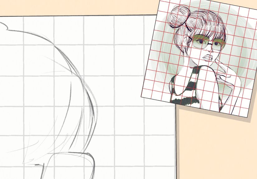
How to Turn a Reference Photo Into Original Artwork
Using a reference photo well is less about copying and more about translating. Here is how to make the leap from “nice photo” to “actual artwork.”
Start With Intent
Before you sketch, ask what drew you to the image. Was it the dramatic backlighting? The gesture? The color contrast? The quiet mood? The crooked smile? If you do not know what matters most, you are more likely to copy everything and emphasize nothing.
Choose your priority early. Maybe you care about atmosphere more than likeness. Maybe you want to push the color. Maybe the main goal is storytelling. That decision helps you edit the reference instead of serving it like a court-appointed intern.
Simplify Into Big Shapes
Do not begin by chasing tiny details. Start by identifying the largest shapes of light and shadow, the biggest masses, and the main directional lines. This makes your work stronger and prevents the dreaded “detail confetti” stage, where you have carefully rendered forty-seven eyelashes on a face that still does not sit correctly on the skull.
Block in:
- Big value masses
- Major directional movement
- Basic anatomy or structure
- Dominant shapes in the background and foreground
Once the big relationships work, details become easier and more convincing.
Change the Composition
This is where your artistic judgment enters the room and takes the job seriously. Move elements. Crop differently. Remove distractions. Combine the best parts of several photos. Shift the horizon. Change the background. Add space around the subject. Push the focal point.
If the photo’s composition is already strong, great. But even then, ask whether it serves your artwork. A photographer and a painter are not solving the exact same problem. A camera can capture everything in the frame. A painting has to justify it.
Use Multiple References
One of the smartest ways to avoid stiffness is to combine multiple reference photos. You might use one for pose, another for hands, a third for clothing folds, and your own sketches for facial expression. Landscape artists often mix skies, trees, architecture, and foreground shapes from several images to build a more original scene.
Using several references helps you stop copying one photo literally. It also forces decision-making, and decision-making is where artistry lives.
Interpret Color, Edges, and Detail
Photos often exaggerate some information and flatten other parts. Shadows can go dead. Highlights can blow out. Skin tones may look colder or more artificial than they do in real life. This is why you should not trust the camera blindly.
Ask yourself:
- Should this edge be softer?
- Would this color feel richer if warmed or cooled?
- Does this detail actually help the focal point?
- Am I painting what I see in the photo, or what I understand about the form?
A strong artwork often comes from correcting the camera, not obeying it.
Common Mistakes When Using Reference Photos
Copying Every Detail
This usually leads to stiff, overworked art. Not every pore, brick, blade of grass, or shirt wrinkle deserves equal attention. Edit ruthlessly.
Ignoring Underlying Form
A photo shows surfaces, but good art communicates structure. Study the skull beneath the portrait, the cylinder under the sleeve, the box forms inside the building, the planes of the landscape. This is especially important when working from flattened photo information.
Using Bad References Because the Subject Is “Cool”
A dramatic subject can distract you from weak visual information. Poor lighting, cluttered backgrounds, awkward crops, and low resolution will not become good just because the subject is a tiger in a leather jacket. Though admittedly, that does sound memorable.
Letting the Photo Outsmart You
Sometimes a photo contains perspective distortion, odd lens effects, or visual shortcuts that look acceptable in a snapshot but strange in a finished artwork. If something feels off, trust your eye. Correct it.
The Legal and Ethical Side of Reference Photos
This part matters, especially if you plan to publish, sell, license, or exhibit your work.
Your Own Photos Are Usually the Safest Choice
If you take the photo yourself, you generally have the clearest path. You know the source, you control the composition, and you are less likely to accidentally build your artwork on someone else’s protected image. Better still, your own reference library becomes a long-term asset that supports originality.
Use Clearly Licensed or Open-Access Images When Needed
If you do not have your own photo, use sources that clearly explain reuse rights. Some reference libraries are built specifically for artists. Museums and cultural institutions also offer open-access collections of public-domain images. Always read the terms. “Available online” is not the same as “free to use however you want.” The internet, tragically, is not a magical copyright-free buffet.
Do Not Assume Changing a Photo Makes It Automatically Safe
Many artists believe that if they change a reference “enough,” they are legally protected. That is not a smart assumption. Copyright questions are fact-specific, and the safest route is to use your own material, public-domain material, or photos with clear permission or licensing terms. If the source is copyrighted and the use is uncertain, get permission.
Ethics Matter Even When Law Feels Fuzzy
Even when the legal side seems complicated, the ethical side is often simpler. Respect photographers. Respect other artists. Give credit when required. Do not build a professional practice on material you would be embarrassed to explain out loud.
A Simple Workflow for Using a Reference Photo Better
- Pick a strong reference with clear lighting, readable shapes, and a useful composition.
- Write down your goal before starting: mood, likeness, story, color, atmosphere, or design.
- Make thumbnails to test crops and rearrange elements.
- Block in big shapes first using value masses and major structural forms.
- Combine references if one image is missing useful information.
- Edit aggressively by removing clutter and strengthening the focal point.
- Adjust color and edges instead of trusting the photo literally.
- Finish selectively so the most detail supports the most important area.
This process keeps the reference photo in its proper role: helper, not boss.
What Artists Learn From Experience Using Reference Photos
Once you have used reference photos for a while, you start to notice a pattern. The first few times, you cling to the image like it is a life raft. You compare every line, every angle, every shadow. You panic when your drawing drifts even a little from the source. It feels safer to stay loyal to the photo because the photo seems objective, certain, and immune to your mistakes.
Then experience kicks in, usually wearing work boots and carrying a clipboard.
You begin to see that the photo is not neutral. It has lens distortion. It may crop awkwardly. It may flatten the depth. The colors may be cooler than real life, the darks may be blocked up, and the background may be full of random nonsense you did not even notice at first. Suddenly, copying the photo exactly stops feeling disciplined and starts feeling lazy. The better you get, the less impressed you are by literal accuracy alone.
You also learn that your best work often comes from references that connect to you personally. A photo you took yourself tends to carry memory with it. You remember the heat of the afternoon, the noise of the street, the mood of the person you photographed, the way the light actually felt. That memory helps you go beyond surface description. You stop painting a tree and start painting that tree, in that light, on that day, for a reason.
Another thing experience teaches is that one reference photo is rarely enough for a complex piece. You may love the pose in one shot but prefer the lighting in another. The hands may look great in one image and cursed in the next. So you gather more information. You take extra photos. You do a quick mirror selfie for the hand angle. You sketch from life. You invent where needed. Over time, you become less dependent on one image and more capable of building a finished work from many kinds of input.
Perhaps the most useful lesson is this: a reference photo should not make you timid. It should make you curious. You can push color. You can soften edges. You can redesign the background. You can exaggerate gesture, simplify anatomy, remove clutter, and reshape the composition so the image says what you want it to say. At first that feels like cheating. Later it feels like art.
And yes, there will still be days when the reference seems perfect until you start working and discover that the nose is at a strange angle, the perspective is nonsense, and the shadows have united against you. That is normal. Every artist has moments like that. The trick is not to worship the source. The trick is to outgrow it.
In the long run, using reference photos well is really about building trust in your own judgment. The photo gives you information. Your job is to decide what deserves to stay, what needs to change, and what will make the final artwork stronger. Once you learn that, the reference stops being a crutch and starts becoming what it was always meant to be: a useful starting point for something original.
Final Thoughts
Using a reference photo in your artwork is not a shortcut. It is a skill. The strongest artists do not simply copy what the camera captured. They select, interpret, combine, simplify, correct, and transform. They understand that a reference photo can improve observation, support accuracy, and spark ideas, but only if it stays in service to the larger artistic vision.
So use the photo. Study it. Question it. Rearrange it. Borrow what helps and ditch what does not. Let it support your process without stealing the wheel. Your artwork should feel like it came through your eye, your hand, and your brain, not straight out of a phone with a brush filter slapped on top.