Table of Contents >> Show >> Hide
- Why This Warm Tiled Kitchen Works So Well
- The Key Elements to Steal
- How to Build the Color Palette
- Fixtures, Appliances, and Hardware That Fit the Look
- Layout Lessons From the Melbourne Kitchen
- Budget-Friendly Ways to Steal the Look
- Common Mistakes to Avoid
- Styling the Finished Kitchen
- Experience Notes: Living With a Warm Tiled Kitchen
- Conclusion
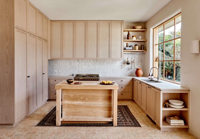
Some kitchens whisper. Some kitchens shout. And then there are kitchens like this warm tiled kitchen in Melbourne: relaxed, textured, sun-baked, and quietly confident, like it knows exactly where the good olive oil is kept. Inspired by the soulful kitchens of Spain and Morocco, this look blends handmade tile, sandblasted oak, limewashed walls, soft stone tones, and practical modern appliances into a space that feels both worldly and deeply livable.
The original inspiration comes from a family kitchen designed by Melbourne designer Georgia Ezra of Studio Ezra. The space uses zellige tile, oak veneer, hemp inlay, limewash paint, quartz countertops, a stainless steel cooker, and a U-shaped layout that feels warm without becoming heavy. It is not a showroom kitchen pretending nobody ever spills coffee. It is a real kitchen with texture, movement, age, and a little bit of “I bought this rug while having an excellent vacation” energy.
If you want to recreate the feeling, you do not need to copy every product exactly. The goal is to understand the design language: earthy color, imperfect surfaces, tactile materials, soft contrast, and a layout that makes cooking feel less like a chore and more like a small daily ritual. Let’s steal the look, politely of course.
Why This Warm Tiled Kitchen Works So Well
The magic of this kitchen is not one flashy element. It is the layering. A warm tiled kitchen succeeds when no single finish tries to become the lead singer at karaoke night. The tile, oak, countertop, wall finish, lighting, and hardware all stay in the same tonal family while offering different textures.
The zellige-style backsplash brings a handcrafted surface with subtle color variation. The mosaic tile floor adds pattern underfoot without needing a loud graphic statement. The oak cabinets soften the tile, while the limewash walls prevent the room from feeling too crisp or too new. Then the quartz countertop steps in as the adult in the room: durable, cleanable, and calm.
This is also why the Melbourne kitchen feels timeless. It borrows from Mediterranean and Moroccan design traditions but keeps the lines simple enough for modern living. Nothing is overly ornate. Nothing is too sterile. It sits in the sweet spot between “architectural” and “please come in, dinner is almost ready.”
The Key Elements to Steal
1. Start With Handmade-Look Zellige Tile
Zellige tile is one of the defining materials in this look. Traditionally associated with Moroccan craftsmanship, zellige is loved for its uneven surface, tonal variation, and glossy finish. In a kitchen backsplash, it catches light beautifully and creates movement even when the color is neutral.
For this style, look for warm white, cream, sand, beige, clay, or pale greige tile. A thin rectangular bejmat tile can create a refined, elongated look, while square zellige gives a more classic handmade feel. The key is imperfection. If every tile looks identical, you lose the charm. You want the wall to shimmer a little when the afternoon light hits it, not look like it was printed by a robot with excellent posture.
For a more budget-friendly approach, choose zellige-inspired ceramic tile. Many U.S. tile brands now offer handmade-look options with easier installation and more predictable sizing. This can be a smart choice for busy kitchens, especially if you want the warmth of zellige without the installation drama.
2. Use Mosaic Tile on the Floor for Texture
The Melbourne kitchen uses tiled flooring to reinforce the warm, handcrafted atmosphere. Mosaic tile is especially useful because it adds pattern at a smaller scale. Instead of a giant statement floor, you get visual rhythm. It feels detailed, not noisy.
If you are recreating the look, consider small-format mosaic, terracotta-look porcelain, stone-look tile, or warm neutral ceramic. For a kitchen floor, practicality matters. Choose a surface with enough slip resistance, and do not forget grout color. A warm beige or soft gray grout is usually more forgiving than bright white, which can go from “fresh” to “why do I own tomato sauce?” rather quickly.
3. Choose Oak Cabinetry With a Natural Finish
Oak is the quiet hero of this kitchen. Sandblasted oak veneer gives the cabinetry depth and grain without looking rustic in a heavy way. The finish feels organic and tactile, which pairs beautifully with handmade tile.
White oak is especially popular in current kitchen design because it brings warmth while staying versatile. For this look, avoid glossy orange wood stains or overly graywashed finishes. Aim for pale oak, natural oak, lightly sandblasted oak, or rift-sawn oak. The cabinet profile should remain clean and simple so the material can do the talking.
Flat-panel cabinets work well here, especially when paired with textured surfaces. If you want extra character, consider woven or fabric-like insets on selected cabinet fronts. The original kitchen used hemp burlap as an inset material, adding another natural layer. In a family kitchen, use this idea carefully: textured insets are beautiful, but they should be placed where sticky fingers are not holding daily conferences.
4. Add Limewash or Plaster-Look Walls
Limewash is one reason the kitchen feels so soft. Unlike standard flat paint, limewash has subtle movement and a cloudy, mineral quality. It makes walls feel older, warmer, and more relaxed. In this style, the wall color should not fight the tile. Think bone, raw white, warm ivory, clay white, or pale stone.
If real limewash is not practical, you can still borrow the effect with mineral paint, plaster-look paint, or a warm matte finish. The goal is to avoid the cold brightness of pure white. Warm white is your friend. Stark white is the friend who shows up to brunch and says your cabinets look “interesting.”
5. Pick a Warm Greige Countertop
The countertop in this type of kitchen should bridge the tile and wood. Caesarstone Topus Concrete, used in the original inspiration, is a quartz surface with a warm greige base and subtle pinkish undertones. That kind of surface works well because it has depth without screaming for attention.
For a similar effect, look for quartz, quartzite, porcelain, or concrete-look surfaces in warm gray, greige, putty, oatmeal, or light taupe. Avoid icy gray counters if the goal is warmth. Also be cautious with very dramatic veining. The tile already brings movement, so the countertop should behave like a good supporting actor: memorable, but not trying to win the entire movie.
How to Build the Color Palette
A warm tiled kitchen in Melbourne style usually begins with five core tones: warm white, sand, oak, greige, and clay. From there, you can add small accents in brushed nickel, stainless steel, aged brass, olive green, terracotta, or muted black.
The palette should feel sun-warmed, not yellow. That distinction matters. Warm white can be elegant; banana pudding white can be a situation. Test samples in morning, afternoon, and evening light before committing. Tile especially changes color depending on light, grout, and surrounding materials.
For a softer look, keep all major finishes low contrast. Use cream tile, pale oak, warm quartz, and bone walls. For a more dramatic version, add deeper terracotta floor tile, darker oak, bronze hardware, or a smoky green accent. Just remember: one drama queen per kitchen. If the floor is bold, keep the backsplash quiet. If the backsplash is expressive, calm the countertop down.
Fixtures, Appliances, and Hardware That Fit the Look
Stainless Steel Cooker
A stainless steel range or cooker adds a practical, professional note to the softness of the room. In the Melbourne inspiration, a Smeg Classic cooker brings a substantial stainless element that balances the handmade tile and oak. This contrast matters. Without a crisp appliance, the kitchen could become too earthy and sleepy.
In a U.S. home, you can recreate the effect with a stainless steel range from brands such as Smeg, Bertazzoni, Bosch, KitchenAid, Café, or GE Profile. Choose a range with clean lines and sturdy knobs. The goal is not ultra-futuristic; it is classic, hardworking, and handsome.
Simple Metal Faucet
A brushed nickel, stainless steel, or aged brass faucet works well in this style. The original kitchen used a streamlined mixer tap, which keeps the sink zone functional and understated. For a warm kitchen, brushed finishes are often easier to live with than high-polish chrome because they reduce glare and hide fingerprints better.
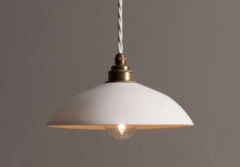
Soft Lighting
Lighting should flatter the tile. Handmade and glossy tiles come alive under warm, directional light. Wall sconces, under-cabinet lighting, and small pendants can bring out the surface variation. Choose warm white bulbs, not cool blue light. Cool lighting can make a beautiful warm kitchen look like it is waiting for a dental appointment.
Minimal Hardware
Hardware should be quiet and tactile. Small knobs, slim pulls, or integrated cabinet grooves all work. Brushed brass adds warmth, while brushed nickel keeps the look closer to the original stainless and neutral palette. Matte black can be used sparingly, but too much black may interrupt the soft, earthy mood.
Layout Lessons From the Melbourne Kitchen
The U-shaped layout is a major reason this kitchen feels practical. It creates a strong working zone with easy access to cooking, washing, and prep areas. A central island adds extra surface area and makes the kitchen social. This is important because a warm kitchen should not only photograph well; it should also handle breakfast, lunchboxes, weekend baking, and the occasional dramatic search for the missing spatula.
If your kitchen is small, you can still borrow the same logic. Use tile as a focal surface, keep cabinets light and natural, and choose a compact island or freestanding table if space allows. If your kitchen is open-plan, repeat the wood tone in nearby furniture so the kitchen connects visually to the living area.
Budget-Friendly Ways to Steal the Look
You do not need a full custom kitchen to create this atmosphere. Start with the backsplash. A warm zellige-style tile can transform a plain kitchen faster than a motivational quote on a cutting board. If replacing tile is not possible, consider peel-and-stick zellige-look tile as a temporary upgrade, especially for rentals or short-term refreshes.
Next, warm up the palette. Swap cool white walls for a soft ivory or plaster-like neutral. Add oak shelves, wood cutting boards, handmade ceramics, linen cafe curtains, or a vintage-style rug. These small touches build the same layered feeling without requiring a builder, a permit, or a nervous conversation with your bank account.
For countertops, if replacement is outside the budget, keep styling simple. Use trays, stoneware, wood boards, and warm-toned accessories to visually soften an existing counter. A kitchen does not need to be perfect to feel intentional. In fact, a little imperfection is part of the charm.
Common Mistakes to Avoid
Choosing Tile From One Tiny Sample
Handmade-look tile varies from piece to piece. Always order multiple samples or view a larger board before buying. A single tile may look calm, but a full wall could reveal stronger color variation than expected.
Using Bright White Grout
Bright white grout can make warm tile look too graphic and can be difficult to keep clean. A tonal grout that sits close to the tile color usually creates a softer, more expensive effect.
Mixing Too Many Wood Tones
Oak cabinets, walnut stools, pine shelves, and orange floorboards can quickly turn into a wood-tone traffic jam. Choose one dominant wood tone and repeat it intentionally.
Forgetting Maintenance
Real zellige, natural stone, and textured surfaces may need more care than standard ceramic or porcelain. If you cook often, choose materials that match your lifestyle. Beauty is wonderful, but so is being able to wipe pasta sauce off the backsplash without performing a full archaeological dig.
Styling the Finished Kitchen
Once the bones are right, styling should stay relaxed. A warm tiled kitchen looks best with objects that feel useful and personal: a ceramic pitcher, a wooden bowl, a linen towel, an antique runner, a small stack of cookbooks, and a few S-hooks for everyday tools.
Avoid overdecorating. This look depends on breathing room. Let the tile and oak carry the atmosphere. If every counter is covered, the texture disappears into clutter. Think of styling as seasoning: enough to bring out the flavor, not so much that everyone at dinner quietly reaches for water.
Experience Notes: Living With a Warm Tiled Kitchen
The best thing about a warm tiled kitchen is how it changes throughout the day. In the morning, the tile reflects soft light and makes the room feel awake before the coffee has even clocked in for duty. Around noon, the oak warms up and the countertop looks smoother and calmer. By evening, under sconces or under-cabinet lighting, the zellige surface starts to glow. This is the kind of kitchen that rewards slow looking.
From a daily-use perspective, the design also encourages better habits. When a kitchen feels warm and grounded, people tend to linger. The island becomes a homework station, a prep zone, a coffee bar, and occasionally a place where someone opens the fridge and announces there is “nothing to eat” while standing in front of twelve edible options. That is not a design flaw. That is simply family life.
If you are planning this look for your own home, spend extra time on touchpoints. Cabinet pulls, faucet handles, counter edges, and floor texture matter more than people think. A kitchen is not just seen; it is used with hands, elbows, socks, and sleepy morning feet. A sandblasted oak cabinet front feels different from a glossy laminate one. A honed or softly textured surface feels calmer than a mirror-polished finish. Even a small detail, like a rounded countertop edge, can make the room feel more welcoming.
Tile is another place where experience matters. Glossy handmade tile is beautiful, but it can show uneven reflections. That is part of the appeal, not a defect. If you prefer a perfectly uniform surface, choose a handmade-look ceramic instead of authentic zellige. If you love variation, embrace the irregularities. The little waves, chips, and tonal shifts are what make the kitchen feel alive.
In real life, the warm tiled kitchen style works especially well for people who cook often but do not want a purely utilitarian space. It offers the durability of tile and quartz, the warmth of wood, and the softness of limewash or plaster-like walls. It feels polished without becoming precious. You can chop herbs, host friends, burn toast, clean up, and still have a kitchen that looks charming afterward. Honestly, any kitchen that can survive burnt toast with dignity deserves applause.
The emotional experience is just as important. A kitchen like this feels settled. It does not chase every trend, even though it aligns with current preferences for warm neutrals, natural materials, earthy color, and handcrafted surfaces. It feels collected rather than decorated overnight. That is the lesson worth stealing most: choose materials that look better together, age gracefully, and make ordinary routines feel slightly more beautiful.
Conclusion
A warm tiled kitchen in Melbourne style is not about copying one room tile for tile. It is about building a mood: handmade, grounded, sunlit, and practical. Start with zellige or zellige-inspired tile, layer in natural oak, choose warm greige countertops, soften the walls with limewash tones, and finish with simple metal fixtures and warm lighting.
The result is a kitchen that feels personal without feeling messy, elegant without feeling stiff, and modern without losing its soul. It is the design equivalent of a perfectly toasted slice of sourdough: crisp where it needs to be, warm everywhere else, and very difficult not to admire.