Table of Contents >> Show >> Hide
- What Made Android 4.2 Jelly Bean Different?
- How Android 4.2 Lock Screen Widgets Worked
- Why Lock Screen Widgets Felt Exciting
- The Best Use Cases for Android 4.2 Lock Screen Widgets
- The Privacy Problem: Convenience Had a Cost
- Usability: Clever, But Not Always Smooth
- Android 4.2 Lock Screen Widgets vs. Home Screen Widgets
- How Android 4.2 Compared With Rival Platforms
- Why the Feature Did Not Become a Permanent Classic
- The Legacy of Android 4.2 Lock Screen Widgets
- Practical Lessons From Android 4.2 Jelly Bean Lock Screen Widgets
- Experience Section: Using Android 4.2 Lock Screen Widgets in Real Life
- Conclusion
- SEO Tags
Android 4.2 Jelly Bean arrived at a curious moment in mobile history. Smartphones were getting bigger, tablets were moving into living rooms, and users were beginning to expect information before they even asked for it. Google’s answer was not a giant redesign or a dramatic name change. It was still Jelly Bean, still sweet, still familiarbut now with a lock screen that wanted to do more than simply stand guard like a digital bouncer.
The headline feature for many Android fans was simple to describe and surprisingly bold for its time: Android 4.2 allowed widgets on the lock screen. Instead of unlocking your phone just to glance at Gmail, Calendar, Messaging, Clock, or other supported widgets, you could swipe across panels and see useful snippets right away. It sounded like productivity magic. It also raised an eyebrow or two from anyone who had ever received a private email subject line at exactly the wrong moment.
This deeper look explores how Android 4.2 Jelly Bean lock screen widgets worked, why they mattered, what made them exciting, where they stumbled, and why their legacy still feels relevant whenever modern Android talks about glanceable information, smart displays, ambient screens, and lock screen customization.
What Made Android 4.2 Jelly Bean Different?
Android 4.2 was not positioned as a completely new generation of Android. It kept the Jelly Bean name, which meant it built on the smoother performance and cleaner interface introduced in Android 4.1. But calling it a minor update would be a little unfair, like calling a Swiss Army knife “just a pocket accessory.” Android 4.2 packed in several features that shaped how people used Nexus phones and tablets.
Alongside lock screen widgets, Android 4.2 introduced Gesture Typing, Photo Sphere, Quick Settings, wireless display support through Miracast, Daydream screen saver mode, and multi-user support for tablets. On Nexus devices such as the Nexus 4, Nexus 7, and Nexus 10, the update gave Android users a more personal, more visual, and more convenient experience.
The Lock Screen Became More Than a Gate
Before Android 4.2, the lock screen mainly answered one question: “May I come in?” It showed time, basic notifications, and shortcuts, but it was still mostly a barrier between the user and the phone. Android 4.2 changed that idea by turning the lock screen into a small dashboard.
Instead of unlocking first and hunting later, users could swipe left or right across lock screen panels. Each panel could host one widget, giving quick access to information without opening the full app. The result felt very Android: flexible, slightly experimental, powerful in the right hands, and occasionally chaotic if you added too much.
How Android 4.2 Lock Screen Widgets Worked
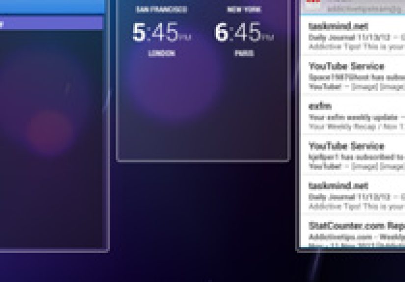
The Android 4.2 lock screen widget system was built around panels. The main lock screen still showed the time and unlock control, but swiping revealed additional spaces where widgets could live. Users could add supported widgets from installed apps, and Android allowed up to five lock screen widget panels.
Each widget occupied its own panel. That design made the interface cleaner and easier to swipe through, though it also limited how much information could appear at once. If you wanted Gmail and Calendar together on one lock screen page, Android 4.2 was not interested in your multitasking dreams. One panel, one widget. Please form a line.
Adding a Widget
To add a widget, users swiped to an empty panel marked with a plus icon. Tapping that icon opened a list of available lock screen widgets. Early options included core Google and Android widgets such as Calendar, Digital Clock, Gmail, Messaging, and Sound Search. As developers updated their apps, more third-party widgets could join the party.
The process was simple enough for everyday users, but it still felt like an enthusiast feature. You had to know the panel existed, swipe in the right direction, and understand why some widgets appeared while others did not. In other words, it was powerfulbut not exactly the kind of feature your grandmother would discover accidentally while checking the weather.
Developer Support: The Keyguard Category
For developers, lock screen widget support required more than hope and a good icon. Android 4.2 introduced a widget category system. App creators could mark widgets as available for the home screen, the lock screen, or both. The important term was “keyguard,” Android’s name for the lock screen environment.
A developer who already had a home screen widget could often adapt it for the lock screen with a relatively small update. That was part of the appeal. Google was not asking every developer to invent a new app experience from scratch. It was inviting them to place useful content in a location users saw dozens of times a day.
Why Lock Screen Widgets Felt Exciting
The appeal of Android 4.2 Jelly Bean lock screen widgets was easy to understand: speed. Unlocking a phone, opening an app, waiting for it to load, scanning for the right information, and then locking the phone again was a lot of tiny friction. A lock screen widget reduced that process to a glance.
Calendar events could appear before a meeting. Gmail previews could show whether a message was urgent. A clock widget could display world times. Messaging could show recent texts. Sound Search could help identify music quickly. In 2012, when mobile notifications were less rich than they are today, this felt like a practical shortcut into the future.
Glanceable Information Was the Big Idea
The smartest part of Android 4.2 lock screen widgets was not that they were flashy. It was that they respected a common user behavior: people wake their phones constantly just to check one thing. Is there a new email? What time is the meeting? Did someone text back? Is the world still on fire? You know, normal Tuesday questions.
By putting controlled pieces of information on the lock screen, Android reduced the number of steps between curiosity and answer. This same philosophy later became central to smartwatches, always-on displays, notification cards, and modern lock screen customization.
The Best Use Cases for Android 4.2 Lock Screen Widgets
Not every widget belonged on the lock screen. A stock ticker might be useful for some users and anxiety fuel for others. A giant social feed could be convenient but distracting. The best lock screen widgets were the ones that answered quick questions without requiring deep interaction.
Calendar Widgets
The Calendar widget was one of the most natural fits. It allowed users to see upcoming appointments without unlocking the device. For students, office workers, frequent travelers, and anyone whose day was held together by digital duct tape, this was genuinely helpful.
Email and Messaging Widgets
Gmail and Messaging widgets were useful but more complicated. They gave fast access to incoming communication, but they also exposed snippets of private information. A meeting reminder is one thing. A message preview that says “Your verification code is…” is quite another.
Clock and World Time Widgets
Clock widgets were among the safest and most universally useful options. They looked good, revealed little private information, and helped users who worked across time zones. Compared with email previews, a world clock was refreshingly low drama.
Music and Sound Search
Media-related widgets also made sense because lock screens have always been a natural place for quick controls. If you are listening to music, you do not want to unlock your phone just to pause a song. If you hear a song in a coffee shop and need to identify it before the chorus vanishes forever, Sound Search on the lock screen feels like a small superpower.
The Privacy Problem: Convenience Had a Cost
The biggest criticism of Android 4.2 lock screen widgets was privacy. Widgets could display content before the phone was unlocked. That was the point, of course, but it was also the problem. A feature designed to save time could accidentally reveal sensitive information to anyone holdingor merely glancing atthe device.
Email subject lines, message previews, calendar details, and authentication codes could become visible depending on the widget and app behavior. Android still required authentication before opening protected app content, but the preview itself could be enough to expose something important.
This created a classic mobile design trade-off: the more useful the lock screen becomes, the more careful it must be. A blank lock screen is private but not very helpful. A fully interactive dashboard is helpful but may be too revealing. Android 4.2 landed somewhere in the middle, and not everyone was comfortable with that balance.
Security Was Not Broken, But It Was Awkward
It would be unfair to say Android 4.2 had no security boundaries. Users still needed to unlock the phone to fully enter protected apps. However, the lock screen widget experience made it clear that privacy is not only about full access. Sometimes a preview, subject line, or calendar title can tell a story all by itself.
For example, a Gmail widget might not open the full inbox without authentication, but visible snippets could still reveal who contacted you and why. A Messaging widget could show enough of a text to make a private conversation less private. In everyday life, that matters. Phones are not used only in quiet rooms. They sit on desks, restaurant tables, kitchen counters, and airplane trays next to curious eyes.
Usability: Clever, But Not Always Smooth
Android 4.2 lock screen widgets were innovative, but the interface had rough edges. Swiping between panels was not difficult, yet the overall lock screen gained more gestures and more possible actions. The camera shortcut, Google Now access, unlock controls, expandable widgets, and widget panels all had to coexist in a small space.
For Android enthusiasts, this was fun. For casual users, it could feel like the phone had suddenly developed secret rooms. Swipe one way for camera. Swipe another way for widgets. Pull down to expand. Tap the lock icon to unlock. It was flexible, but it did not always feel obvious.
One Widget Per Panel
The one-widget-per-panel rule kept things visually clean but reduced dashboard power. Modern users are accustomed to stacked cards, compact complications, and notification groups. Android 4.2’s approach felt spacious, but sometimes too spacious. A full panel for one small piece of information could feel wasteful, especially on larger tablets.
Discovery Was Another Challenge
Many users simply did not know the feature existed. Unless you followed Android news, bought a Nexus device, or explored every swipe gesture like a digital archaeologist, lock screen widgets were easy to miss. Great features need good discovery, and Android 4.2’s lock screen sometimes hid its cleverness behind gestures.
Android 4.2 Lock Screen Widgets vs. Home Screen Widgets
Home screen widgets were already a defining Android advantage. They gave users weather, calendars, music controls, notes, search bars, and app shortcuts directly on the home screen. Lock screen widgets extended that idea to an even faster location.
The difference was context. A home screen widget assumes the user has unlocked the device and is ready to interact. A lock screen widget assumes the user wants something quickly, possibly with one hand, possibly while walking, possibly while pretending not to check their phone during a meeting.
That context changed the rules. Lock screen widgets needed to be simple, glanceable, and privacy-aware. A home screen Gmail widget could show more detail. A lock screen Gmail widget needed restraint. The best developers understood that the lock screen was not just another rectangle. It was a sensitive space.
How Android 4.2 Compared With Rival Platforms
In 2012, mobile operating systems were competing heavily on lock screen experiences. Apple’s iOS had a more controlled lock screen with notifications and camera access. Windows Phone used live tiles on the Start screen and offered its own glanceable design language. Android, true to form, leaned into customization.
Lock screen widgets made Android feel more open and more personal. They also made it feel more complicated. That was often the Android bargain: more control for users who wanted it, more room for confusion for users who did not.
Still, the idea was ahead of its time. Today, lock screen customization is mainstream. Users expect weather, alarms, music controls, smart home shortcuts, wallet access, and notification summaries before unlocking. Android 4.2 helped explore that territory early, even if the first attempt was not perfect.
Why the Feature Did Not Become a Permanent Classic
Despite the excitement, the original Android 4.2-style lock screen widget system did not become a long-term centerpiece of Android phones. Later Android versions shifted focus toward richer notifications, Material Design, improved quick settings, ambient display features, and tighter lock screen security.
One reason is that notifications became much better. As Android notifications evolved, they could show actions, images, message replies, bundled alerts, and media controls. That reduced the need for full lock screen widgets. Another reason was privacy. Giving apps a large lock screen surface created too many chances for sensitive information to appear casually.
In hindsight, Android 4.2 lock screen widgets were less of a final answer and more of a bold prototype. They tested an idea that would return in different forms: glanceable, personalized information at the edge of authentication.
The Legacy of Android 4.2 Lock Screen Widgets
The most interesting thing about Android 4.2 lock screen widgets is that the idea never fully disappeared. It changed shape. Smart displays, always-on screens, Pixel Tablet lock screen widgets, Android widgets with dynamic resizing, notification actions, and watch complications all echo the same goal: let users access small pieces of useful information without opening a full app.
Modern Android has also revisited lock screen widgets in a more controlled way. The newer approach focuses on adaptable widgets, authentication for sensitive actions, and device-maker flexibility. That suggests Google still believes in the original idea, but with lessons learned from the Jelly Bean era.
Android 4.2 was like the first pancake in a breakfast stack. A little uneven, maybe slightly undercooked around the privacy edges, but absolutely necessary for figuring out the recipe.
Practical Lessons From Android 4.2 Jelly Bean Lock Screen Widgets
1. Glanceable Design Works Best When It Is Focused
The lock screen is not the place for everything. It is the place for the next thing. Calendar reminders, music controls, weather, timers, and smart home toggles make sense because they are quick and limited. Long feeds, private messages, and complex dashboards can become cluttered or risky.
2. Privacy Must Be Designed In, Not Added Later
Android 4.2 showed that “locked” does not always mean “private.” If information appears before authentication, users need clear controls over what is visible. A secure lock screen should protect not only full app access but also sensitive previews.
3. Customization Needs Good Defaults
Android users love options, but too many hidden gestures can make a feature feel mysterious. A great lock screen widget system needs simple setup, obvious controls, and smart recommendations. Otherwise, only power users enjoy it.
4. The Lock Screen Is Prime Real Estate
The lock screen is one of the most viewed surfaces on a phone. That makes it valuable for users and tempting for apps. The challenge is making it useful without turning it into a billboard, inbox, dashboard, and carnival booth all at once.
Experience Section: Using Android 4.2 Lock Screen Widgets in Real Life
Using Android 4.2 Jelly Bean lock screen widgets felt like discovering a shortcut through a building you entered every day. At first, the feature seemed almost too simple: swipe, add a widget, glance, move on. But after a few days, the rhythm made sense. The phone became less of a locked box and more of a window with curtains. You could peek in, but you did not always need to step inside.
The Calendar widget was the easiest to love. There was something satisfying about waking the screen and immediately seeing the next appointment. No app drawer, no tapping, no waiting. If you were running late, the lock screen had the decency to tell you quickly, without making you perform a full unlock ritual like a tiny productivity ceremony.
The Clock widget also felt natural. On a phone, it was useful. On a tablet like the Nexus 10, it looked especially at home. A tablet on a desk or nightstand suddenly felt more like a smart display before smart displays became common household objects. Add Daydream mode while charging, and Android 4.2 started to hint at a future where idle screens were not wasted screens.
Gmail and Messaging were more complicated. On one hand, they were incredibly convenient. You could check whether a new email mattered before deciding to unlock the phone. On the other hand, that same convenience made the phone feel a little too chatty in public. A lock screen should not casually announce your inbox like a town crier in a medieval square.
The privacy issue became obvious the first time a message preview appeared while someone else was nearby. It did not have to be dramatic. Even a harmless subject line could feel too visible. That was the moment many users realized that lock screen widgets required discipline. The best setup was not the most feature-packed setup. It was the one that showed only what you were comfortable sharing with the room.
The swipe navigation was fun but not flawless. Power users enjoyed the extra panels, while casual users sometimes forgot which direction did what. The camera shortcut was handy, but the lock screen started to feel busier than before. It was no longer just a place to unlock the phone. It was a mini operating system with its own rules.
Still, Android 4.2 lock screen widgets had charm. They captured the playful, experimental spirit of early Android. Google was willing to ask, “What if the lock screen did more?” The answer was not perfect, but it was useful enough to be memorable. It made phones feel more immediate and personal. It also taught users and developers an important lesson: the fastest interface is not always the best one unless it also respects privacy, clarity, and context.
Looking back, the feature feels like a fascinating ancestor of modern glanceable technology. Today, people expect phones, watches, tablets, and smart displays to show the right information at the right time. Android 4.2 Jelly Bean lock screen widgets helped test that idea in public. It stumbled a little, sure, but it stumbled in the direction of the future.
Conclusion
Android 4.2 Jelly Bean lock screen widgets were one of Google’s boldest attempts to make the phone more useful before unlocking. The feature brought Calendar, Gmail, Messaging, Clock, Sound Search, and third-party widgets closer to the user’s eyes, reducing friction and making Android feel more personal. It also exposed the delicate balance between convenience and privacy.
As a product idea, it was not perfect. The interface could feel hidden, the one-widget-per-panel rule limited flexibility, and sensitive previews created legitimate concerns. But as a design experiment, it mattered. Android 4.2 showed that the lock screen could be more than a locked door. It could be a dashboard, a shortcut, a reminder board, and sometimes, if configured carelessly, a gossip with a glowing screen.
The modern Android ecosystem continues to revisit this concept with better tools, smarter privacy rules, and more polished widget systems. That makes Android 4.2 Jelly Bean lock screen widgets worth rememberingnot as a forgotten gimmick, but as an early step toward the glanceable, personalized mobile experiences users expect today.
SEO Tags
Note: This web-ready article is written in original American English and synthesizes verified historical information about Android 4.2 Jelly Bean lock screen widgets without including source links inside the article body.